

Decorating & Design
March 6, 2018
3 Reasons To Decorate With Clashing Patterns Like Kelly Wearstler
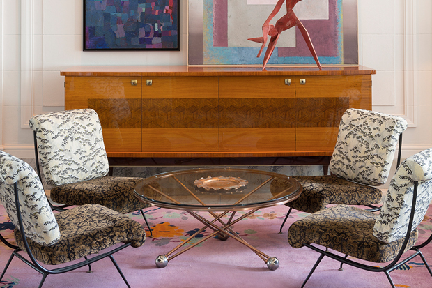
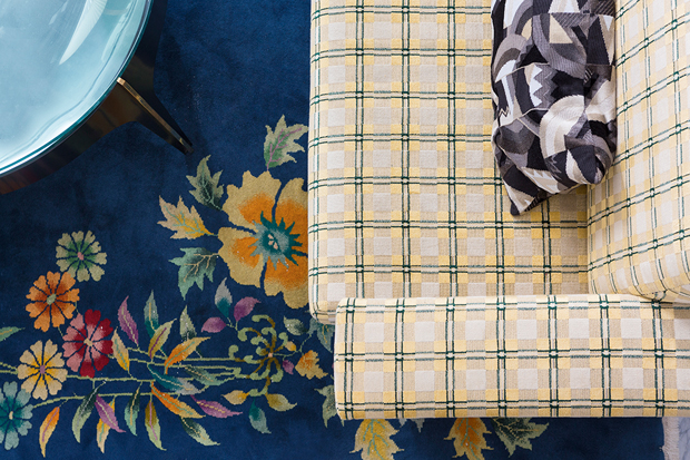
L.A. designer Kelly Wearstler gave the new San Francisco Proper hotel a trendsetting mix of clashing patterns in its guest rooms, restaurants and lobby. Here’s why you should consider bringing the look home — and how to master the mix!
1. It’s a classic designer trick. Already well-known for her bold approach, Kelly used an anything-goes mix of florals and plaids, geometrics and checks, and stripes and abstract prints. Done in layers of warm colors and rich textures, the design’s happy juxtapositions refresh the 1904 Callaghan Building.
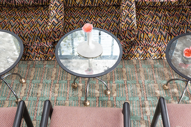
2. It gives rooms major personality. How you combine patterns is up to you, so the result is always unique. But, a few guidelines help: tie everything together by choosing a hero color and repeating it in every pattern, and use a mix of scales so patterns stylishly clash but don’t compete for attention.
3. The commitment can be big or small. Reimagine an entire room with upholstery, drapes, pillows and rugs in crazy-cool pattern combinations. Or, refresh a single art wall with a gallery-style grouping of exotic botanicals, abstract paintings and figure drawings. Include a few non-art pieces, such as mirrors with interesting frames, to give the eye a place to rest.
Courtesy of Proper Hospitality.