

Best Paint Colors
November 29, 2018
Hot Hues: Fall In Love With Farrow & Ball’s Nine New, Richly Crafted Paint Colours
Presented by
![]()
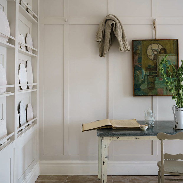
Craftsmanship and curation are key to great design. That’s one of the reasons why decorating fans and interior designers rely on Farrow & Ball’s coveted 132 paint-colour palette for timeless shades that work beautifully in living rooms, bedrooms, kitchens and bathrooms alike. So it’s no surprise that the rare release of nine new colours feels like something worth celebrating. Preview the collection below, plus enter our contest for your chance to win $1,000 worth of Farrow & Ball paint!
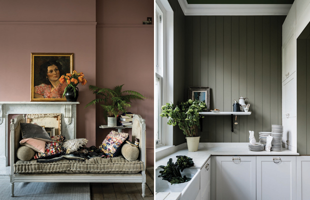
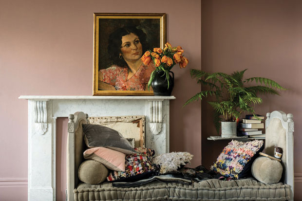
“It’s always exciting when a master brand like Farrow & Ball — which is a resource for so many classic colours — turns its attention to something new,” says designer Julie Charbonneau of Julie Charbonneau Design in Montreal and Toronto. Charbonneau and her colleague Janinna Caverly particularly like the new Sulking Room Pink No. 295 (above left), Treron No. 292 (above right) and Jitney No. 293 shades from the collection.
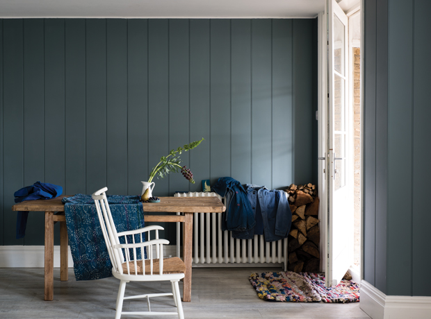
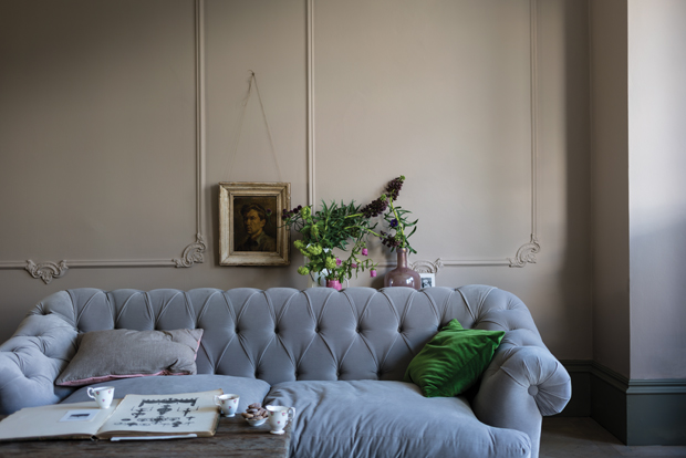
But they’re also game to mix old favourites, such as the timeless neutral Purbeck Stone No. 275, with the newly released elegant blue, De Nimes No. 299 (above).
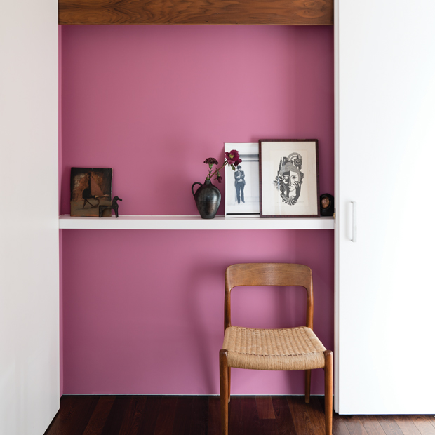
On the bright side, House & Home editors were so keen on Farrow & Ball’s Rangwali No. 296 — a vibrant pink inspired by the Holi festival in India — that they included it in their top 2019 paint colour trends story. As they say, “Exotic and enveloping, deep, vibrant pink is one of the year’s most daring choices for walls.” (Download the January 2019 Trends Issue today, plus watch our video with more on-trend colours that H&H editors are loving.)
The enduring appeal of Farrow & Ball paint colours stems from their rich pigmentation and ability to play well together. “An extraordinary amount of time and thought goes into each colour,” says Charlotte Cosby, head of creative at Farrow & Ball. “The collection is intelligently designed to ensure the colours you choose work effortlessly alone or as a scheme — plus they respond beautifully to the light in any room.”
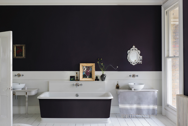
Trying to choose a white paint is always a challenge, which is why Toronto designer Joel Bray is warm on the new Farrow & Ball School House White No. 291 shade. “This soft, ethereal white borders on cream and looks aged to perfection,” says Bray, who also maintains a soft spot for Hague Blue No. 30 — a classic colour he’s used in countless rooms.
Some of the new colours represent tweaks to older shades, while others respond to new trends. “Jitney is a wonderful example of this, with brown-based tones that mark the move away from cooler greys,” says Joa Studholme, Farrow & Ball’s colour curator.
Paean Black No. 294 — which nods to the deep hue of old leather hymnals — the deep, baroque Preference Red No. 297 and Bancha No. 298, a modern olive green, round out the remaining nine new paint colours, which are all bound to become favourites. (Find out which ones H&H editors chose in our video, plus discover the stores near you that carry Farrow & Ball paint.)
True to the 100% water-based range, the new Farrow & Ball paint collection is low odour, eco-friendly, safe and easy to use and available in a range of high performance interior and exterior finishes. Plus, the paint is also used in Farrow & Ball hand-crafted wallpapers made in Dorset, England, so they match seamlessly. (See the complete Farrow & Ball wallpaper collection here.)
So, what’s your favourite shade from the new Farrow & Ball paint collection? Click here to tell us and you could win $1,000 worth of Farrow & Ball paint!