

Decorating & Design
April 13, 2018
15 Designer Color Combinations To Help You Find Your Perfect Palette
Picking the perfect palette for a room can be challenging, so we’re looking to the pros for inspiration. By going beyond the expected, these designers have created complex color stories for truly spectacular spaces. We break down some of our favorite colorful rooms and explain why they work so well.
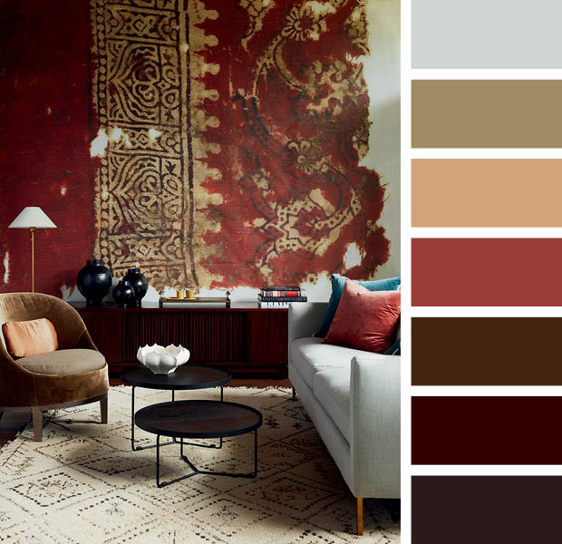
A wall covered with a blown-up print of a vintage textile from The University of Oxford’s Ashmolean Museum has a rich palette. The deep maroon and muddy gold of the mural are picked up in the brightly hued throw pillows.
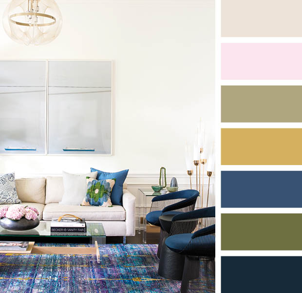
Even a white-walled room can be colorful! Against a neutral backdrop of Benjamin Moore’s White Dove (OC-17), the saturated blues and greens of the decor really pop. Soft pinks and yellows balance the dark blue’s intensity.
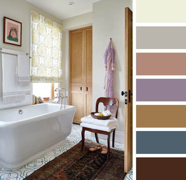
The subtle darker tones of this bathroom help ground the light sandy walls, done in Old Prairie (2143-60) by Benjamin Moore. The grey and dark blue of the geometric floor tiles and the warm wooden accents lend an earthy vibe.
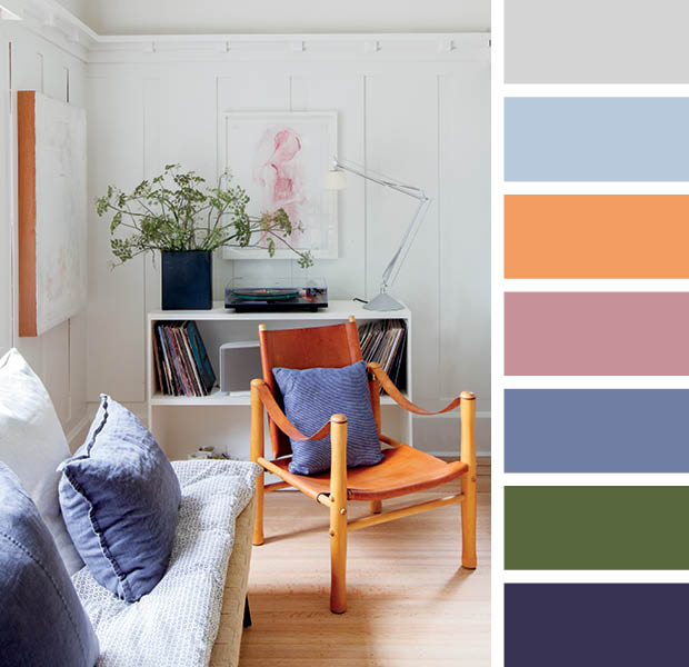
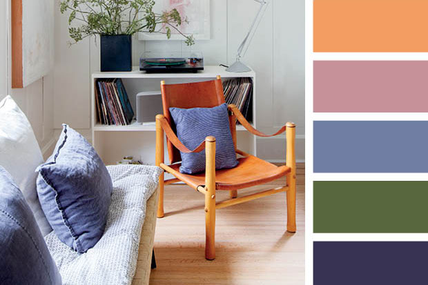
Designer Sophie Burke’s trendy West Vancouver home is awash in delicate blues and light woods, giving it a Scandi flair. Because they’re contrasting colors on the color wheel, the warm orange-y leather of the chair pops against the faded blues.
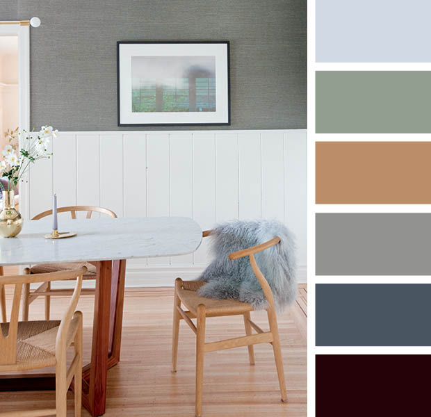
In Sophie’s ethereal dining room, blue-green wallpaper sets the scene. An icy blue throw and blonde wood wishbone chairs add some warmth.
A range of soft hues from Farrow & Ball’s historical color collection proved to be exactly what this heritage Cape Cod, Massachusetts, Saltbox needed. Lime White (1) on the walls, contrasts subtly with Old White (4) on the cabinetry, while the pantry at the back is painted in F&B’s Lichen (19) for a bit of depth.
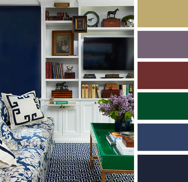
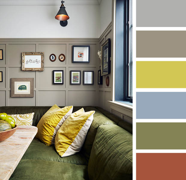
Nearly all of the color wheel is on show in this bold living room, but their muted tones prevent the palette from overwhelming. Deep navy blue walls provide a foil for a lively emerald green coffee table and rich reds and yellows in the shelf dressings. A vase of lilacs provides a subdued pastel touch.
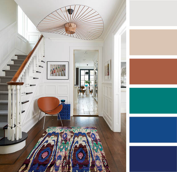
Small pops of color in this entryway set the tone for the rest of the home. The colorful rug picks up on the colors of the flooring, chair, side table and even the artwork, ensuring a cohesive look.
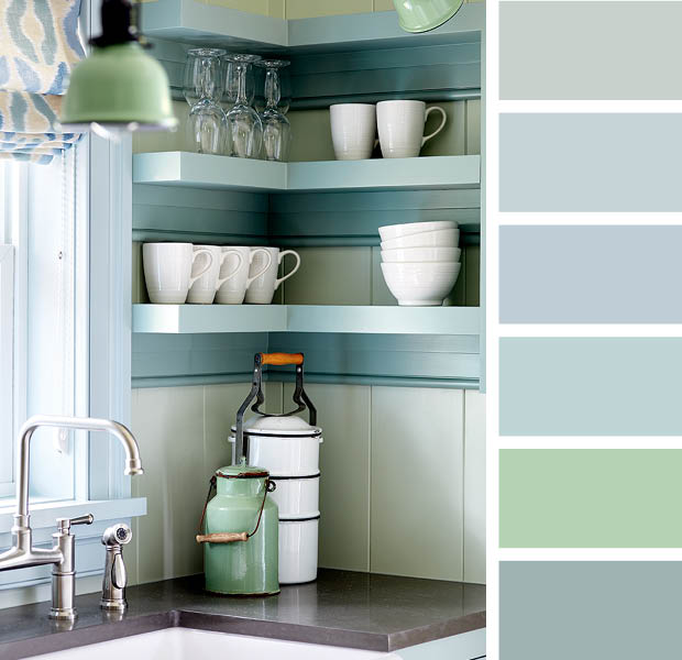
Designer James Davie is legendary for his adventurous use of color. Here he puts on a masterclass in how to mix various shades of green and blue — the key being all the shades are different enough to stand on their own and have similar undertones. On the walls are Hollingsworth Green (HC-141), shelves are in Stratton Blue (HC-142) and the window trim is in Yarmouth Blue (HC-150), all Benjamin Moore.
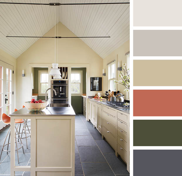
The palette in this kitchen — with its rich ochre, apple green and rust accents — reads like a bright autumn afternoon. The warm greige panelling acts as a neutral yet lively counterbalance to the bold colors.
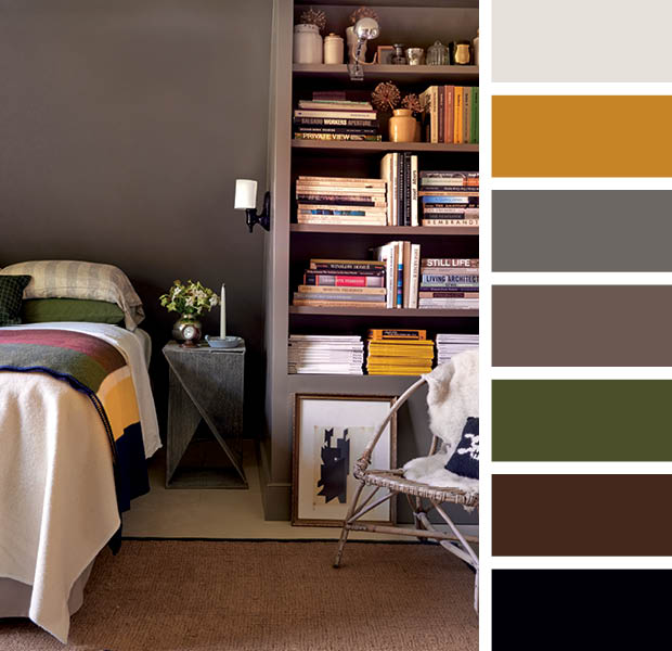
The principal bedroom of former J.Crew designer Frank Muytjens’ upstate New York country house is appropriately cozy and rustic. The moody scheme of muddy greens and reds is lightened by bright yellow, as seen in a stack of National Geographic magazines on the shelf, a vase and striped blanket on the bed.
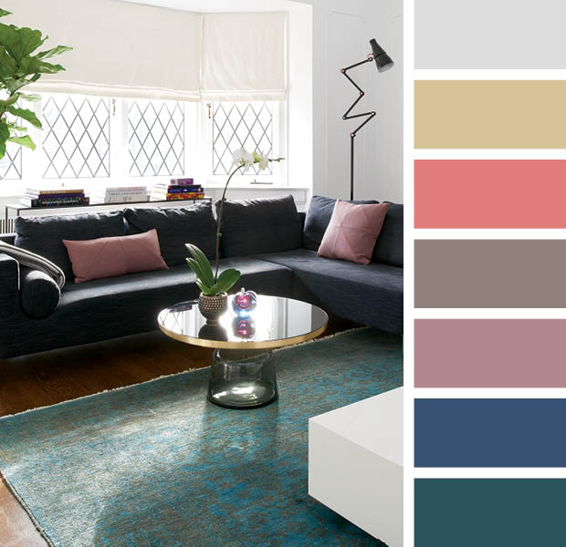
This living room is a masterful blend of cool and warm tones. Pink and blue-green play well off each other and various shades of the two keep the look from feeling two-dimensional.
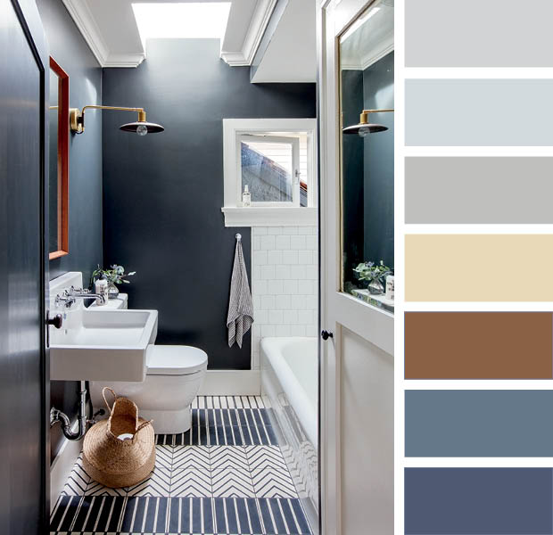
Farrow & Ball’s Off Black (57) is a soft yet dramatic black, played up by the cool blues of the graphic floor tile and towel. Warm hits of brass and red-ish wood provide a warm contrast.
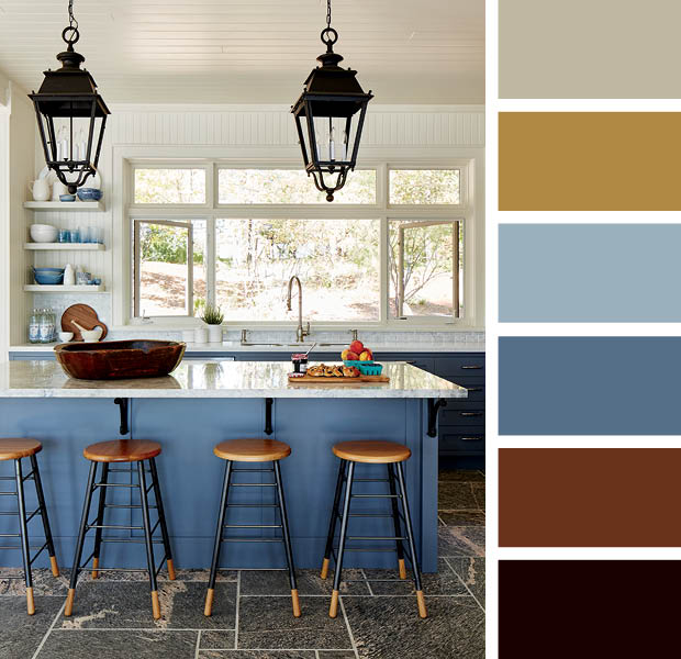
A play on the classic blue and white palette, this cottage kitchen features creamy beige walls and wood accents to keep the ocean blue island from feeling too nautical.
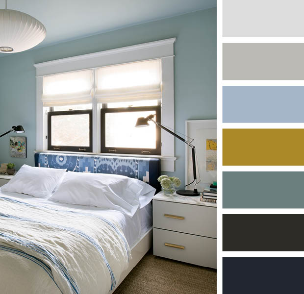
In designer Cameron MacNeil’s principal bedroom, a cool blue and white palette is warmed up through subtle accents. Cameron used blue several ways: Pratt & Lambert’s perfect green-blue Argent (1322) adorns the walls, the framed art features watery scenes and the soft furnishings go from bright to inky blues. The magic is in the mix!