

Best Paint Colors
May 30, 2017
17 Stunning Ways To Decorate With Red
We’ve rounded up our favorite interiors with a crimson spin. Whether they’re big moves (all red everything) or smaller hits (a few throw pillows or some great art), here are 17 inspiring spaces that make the most of this bold hue.
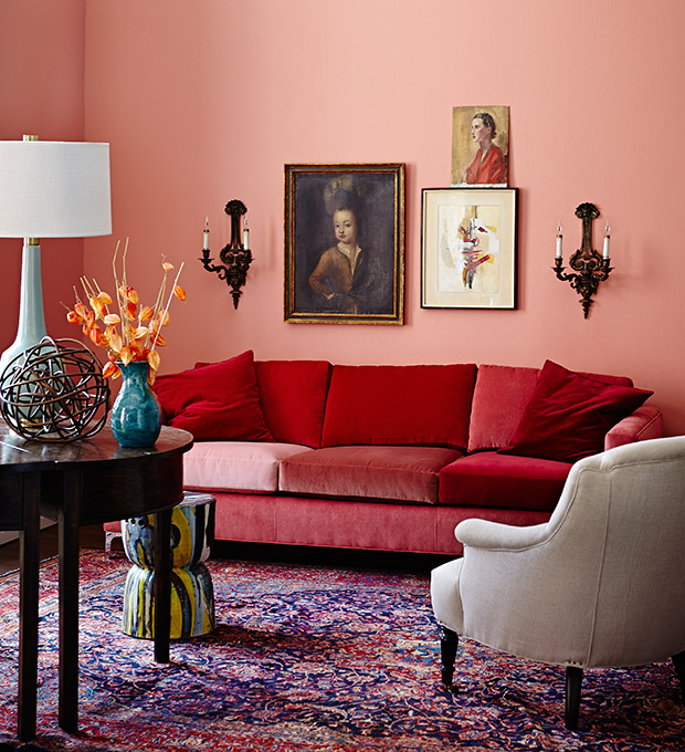
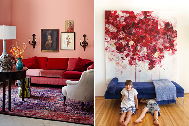
Upholstery in varied tones of red has grown-up appeal, especially when set against a pretty salmon-colored wall (Behr’s Coral Serenade, 180D-4). The sofa’s clean lines keep the overall look modern, while a Persian rug picks up on the rosy palette and adds a sophisticated hit of pattern underfoot.
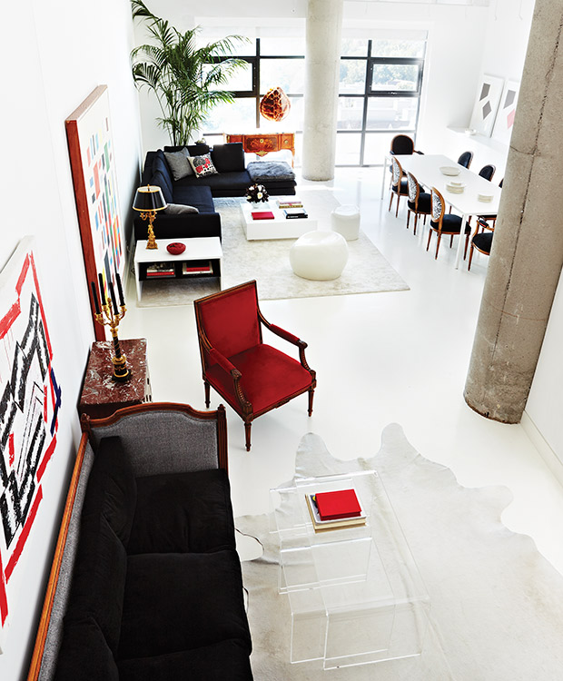
In this Toronto penthouse loft, the home of Canada Blooms artistic director Colomba Fuller, a palette of black, red and white feels both contemporary and restrained. There aren’t many hits of red — just the armchair, art and accessories — but these additions have huge impact when set against an all-white shell.
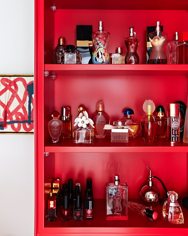
In Colomba Fuller’s powder room, the red medicine cabinet is a dramatic backdrop for her collection of sculptural perfume bottles.
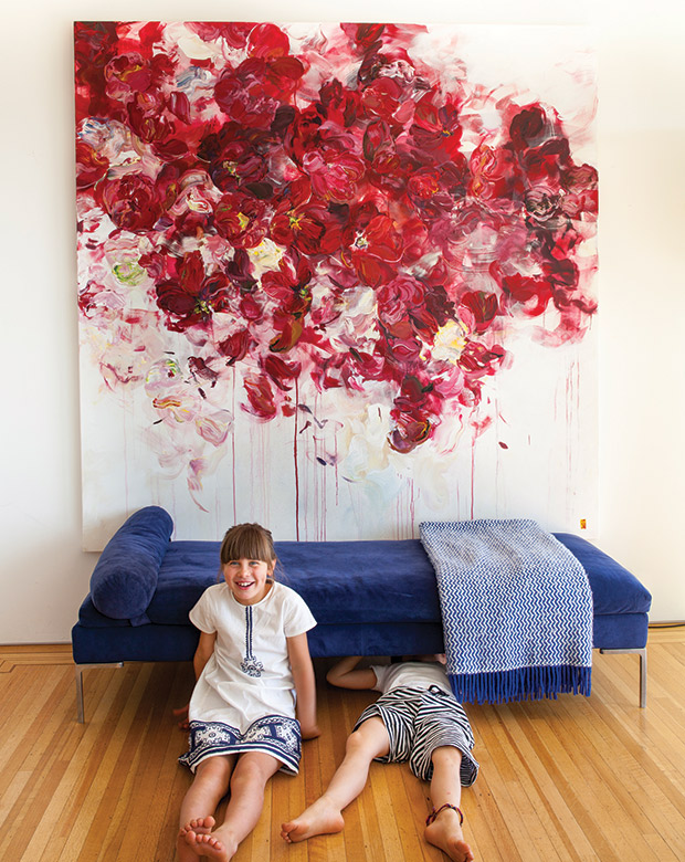
A large-scale floral painting contrasts nicely with the rich blue upholstery of the low settee; the pairing gives a gallery-like feel to artist Bobbie Burgers’ living room.
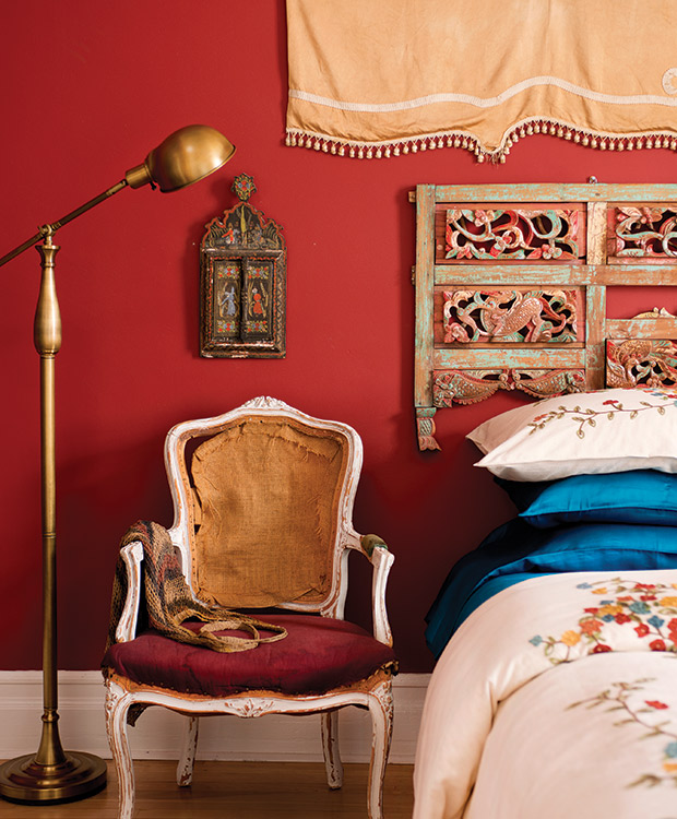
Forget serene and spa-like, this bedroom has a rich, global feel thanks to deep red walls, carved wood accents and a tasseled fabric wall hanging. An artfully distressed armchair adds an element of beautiful decay, while the floor lamp has a cool, industrial flavor.
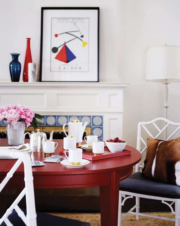
Painting the dining table a daring red provides much-needed tension in this otherwise ladylike dining room. Smaller accents, like the framed modern art print and jewel toned vases, are also edgy counterpoints to the classic mantel and Chippendale chairs, while a gold-rimmed tea service is a charming addition.
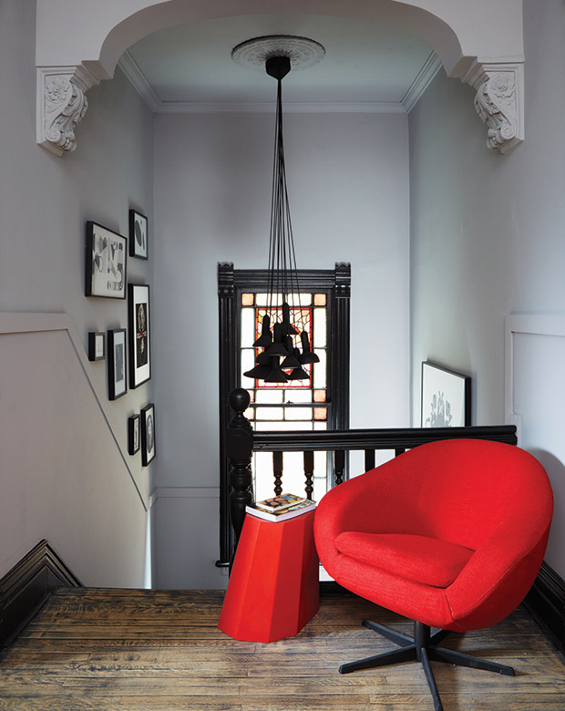
Designer and homeowner Stéphane Chamard took an avant-garde approach to decorating his three-storey Toronto Victorian, like on this upstairs landing, where ornate architectural details feel ultra-cool when paired with mod furniture. He found the chair by the side of the road, reupholstered it in red silk tweed and paired it with a geometric Martino Gamper side table. A cluster of Established & Sons lights are the perfect finishing touch.
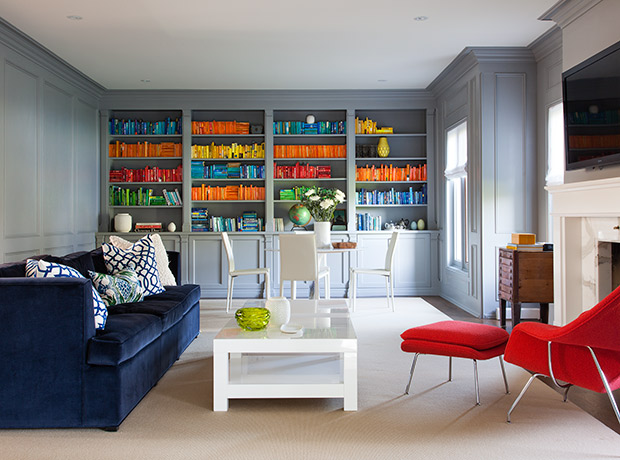
In this contemporary-meets-classic living room, a lipstick red Saarinen Womb chair is the star attraction, while color-blocked books and accessories provide a secondary hit of energetic color.
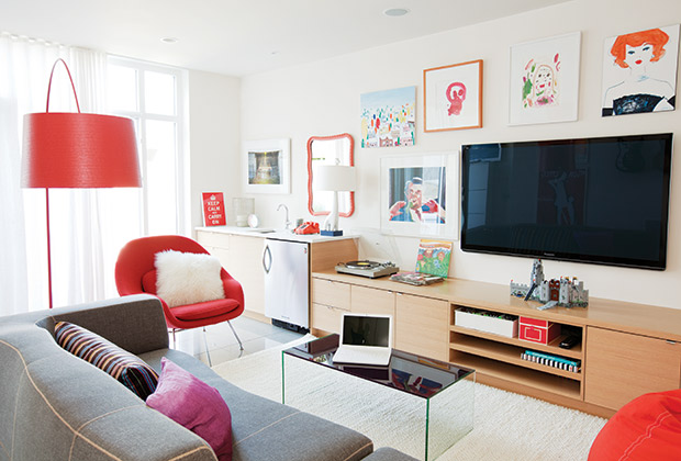
In designer Nancy Riesco’s own Vancouver home, red accents liven up the light-filled basement media room. A Saarinen Womb chair and Soscarini floor lamp are high-design moments that feel right at home in the family-friendly space thanks to their playful hue, while the art features more than a few hits of red to tie the space together.
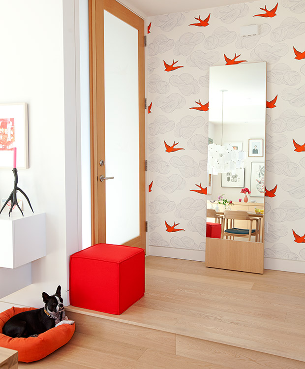
Graphic wallpaper makes a tiny entrance feel impactful; here, it’s pretty red birds in a design by Hygge & West. A bright red felt-covered pouf adds a cheerful vibe.
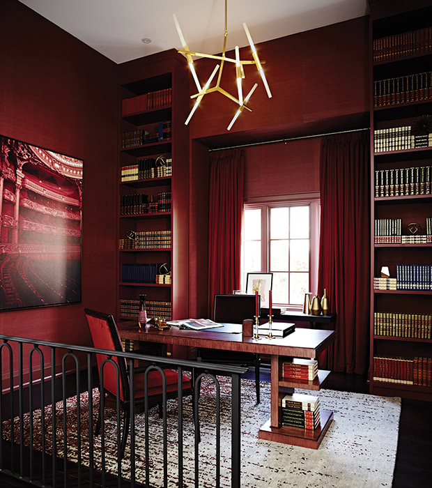
Rich, Bordeaux-hued wall coverings by Télio give this suburban study — in the Brian Gluckstein-designed Princess Margaret Showhome — a decidedly luxurious feel, especially when combined with satin drapery in the same hue. Built-in bookcases are stocked with leather bound volumes, while chairs upholstered in velvet are another luxe hit. Overhead, an angular chandelier is a modern note.
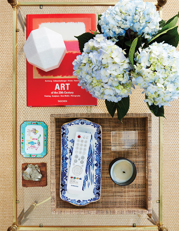
Even if going all out isn’t your style, a tiny touch of red can add energy and visual interest. Seen through the glass top of the coffee table, the rug’s natural fibers provide a neutral backdrop for this pretty vignette, while a bright coffee table book is an eye-catching addition.
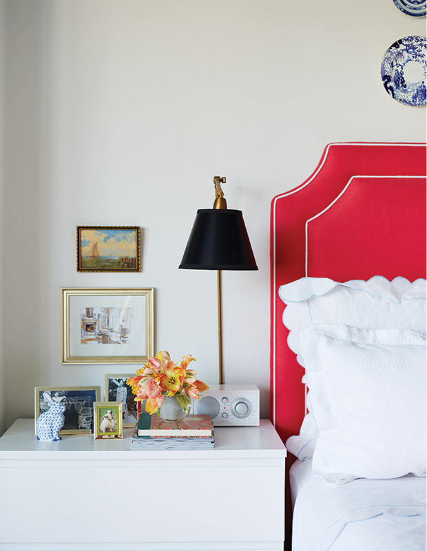
In designer Alison Pringle’s tiny studio apartment, the custom headboard, which was upholstered in a bright poppy red, is the focal point, giving the whole space a hotel-like feel.
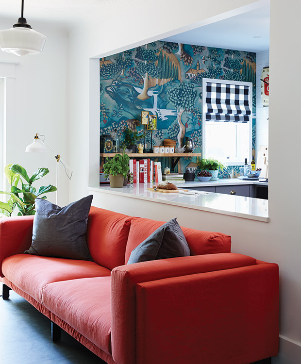
A cutout wall connects the living room and kitchen in this century home, so cohesive design was a must. The mod, orange-red sofa picks up on the rust tone in the kitchen’s cool wallpaper — and so do the red-covered cookbooks, a practical addition to the space that also amps up the pretty.
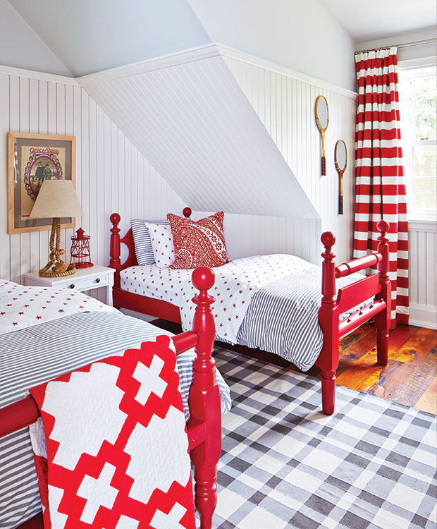
A mix of patterns can still feel cohesive — the trick is to keep the colors consistent and vary the scale, according to designer Kate Stuart of Sarah Richardson Design, who tackled this Port Colborne, Ont. cottage with colleague Natalie Hodgins. A strict palette of red, white and sky blue helps traditional elements, like ticking, quilts and vintage beds, feel crisp and youthful.
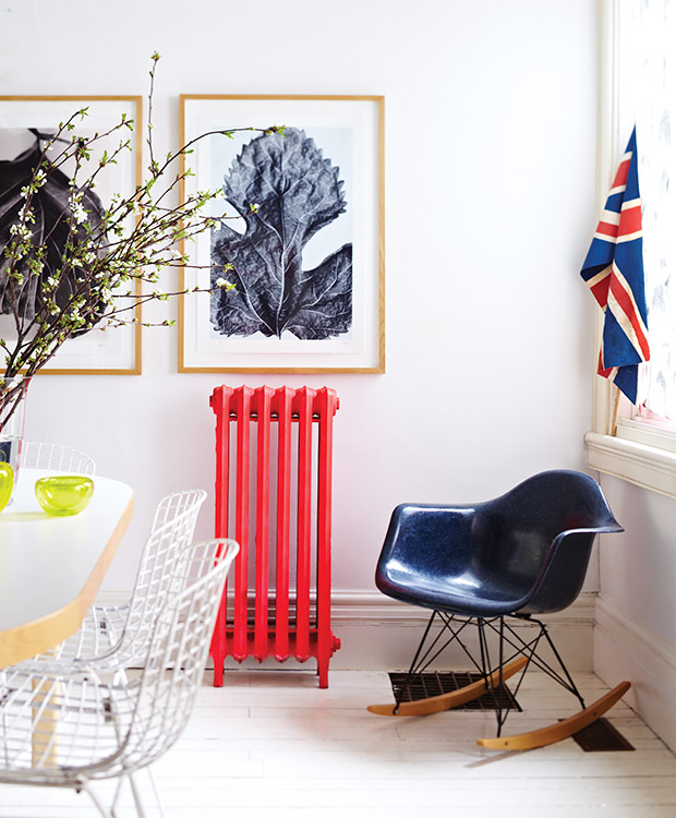
Painted in an eye-catching cerise, this radiator feels like a sculptural focal point, while an all-white envelope, navy rocker and subdued art allow it to shine.
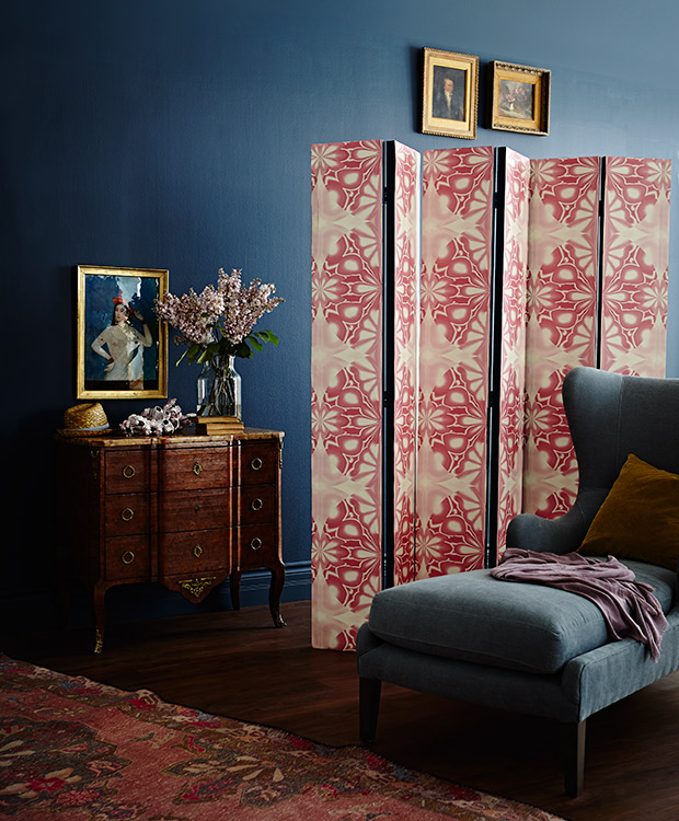
In a moody space like this sitting area, which has walls painted in Farrow & Ball’s Hague Blue (30) and a sculptural chaise with lush blue-green upholstery, red accents add to the rich and layered feel. A DIY screen — three sets of bifold doors are attached to one another with hinges, then covered in an abstract wallpaper — adds a subtle infusion of color and pattern, while an antique rug adds historical patina.