

Bedrooms
February 9, 2016
8 Dreamy Bedroom Paint Color Ideas

Senior editor Morgan Michener shares fresh paint color ideas for bedrooms.
 Thinking of painting your bedroom but unsure of what color to choose? Check out this selection of some of H&H’s most inspiring bedrooms, and the shades of paint that make them sing.
Note: For many of these shots, we know the exact paint color used to create the look. But in cases where we don’t, I’ve suggested hues that I think would create a similar effect. Always test out your colors before diving into a project. Happy painting!
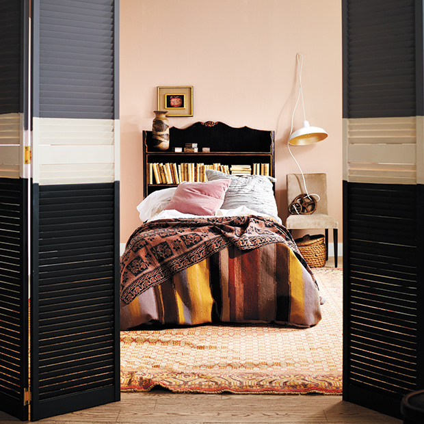
Pale pink walls provide a soft, neutral backdrop in this eclectic bedroom, while shuttered doors painted in bold stripes add graphic interest. Here are the colors we used: Top stripe, Plummett (272), Farrow & Ball; middle stripe, Sail Cloth (N300-1), Behr; bottom stripe, Down Pipe (26), Farrow & Ball; wall color, Setting Plaster (231), Farrow & Ball.
Dark grey walls and crisp bedding always work well together. Here, designer Olivia Botrie used Benjamin Moore’s Templeton Gray (HC-16) on the walls to give the room a tailored look. This color looks great paired with a clean white ceiling, such as Standard White (CA25) from Cloverdale Paint’s Artisan collection.
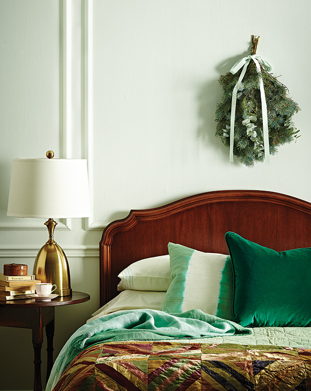
Mint is a great option if you’re looking for a subtle hit of color, and it pairs so beautifully with wood tones. One of our senior design editors Joel Bray selected Farrow & Ball’s Pale Powder (204) to balance out this room’s rich wooden headboard and side table.
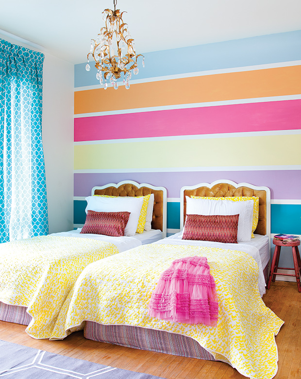
In this kids’ room, a striped feature wall accentuates the space’s ceiling height and creates a playful atmosphere. To get the look, I’d suggest painting out thick stripes in these shades from Sherwin-Williams (from top to bottom): Extra White, Empire Sky, Heirloom Carrot, Kissable, Lilting Lily, Maison Bleu and Highland Loch.
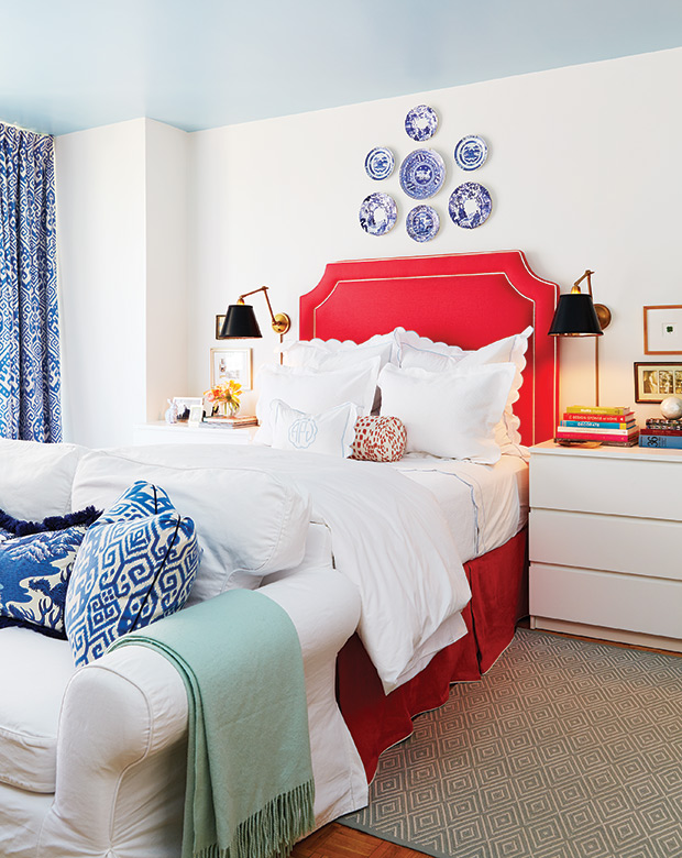
Designer Alison Pringle went with a high-gloss, sky blue paint — Benjamin Moore’s Blue Flower (2057-60) — to accent the ceiling of her studio apartment. I love the fresh, outdoors-in effect it creates. Love her bright white walls? I’d recommend a shade like Best In Snow (SC062) by Beauti-Tone.
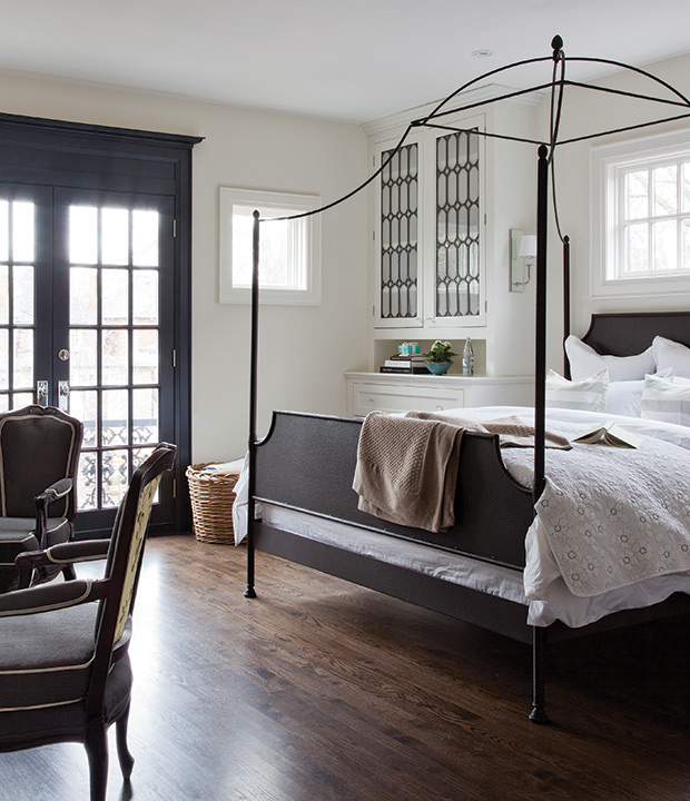
In this handsome bedroom, classic white walls and ceilings take a quiet back seat to a dramatic door painted out in a warm, dark grey. To achieve a high-contrast look like this, I’d try combining Sico’s Natural White (6000-11) with Lunar Landscape (6021-83).
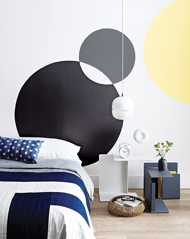
With a steady hand, my colleague Lauren Petroff and I created this circular-themed headboard/mural for our September 2014 issue. Combining a single pop of yellow with different shades of grey keeps the look from going over the top. Here are the colors we used: Bit Of Sugar (PR-W14), Upbeat (P300-5), Pencil Point (PPU18), Cool Ashes (N520-4), Behr.
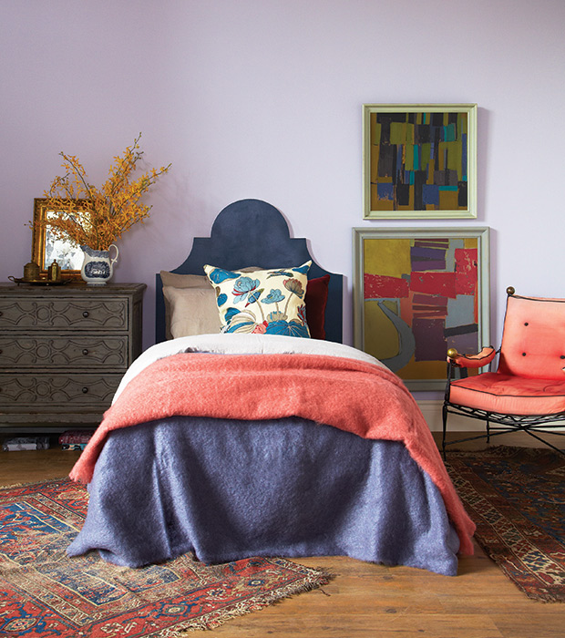
Soft lavender walls (painted in Farrow & Ball’s dreamy Calluna paint) look grown-up, not precious, when paired with a navy headboard and spicy-hued accents.