Decorating & Design
June 16, 2016
A Look Inside House & Home Editors’ Covetable Kitchens
If you think all House & Home editors have fabulously designed and styled kitchens…you’d be right! Our talented team of design experts knows that the kitchen is the heart of the home and a natural gathering place — so you might as well make it spectacular.
These designer-approved and -tested kitchens are neither too trendy nor too over-the-top. While most of the designers used a light palette, each kitchen features different accent pieces and colors to make their space truly unique. In need of some kitchen inspiration? Look no further!

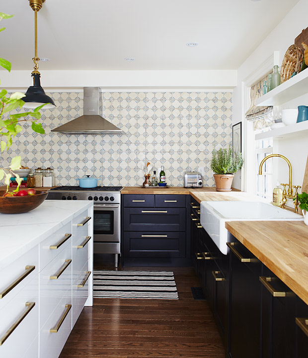
A space to entertain was the top priority for Beth. In this turn-of-the-century kitchen, she blended modern and traditional styles and created a show-stopping feature wall of hand-painted ceramic tiles.
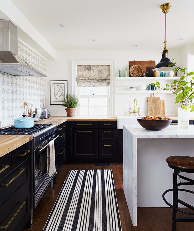
Mixing butcher block and marble counters is practical as well as stylish — hardworking butcher block can withstand daily prep while the marble island is perfect for casual dining.
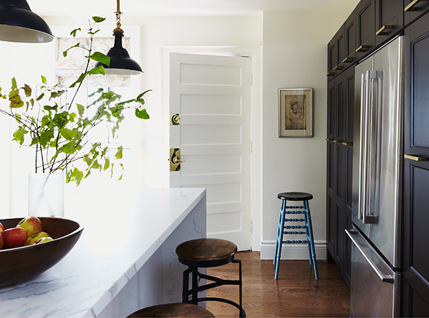
A small, awkwardly placed window was removed and replaced with a bank of tall dark blue cupboards which allowed for coat storage next to the side door.
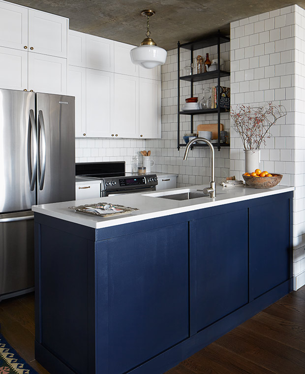
In Joel’s builder-basic condo kitchen, he concealed a bulkhead with short door fronts to make it look like the cabinets extend all the way up. To add architectural detail, he wrapped subway tile around the walls and added a bright pop of blue on the peninsula to liven up the space.
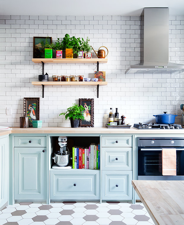
When Kai wanted to redo her family’s kitchen, playful whimsy took the lead. A light grey-blue color on the cabinets instantly gave it life, while the salvaged cabinets and leaning artwork offer some vintage charm.
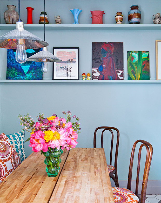
Vibrant patterns on the pillows pick up on the two-tone hexagonal bistro-style flooring and bring the eye up to the bright colors of the art.
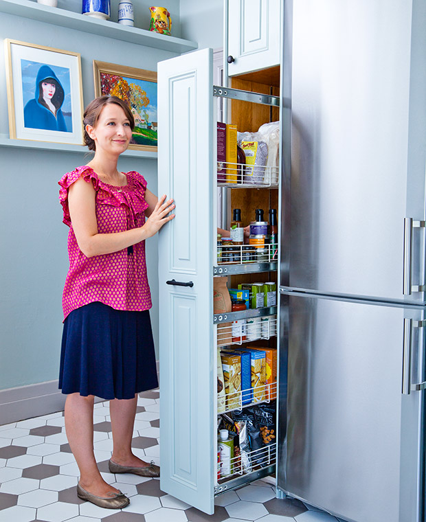
Making use of an awkward space beside the fridge, a deep pantry cupboard that’s the same depth as the fridge allows for some much-needed, easy access storage.
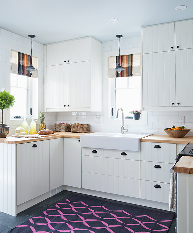
For Katie, getting some natural light into the space was key — two windows were added where there were previously none! Bright window treatments and a playful rug invigorate the white interior.
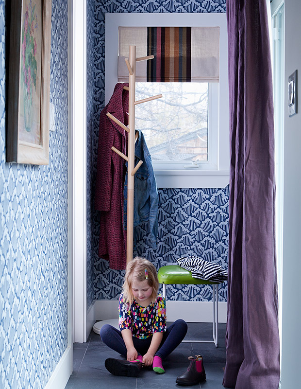
Designer Sarah Hartill embraced the back hallway just off the kitchen, which was previously dead space. The bright wallpaper and equally attention-grabbing aubergine curtain and lime green stool contrast the cool white of the kitchen, without feeling too detached.
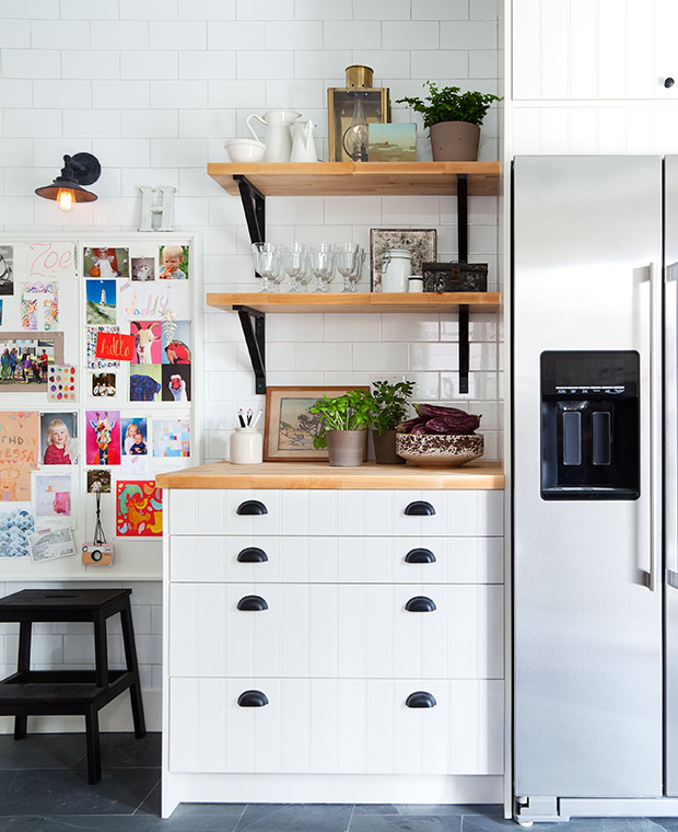
With two young girls, having a space to show off art or school recital programs is essential, especially when the fridge is demagnetized stainless steel. The airy, open shelving balances the opposite wall of upper cabinets.

In order to continue the wall of upper cabinets, they had to work around an awkward pillar in the corner, building a fully functional spice cupboard on top.
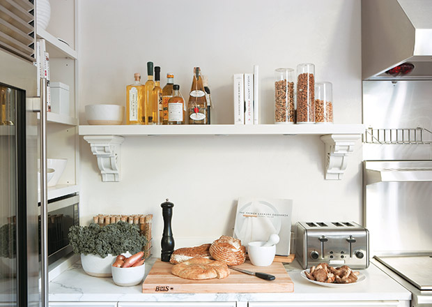
In Lynda’s kitchen, simplicity is key. In this prep area, oils and spices are easily accessible (and look great) displayed on a floating shelf.
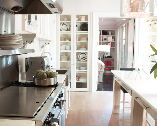
The glass-fronted dish closet provides ample storage while also creating a focal point, with something beautiful to look at on every shelf. It also creates a harmonious view through to the shelves in the library.
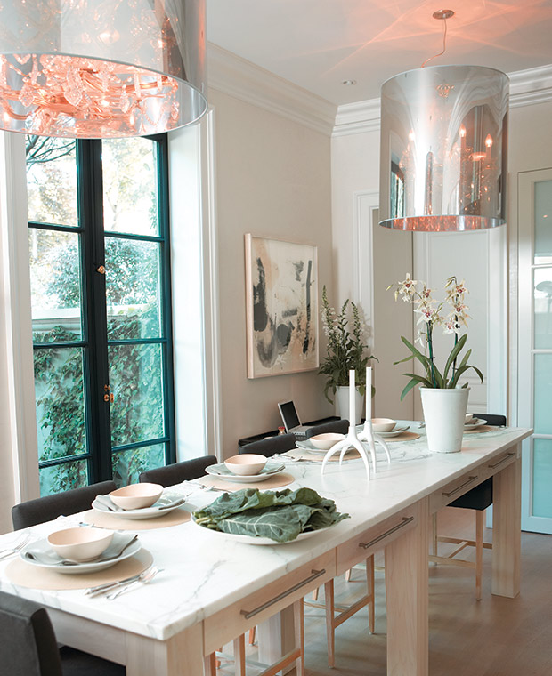
At the island, low-backed custom chairs create an uninterrupted sight line out to the garden, while oversized chandeliers give the room a warm glow.
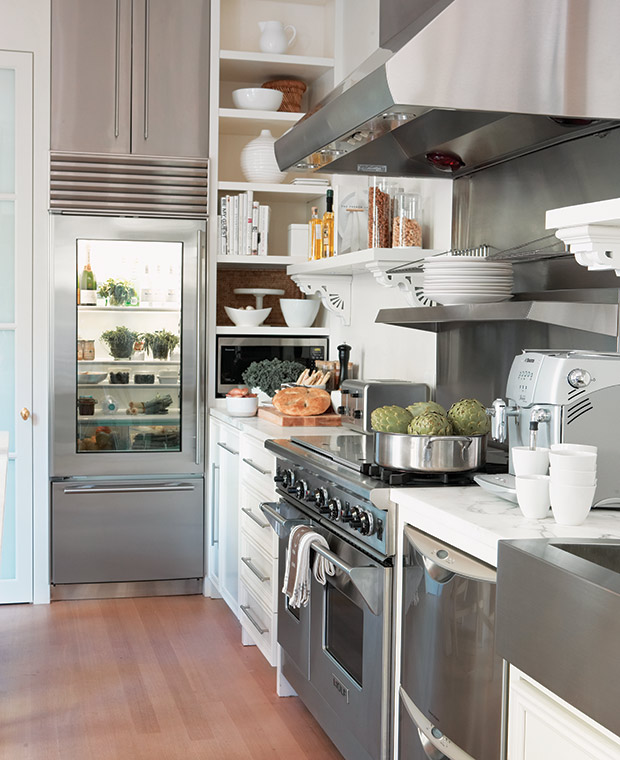
Instead of having a fridge hidden away beneath contrasting cabinets, Lynda continued the stainless from the fridge front up to two cabinet doors to create a continuous column of metal.
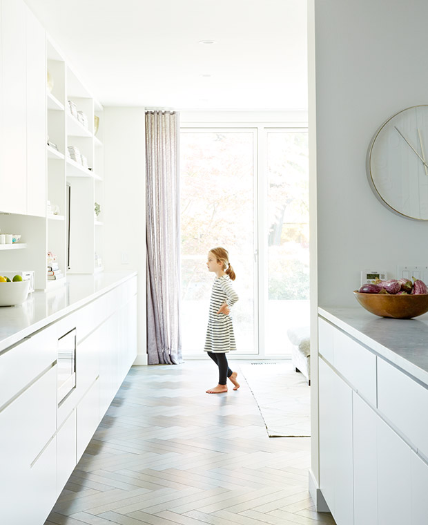
A wide and long kitchen with no eat-in space meant Sally had to get creative. She seamlessly blended the counter, shelves and cabinets from the kitchen into the family room to create one long wall of built-in storage.
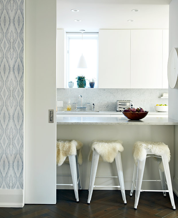
Seen here from the dining room, a sliding pocket door closes off the breakfast bar and the inevitable meal prep mess in the kitchen from the entertaining space. Sally loved the look of a sliding barn door, but this clever alternative means the door can disappear completely when not in use.
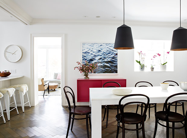
Dramatic black and pink accents in the dining room give a grown-up feel to the space, while classic bentwood chairs inject a fun café flair.
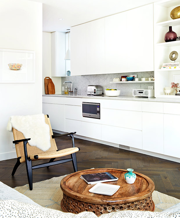
Placing the microwave below the counter frees up valuable prep space. Warm accents — found in the fur throw, wooden table and cutting boards as well as a rich floor — complement the clean white walls.
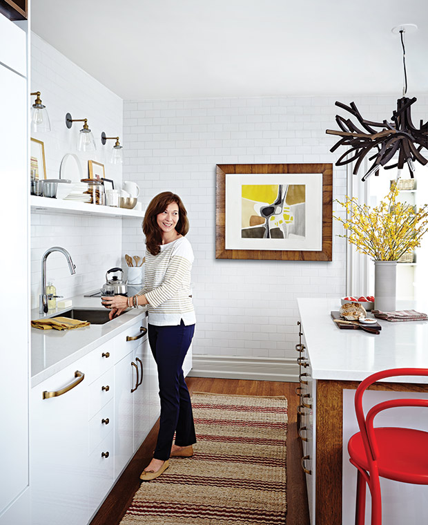
Sheri’s kitchen is a comfortable oasis for quality family time. The walls were clad in crackle-finish subway tiles to give it some patina and depth as well as soften up the white walls.
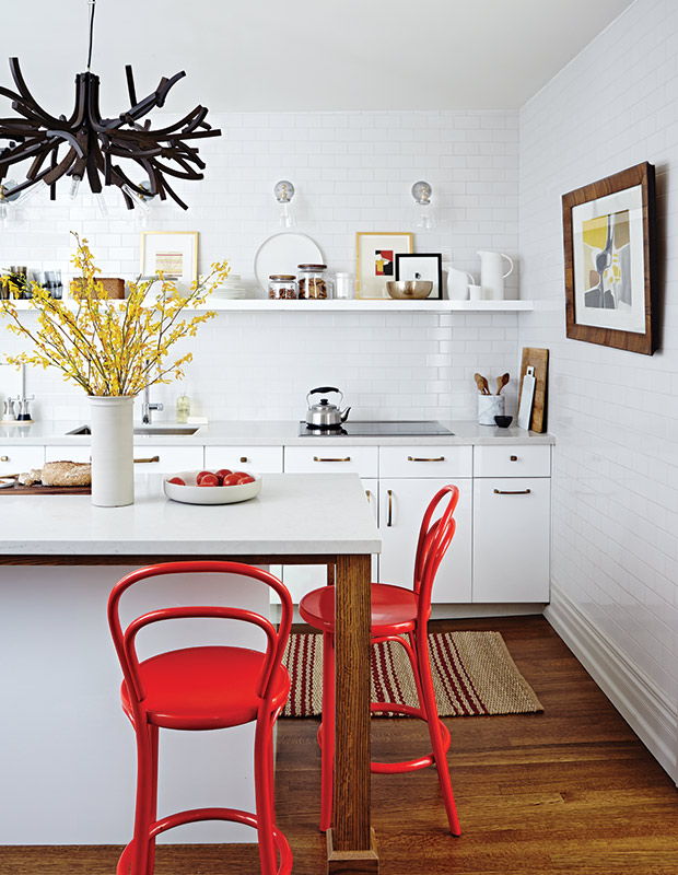
At the island, iconic bright red Thonet bistro-style chairs bring a pop of color and even more warmth to the space. A mod statement light fixture is an update on the classic twig chandelier.
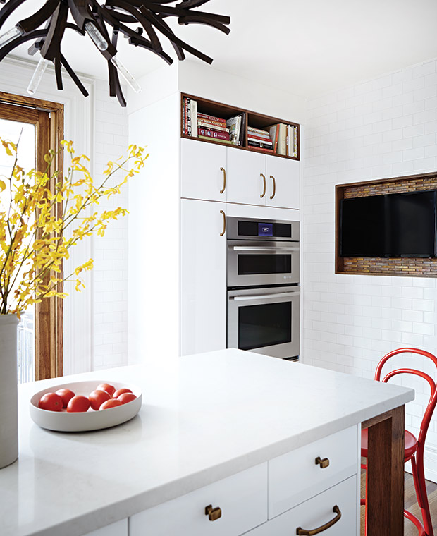
For those who need their up-to-the-minute morning news with their coffee, a flat screen TV can find a stylish place in the kitchen. As seen here, an oak-lined recess is accented by copper tiles which makes the screen look like a work of art even when turned off.
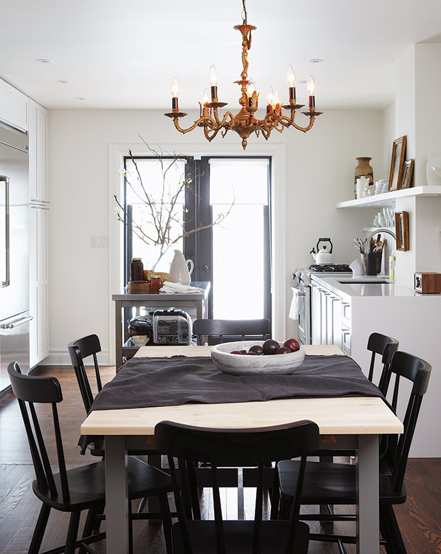
Inspired by a New York brownstone she’d seen in a magazine, Stacey opted for a sleek and minimal look. A downdraft stove meant there was no need for a hood and the dishwasher was hidden behind a panel, which eliminated two large chunks of metal.
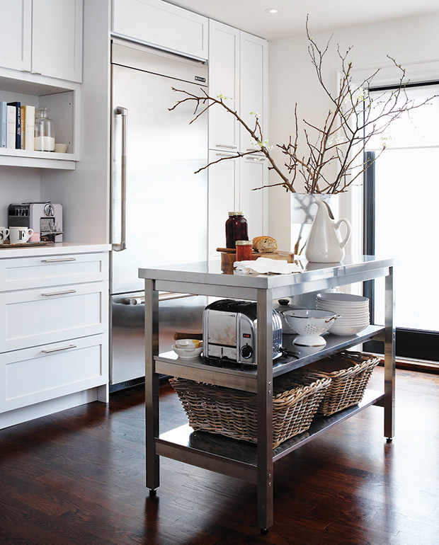
The island picks up on that industrial vibe, with its metal legs and open restaurant-style storage for small appliances and miscellaneous knick-knacks.
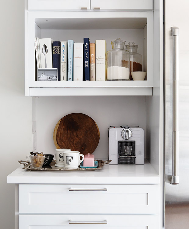
Over by the fridge, a shelf for cookbooks and ingredients creates an opportunity for a charming vignette.
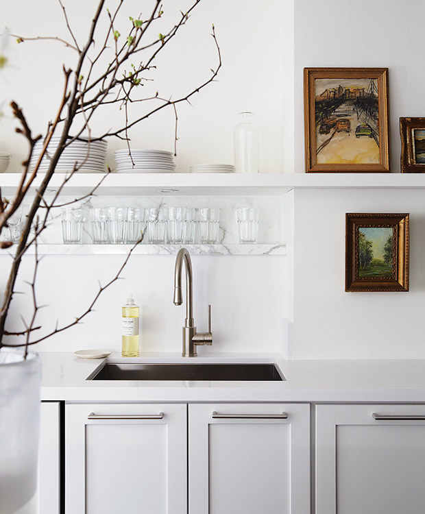
Displaying vintage art and ceramics in the kitchen creates a cozy atmosphere and tempers sleek stainless steel.
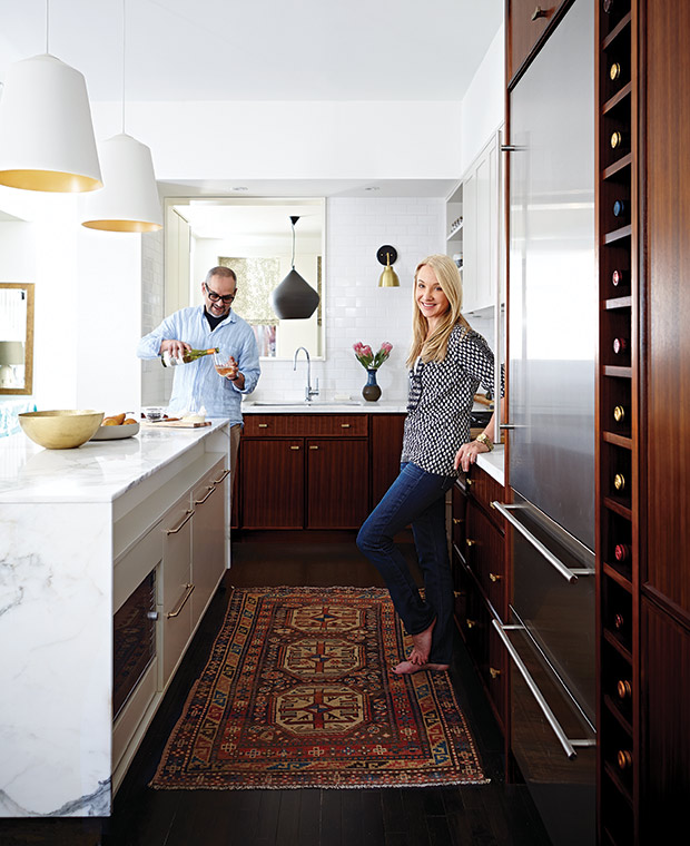
Suzanne and her husband, designer Arriz Hassam of arriz+co, completed their renovation in phases so they could judge what was needed. An industrial-sized fridge and a compromise on the style of cabinets (he wanted natural wood, she wanted painted fronts) ensured it was a space they could both love.
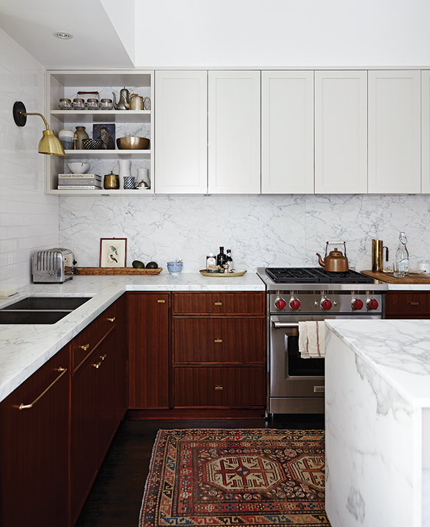
A showcase shelf in the corner breaks up the continuous wall of cabinets. The brass accents echo the sconces, pendants and cabinet hardware.
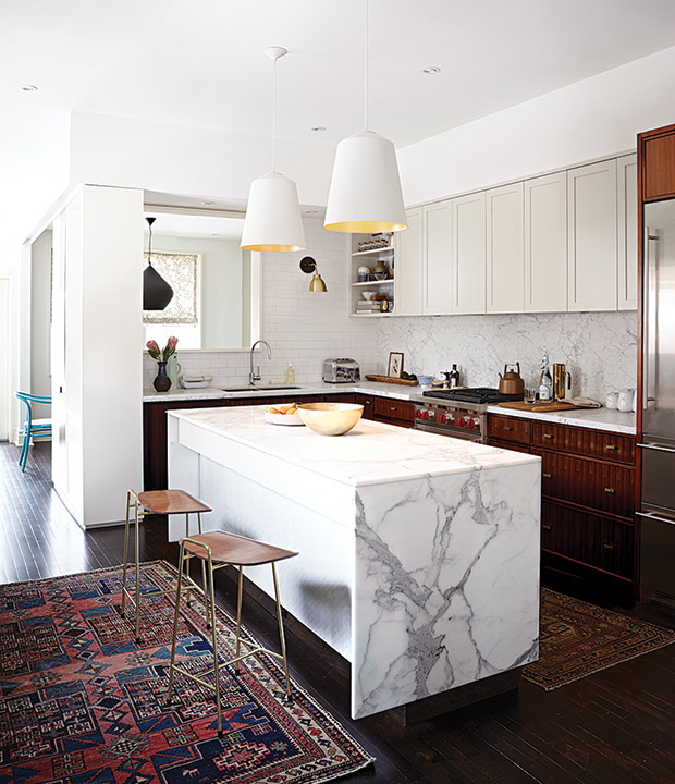
Suzanne and Arriz’s take on a white kitchen has so much texture and warmth. Antique rugs and soft leather stools at the island bring even more textural depth to the room.

