

Decorating & Design
September 1, 2016
Go Behind The Scenes Of The 2016 Ikea Kitchen Makeover
Senior design editor Joel Bray shares a look at the renovation process behind the Ikea kitchen makeover in our October 2016 issue.
 House & Home and Ikea’s annual kitchen makeover contest is always a fun project. After admiring all the beautiful kitchens that my colleagues had created in the past, I was really excited to be involved in this year’s remodel — and couldn’t wait to give deserving readers a much-needed kitchen makeover! Here’s how it all came together.
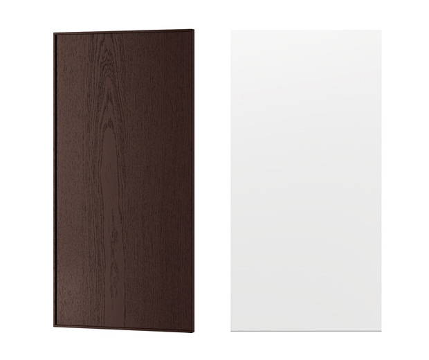
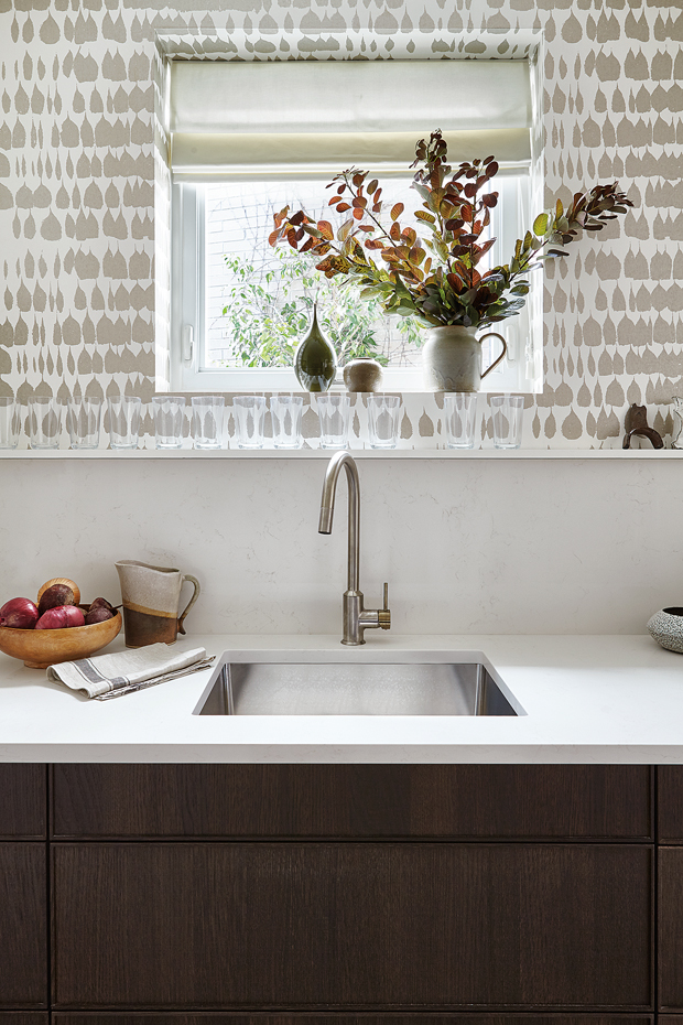
The design process began with a trip to Ikea, where this year’s winning homeowners and I decided on door styles, chose appliances and sorted out a general direction. The owners knew they liked a modern look, so I decided to do a classic spin on modern — something that felt a bit mid-century. I opted for a mix of Ekestad cabinetry, which has a dark, rich wood finish, and Veddinge, which is a creamy white.
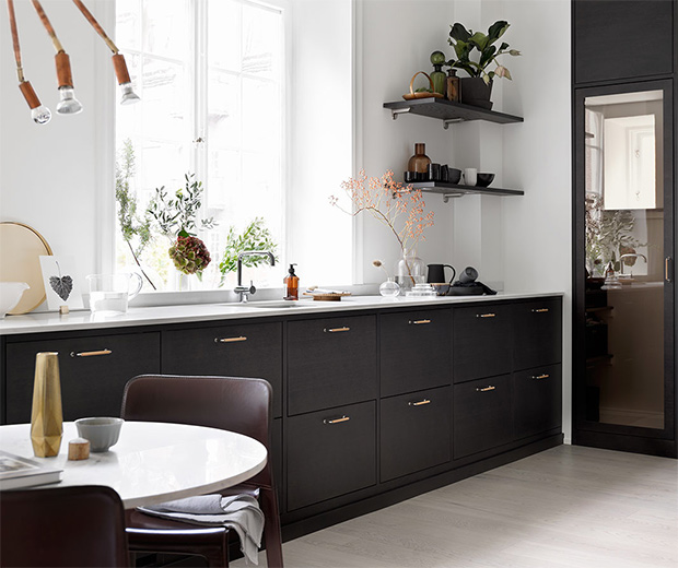
Soon after our Ikea trip, I came across this inspiration shot and was convinced that we were heading in the right direction. I loved how the dark wood drawers looked more like furniture than cabinetry — channeling a long, low mid-century modern sideboard — and how the upper portion of the wall had been left clean, white and open.
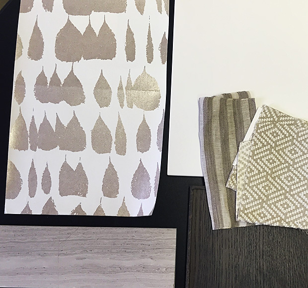
I came across the wallpaper next. I fell in love with Schumacher’s Queen of Spain pattern (in Warm Silver) after my colleague Stacey Smithers showed it to me. It’s quite neutral, but has just enough contrast to be the perfect accent. It also has a subtle, light-reflecting shimmer that you can’t quite see it until you’re close to it. I didn’t think I’ve ever liked a shiny wallpaper as much as this one!
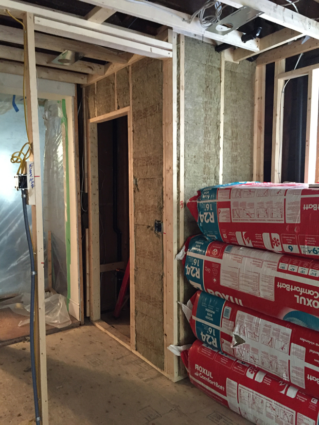
With some of the key decor elements decided, we started on the structural changes to the space. Once the homeowners’ old kitchen was removed and new walls were framed and insulated, it really started to take shape!
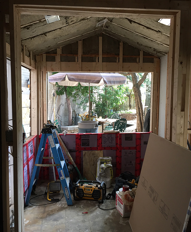
One important change we made to the kitchen, at this point, was enlarging the opening to the breakfast room. We also replaced the windows and doors to let in more light. You’ll see we decided to leave the angled ceiling in tact. I really like how the shallow slope of the roof line feels like a modern saltbox house, lending character to the space.
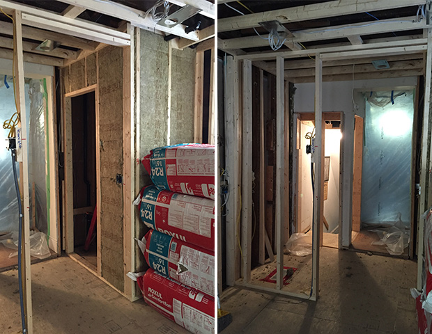
On the opposite end of the kitchen, we added a powder room, small hallway and pantry. While this is not the way people tend to renovate these days — so often it’s about opening up spaces instead of creating smaller zones — this was a perfect solution for a compact home that needed to work hard.
An open floor plan wouldn’t have allowed for all the storage the homeowners needed, not to mention a new powder room. Dividing the space also creates a more unique experience: Instead of seeing the entire home the minute you walk through the front door, the house unfolds as you walk through it.
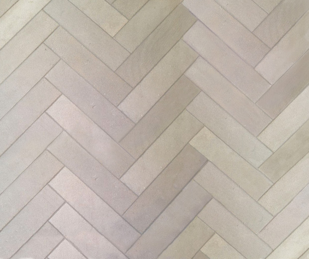
Next up was flooring. Inspired by a limestone herringbone I’d seen in an old church in England, I laid out cream and beige porcelain tile in a similar pattern. Ultimately, I think it’s one of the kitchen’s most eye-catching features, and the warm, chalky tones of the tile work perfectly with the wallpaper.
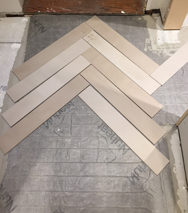
Since the tiles were going to be placed in a random herringbone pattern, I made sure to be on site the day of installation. I laid out out a small section with the tile installer to get a feel of what the overall effect would be. The key was to line up the herringbone pattern in the middle of the room, and alternate tile colours (we made sure not to have more than three similar tiles beside each other so the floor would look balanced).
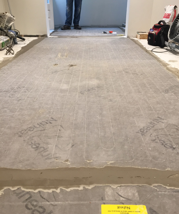
We also added a Nuheat radiant heating system beneath the tiles, an idea the homeowners loved. Radiant heat not only feels great underfoot, but is a very energy efficient form of heating. Plus, Nuheat allows you to break up the heated floor into different zones and control each one with a thermostat.
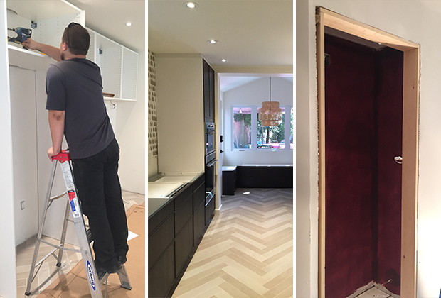
With the flooring installed, and the walls drywalled and painted, it was time to mount the cabinets. I’ll admit I’m always bit nervous on cabinet-install day, since this is when the kitchen goes from a drawing to reality! And to make the most of the small space, I had decided to use minimal filler strips in my design — which basically meant there was much less room for error. Thankfully the construction team did an excellent job preparing the space, and the Ikea installers were able to fit the cabinets exactly as planned.
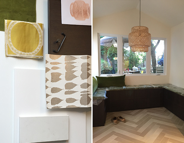
Finally, it came time to decorate the space. I knew I wanted to use rich green velvet on the breakfast room banquette; the color felt in keeping with the mid-century modern feel I was going for. I then selected other accents in wood, woven and white materials. The only exception to the scheme was the powder room, which we painted a rich shade of aubergine.
Although this kitchen makeover was a fun design challenge, the process of renovating a Victorian row house had its challenges, with problems continually revealing themselves (you’ve probably seen a lot of them dramatized on decorating shows). From firewall building codes, to very picky inspectors, we seemed to encounter it all with this project! Still, we took it all in stride, and I’m super happy with the finished project. I hope it’s a kitchen the homeowners will love for many years to come.
Tour the finished kitchen in our October 2016 issue, on newsstands September 12.