

Decorating & Design
March 2, 2018
Color Crush: 15+ Reasons To Decorate With Purple
Whether painted boldly on the walls or used sparingly as an accent hue, purple feels fresher than ever since Pantone named Ultra Violet their 2018 Color Of The Year. To highlight this regal hue’s versatility and style, we’ve compiled our favorite spaces that feature everything from the softest lilac to the deepest plum. Click through to discover why you should embrace purple at home!
It’s undeniably sophisticated. Rich, plum-colored armchairs pop against an otherwise natural palette in this Quebec home. Full-length drapes with light lavender brushstrokes accentuate the chairs’ regal hue.

It adds oomph to a foyer. In the same home, designer Richard Ouellette chose an abstract, purple-smudged rug to impart a more contemporary feel in the entryway and act as a playful foil to the space’s stately moldings and ornate bannister.
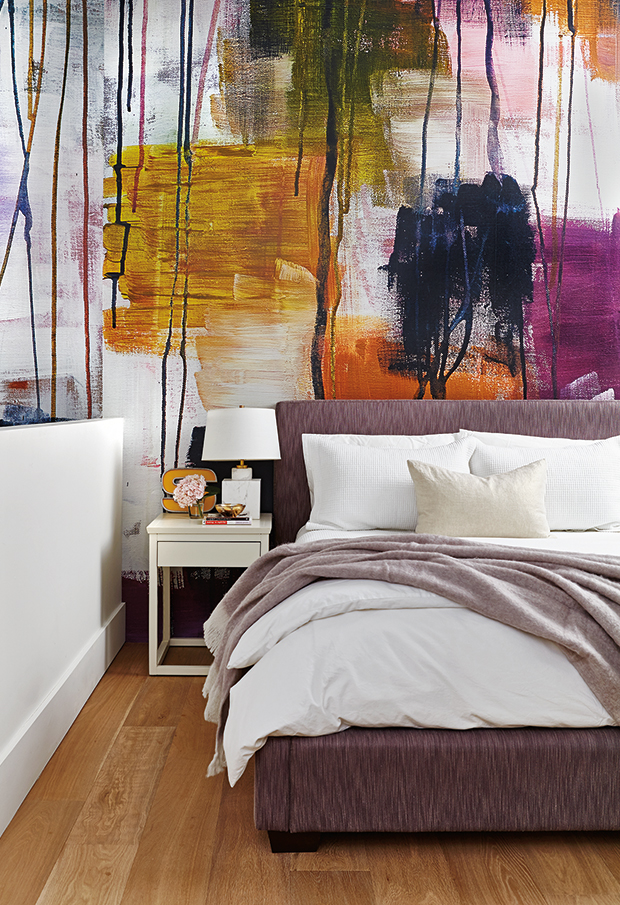
Purple can punch up a space. In designer Erika Floysvik’s principal bedroom, a grafitti-esque wallpaper with splashes of plum are dramatic and energizing.
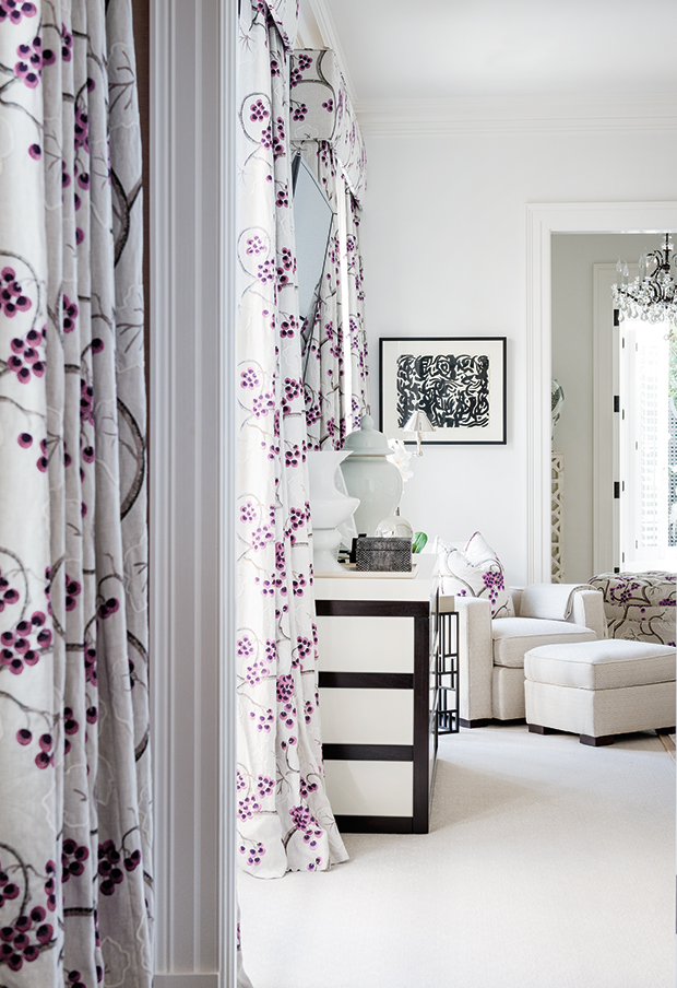
It pairs perfectly with white. Drapery with a soft purple print is set off with serene shades of white in this Palm Beach, Florida, bedroom. “One of the homeowners loves florals, so we always do her bedrooms with a different type of flower,” says designer Richard Ouellette.
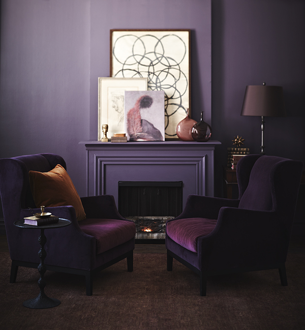
It can be dramatic. For a completely saturated look, designer Joel Bray painted out the trim, walls and mantel in this living room a rich purple. Velvet armchairs in a similar dark shade complement the room’s envelope, while muted gold accents add a hint of shine.
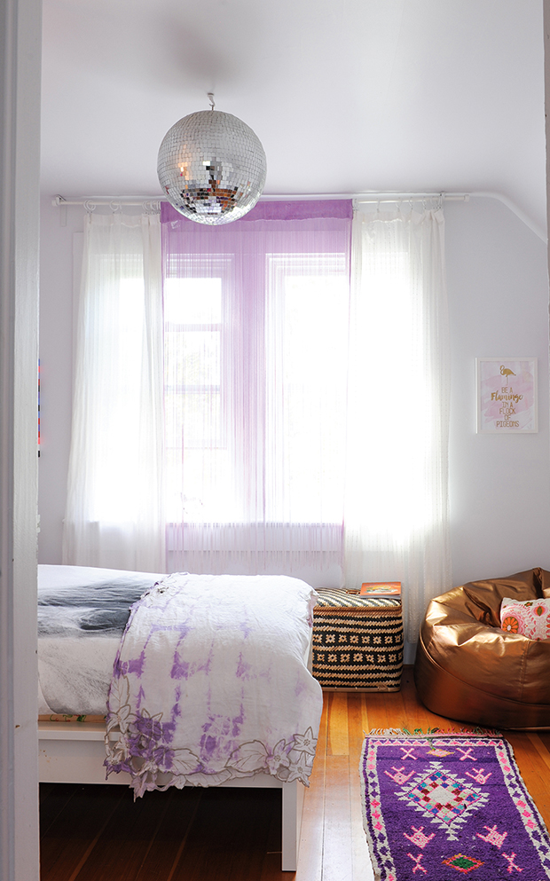
Brighter shades of purple look great in kids’ rooms. Sheer violet-tinged drapes, a mottled bed sheet design and Moroccan runner give this young girl’s bedroom a spirited appeal.
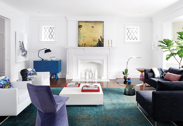
It makes statement pieces sing. An angular purple chair is an attention-grabbing piece in this Toronto living room. “I was really struck by the opportunity to take a classic interior and see what could happen when we applied very modern decor,” explains homeowner Elizabeth Margles of the unconventional choice.
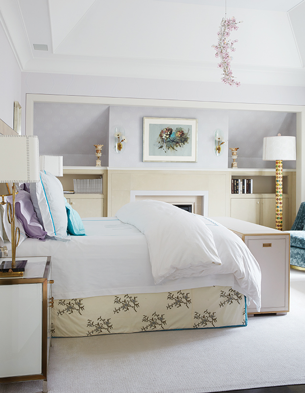
In a bedroom, it can have a soothing effect. Light lavender walls are an unexpected, yet surprisingly fitting, choice in this tailored principal bedroom. An intricate floral chandelier creates an elegant focal point.
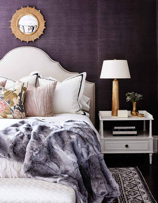
Or, it can create a cocooning feel. A rich grasscloth wallpaper beautifully envelops designer Allison Willson’s principal bedroom. A faux fur throw adds instant winter luxe.
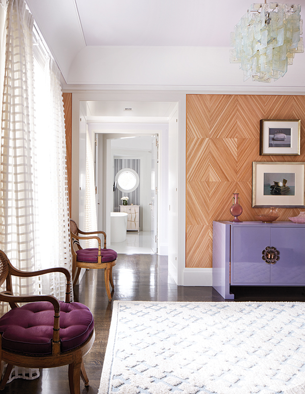
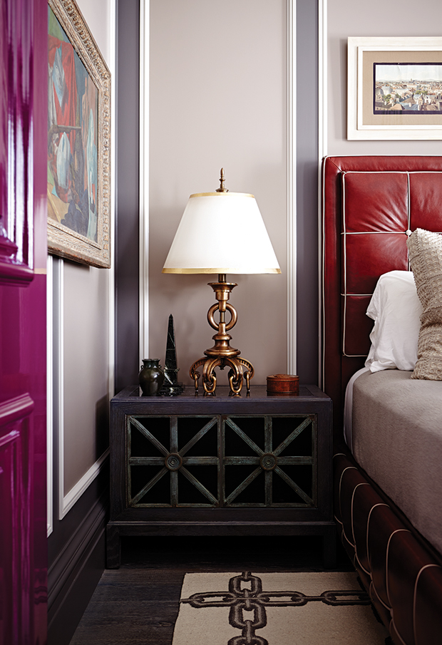
It makes a room feel more luxurious. A lacquered mid-century modern credenza and wine-colored seat cushions give this principal bedroom an elevated feel.
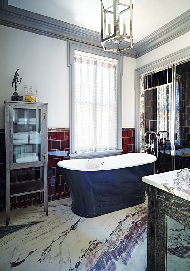
It can be masculine. Purple veining in large slabs of marble create a sense of movement in designer James Davie’s principal bathroom. Hand-glazed burgundy tiles add to the masculine feel.
Or, it can be feminine. Femininity abounds in this spacious dining room thanks to smoky mauve walls and a color-blocked, Deco-inspired rug.
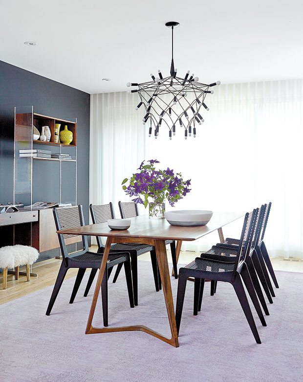
It can help soften the look of a room. A lilac-toned rug defines the dining area in designer Shirley Miesels’ own Toronto home. The dainty shade helps temper the look of linear furnishings and an eccentric Orbit chandelier.
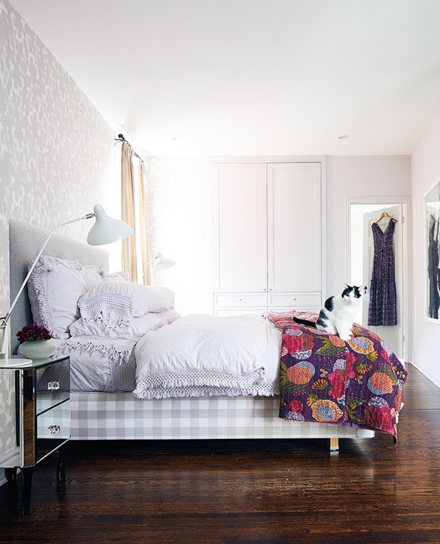
It has a quiet, calming effect in a bedroom. A relaxed neutral envelope allows homeowner Genevieve Makinson’s treasured collection of plum- and lilac-colored linens to be standout pieces.
It makes architectural details pop. Exuberant color — including mauve accents and a magenta door — and clever architecture make this Toronto bedroom feel rich and inviting.

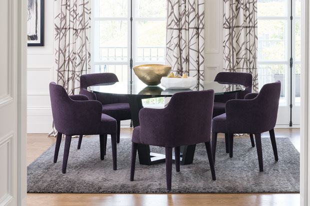
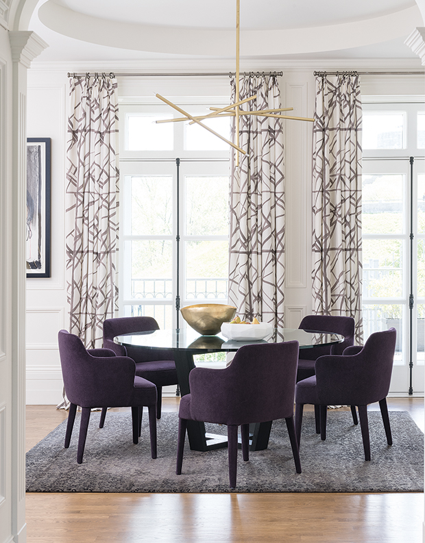
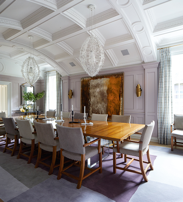
It has regal roots. Purple is the color historically associated with royalty, and for good reason. Drenched in a deep plum hue, this room sets the scene for sumptuous dining.