

Bedrooms
April 22, 2016
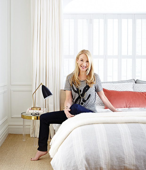
From The Archives: Suzanne Dimma’s Modern Master Bedroom
Suzanne Dimma shares the story behind her master bedroom renovation.
 Honestly, this whole project started because I wanted a king-size bed. When I bought this three-storey Victorian in 2001, the second floor was split in two: a bedroom with big bathroom, and a separate rental suite with private entrance (each accessed by its own staircase). I was single and didn’t need the extra space, so I gave the apartment a coat of Benjamin Moore’s Cloud White and rented it as is.
When I met my husband, designer Arriz Hassam, our needs for the space changed. In 2003, the tenant moved out, and we turned the unit into an office and den, where we could work at night or hang out and watch TV (it also made an amazing guest suite!). We spent a lot of time up here, but it was a hassle to have to use the front staircase — and I started imagining taking a sledgehammer to the wall dividing the spaces and daydreaming about that king-size bed, which was just a bit too big for our bedroom.
Finally, in spring 2014, we were ready to rework the second floor. The entire thing is now a wonderful retreat comprised of our principal bedroom, two walk-in closets and two bathrooms (with a guest room on the third floor). I love how open and flexible the space is, so hopefully our needs won’t change again any time soon!
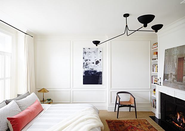
Trad moldings give the bedroom an old world feel, making subtle reference to the house’s history (it was built in 1885) and balancing my mod leanings.
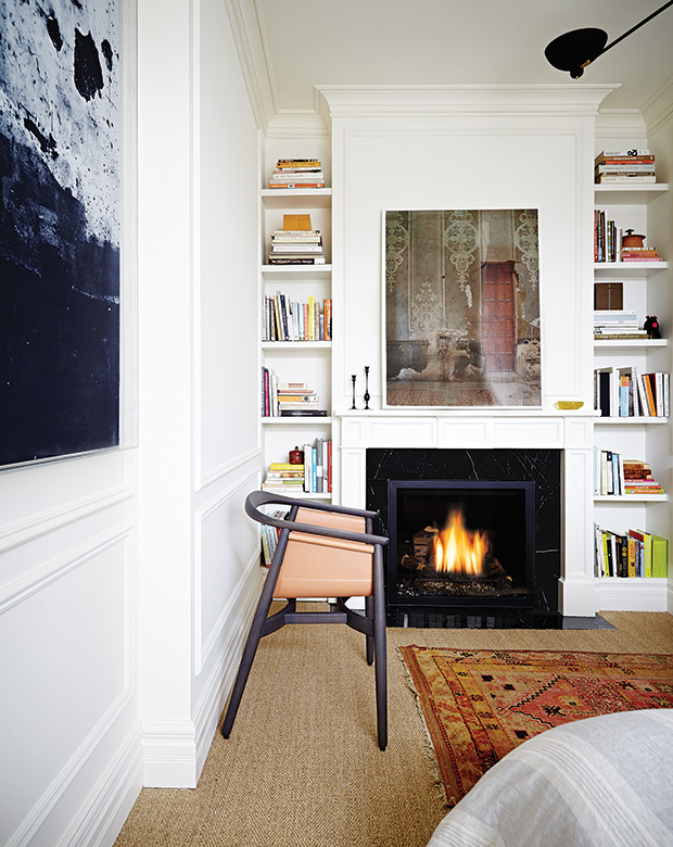
A new gas fireplace was installed on the south wall, which opened up the space enough to fit my coveted king bed. The mantel was designed to feel like it has always been in this exact spot. My inspiration for it was a gorgeous Parisian apartment, and the black marble with white veining is key to the look. A chic leather sling chair acts as functional sculpture.
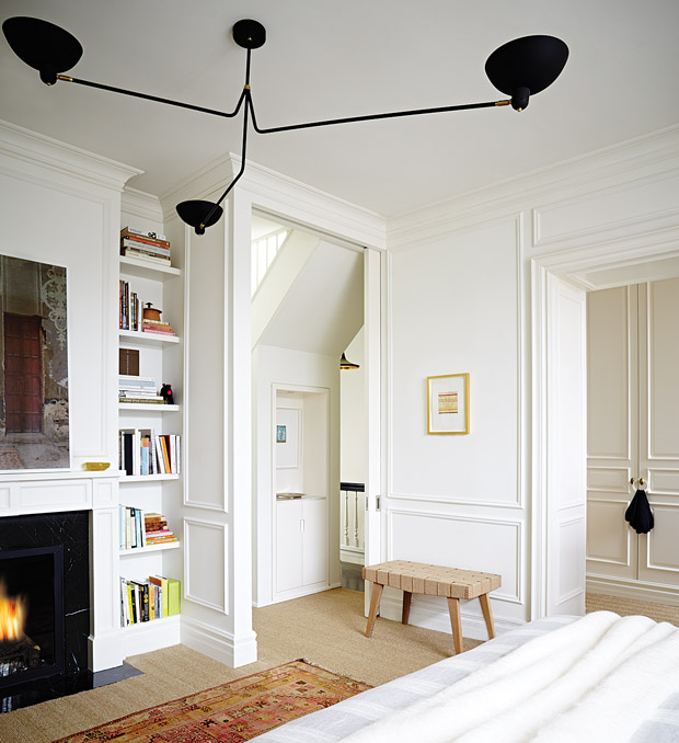
A standout tri-arm ceiling fixture is hung slightly off-center, so it feels architectural and not overwhelming. Seagrass carpeting (I’m a lifetime fan of seagrass!) adds texture, while an antique Turkish rug layered overtop softens the look.
New shutters block early-morning light without making the room feel too dark. A metallic lamp and a pair of gold-framed Lucite side tables add a touch of glam.
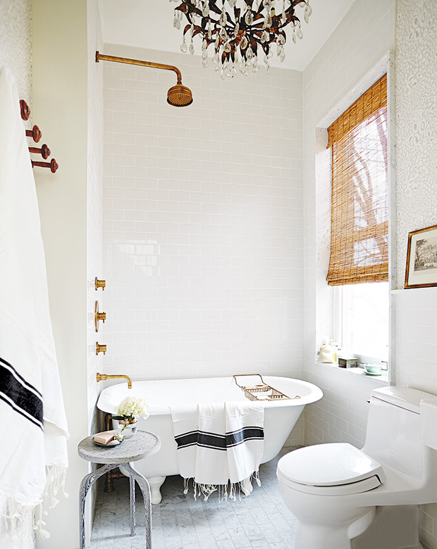
We now have his-and-her bathrooms on this level. The smaller one — a.k.a. his! — is bright, which helps to make it feel spacious. I kept the tub fixtures from the previous update and bought new faucets for the upgraded sink.
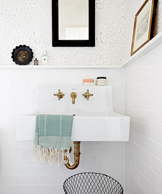
To get a uniform — and luxurious — look, I had all the pieces dipped in unlacquered brass. The gorgeous wallpaper adds just the right amount of pattern.
This area used to be the kitchen. Now, it’s Arriz’s walk-in closet with floor-to-ceiling Ikea cabinets fronted by custom doors. I found the knobs at a flea market in Paris and had them retrofitted at The Door Store in Toronto. The end walls are papered in pale blue grasscloth to give the space an infusion of color, while the mirror helps it feel more expansive.
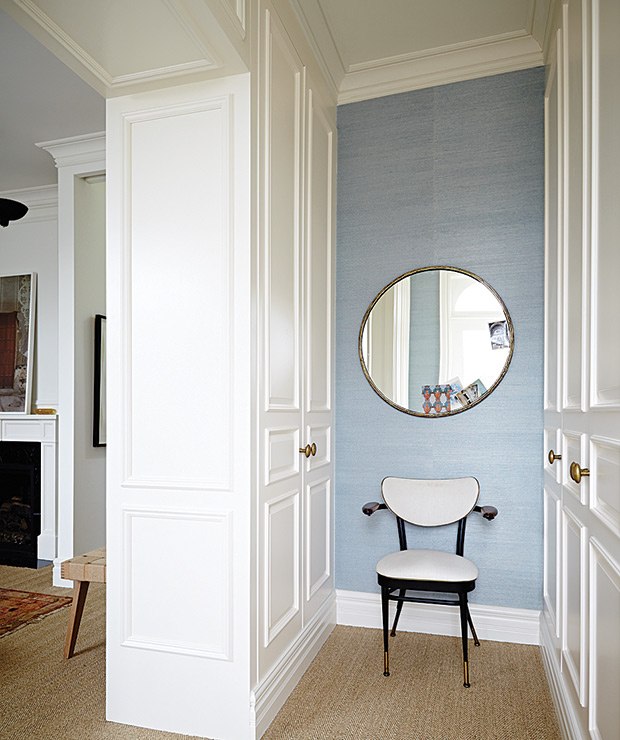
This pocket door used to be the wall separating the rental unit from our old bedroom, which is now my own dressing room! I covered the door in a stunning wallpaper to bring a splash of color and a whimsical vibe to the mostly neutral palette. A second pocket door (bottom right, at far right) closes off our bedroom when needed. The set of doors gives us lots of flexibility. When they’re closed, we have private rooms. When open, the second floor feels like a luxurious open-concept suite.
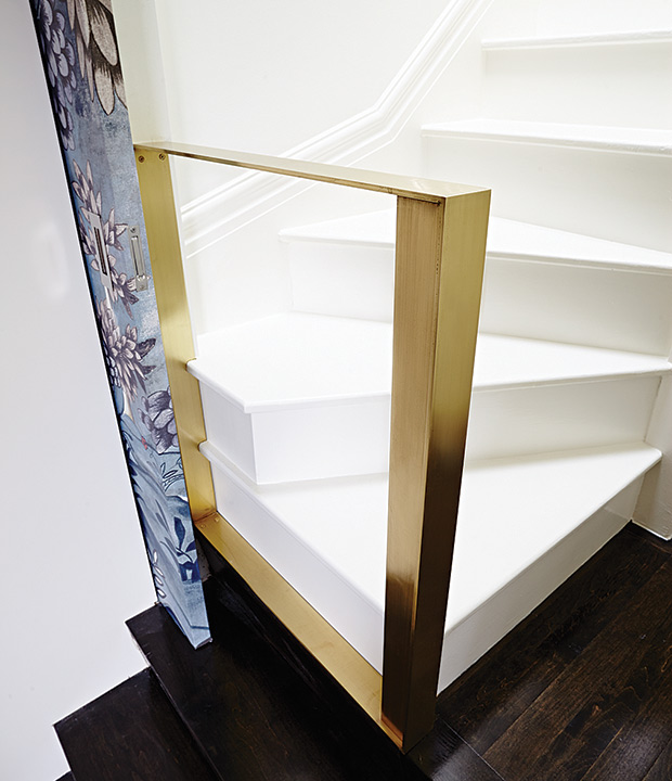
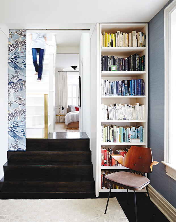
The third floor is now a proper guest room. Once the wall that divided the rental space from our space was gone, we needed a safety railing; this brass one keeps sight lines open and looks sculptural.
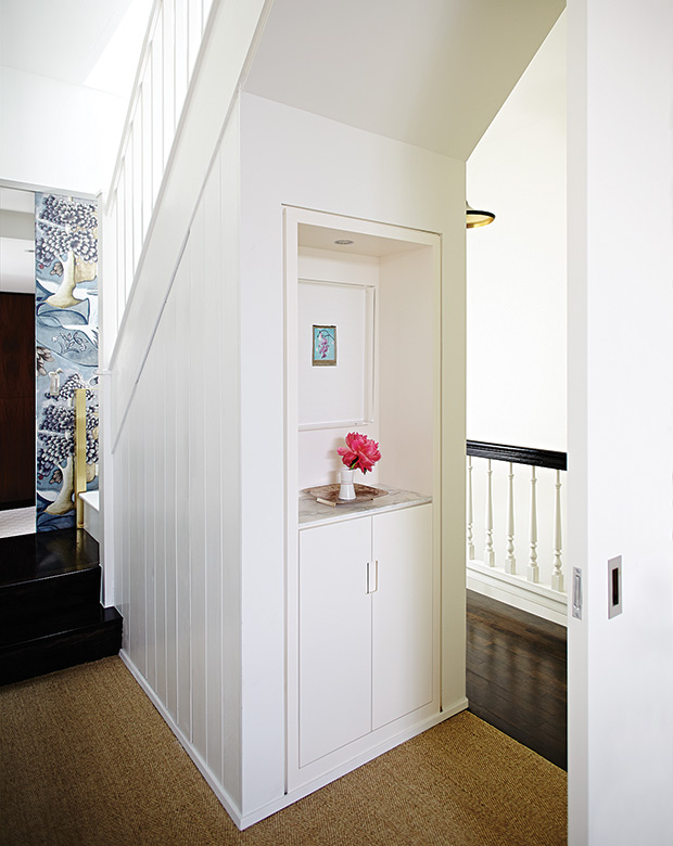
A nook under the stairs to the third floor serves as display, with a storage cabinet underneath, while beadboard panelling hides a touch-latch linen cupboard around the corner.
Angus Fergusson
House & Home February 2015
Suzanne Dimma, Arriz Hassam of Arriz+Co.