Decorating & Design
January 12, 2018
How To Make Antiques Modern
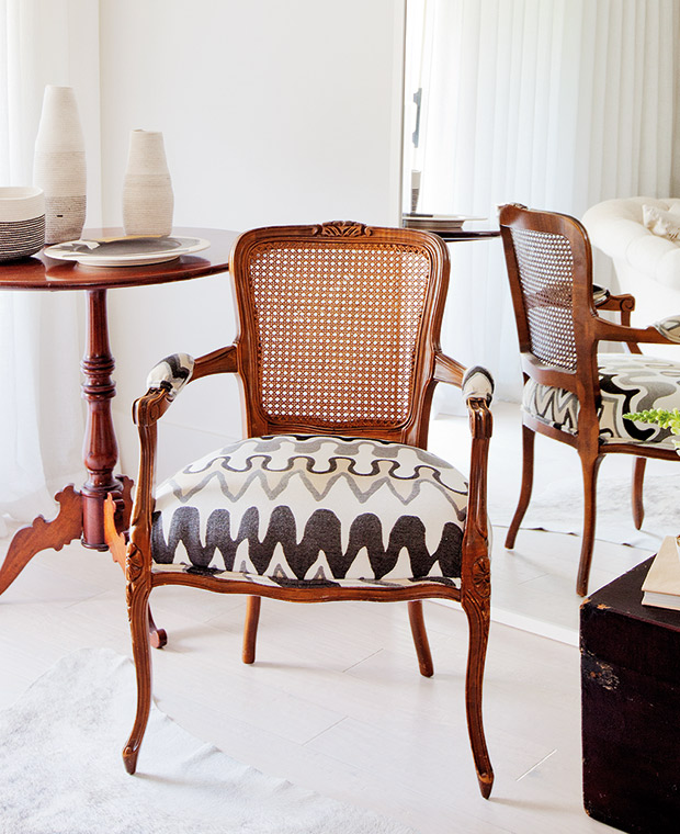
For more than 20 years, this Vancouver condo’s owner collected antique furniture while travelling the globe. So when he decided it was time for a fresh start, he approached designer Peter Wilds and asked that he not only reimagine the home in a new light, but also carefully curate the objects inside. The result was a two-year renovation of the 600-square-foot space. Click through to learn how they transformed this dated condo into a cool and contemporary space.
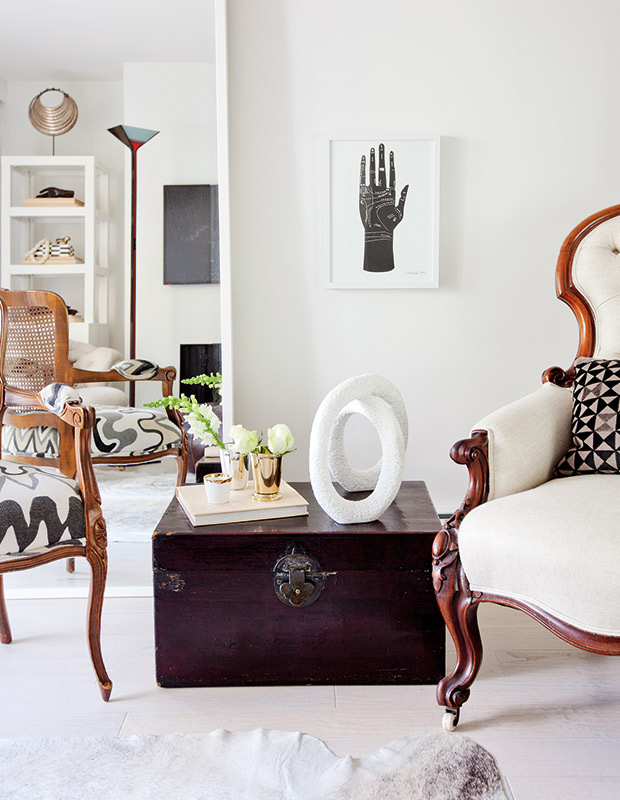
The space was refreshed with wide-plank, whitewashed oak floors and gallery-style white walls, with accents of black in the art and accessories for interest. Quiet linen upholstery reinvigorates a traditional tufted bergere. “The furniture shapes are really the stars of the room,” says Peter.
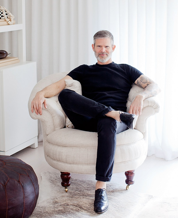
Peter suggests layering different patterns so the end result doesn’t look bland. Traditional details like tufting and ruching, as seen in this armchair on brass casters, are fresh when done in a neutral fabric.
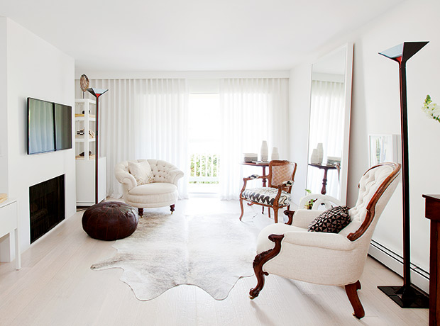
Mirrors make rooms appear larger and throw around light, but it’s important to scale them to the space. Here, a tall version lines up with the window valance and is surrounded by a simple box frame painted white to disappear into the wall. Global touches such as a Moroccan leather pouf and hide rug from South America inject a worldly, but casual counterpoint to more formal pieces.

A lively indoor-outdoor fabric turns a traditional cane-back chair into a piece of art. “The shape of this chair is appealing and somewhat feminine,” says Peter. “But I like to play with opposites and inject a more masculine fabric for the upholstery — something geometric and a bit raw.”
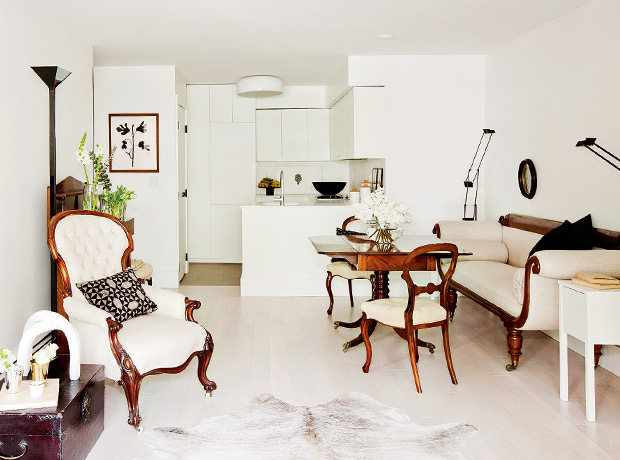
Affordable side tables from Ikea offset the cost of iconic black Tizio task lamps and a rolled arm settee.
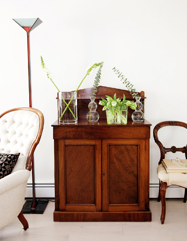
Most of the owner’s antique furniture is mahogany, which made it easy to create a consistent look. That said, Peter doesn’t have qualms about painting dark or orangey woods, if needed. “I’m not precious about wood and will definitely suggest painting a frame. But in this case, the mahogany tones were so warm and perfect.”
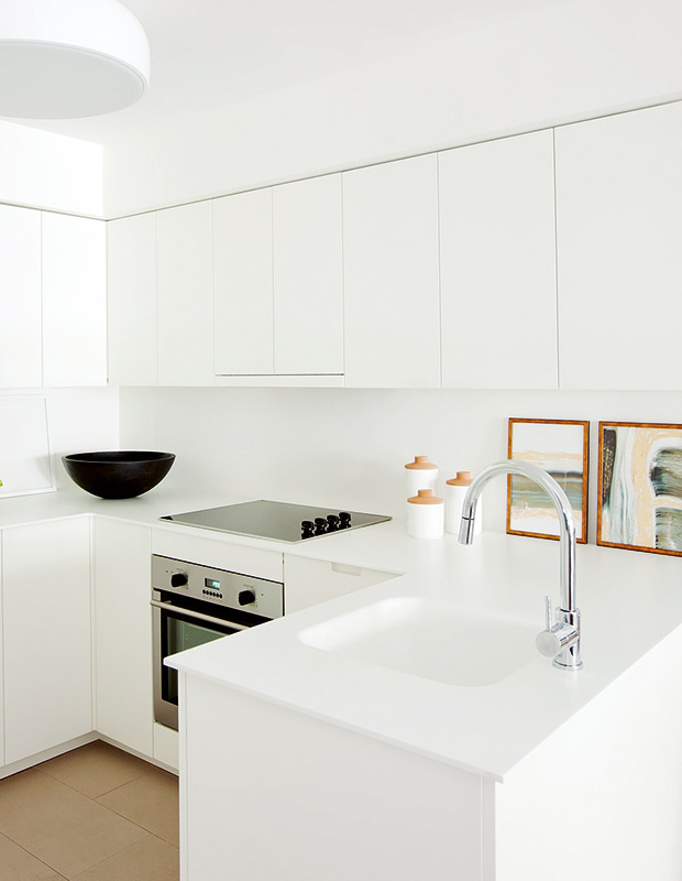
Custom touch-latch MDF cabinetry in a glossy white finish keeps the kitchen ultrasleek. Peter insisted on three things: no drawers (they’re hidden behind cabinet doors because the horizontal lines felt too busy), no hardware, and panel-ready appliances. “Clutter starts to happen when pots and pans are displayed,” he says. “In an open-concept space it can look chaotic.” Corian countertops and a seamless sink have a clean profile.
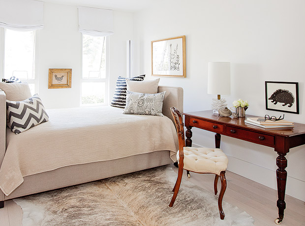
“The antique desk is a workspace that also serves as a bedside table,” says Peter. The daybed was chosen to mimic the symmetry of the windows and makes the principal bedroom look like a chic home office.
Janis Nicolay
House & Home October 2017
Peter Wilds

