Decorating & Design
7 Renovation Tips From Toronto Blogger Wendy Lau
Updated on May 9, 2022

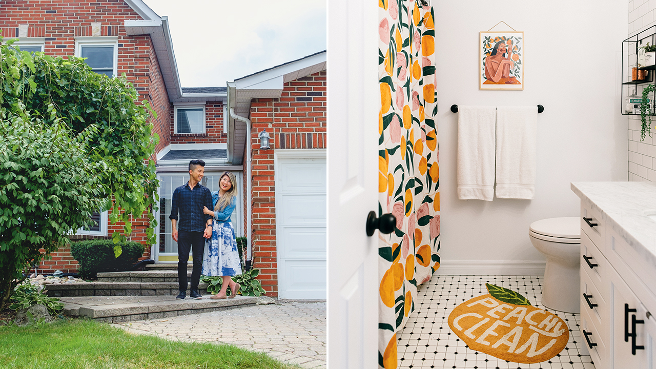
It’s not easy to make people laugh about renovating, but it comes naturally to Wendy Lau of thekwendyhome.com. Videos depict her skipping down the aisles of The Home Depot Canada for bathroom fixtures, or celebrating snagging a pricey mirror, only to pull back and reveal it’s dollhouse-sized. Wendy’s joy in renovating has drawn nearly 300,000 Instagram followers, and millions of views on TikTok. In 2021, Wendy and her husband, Kwan Chan, bought a suburban ’80s-era house in Thornhill, Ont., vowing to “take a builder-grade home to charm school.” Wendy pokes holes in the illusion of Instagram perfection and has plenty of IRL reno wisdom to share.
Scroll down for some of her tips and tricks!

Experiment with Paint
This painted door in Wendy’s former home was a DIY spin on arched doorways. “I didn’t have the money to knock down my door and build an arch, so I used paint,” she says. “People were colour blocking, but nobody was doing it over entryways.” After the project went viral on TikTok, the door was snarkily compared to a toenail, which made Wendy love it even more. The colour is a custom blend, but you can get a similar look with Benjamin Moore’s Antique Glass.

Mix High and Low
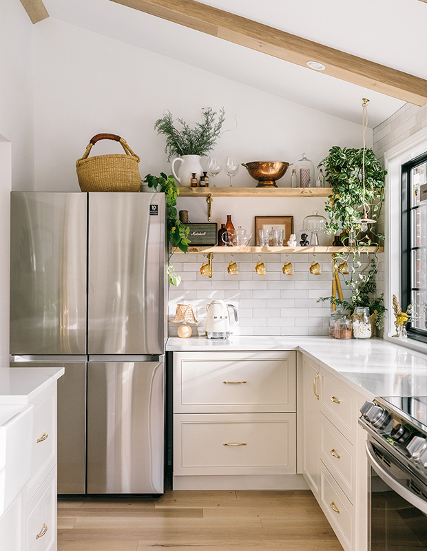
Wendy chose Ikea cabinet boxes but created a high-end effect with custom doors and drawer fronts made by a local millworker. “He had a wide range of options, so I chose a slim Shaker style with a detailed inner edge.” She found inexpensive hardware from Etsy but splurged on the island kitchen faucet, choosing one from deVOL Kitchens in aged brass that was around $1,875. “It’s the star of the kitchen.”

Consider Your Sight Lines
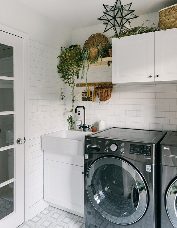
“The laundry room has a very small footprint, but it’s a room we use every day and you can see it from the front door,” says Wendy. “One of the biggest changes was swapping the solid door for one that lets in light.” The marble backsplash tiles look expensive but were bought on clearance from a warehouse, and the farmhouse sink is an Ikea find. “The star pendant inspired the dark hardware and gunmetal appliances, which breaks up all the white.”

Open Up Your Kitchen
The kitchen was fairly small, so Wendy removed a wall and co-opted space from the adjacent dining room. “We built faux beams and recessed pot lights into them, cladding the outside in the same planks we used for the floorboards,” says Wendy. “That’s why the woods are a perfect match.” A generous island marries the family room and kitchen, and sliding patio doors were removed (where the fridge is now) to extend the space.

Trick the Eye
In the guest bedroom, Wendy got the look of beadboard with wallpaper. “You paint it to make it look more realistic, and it even comes pre-pasted. You just need water and a utility knife — it’s so easy!” She added a wooden peg rail at the top edge and painted it to match.

Create a Neutral Envelope
A wall of white subway tile balances the punchy theme in the bathroom. “With neutral tile and hardware, you can change out the shower curtain, bathmat and art for a completely different vibe without breaking the bank,” says Wendy. Matte black hardware complements the graphic look and is easy to source on a budget.

Get Creative with Accessories
Wendy was looking for a way to add boho warmth to the dining room. “Wicker can be expensive, so one way to incorporate it is with baskets and steamers,” she says. “These were bought from thrift stores and restaurant suppliers in Toronto’s Chinatown.”
Janet Kwan (Interiors) Micah Tam (Portrait)


