Bathrooms
8 Bathroom Design Tips To Help You Transform Your Space Into A Dreamy Destination
Published on July 18, 2018
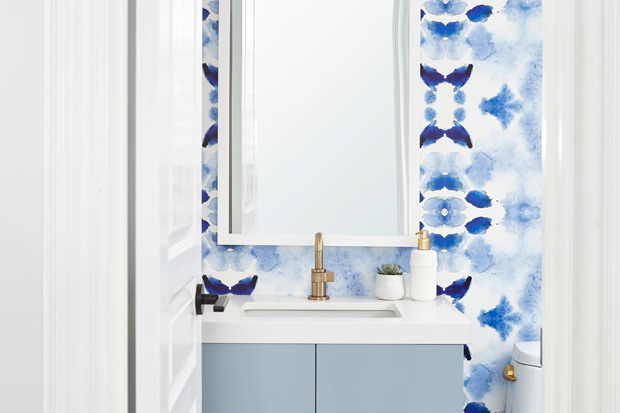
What if we approached bathroom design more like living room decorating? Maybe, just maybe, we’d start to look forward to daily tasks like flossing and jumping out of bed in the morning. Designers Alana Firestone and Jordy Fagan of Collective Studio have mastered the art of mixing form and function to create hardworking bathrooms that are layered with creativity and personality. We caught up with the design duo to get their tips on bringing wow factor to bathrooms no matter your budget. Read on to learn how to create a hardworking space the whole family can enjoy waking up to!
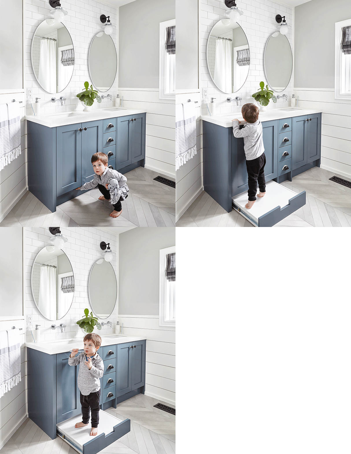
Collective Studio: We always start with a shower system that is kid friendly. Something that’s easy to operate and has a hand shower, which makes bathing kids (and cleaning) so much easier! It’s also a great idea to tile the walls outside of the tub in a kids’ bathroom because of splashes. A pull-out stool on the vanity is a great feature to avoid clutter and give kids independence when getting ready in the morning and at night.
CS: Thanks! We loved using this chevron pattern to elevate an otherwise simple tile. There are so many ways bring interest to simple tile using patterns. Try parquet or different brick offsets, or consider using borders. We also like to add wow factor with accessories like towels and art when it comes to bathrooms, since they can be switched out if you get sick of them or if they’re no longer on trend.
Hot Tip: Get your tile cut on site to achieve interesting shapes and patterns — just remember you’ll likely be charged for the labor involved!
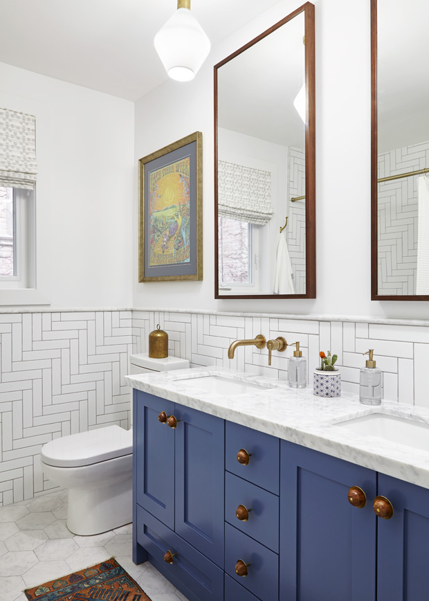
CS: We always like to use at least two different tiles in any given bathroom (excluding powder rooms) and generally we start with looking at color and scale. Colors should of course compliment each other if they’re not the same color. Be especially careful with whites and greys as there are so many different undertones. In terms of scale, if you’re using a large tile on the floor opt for a smaller wall tile or vice-versa. We like to keep the finish consistent as well; if our floors are honed or matte we keep the same finish on the walls.
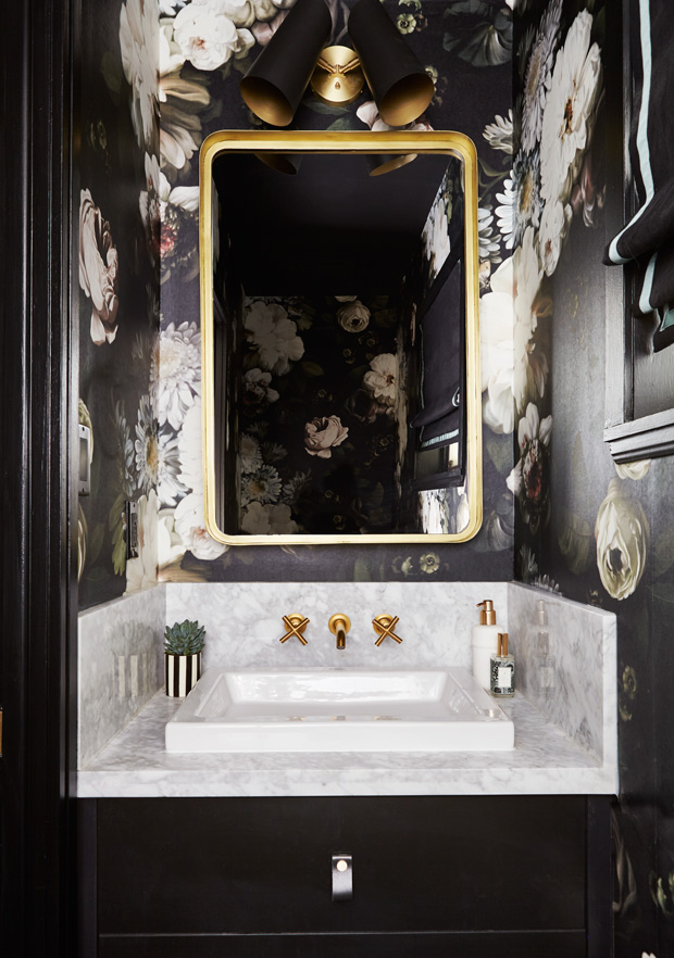
CS: Powder rooms in our opinion are a place to have fun and take bold risks that you wouldn’t necessarily do in the rest of your house. There are really no rules — if you find a paper you love then we say go for it! Keep the tile simple or run your hardwood floor right into the powder room to make the paper the main feature. The smaller the powder room, the easier it is to get away with a dark or busy paper!
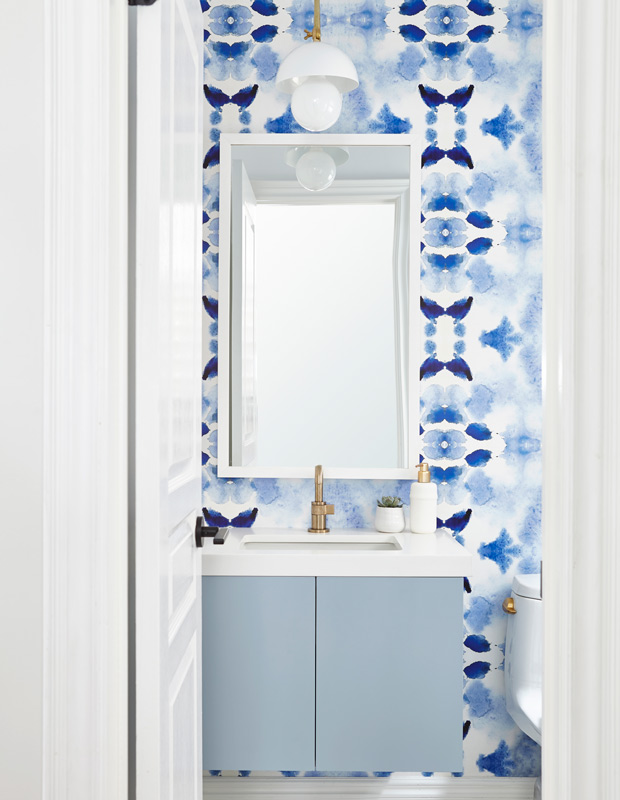
CS: Typically we don’t like to use it when there’s a shower (because of ventilation and steam causing the paper to peel off over time) but if there is a separate vanity room or wash closet, go for it. You’re better off making a bold statement with tile if you’re the type who takes long and hot showers.
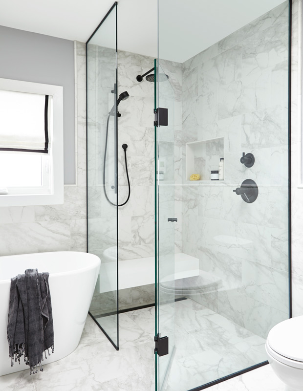
CS: If money is no object the best way to make a shower stand out is through unique glass or an interesting shower bench. You can use metal to make the shower glass more unique, and use stone to make a bench a big feature in a shower. On a tight budget, it’s great to use a unique tile in a niche or play with the scale of the niche to make it stand out.
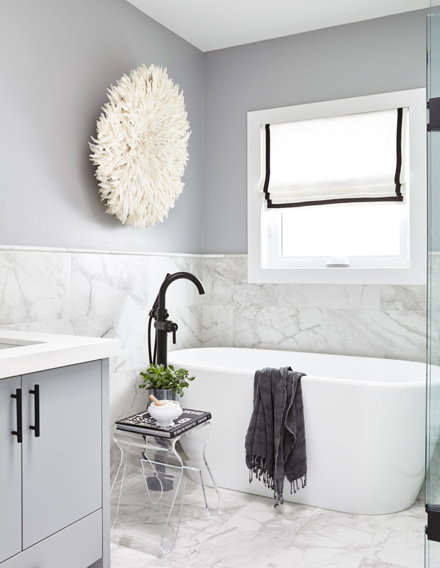
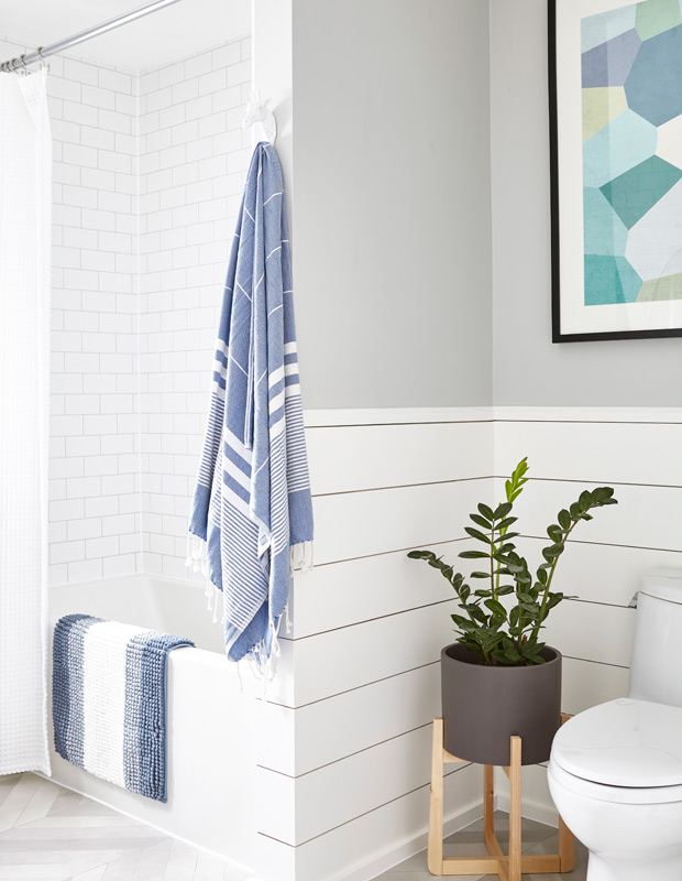
CS: It’s crazy how much soft finishes help a bathroom come to life and feel so much more designed and also lived in. We always try to add a roman shade on windows when possible because it’s a great way to bring in texture, pattern, color or all three! The juju hat was the perfect piece for the wall above the tub because there was already art over the toilet. We didn’t want two pieces competing for attention. Towels are also a great way to add texture, color and pattern to a bathroom.
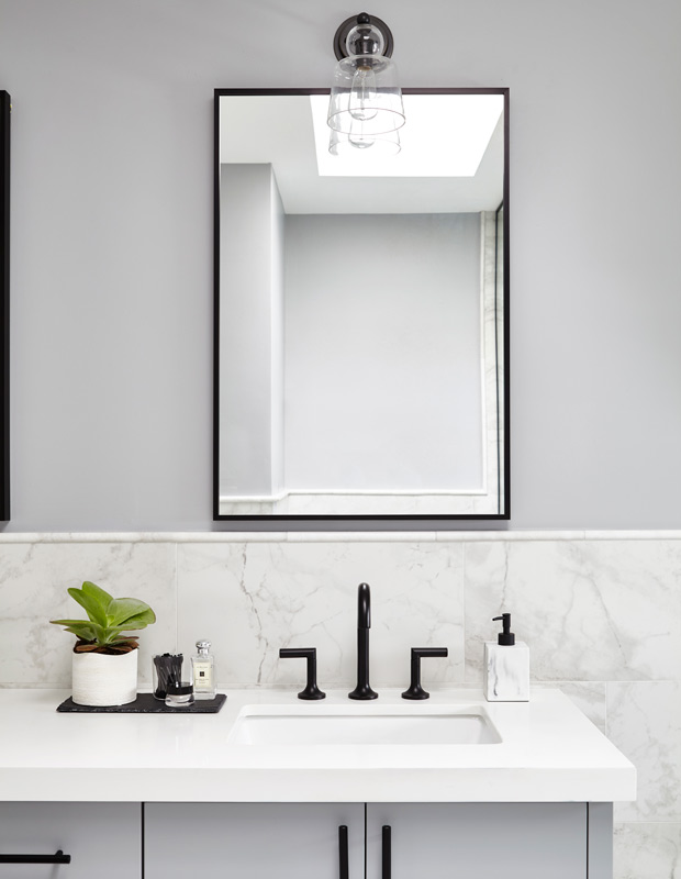
CS: We do custom mirrors a lot because it allows us to get a perfect width and height. Each vanity is so specific to a number of different factors (lighting, wall tile, ceiling height, faucets, etc.) Everyone loves round mirrors these days but when working with double vanities, it’s hard to make them work because a standard 24-inch vanity will often look stunted height wise. We used the oval mirrors as an alternative in this kids bath.

