Decorating & Design
A Dark ’80s Kitchen Becomes An Emerald Jewel For A Fairy-Tale House In B.C.
Updated on August 24, 2023
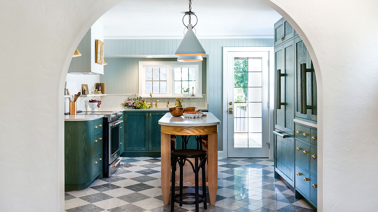
Designers don’t often squeal with delight when they arrive at a prospective project. But Christi Rivard and Jessica Allerton from Bidgood design studio did when they pulled up to the Victoria house belonging to Rachel Nolte-Laird and Dave Laird. The Tudor Revival home looked like it was pulled straight out of a fairy tale. Located near the city’s Galloping Goose Trail and Swan Lake, it certainly sounds like one, too.
“It’s a very quaint English countryside–style neighborhood and the architecture suits that style,” says Jessica of her clients’ 1940s abode, which is situated close to the lake. They’ve owned the house since 2016 and were ready to swap the kitchen’s stainless steel appliances and dark counters for something that resonated with the home’s historical charm. “They were looking for a more traditional style because the sleek kitchen didn’t go with the house,” says Jessica.
Scroll down to see how they transformed the space!
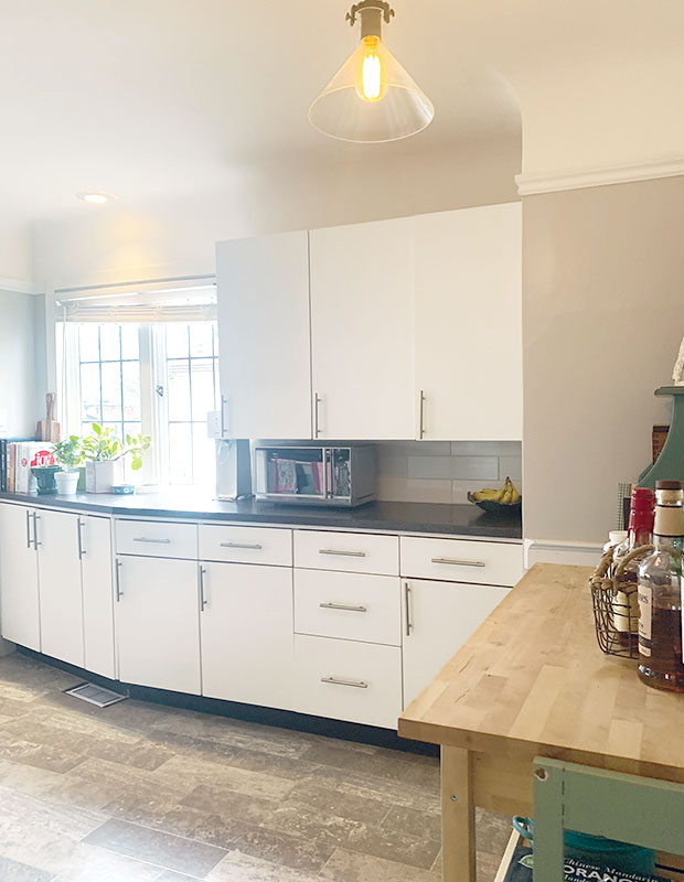
The previous kitchen didn’t have an island; Rachel and Dave felt like they always had their backs to each other while prepping food. “When we hosted parties, everyone wanted to be together in the kitchen, but there was no place to sit and no counter space to serve food.”
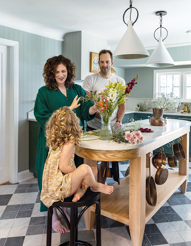
They envisioned a spot where their kids could gather and be involved in cooking or doing homework. The answer was a slim, freestanding island. “The custom-made red oak island with Caesarstone counter was worth the splurge, and it will age well over time,” says Rachel.
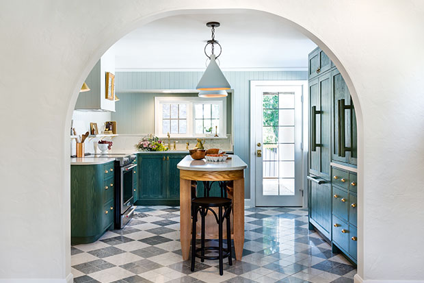
The existing kitchen was compact and the goal was to open it up more to the adjacent living room — without changing the footprint. A small doorway between the two spaces was replaced with a sweeping archway. “It plays up the sight line from the living room into the kitchen, and it captures a storybook idealism,” says Jessica. The designers were inspired by mid-century modern checkerboard floors but, instead of using linoleum, they elevated the look with locally quarried marble from Vancouver Island. When the tile they liked wasn’t available in the large size they wanted, they improvised, using groupings of four smaller tiles. “The floor adds a hit of luxury to the space, and it’s going to last for decades,” says Christi.
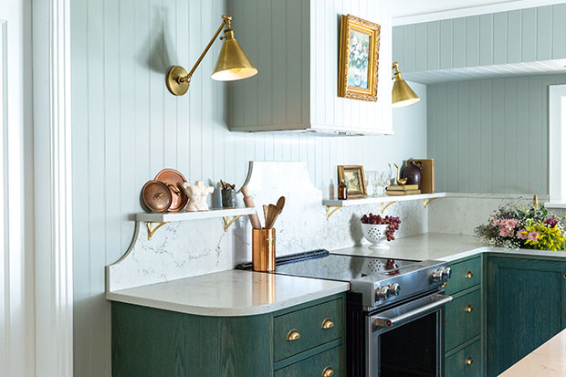
Jessica and Christi liked the idea of beadboard on the walls and cabinets because it’s durable and easily wiped. Several shades of dark green were considered and, ultimately, Cushing Green by Benjamin Moore was the winner.
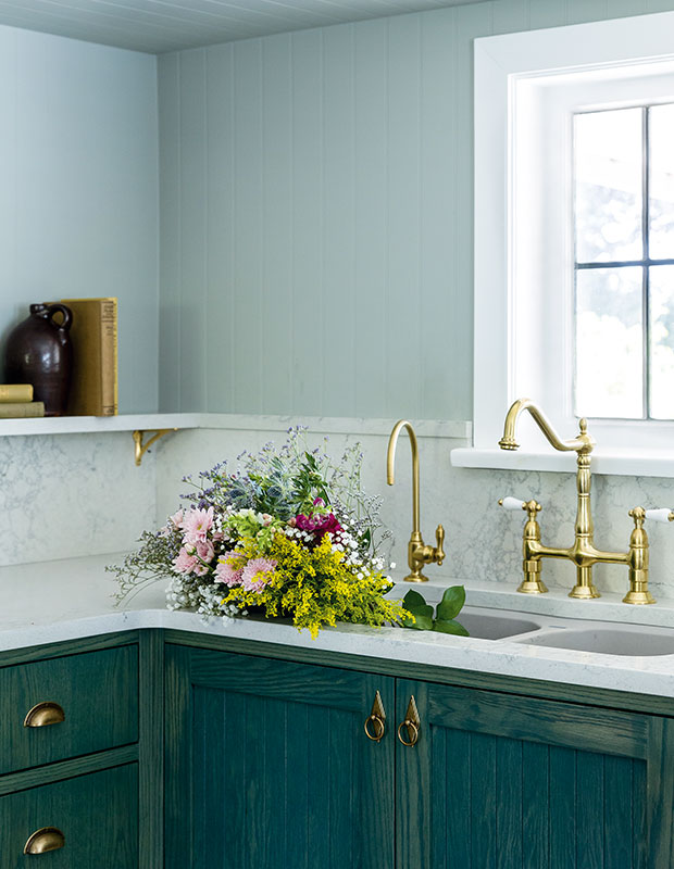
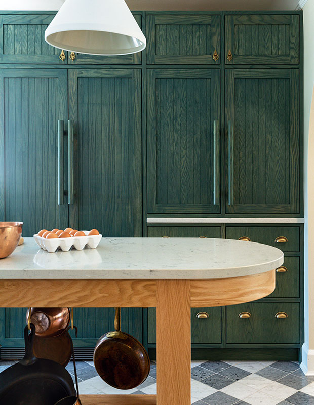
To keep costs down, the homeowners decided not to relocate any of the plumbing in their kitchen during the renovation. “That helped Rachel and Dave stay on budget and it gave them everything else they wanted,” says Christi. The pair chose to splurge on custom cabinets instead, with integrated appliances that shift the emphasis away from cold stainless steel.
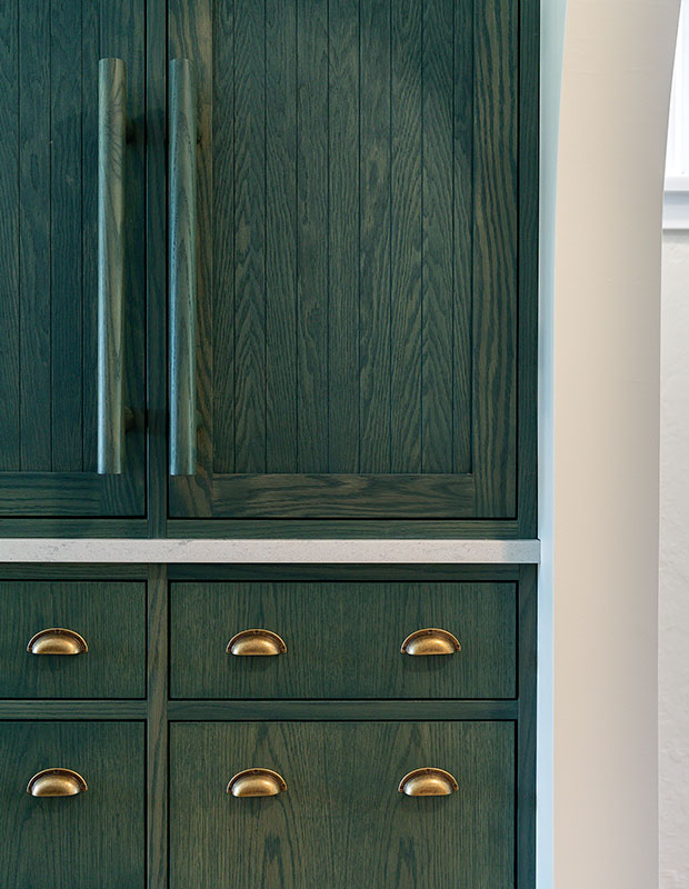
Farmhouse-style beadboard-paneled cabinets bring depth and texture, as well as vintage character. Custom handles are offset by inexpensive cup pulls. While counter space was lost on this wall, it was gained back on the new island.
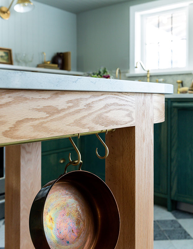
Also important to the couple was showing off pieces from their travels. “Rachel and Dave are well-travelled and have spent time in New Zealand,” says Christi. “We didn’t want to strip away their personalities in the reno.” Integrated shelves above the backsplash are ideal for displaying those treasures. “This is our long-term family home, and now the kitchen is the heart of it,” says Rachel.
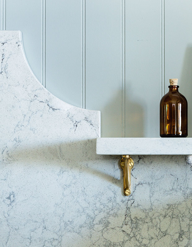
Having no uppers on the range wall means plenty of space for display. Here, an integrated shelf extends out from the top of the backsplash.
Mary McNeill-Knowles
House & Home Kitchens & Baths 2022
Christi Rivard and Jessica Allerton


