

Artist File
Artist Spotlight: Beth Letain’s Oversized Paintings Pack A Colorful Punch
Updated on November 28, 2023
In our column, Artist File, art advisor Diana Hamm of WK ART shares the artists that have caught her eye.
The Artist: Beth Letain’s arresting, oversized canvases focus on color and form in a minimal style. The Edmonton-born, Berlin-based artist is influenced by other minimalists such as Agnes Martin and Mary Heilmann. Though these references can be seen in Beth’s work, her canvases feel distinctly her own through her brushwork and color. Her starting point is always drawing and working on a very small scale (think three by five inches). These little pieces are then translated into a larger form — typically six to 11 feet high — using oil paint.
The lines in the works are simple, pared-down forms in saturated colors that create a pleasing tension with the use of oil paint and the sheer size of the pieces. A push-pull sensation between the simplicity of the subject and the physical demands of painting the actual canvas is ever present.
The Works: One of the most important starting points for Beth is the physical canvas. She doesn’t buy pre-primed canvas but does this herself — a process that involves applying layers of homemade gesso — which can take two to three days. This allows her to create a texture and the desired white she wants. Many of her works leave a section unpainted and her gesso base allows the contrast between the primed white and the saturated oil paint to be striking and a focal point in itself.
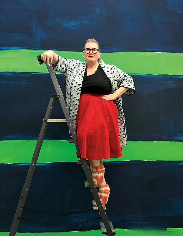
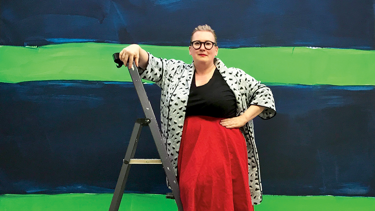
Artist Beth Letain in front of her work Dandelion (2017). Beth received her BFA at Nova Scotia College of Art and Design in Halifax, and her MFA in painting at State University of New York at Purchase College, in New York.
She is represented by Peres Projects in Berlin and has exhibited widely throughout Europe. Her paintings start at around $25,000 and she has an upcoming exhibition at Leeahn Gallery in Seoul, South Korea, in 2022.

In Dayfall, for example, the entire canvas is painted in a brilliant purple except for one bar at the very bottom that’s left untouched. You don’t notice it at first but, once you do, it forces your eye to look at the purple differently because, all of a sudden, the contrast in tone is highlighted. I love that Beth’s brushstrokes are visible and sweeping. In some instances, they remind me of drawing as a child, covering an entire page with a marker, where you can see each individual line formed.
I think there’s an interesting play here, as Beth does begin her process with the act of drawing. Her choice to use oil paint, however, elevates this work into a much more grown-up and formal realm of painting. “There’s something about the color quality and density of oil paint that’s very satisfying to me,” says Beth. “I also like that these paintings often look very ‘fast’ in their execution but are made with an inherently ‘slow’ material.”
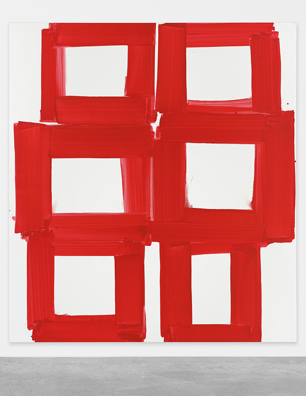
In other pieces, Beth creates much more defined shapes. In Antidote, for instance, her repeated geometric squares play on a simple primary shape in a simple primary color. The tomato red of the squares is the first thing to grab the attention of the viewer and can be appreciated and understood at a moment’s glance. But in looking closer and more carefully, the painting seems to unfold as though it’s a story.
Each square actually differs in size, bringing a lyrical rhythm to the piece. The squares at the top are smaller and closer together, followed by larger squares and finally, again, they’re smaller at the bottom. There are areas where the paint is thin and, in other places, you can see the gloopiness in a really satisfying way. These subtleties build up the canvas, resulting in a composition that isn’t a perfect pattern and, as such, the artist’s hand is entirely visible.

I think the scale of these works is also really important to grasp. In one of her latest exhibitions, the smallest painting measured six feet high, while the biggest was more than 11 feet high. The sheer size of these canvases allows the color to take on a personality of its own — you’re physically confronted by it when viewing the works in person. “Painting is definitely a physical act and, for me, the scale I work at seems to have grown out of my personal scale,” says Beth.
“The actual length of my arm and the distance of my reach are really intrinsic to the work. I like these large-scale works, as they fill up your vision as you approach them and give you a new way of looking at simple relationships of forms.” This is what makes the work so wonderfully inviting to me — the relationship between the visual simplicity and the physically demanding process has been thoughtfully considered and executed, which gives the works life and power.