Decorating & Design
Meet The British Walk-Out Kitchen Of Your Dreams (It Even Has Mint Doors)
Published on August 21, 2020
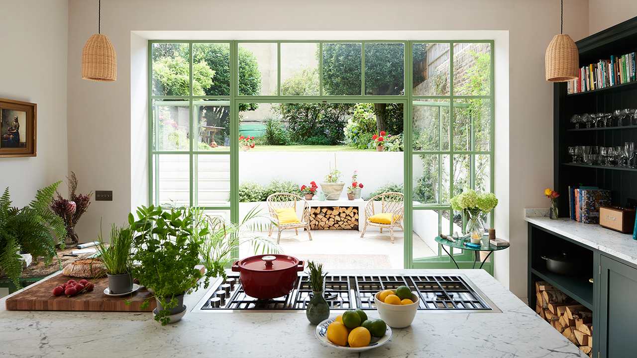
When you picture the words “basement kitchen,” it often conjures up a petite, nanny-suite situation — but not this beauty by interior designer Chris Graves of Clarence & Graves. The kitchen is located in the charming Chiswick, London, home he shares with his partner, two children and whippet, Clarence. Chris worked with iconic British firm deVOL Kitchens, which is famous for their rustic, welcoming aesthetic. “The craftsmanship is extraordinary, and the look is timeless,” says Chris.
Scroll down to learn more about this quaint kitchen oozing with European charm.
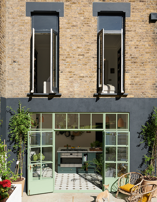
This Victorian house in West London dates back to around 1880, and represents a full gut and renovation. Before, it was a 1970s kitchen with two small windows and no courtyard. The flooring and doors were designed by Clarence & Graves.
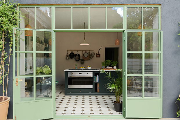
“We’re very keen cooks, and the positioning of many ovens or hobs (stovetops) means the chef has their back to the room,” says Chris. “The island was designed with a sunken Barazza hob, so the cook can be facing and interacting with guests, friends and family. We designed this kitchen for sociable cooking.” The marble, steel doors and stainless steel oven contrast the softness of the weathered, Provençal-style tiles, beautiful woodwork and wicker pendants.
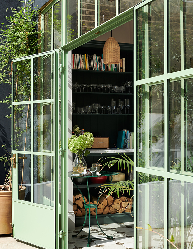
The steel doors are mint green, while inside, emerald cabinetry reflects the proximity to the courtyard. Wood is stacked near the door, so it’s easy to unload.
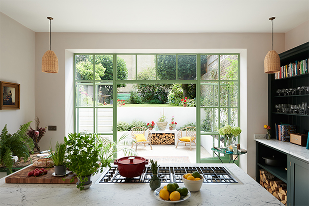
“As designers in our own home, we were free to experiment and make bolder choices,” he says. “Our goal was to find a refreshing marriage between city and country.”
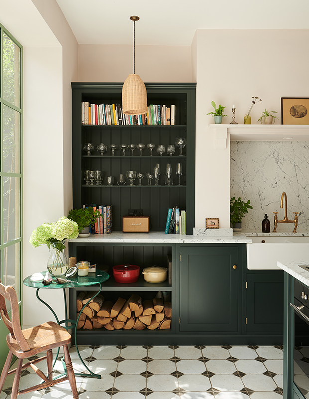
The palette was inspired by a love of Wes Anderson films. “The soft pinks are anchored by dark colors for a ‘Wes Anderson-meets-Provençal’ look,” says Chris. The bespoke deep green color was mixed especially for this project, and the wicker pendants are from Iconic Lights, to add a tactile note.
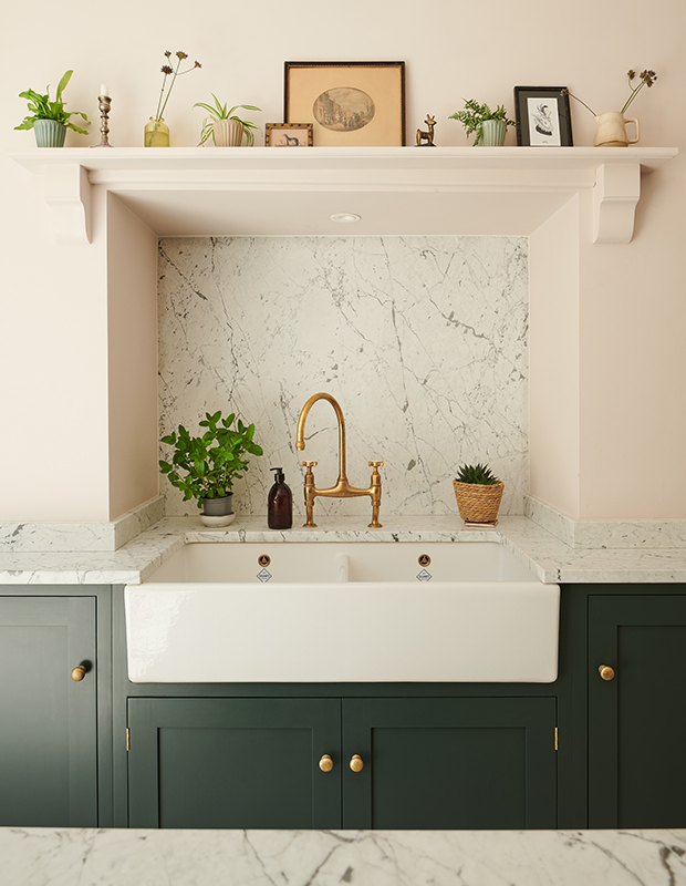
“I wanted all of the traditional vernacular of a kitchen to be hidden,” says Chris. “The sink is in the chimney, so you can’t see the oven when you enter room. The beautiful hob is sunk into the marble of the island. The kettle and toaster are hidden in the pantry on a marble cold shelf. The room is familiar but surprising. Books, open shelves, art and rugs all help contribute to the room feeling less like a traditional kitchen.”
The Shaker cupboards by deVOL start at $20,000, while the company’s Aged Brass Ionian fixture, made in collaboration with Perrin & Rowe, rings in at $1,080. The backsplash is honed marble.
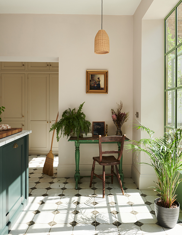
“I knew I wanted green doors,” says Chris. “I went deep into color samples. It had to be bold, and the rest of the palette is built around the green.” China Clay Mid by Little Greene Paint Co. is used on the walls.
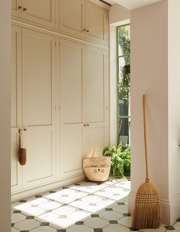
Banks of neutral millwork — painted in deVOL’s own Mushroom shade — blend into the walls for a clean, orderly effect.
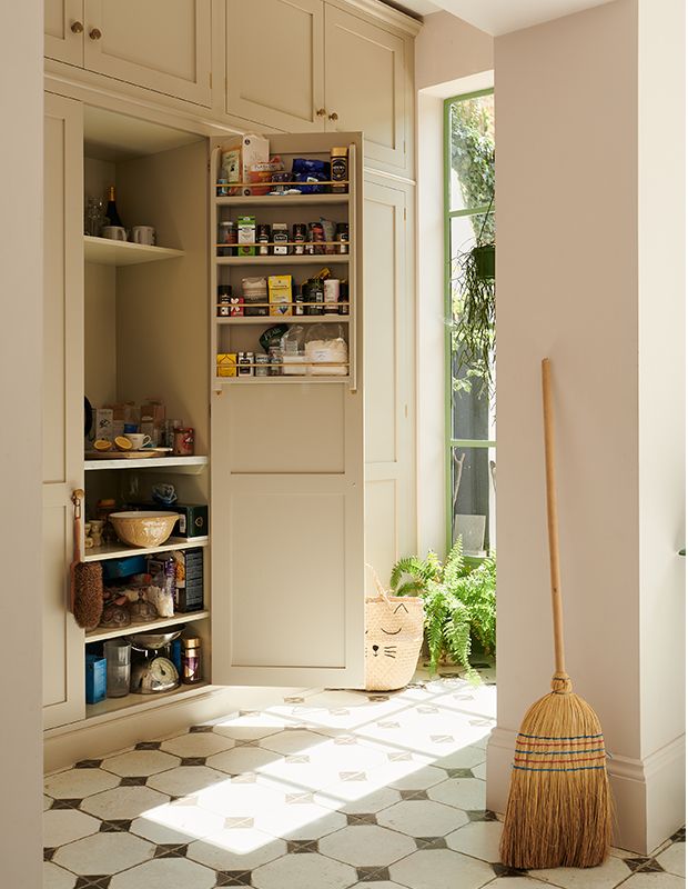
Varying the depth of the shelves means there is room for spice racks built into the doors, making them easy to access.
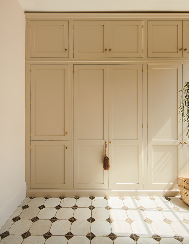
“The incredible storage is beautiful to just look at,” says Chris. “What lies beneath is all the hardworking machinery of a kitchen, a washing machine and dryer, pantry, fridge/freezer and a ton of storage.”
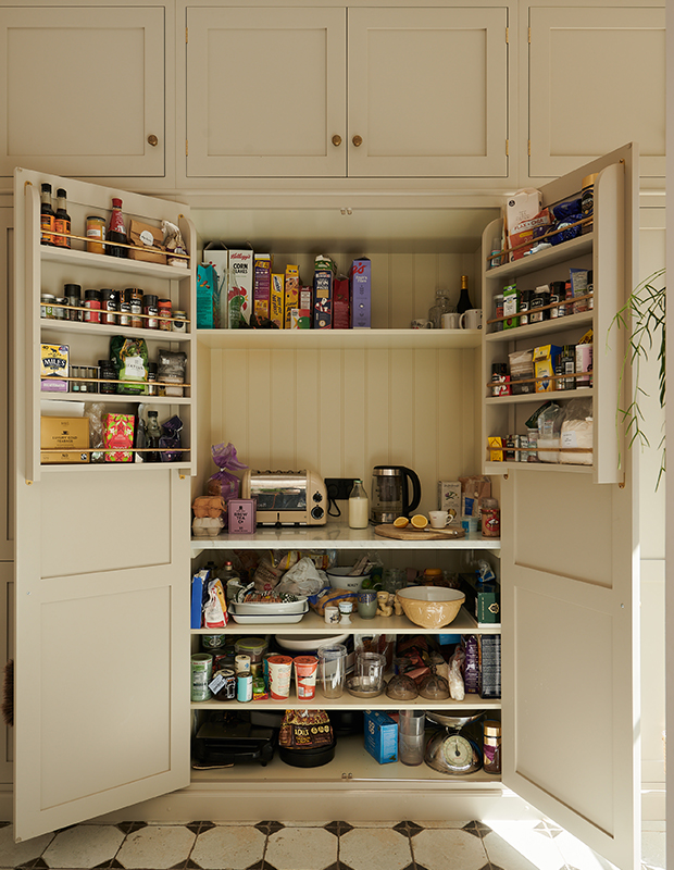
A large pantry is kitted out with beadboard backing, so it looks lovely when open as well.
deVOL Kitchens
Chris Graves, Clarence & Graves


