Decorating & Design
Contrasting Elements Come Together Harmoniously in This Barrie, Ont. Kitchen
Updated on November 17, 2023
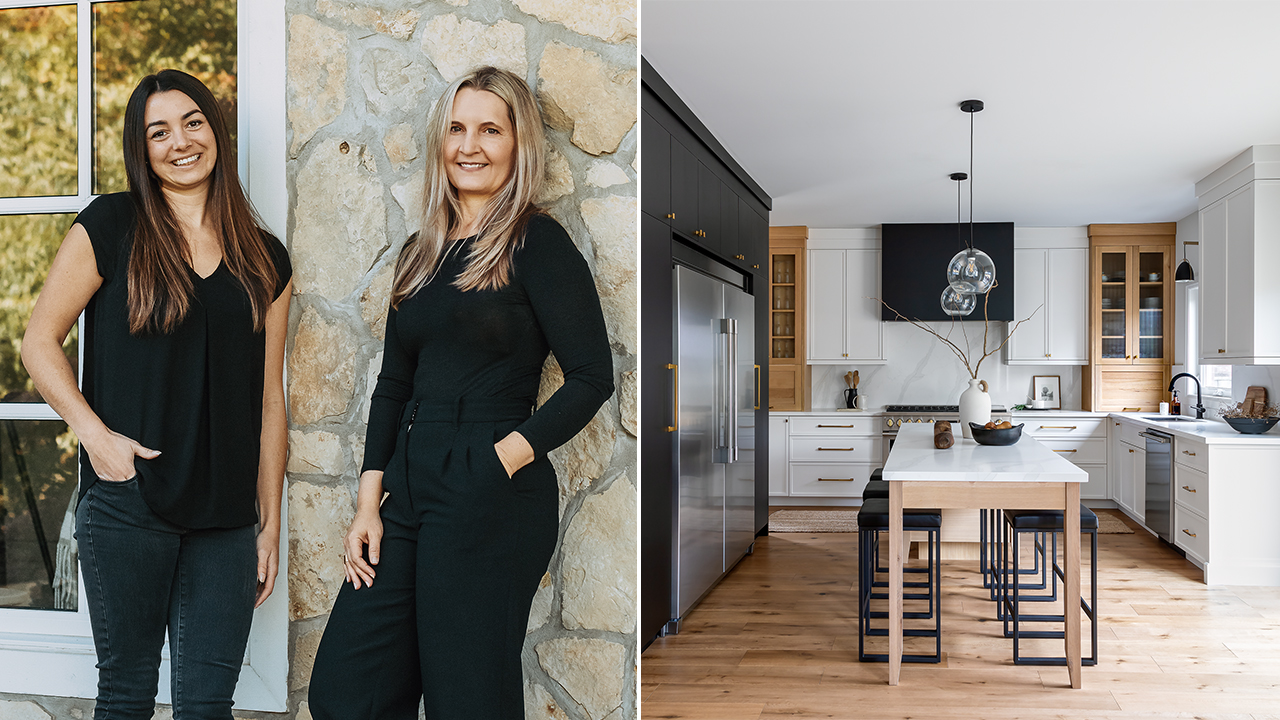
Lidia Van Zyl and Hayley Kay of LVZ Design recently renovated this kitchen in a circa-2000 family home in the suburbs. Made more expansive and designed in a winning transitional style that brings together contrasting elements, this 14- by 18-foot hub is now perfect for entertaining friends and family.
Scroll down!

Senior designer Hayley Kay (left) and owner and principal designer Lidia van Zyl.
House & Home: What was the jumping-off point for the design?
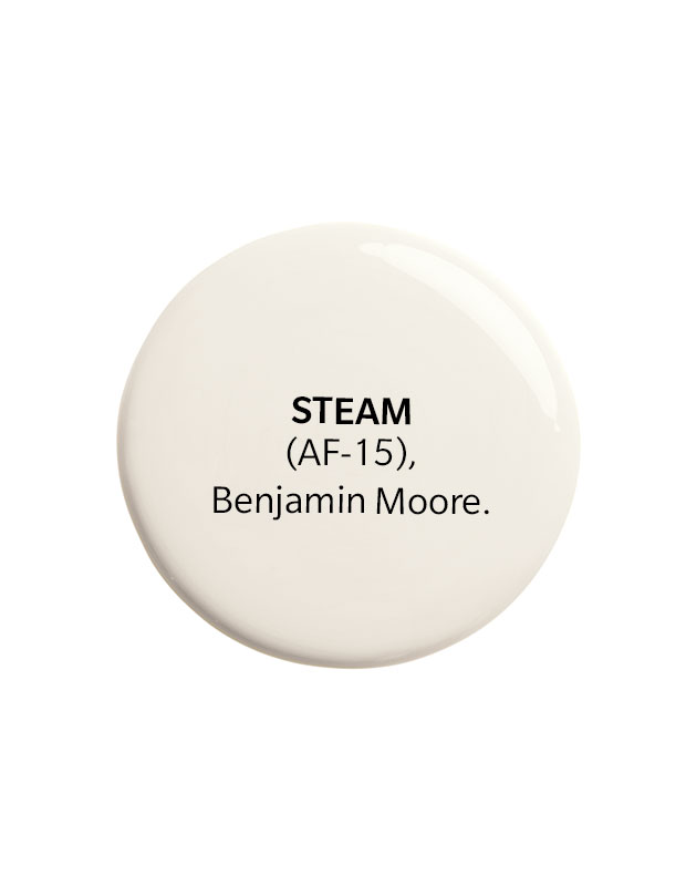
Lidia Van Zyl: Our clients didn’t want an all-white kitchen, but the inspiration photos they liked were often all-whitespaces, so we balanced white cabinets and walls with black cabinets and white oak elements.
H&H: What was on your clients’ wish list?
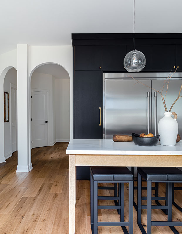
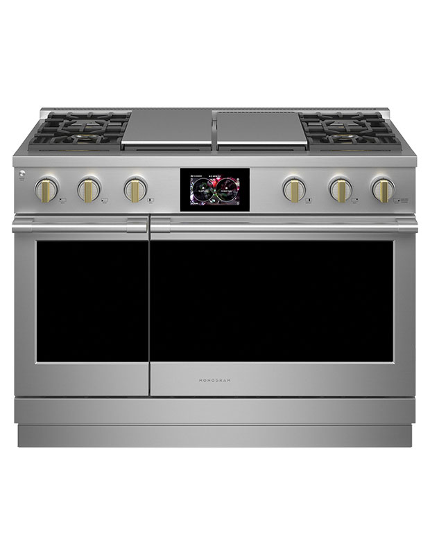
LVZ: They wanted a spacious kitchen where the family could cook together, plus large appliances, including a 70-inch fridge and freezer, and the six-burner Monogram range. It was quite a tight space, so we moved a few walls, stealing space from the dining and living rooms, and hid ductwork behind false backs in the white oak cabinets.
H&H: Why did you opt for a transitional style?
LVZ: Our clients are going to live here for a long time, so the kitchen had to be functional and not too modern or trendy.
H&H: Tell us about that gorgeous island; it seats six!
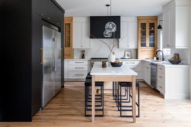
LVZ: Our clients were adamant about having a freestanding island. We wanted it to look like a piece of furniture, which, to me, meant fabricating it in white oak. Our cabinetmaker suggested tapering the legs and adding skirting at the top. We lined it up with the range and carried the white oak through to the cabinets for a bit of symmetry, which also kept the emphasis on the vent hood.
H&H: How did you bring all the different finishes, materials and colors together?
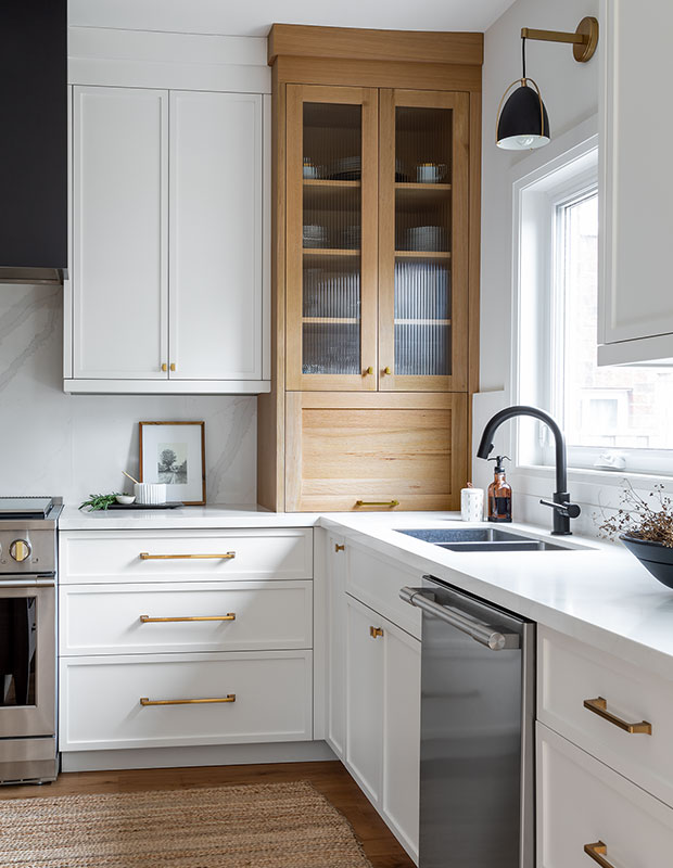
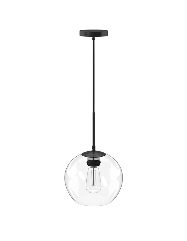
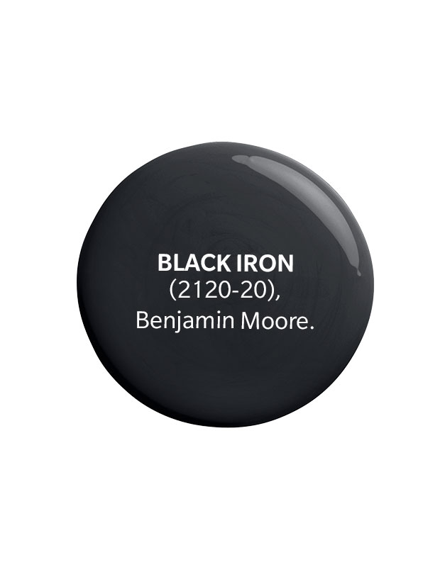
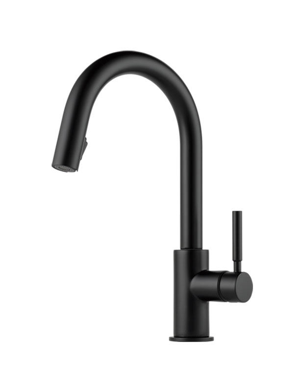
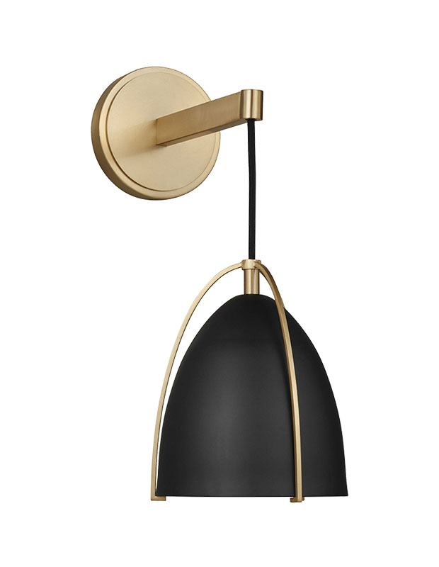
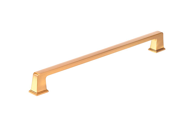
LVZ: Our client picked out the range, which is stainless steel and has hits of black and gold on the knobs, so I added those accents throughout: golden touches on the hardware, and black on the vent hood and light fixtures.
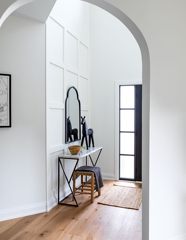
H&H: What inspired you to add arches?
LVZ: There are arches elsewhere in the house so, when we moved the walls to open things up, we added arches to connect the spaces. Once we started renovating, the homeowners decided to continue the new flooring across the rest of the main floor and redo the stairs and several other rooms. It always starts with wanting a new kitchen —and then it escalates!
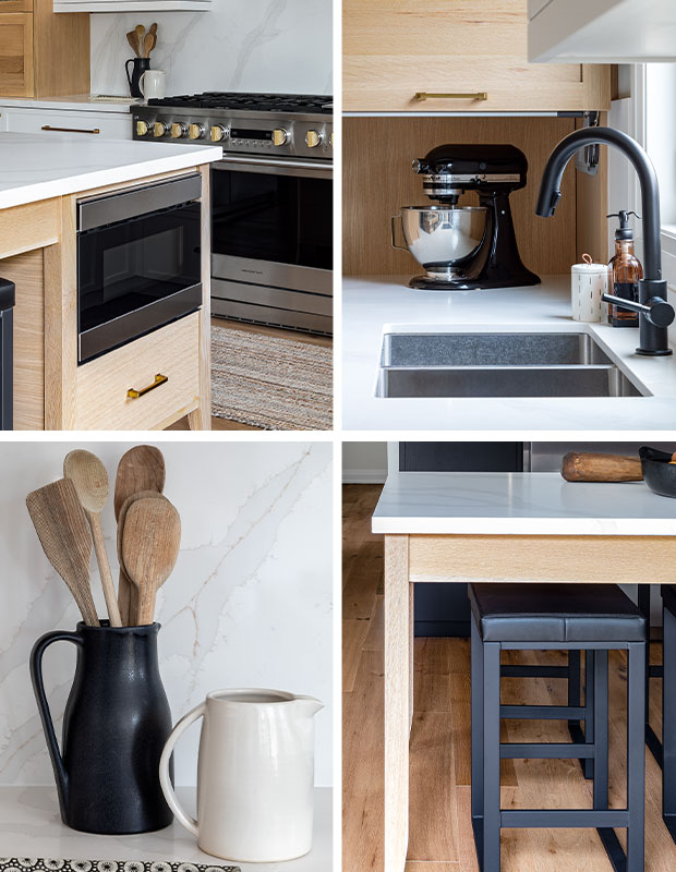
The Details
1. The microwave is cleverly integrated into one end of the island.
2. A compact appliance garage is perfect for the stand mixer.
3. The counters and backsplash are in an understated yet elegant quartz.
4. The work table–style island is grounded by black seating.
Keep scrolling for elements of this look!

Robin Stubbert
LVZ Design


