Decorating & Design
January 20, 2020
Here’s Why Up-And-Coming Designer Heidi Caillier Should Be On Your Radar
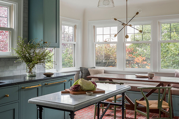
Seattle designer Heidi Caillier is attracting lots of attention for her heritage-style designs, but what caught our eye was how Heidi wields gorgeous color on kitchen and bathroom cabinetry so artfully. Here, she shares her rationale for creating these chromatic spaces that read as calming and classic, but are kicked up a notch from basic neutrals. Scroll down and get inspired!
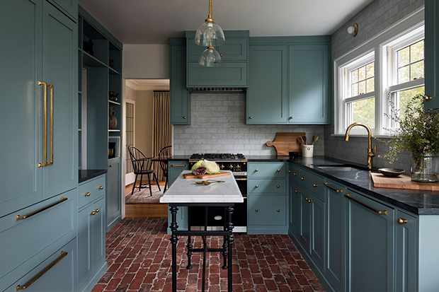
Heidi chose Farrow & Ball Oval Room Blue (85) for the cabinets in this Seattle kitchen. “I love to use their paint colors because they have a richness that makes them hard to distinguish: it can read as blue or green or gray depending on the time of day,” she explains. She topped the look off with a conversion varnish for a really durable finish. This small kitchen didn’t have room for a large island, so Heidi found a vintage-style console with metal legs to stand in as an extra work surface.
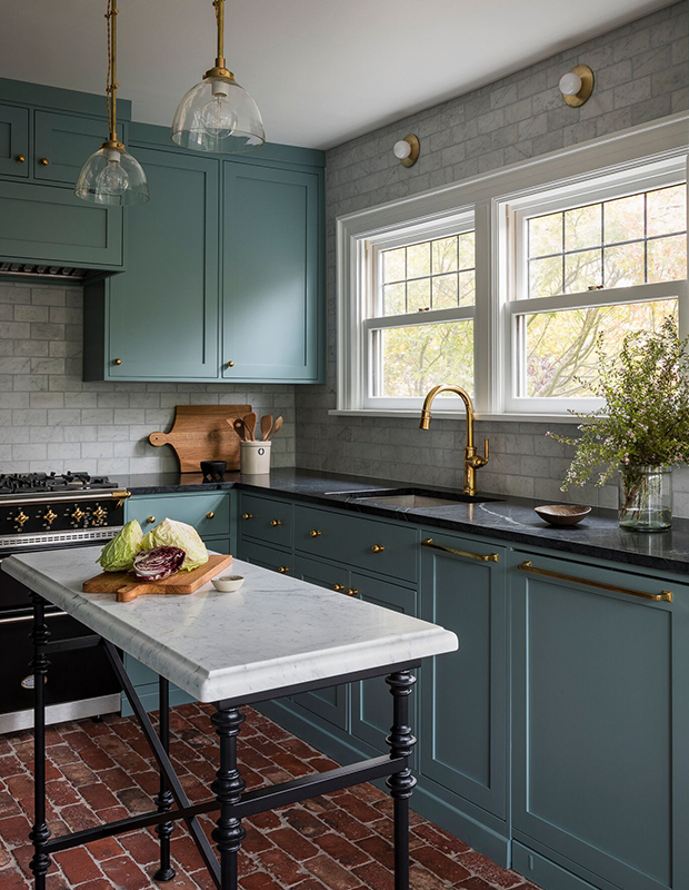
“I wanted charming details: inset cabinets definitely, a classic backsplash and a pop of color with the blue,” says Heidi. She didn’t want to take the focus away from the jewel-like enamel Lacanche stove, which underscores the period charm of this kitchen. “I like to panel all the appliances to keep it clean, especially in small kitchens so there’s no visual start and stop from stainless appliances.”
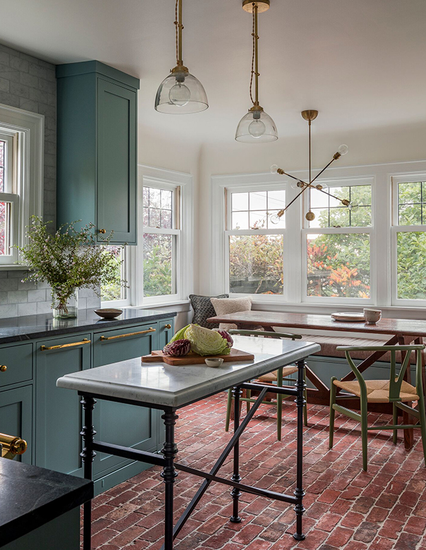
Because this Tudor-style home is older, Heidi aimed for an authentically aged look in this kitchen with brick flooring. “Not everybody would go for those floors,” she says. “It’s not as low maintenance as a ceramic or porcelain tile, but obviously brick can handle a lot of wear of tear. I found a company which specializes in reclaimed brick from an old warehouse buildings, and this was from a demo site in New York — where the homeowners used to live — so it was perfect.”
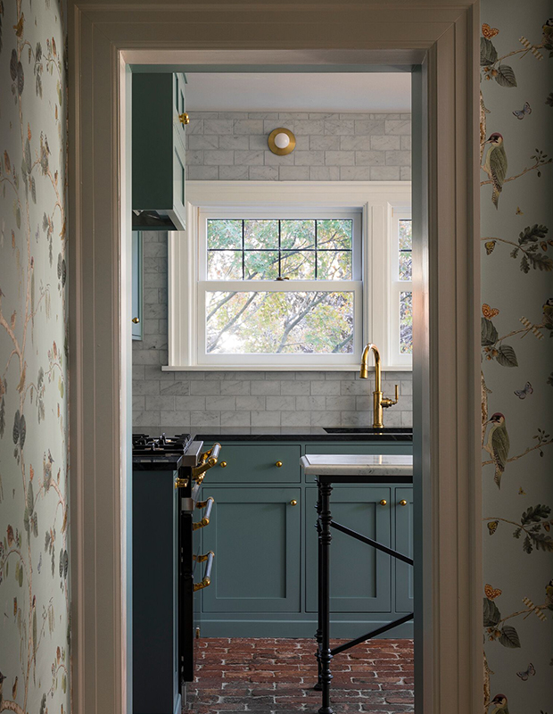
A nostalgic bird-printed wallpaper frames the view to the kitchen, and reinforces the period character of this home. Touches of brass, such as the flush-mounted sconces, warm up the Carrara marble tile walls.
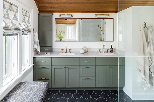
The bathroom vanity, painted in Dark Olive (2140-30) from Benjamin Moore, is a focal point in this Queen Anne home. “That was one of the first things I recommended to the clients: do an olive-y dark green vanity. It’s really pretty with the wood ceiling and feels rich, but not super dark,” says Heidi.
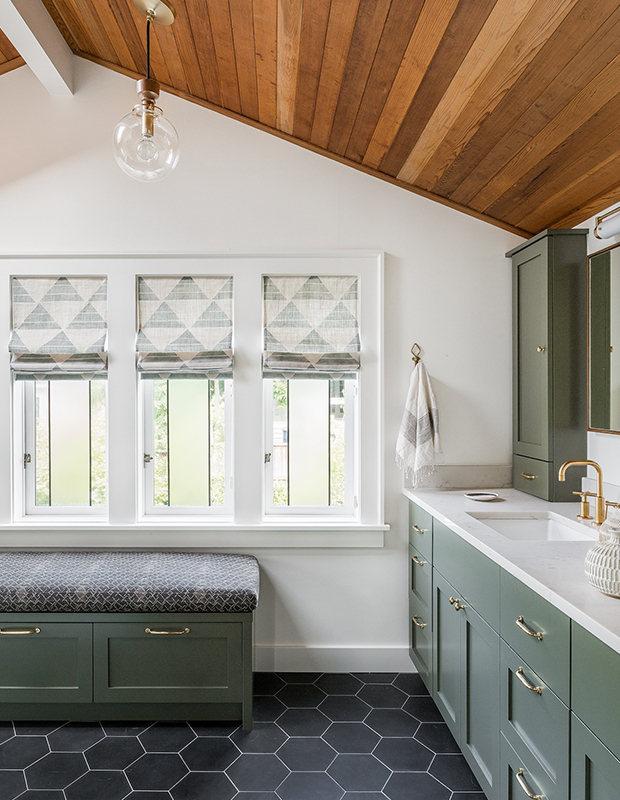
This bathroom also serves as a laundry area, so extra towels, detergent, toiletries and toilet tissue are stored in the bench. “The fabric on the cushion is a linen with a knit-back so it’s really durable,” she says. “It has natural faded variations so it can take some sun and not show wear it as much.”
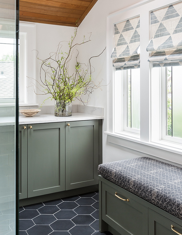
The graphite shade of the oversized hex floor tiles is repeated in the window treatments and graphic cushion for a mix of pattern that still looks cohesive. “I didn’t want the bathroom to feel busy,” says Heidi. “The clients are conservative, so I opted for fabrics with pattern, instead of using it on the hard surfaces.”
Haris Kenjar

