Decorating & Design
July 4, 2016
How To Add Personality To A New-Build Home
Designer Nam Dang-Mitchell was faced with a challenge: to add layers of character to a young Calgary family’s new-build. “We’re all craving authenticity — from farmers’ markets to handcrafted pieces — and we certainly don’t want to walk into a builder-grade house with no personality,” she says. By adding old world texture atop the drywall, whether it was the applied panelling in the dining room or the glazed brick in the kitchen, Nam created a modern farmhouse that feels fresh and has plenty of charm. Click through to see the contemporary, serene space.

Nam changed the initial plans for the entry, adding a second doorway into the adjoining rooms for flow. “But it’s also important to create a sense of arrival, even in an open-concept house,” she says. Natural hits, like huge Monstera leafs and a turtle shell, enhance the home’s quiet beauty.

Patterned cement tiles in tones of grey, white and black are a fun yet moody foil to the mudroom’s wall of white oak built-ins. Long stretches of hooks, shelving and floor-level cubbies mean abundant storage for the busy family of four.
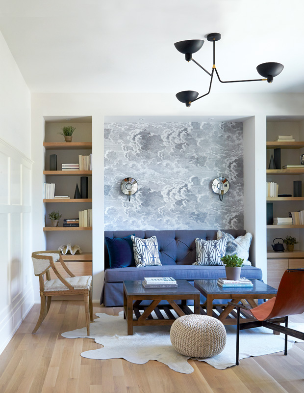
This lounge off the front hall is homeowner Amy Goos’s favorite place to read or have coffee with friends. “[My husband] Ryan got a big garage, and I got my reading nook,” she says. Iconic Fornasetti wallpaper draws the eye to the cozy niche, and furniture and accessories in different styles give the space a rich, collected look.
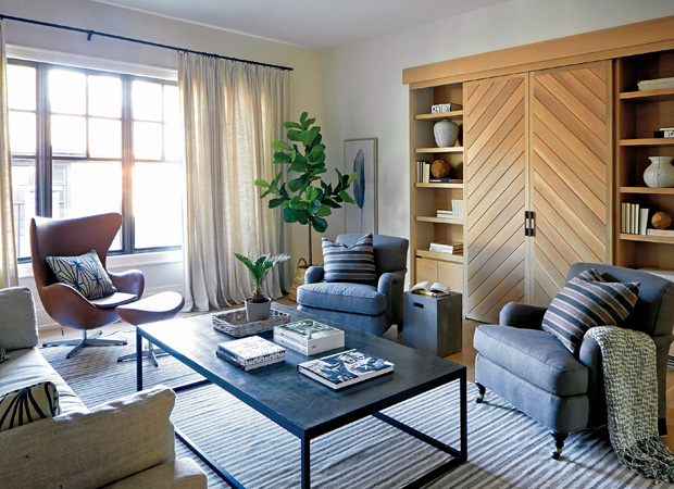
The house has no formal living room, so this family room is meant to be unfussy and comfortable, while the lounge is more elegant. The focal point here is the wall unit built of rift-cut white oak. Its chevron-pattern doors hide the TV. A huge coffee table anchors all the seating.

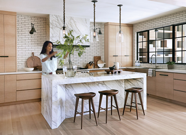
Nam clad the entire outer face of the island in Calacatta Gold marble. “A waterfall effect wasn’t enough; we wanted it to be monolithic, like it was carved from a block of marble,” she says. “Tilting the gables makes it look more structural.” The marble hood stands out against a wall of glazed bricks. Luxe surfaces are offset by white oak cabinets and floors, and rustic pieces, like wood stools with tractor-style seats and pendants with jute-clad cords.
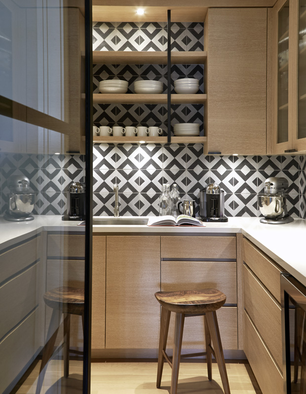
The walk-in pantry was a place to add drama. “We gave this tiny utility space its own graphic hit,” says Nam of the high-contrast cement tiles. The glass door makes it feel roomier and puts the tiles in the sight line. “Ryan likes to have countertop appliances out, and I like to put them away, so this is a compromise,” says Amy. “The kitchen looks tidy, but we still have easy access to these appliances. I also wanted a second sink, but preferred to keep the island clear.”
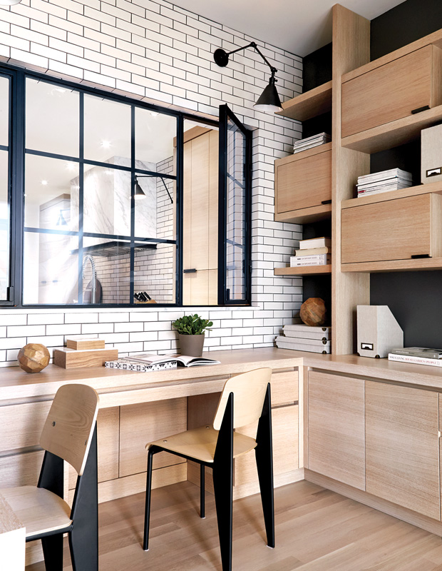
With ample space for homework, crafting and bill-paying, plus lots of room to tuck things away, the office helps keep the adjacent kitchen clutter-free. Nam enhanced the black accents by painting the wall behind the built-ins dark grey.
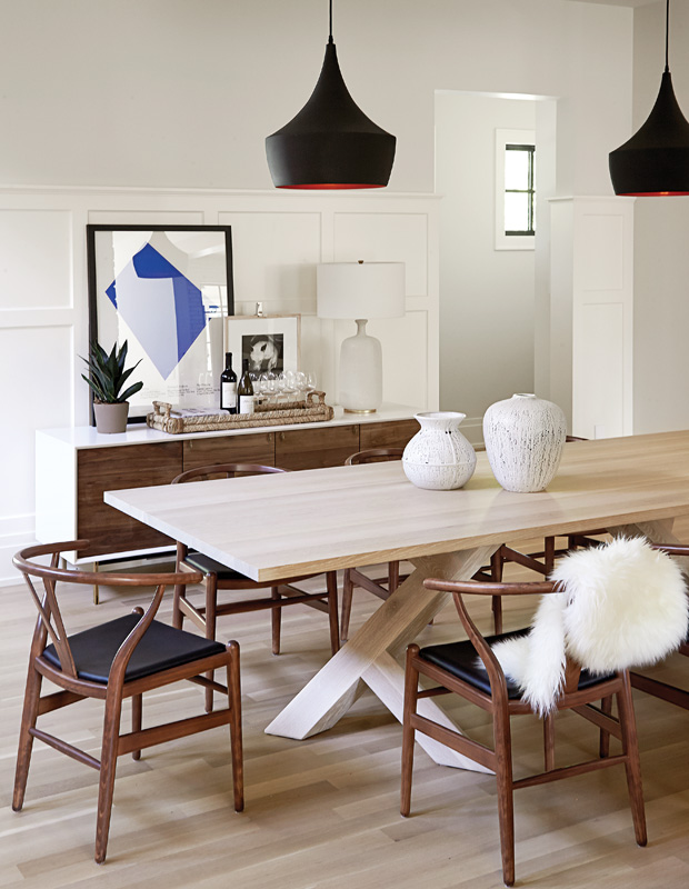
Amy’s friends Jerad Mack and Shane Pawluk of Izm made the white oak dining table, which has a twist on the classic trestle base. A white frame gives the walnut credenza a mod look, while the bold blue art and black pendants are graphic hits against the white panelling.
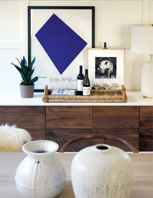
Vignettes, like this one in the dining room featuring an Ellsworth Kelly poster and woven tray, reflect the textural materials and natural hues used throughout the home.
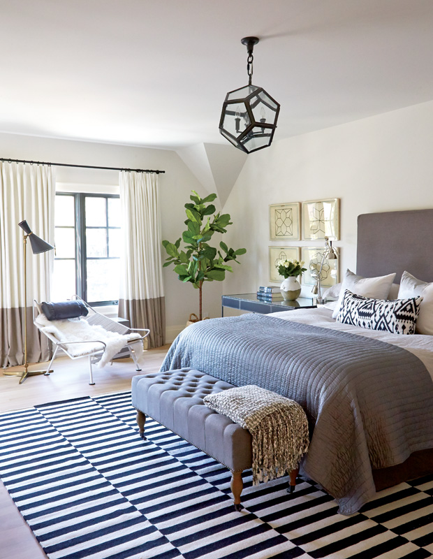
Nam energized the principal bedroom’s restful scheme with a high-contrast rug from Ikea, geometric fixture from RH Restoration Hardware and bold ikat accent pillow. “All ceiling fixtures should have personality,” she says. “They’re such an important part of the vocabulary of a house.” Here, the color-blocked drapes play backdrop to an artful reading chair.
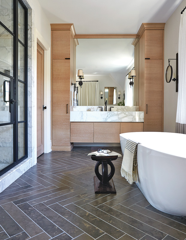
In the ensuite, Amy’s vanity is made from the same rift-cut white oak as the kitchen cabinetry. Limestone floor tiles set in an elongated herringbone pattern enforce the home’s earthy palette and create a sense of movement.
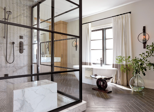
One of Nam’s signature statements, seen here in the spacious principal ensuite, is to frame a freestanding tub with drapes. “It makes a bathroom feel more civilized and less clinical — like it’s an extension of the rest of the home,” she says. The huge metal-framed shower was designed to match the interior window in the kitchen and door on the pantry, and the block-like marble bench echoes the kitchen island. A huge vase, side table and sconces with rounded lines balance the right-angled elements.
Colin Way
House and Home March 2016
Nam Dang-Mitchell

