Arch Motfis, Eclectic Patterns And Enchanting Sight Lines Enliven Michaela Burns’ Tudor-Style Home
Sometimes, while standing at her kitchen sink, designer Michaela Burns has to remind herself about how she got here.
“It’s as though someone lifted me up, built a new house around me and plopped me right back down,” she says with a laugh. “The kitchen, banquette and even my sons’ rooms are in the same location as the original house.
It’s very comforting.”
For eight years, she and her husband, Mike, who works in finance, lived in the leafy Lawrence Park neighborhood with their two sons, Jack and Oliver, plus Myles, a chicken nugget–motivated standard poodle. While the original Georgian had a welcoming center-hall plan, it had undergone an unflattering 1980s renovation complete with angled walls and glass brick. Low ceilings and small window openings felt restrictive, and the stone foundation hindered the couple from digging out the six-foot-high basement. Another challenge? The 16-foot drop from the house to the backyard. They considered selling the property, but the lot was just too good to leave. “It’s 170 feet deep — in Toronto!” says Michaela. “We have a ton of ancient trees; it feels like a ravine with a beautiful canopy of greenery.”
So, they decided to tear down the house and build. After interviewing six architects, Michaela hired Stan Makow of Makow Associates Architects who used Michaela’s rough sketch of a brick house with peaks and a chimney as inspiration for the design of a new house with a Tudor feel. Tishler Custom Homes completed the build with landscape architecture by Mark Pettes. Planning started in March of 2020, and the project was complete by August 2023.
The exterior of the 5,000-square-foot, four-bedroom house features a high-contrast façade of Indiana limestone and black-framed windows. “I like the muntin bars on the windows because they add another dimension,” says Stan. “You get a modified view when you see through a frame to the natural landscape beyond.” Large gables, an arched entryway and a glass pop-out cube are also striking elements. “The glass box was initially there because I needed to square off the room inside,” says Stan. “It’s exciting when you can combine a traditional form with modern elements.”
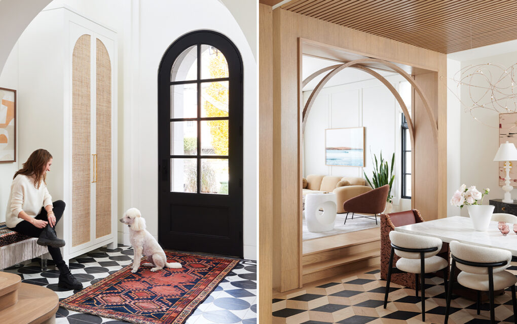
Indoors, the house delights from the moment you walk in. “The arch is a design trend I was drawn to — the curve has a softness and gives a welcoming feeling,” says Michaela of the arch motifs used throughout the interiors.
In the dining room, homeowner and designer Michaela Burns (pictured) added a skeleton arch, reeded wood accents and graphic floors for a dose of drama.
The airy formal living room is just off the foyer. A Calacatta Viola marble coffee table adds gravitas. “It weighs 400 pounds — that was a splurge!” says Michaela.
A skeleton arch visually divides the wood-lined dining room and formal living space, and there’s also an archway in the pantry. Michaela’s also got patience in spades — she waited six months for the stunning dining room flooring to arrive. “There were less expensive alternatives, but this was the flooring I wanted,” she says. “The color of each piece of engineered parquet was specifically selected for this room.”
The kitchen counters have subtle marbling with a beautiful matte finish. “Loud veining can be overpowering and restrict your design,” says Michaela.
Brushed brass pulls complement the white oak cabinets. Forgoing uppers allows the black-framed windows to pop.
When it comes to decorating her own home, Michaela relishes in the unexpected. Case in point: the sculptural, curved coffee bar dividing the kitchen from the family room. Boasting a glossy black backsplash, the bar is also equipped with a microwave and fridge drawer.
The curved banquette is upholstered in caramel-colored leather with a channelled back and has integrated shelves on one side.
For every bold design move, there’s an accompanying moment of calm. “The pantry is dramatic, for instance, while the kitchen is light and airy,” says Michaela. “As a designer, there are so many elements you want to layer in to your own home — you have to find a place for them all.”
“We’ve got four colors of cabinets on the main floor: the black-stained oak ones on the coffee bar, the light oak and lacquered grey in the kitchen and the bold teal cabinets in the pantry,” says Michaela. Because when you’re designing a house for yourself, why not have a little fun?
“The kids hang out here after school,” says Michaela of the family room. “It’s casual but still refined.” Expansive glazing captures the backyard foliage.
Pink bird-motif wallpaper and the Titanium Leather granite counter are a lively pairing in the second-floor powder room.
That accounts for the 12 different wallpapers in the house. “Some are subtle, just for the sake of texture, and some are graphic to set the tone of the space,” she says. The principal bedroom showcases a free-form brushstroke grasscloth wall covering. “I’ve wanted to use that paper for years!”
An undulating brushstroke wall covering jump-started the design for the principal bedroom.
The principal ensuite has two separate vanities, each with reeded details and a curved profile.
From the soaker tub, there’s a sublime view of the backyard. Automated blinds are concealed in a ceiling channel.
“We did the walk-in shower with large-format porcelain tile for a seamless look,” says Michaela.
The petal-shaped light fixture gives the walk-in closet a feminine feel.
- Photographer Alex Lukey
- Designer Michaela Burns (design)/Stan Makow (architecture)