Decorating & Design
Philip Mitchell’s Best Advice For Bringing Character To Your Rooms
Published on November 1, 2024
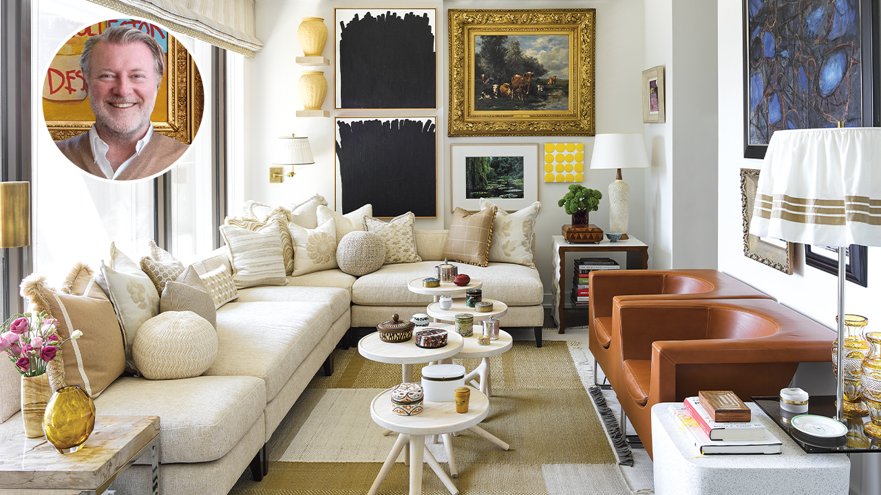
Philip Mitchell and his husband, Mark Narsansky, live primarily in Lunenburg, N.S., and they also have a beach house in Kingsburg, N.S. When they found this modern, 600-square-foot box in the sky in Toronto’s Yorkville neighborhood, Philip decided to tackle the new pied-à-terre with his usual maximalist approach. The result is an apartment chock-full of fabulous pieces from his personal collection that manages to look airy and inviting, with plenty of visual glamor.
Take a lesson from the master of the mix and scroll down for Philip Mitchell’s design advice!

Designer Philip Mitchell shares his best lessons on layering below. Keep scrolling!
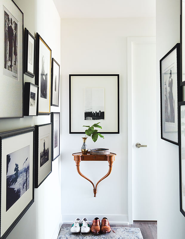
1. Create Strong Sight Lines
In this narrow hallway, Philip was still able to make a big statement. A circa-1940s wood console hangs like a punctuation mark right inside the entry door. The walls are lined in black and white photography mounted in oversized white matting and simple black frames. Like things grouped together in one color scheme will expand a space.

2. Wrap Your Room in Seating
Philip had custom armless sofa sections made to form a wraparound sectional. “In small rooms, we tend to choose armless pieces with curves whenever possible to give the illusion of more space than there actually is,” he says.
3. Tables, Tables, Tables
Choose versatile options instead of conventional pieces. Philip found these small round cocktail tables, which he placed in a row to serve as a coffee table. “We love the flexibility they offer in our small space,” he says. “They have varying heights and are light, so they can be easily moved around and arranged, almost like nesting tables.”
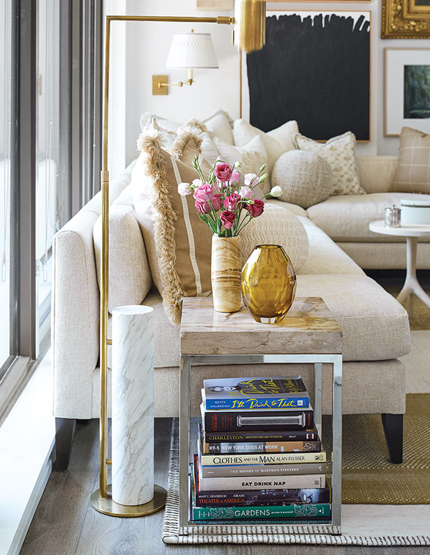
4. Stack Your Books
Instead of bookcases, use square corner tables with stacked books underneath.
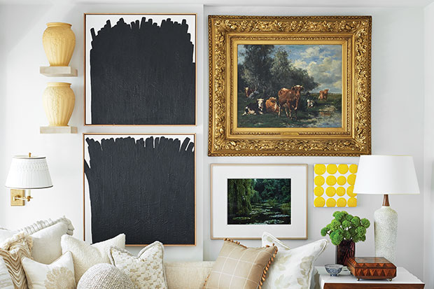
5. Wall-to-Wall Art
Don’t be afraid to group classic oil paintings with modern abstracts and even accessories on small shelves. Ceiling-to-floor and wall-to-wall art expands the room and brings great maximalist style.
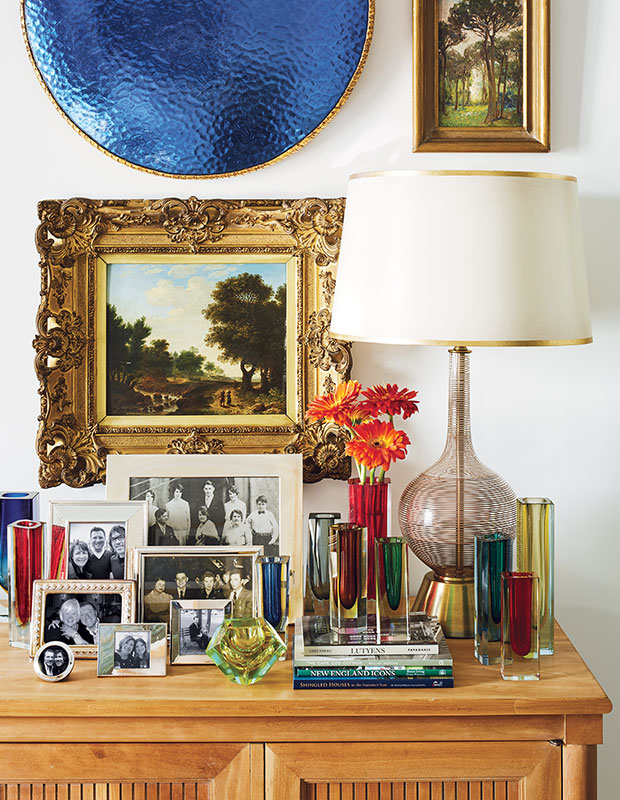
6. Make it Curated, Not Cluttered
“I group similar items, as they make more of an impact visually and feel more tidy than random objects combined together,” says Philip. When he’s working with clients who don’t have a full collection of a particular item, he’ll encourage them to add to a smaller group of pieces they already have to start building something more robust.

7. Create Layers by Placing Furniture in Unlikely Places
Philip has a great talent for composing layered rooms. “I take any opportunity I can to add something interesting and visual,” he says. “In this case, it’s an ottoman tucked under a coffee table, but I also like adding a bench or chest of drawers under a console — it adds another finish or material and an extra layer of interest.”

8. Build a Story With One Color
On the sofas, Philip layered pillows and throws in shades of beige, using varied textures and shapes to create interest. The neutral palette doesn’t compete with the bold, art-filled walls.

9. Create Cozy Corners
Curvy chairs, tables of varying heights and tall table lamps work together to make bold, visually strong seating areas.
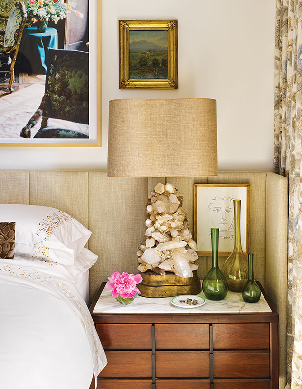
10. Choose Statement Table Lamps That Tell A Story
Philip’s eclectic collection of lamps adds to his design narrative. “Some come from a favorite supplier like the Carole Stupell–designed rock crystal lamps purchased from David Duncan Studio in New York City, and some were acquired at auctions like the vintage ceramic flower lamp,” says Philip. “When it comes to lamps, I love to mix different styles and periods; I use them as pieces of sculpture in a room.”
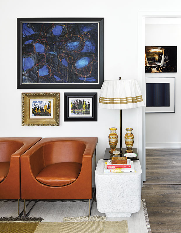
11. Opt for Solid Upholstery Fabrics
Neutral solid fabric or leather seating against light walls will visually expand your space.

12. Keep the Envelope Neutral
“Because of the contemporary architecture and the tremendous floor-to-ceiling windows, it felt right to keep the space neutral,” says Philip. “We introduced layers of textiles with a multitude of textures in one palette to add interest, but also let the curated collection of pieces be the focal point of the space.”
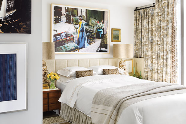
13. Small Spaces Don’t Need to be Boring
In the petite bedroom, floor-to-ceiling drapes, a full ruffled bed skirt, layered rugs, imposing table lamps and multiple pieces of art could seem overpowering, but Philip’s deft hand with color and textiles keeps it understated. The wraparound channelled headboard pulls the space together and creates a cozy enclosure.
Annie Schlechter
House & Home
Philip Mitchell


