

Decorating & Design
January 15, 2018
This Small Victorian Proves Bigger Isn’t Always Better
Not many homeowners would consider removing an addition to make a home feel roomier. But that’s exactly what designer Tatiana Velasevic did to the three-storey rowhouse she shares with her husband, Ilias; 16-year-old daughter, Gala; and dog, Colette. “We gained more natural light and improved the flow of the ground floor,” she says of the decision. The bold move is a testament to both Tatiana’s eye (she’s the owner of Pimlico Design Gallery, a Toronto home store) and her willingness to sacrifice elements that don’t work with how her family lives. Now her home’s light hardwood floors and white walls have a clean, crisp look. Click through for a peek inside.
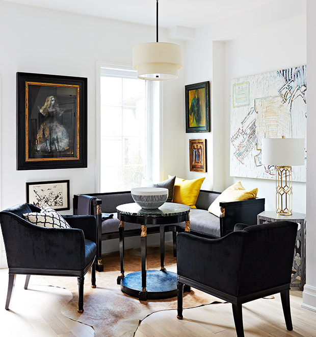
Tatiana refinished and reupholstered the living room furnishings she inherited from her grandparents for an updated look.
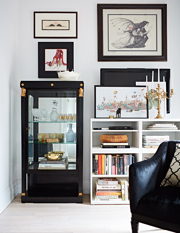
This mirror-backed cabinet reflects light around the black and white living room.

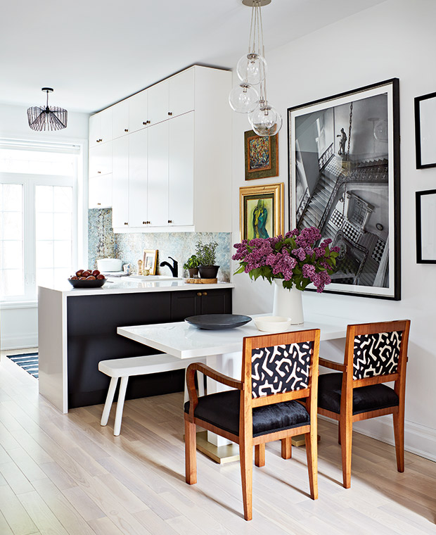
Tatiana chose a simple resin bench and pedestal table for the dining area to give the gallery wall star billing.
The kitchen cabinets extend to the ceiling to maximize storage space. The black- backed peninsula helps to create a defined dining area, balancing the frames and upholstery.
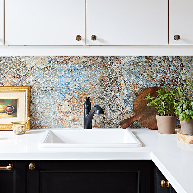
The damask print backsplash adds a hit of rich pattern to the kitchen.

In the principal bedroom, a Mexican Otomi bedspread and photo of a Portuguese palace add global flair.

Decorative containers keep the open shelving in Tatiana’s bedroom feeling curated, not cluttered.

The downsized second-floor bathroom is inspired by Art Deco spaces of the 1930s. “This much smaller bathroom is more comfortable and functional than the former one,” Tatiana says.

A loveseat and side table fit perfectly under a third-floor alcove to make a cozy study for Tatiana’s daughter Gala.
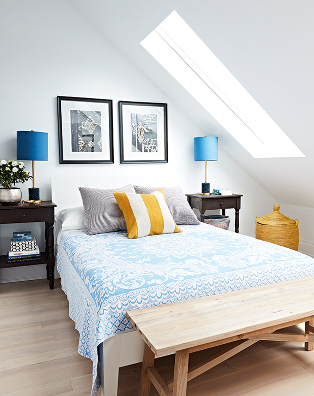
An icy blue coverlet and raw wood bench lend Scandinavian flavor to Gala’s bedroom.
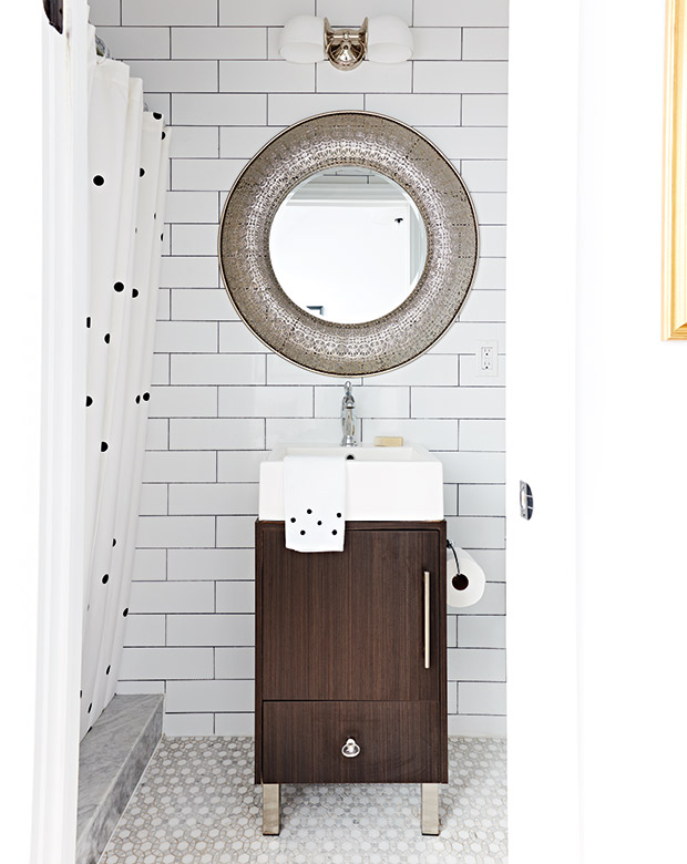
A slim vanity saves space in Gala’s bathroom.
Angus Fergusson
House & Home September 2017
Tatiana Velasevic