Decorating & Design
This Vacation Home Kitchen Delivers Beachy Boho Style
Updated on January 8, 2024
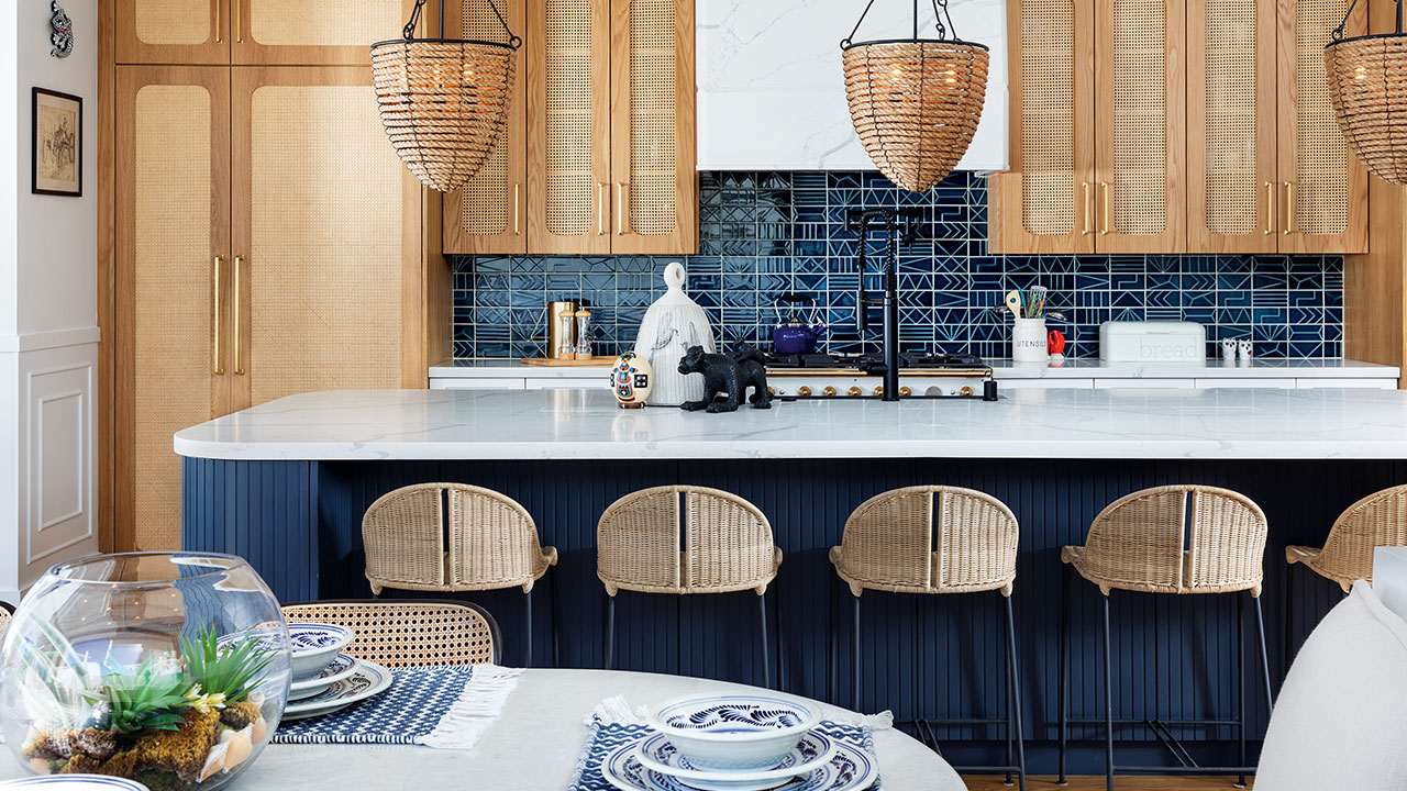
For this welcoming kitchen, designer Mariana Postlethwaite of Casa Duhagón stayed true to her clients’ Mexican-American roots by pairing modern Cali style with woven textures and a bold blue hue.
Keep reading to see more of this casual, coastal kitchen!
House & Home: Is this project a renovation or a new-build?
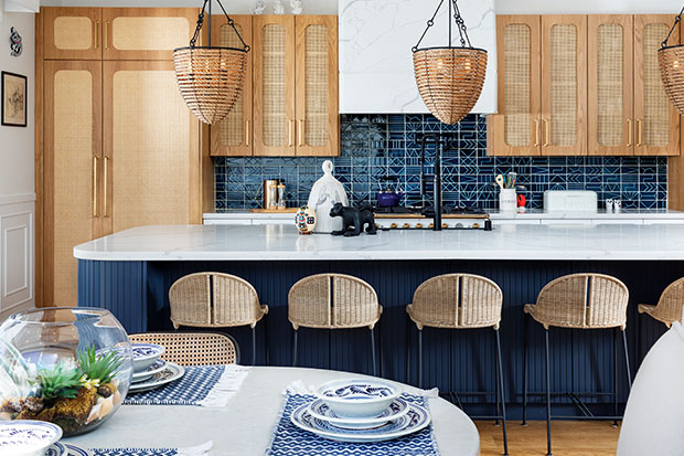
Mariana Postlethwaite: The home is a new construction, so a totally blank canvas. Originally, I designed a kitchen that was all glass and metal — it was like a bird cage — but my clients wanted a more casual, coastal look that felt like a beach house. Their style is a little boho, and they wanted their house to stand out from others in their Coronado neighbourhood; something different, modern and eclectic.
H&H: Tell us about that gorgeous tile; how did you land on it?
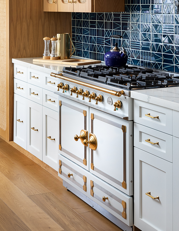
MP: The backsplash is made of different tiles that are all sold individually. I saw a few of them laid next to each other in a San Diego tile showroom and loved the look, so I created my own pattern. This blue is what inspired the kitchen palette, including the colour of the island, and the rest of the house, too.
H&H: What’s behind the decision to pair coastal touches with more trad elements like the brass hardware?
MP: I always use contrast; it’s my big secret. If you use a more informal material or texture, you need to counteract it with a formal element such as brass or marble — something sleek. This is a vacation house in the city, so I wanted to represent that contrast.
H&H: Wovens appear prominently here; what do they bring to the design?
MP: They have the texture of seagrass and, visually, they resemble sand. It’s very beachy and it’s also boho; it made sense to play with those materials and textures. The caning on the cabinets is made in Mexico — which ties in nicely to my clients’ Mexican-American heritage.
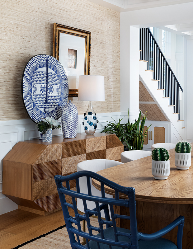
H&H: Did the owners’ heritage impact anything else in the design?
MP: Latino families often have lots of gatherings, and it’s not unusual to have several dining areas. That’s why there’s a counter eating area, a breakfast nook and a dining table all in one space. I also added a pot filler because Mexican traditions involve cooking in large saucepans and pots, which get really heavy.
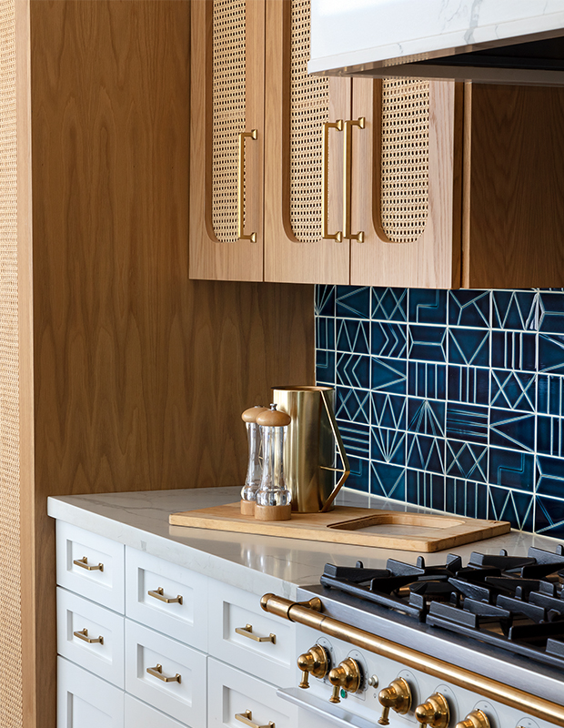
Mariana was given carte blanche on the appliances and chose the La Cornue range for its beauty. Simple white quartz counters balance the colour and pattern in the kitchen. Mariana added caning to the upper cabinets and the fridge. The oversized island has space for five stools.
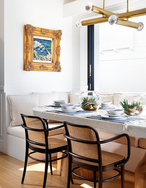
The breakfast nook has mid-century modern touches that work with the rest of the house.
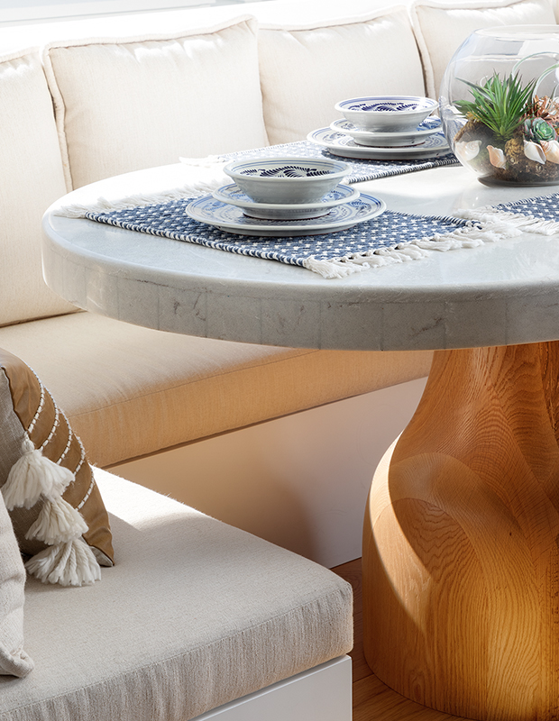
A banquette was a must-have for the homeowners, and turned an awkward niche into a casual seating area.
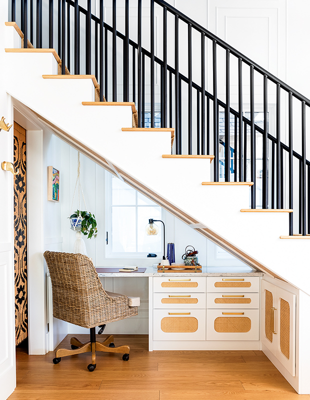
The cane detailing and brass hardware from the kitchen are continued in an office space tucked under the stairs.
Adrian Tiemens
House & Home July/August 2022
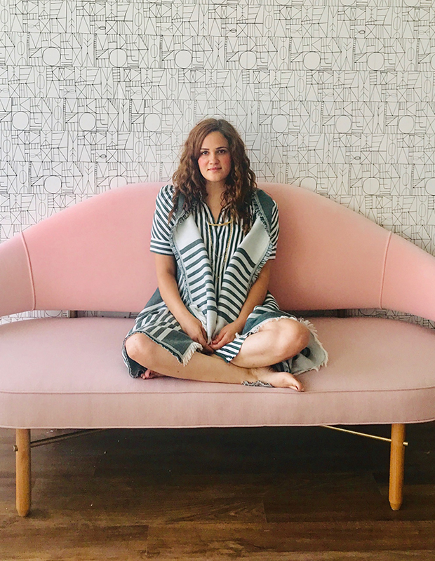
Mariana Postlethwaite


