Decorating & Design
Three Takes On The Classic Country Kitchen
Updated on November 17, 2023
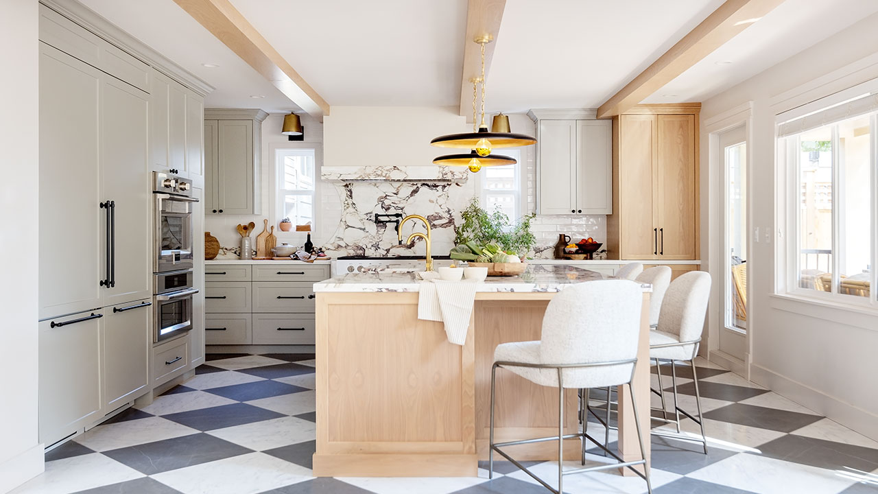
Country kitchens are having a moment right now. The traditional farmhouse style has been popularized with a modern twist, and we love to see how designers are putting their own personal touch on it. From Italian Farmhouse to New French Country, here we give you three fresh takes on the classic country kitchen style.
Scroll down!

Look 1: Italian Farmhouse
When Mauro Padula and Zohreh Serri renovated their Pemberton Heights home in North Vancouver, B.C., they wanted the kitchen to have an Italian country vibe. Having recently invited Mauro’s 81-year-old father, who grew up in Civitanova del Sannio, to move in, they wanted to strike an authentic chord to make him feel at home. (It must be working: he’s since planted olive trees in the garden.)
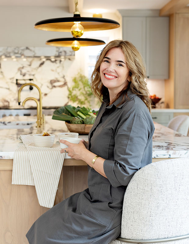
Designer Ami McKay, having just returned from house hunting in Puglia, Italy, was hired for the project.
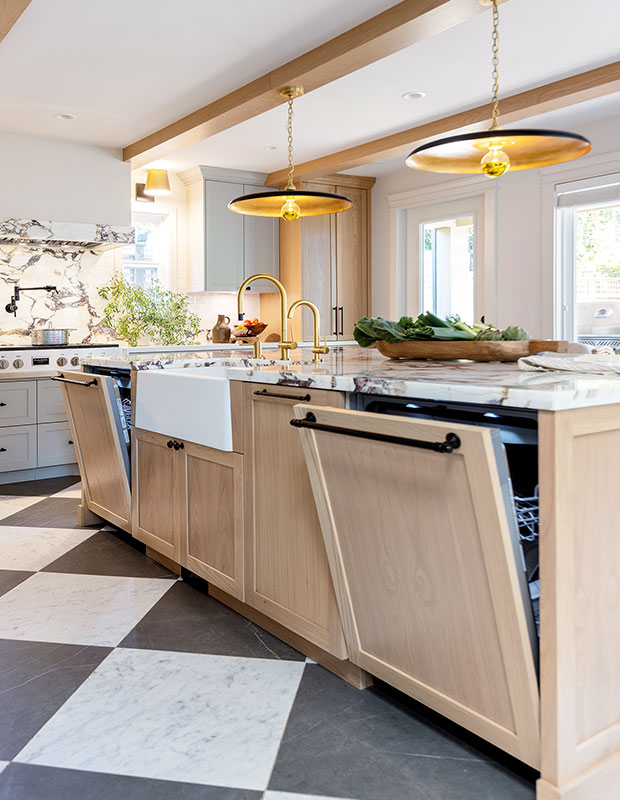
“The house isn’t very old, so we needed to inject the space with as much character as we could muster,” says Ami. Mauro and Zohreh wanted lots of counter space for making homemade pasta and pizza. They also requested Italian appliances and a small pantry prep area to house a salami slicer and accommodate canning vegetables. Because Mauro and Zohreh are frequent entertainers, two dishwashers were a must.
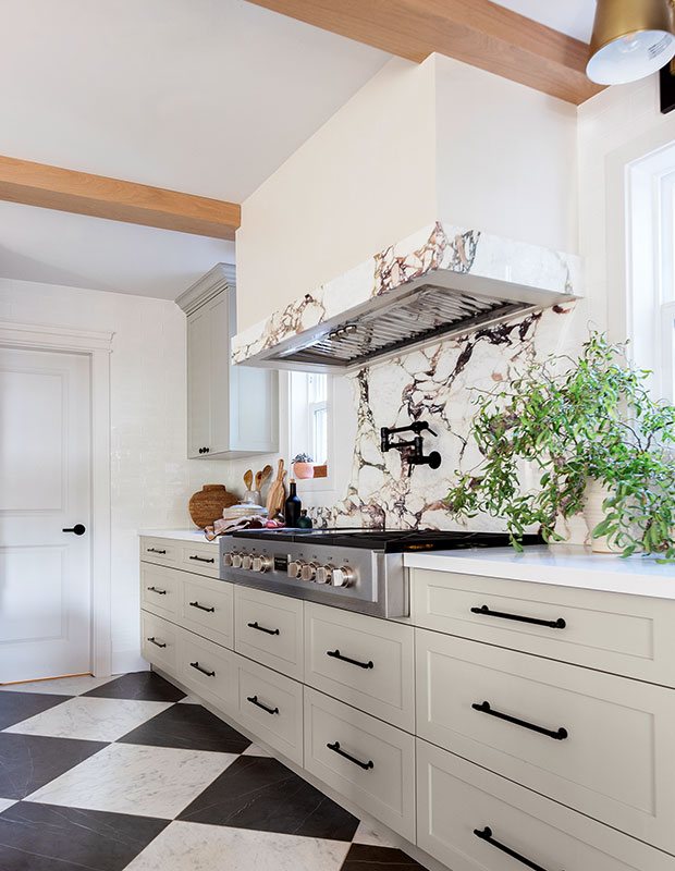
Zohreh initially wanted herringbone oak floors in the kitchen, but Ami convinced her that checkerboard would be more authentic. The large-scale porcelain tile in classic grey and white is complemented by a bold Calacatta Viola marble on the island counter, backsplash and trim, and an Italian lime plaster–finished vent hood is the crowning touch.
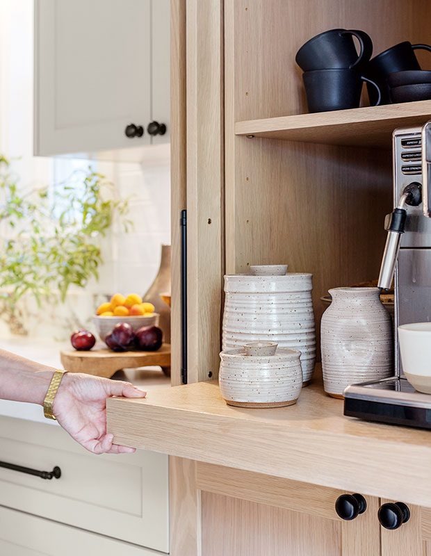
Pocket cabinet doors conceal a coffee bar. The base slides out for easy use.
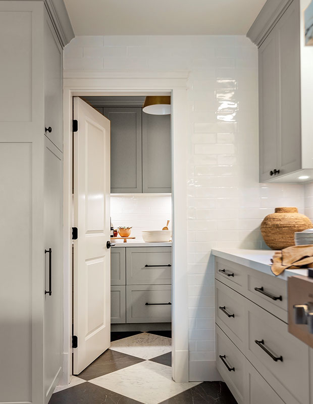
“The kitchen is subtle, earthy and warm,” says Ami. “The details make it interesting and more beautiful.” The couple loves the captivating yet comfortable feel of the kitchen, which is perfect for large family gatherings. A broom closet is tucked into the cabinet to the left of the pantry door. “I like using the ends of millwork to conceal things,” says Ami.
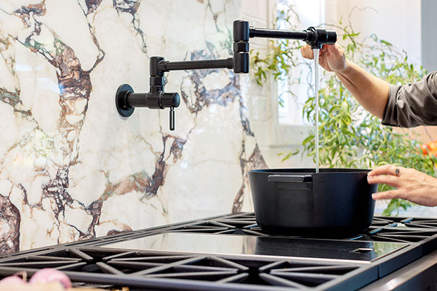
The pot filler and six-burner cooktop come in handy for making large family meals.
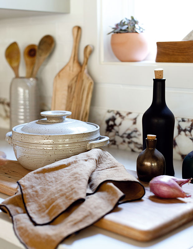
“We set up hors d’oeuvres on the island and a shot bar on the counter,” says Mauro. “The space has great flow and it’s big enough for 20 people to mingle.” Now that’s Italian.
Look 2: Classic Country
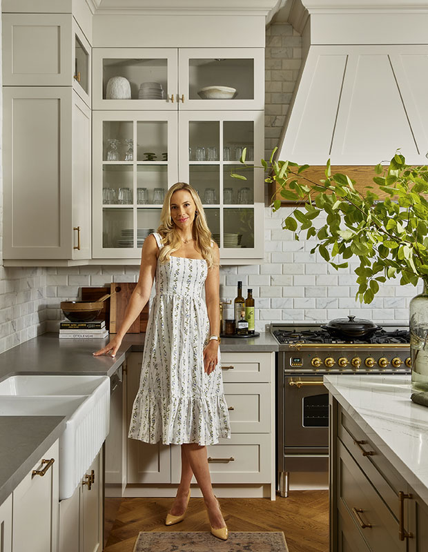
For the past 14 years, 1990s-style cabinets had been ruining the view out to Darlene Sweetman and Dr. Sean Rice’s wooded North Toronto backyard. Overdue for a change, Darlene, an artist, and Sean, a plastic surgeon, reached out to designer Mia Parres to help create a warm, updated kitchen that evoked a slower pace of life.
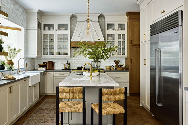
“This isn’t a sterile space — it has more layers,” says Mia. The layout and most of the existing appliances worked with Mia’s design, allowing Darlene and Sean to splurge on floor-to-ceiling marble-tiled walls, a mixed-metal range and fluted sink. Darker quartz counters were introduced on the perimeter to contrast with the lighter island top.
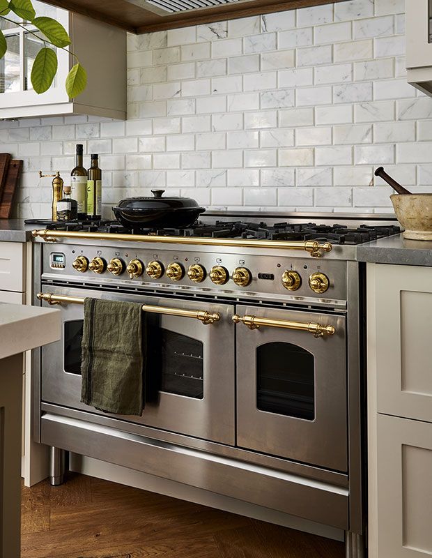
Custom-stained herringbone floors were Darlene’s idea; they tie in nicely with the oak edge on the custom vent hood, which Mia says gives the kitchen more dimension and a traditional look. The combo of warm colors, marble backsplash and wood creates a cosy space that’s timeless and on trend.
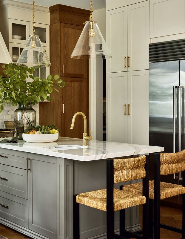
The island was painted a glossy dark grey to contrast with the light counter.
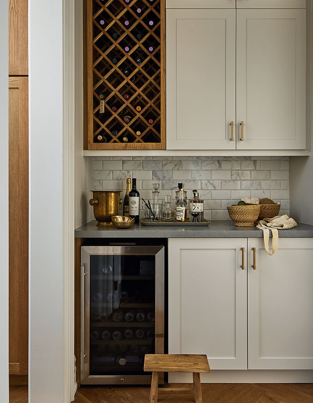
A new wine fridge was added to the butler’s pantry as part of the beverage centre. “They love the additional wine storage, which was made to match the flooring,” says Mia.
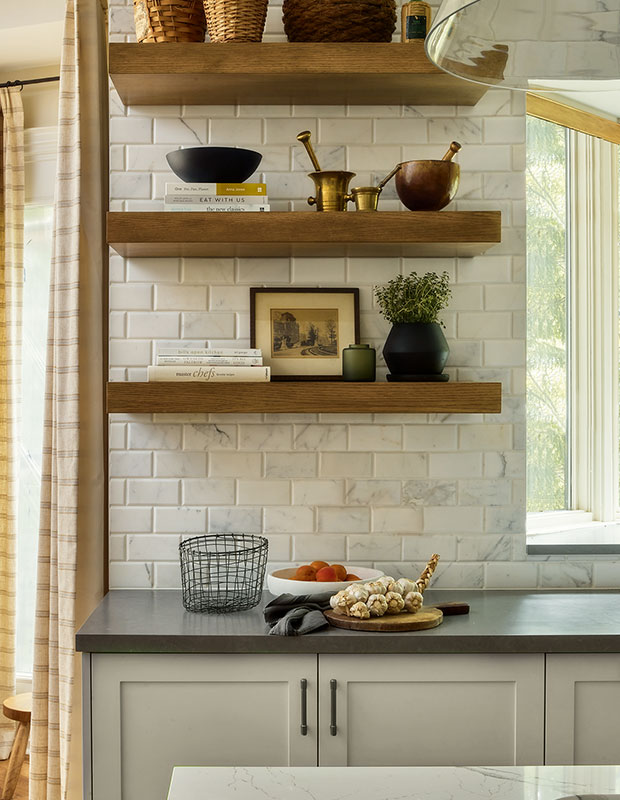
Floating oak shelves echo the floors. “The shelving opened up the space and allowed me to display my favorite pieces,” says Darlene. “We had a clear vision of what we wanted, and Mia brought it to the next level, showing us how to enhance the ceiling height and create an airy feeling.”
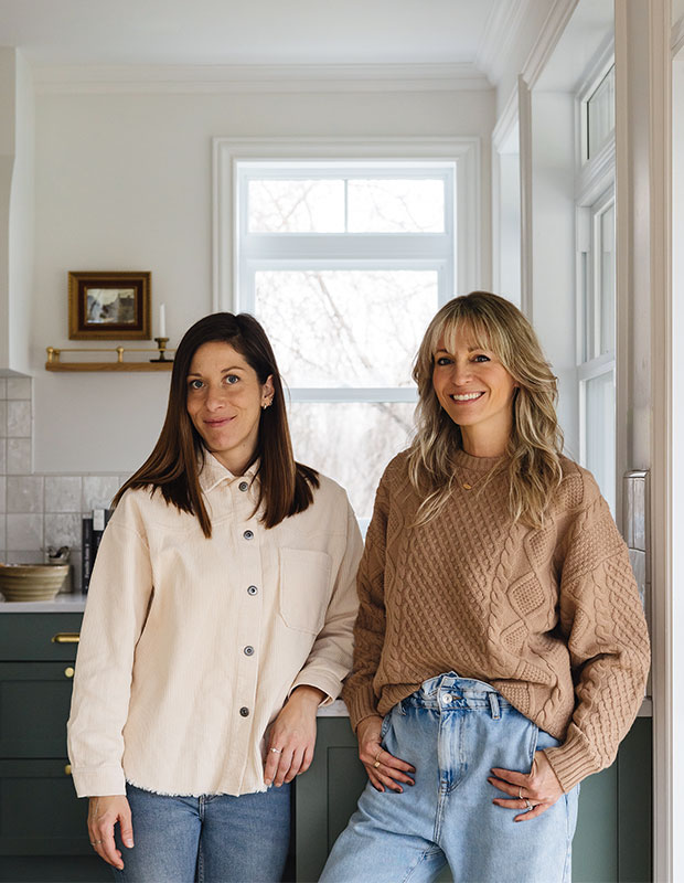
Look 3: New French Country
It was the spacious yard studded with maple trees that first drew Anne-Marie Drolet to the property in Lévis, Que. The house, with its tiny square kitchen, didn’t spark quite the same connection, so when she learned it didn’t have the structural integrity to withstand a renovation, she recruited designers Laurence Pons Lavigne and Mélanie Cherrier to help rebuild.
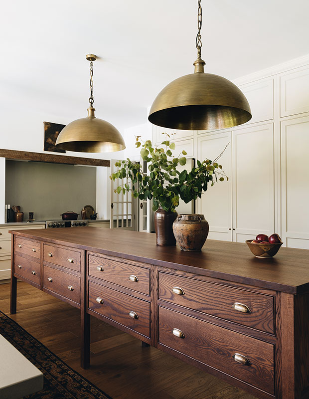
“I love their timeless style and the way they incorporate warmth into spaces,” she says. To achieve a heritage look, they brought in inset cabinets painted in a putty hue, red oak floors, a beam over the range and hammered brass pendants.
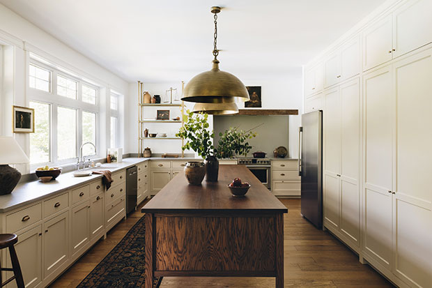
Instead of uppers, Mélanie and Laurence added a custom brass and glass shelf for displaying vintage pieces. “Anne-Marie embraces the antique, so she didn’t want a space with a clinical feel,” says Mélanie. The kitchen is long and narrow; a custom island in red oak on tall legs with apothecary-style drawers and brass cup pulls was designed to fit the space.
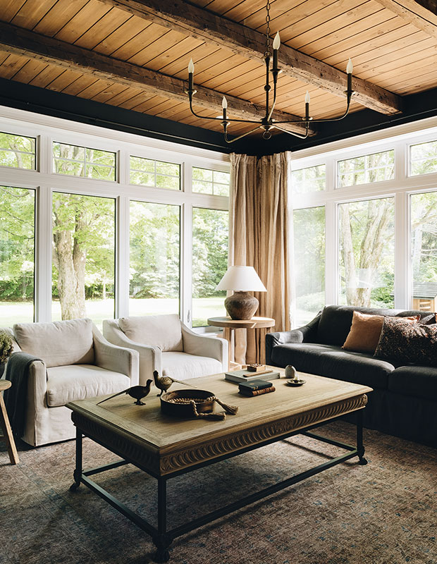
Floor-to-ceiling windows show off the living room’s wooded setting while accents such as linen upholstery, an earthenware lamp and linen drapes add texture.
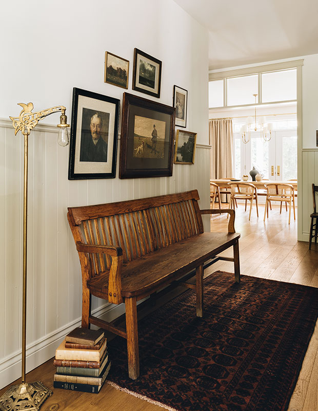
The gallery wall spills over onto the shiplap panelling, which helps establish a historical feel.
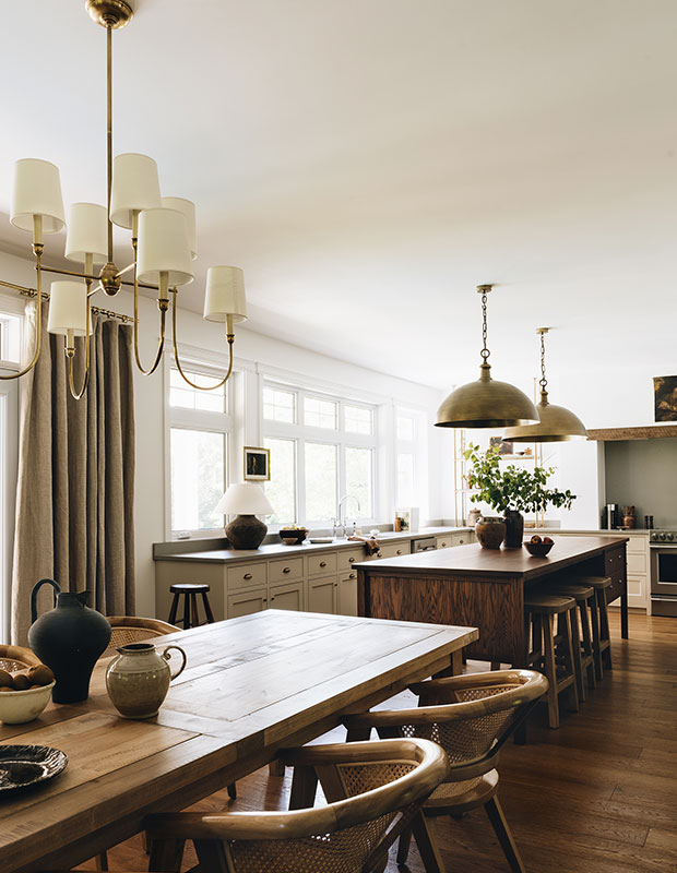
“My children do everything at this island: homework, drawing, eating and playing games. Now, our biggest worry is teaching our son not to climb on it!” says Anne-Marie with a laugh. A dining area next to the kitchen underscores the family-friendly character often present in older homes.


