

Decorating & Design
November 22, 2017
10+ Holiday Color Palettes That Go Beyond Traditional Red & Green

If you’re craving a change from traditional Christmas colors this year, we dare you to switch it up and try mixing in a little indigo, clementine or even light pink. After all, the holidays are about having fun and the decorating should be, too! Click through for fresh inspiration that’s sure to brighten up your holiday style.
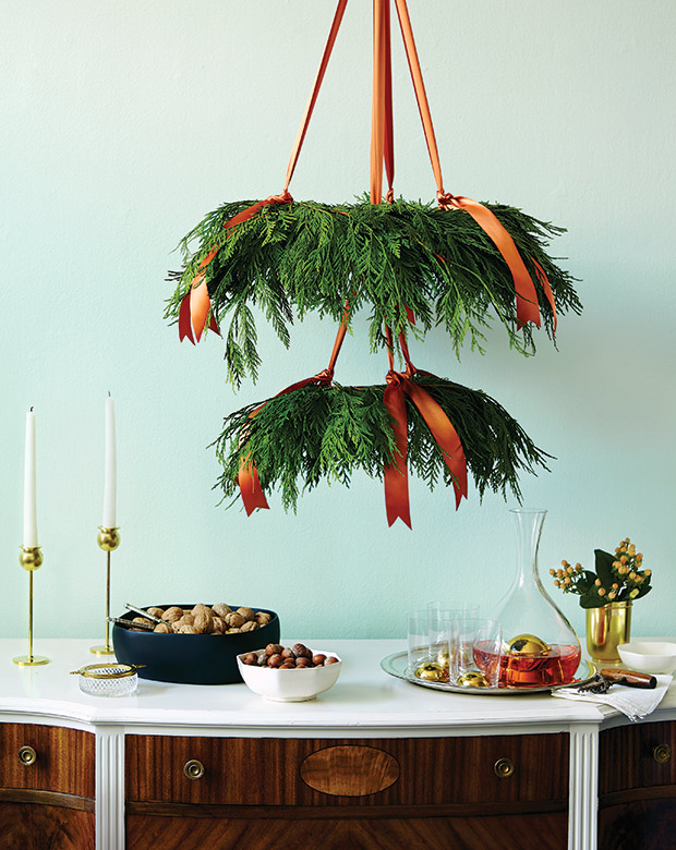
With clementines considered a staple at this time of year, it was only a matter of time before orange itself snuck into our holiday palettes. H&H design editor Lauren Petroff created an eye-catching display over a buffet table using real cedar and a generous amount of orange satin ribbon. A mint green wall keeps the look crisp.
Learn how to make this DIY Festive Chandelier.
In honor of welcoming her new baby daughter Lillya, designer Monika Hibbs went for soft pinks last Christmas. “I thought it was so fitting to do a pink theme for Christmas. Tons of blush pinks and coppers, it was even more beautiful than I planned!” she says.
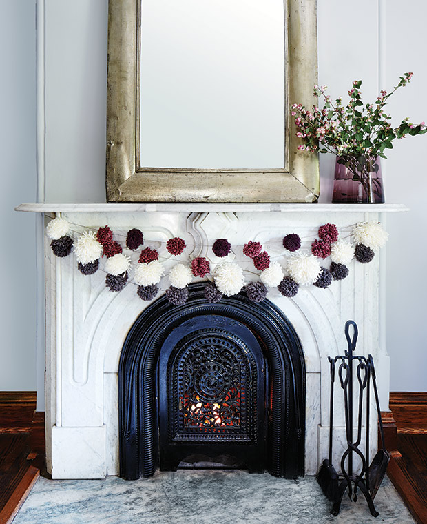
H&H senior design editor Stacey Smithers wanted something a bit more playful than the usual greenery on her mantel, so she decided to try her hand at making pompom garlands. “Rather than traditional red and green, I chose a slightly more sophisticated sugar-plum palette,” says Stacey. “These garlands look just as nice along a tabletop or up a stair railing plus, kids love them, too.”
Learn how to make this DIY Pompom Garland.

Blue may seem like an unconventional color choice for such a wintry time of year, but when mixed with warm metals it can look quite classic for Christmas. Here, a pair of sweater-like stockings knitted in blue really pop against the white mantle.
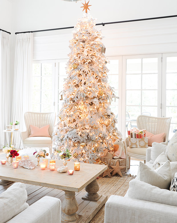
This Scandi-inspired look is easy to achieve if you’ve already got white accents throughout your home. With so many similar shades of cream and white, it’s all about layering in cozy textures.

Former H&H design editor Sarah Hartill decked her banister out with easy-to-assemble paper decorations in refreshing silver, white and gold hues. Set against her neutral front hall, the look feels special enough for the holidays but not over-the-top.
Learn how to make this DIY Festive Paper Garland.
This color combo may seem a little Fourth of July but as designer Emily Henderson proves, the look can be just as Christmassy. “Life really does become about seeing things through your kids eyes and with two small kids I was less interested in sophistication, and more into creating an environment that felt really playful and fun for them,” she says.

Green is a signature color of the holidays, but if you’re looking to tweak your palette while still staying true to seasonal hues, consider a lighter shade of green. Here, green silk ribbons and gilded accents look great next to understated kraft paper.
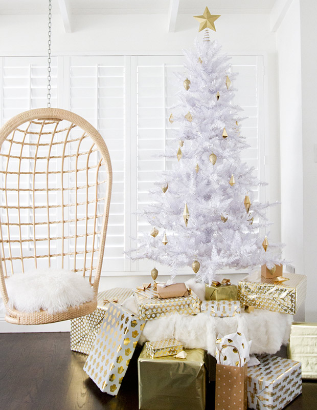
Minimalist whites meet maximalist golds in this funky holiday look from design blogger Sarah Sherman Samuel. “I wanted the holiday decorations to blend with the decor but still add all that extra sparkle that makes the season special,” says Sarah.
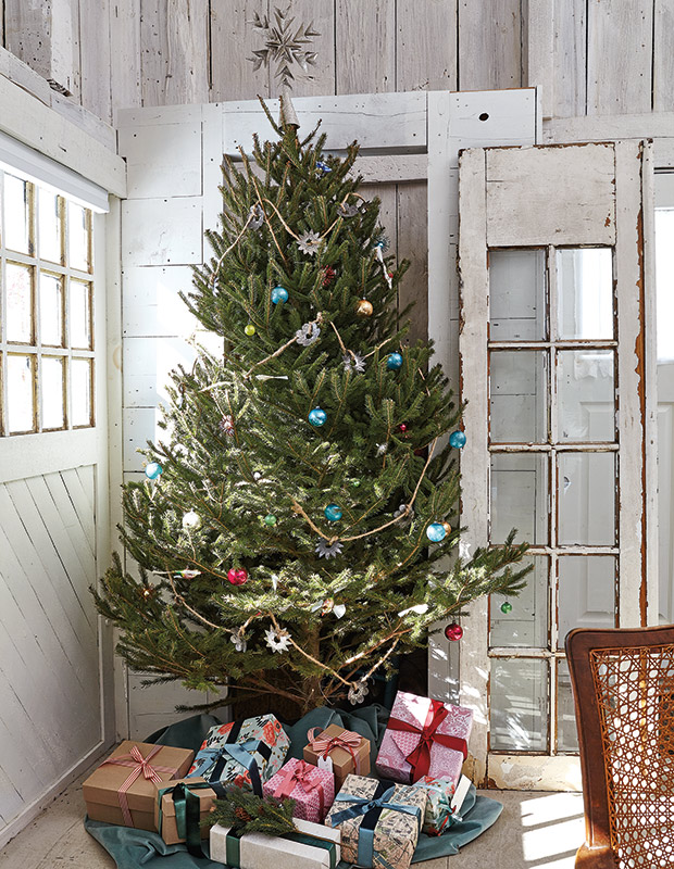
Candy-colored vintage ornaments, a pressed-tin star garland and gifts tied with wide bows add festive color to this white cabin. They also prove that special ornaments warrant a little breathing room, so you don’t need to over decorate your tree.
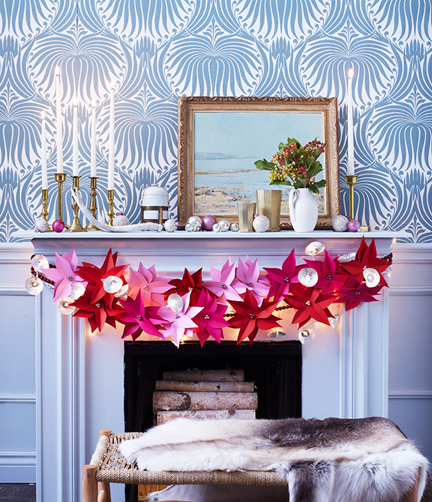
Rather than real red poinsettias, consider a vibrant display of pink paper ones dashed across your mantle.
Learn how to make these DIY Paper Crafts.
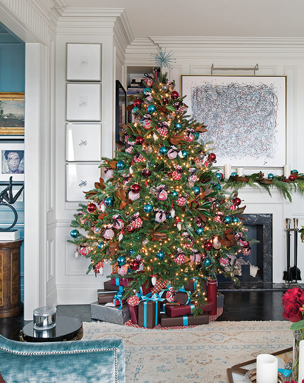
Designer Philip Mitchell and his partner, advertising executive Mark Narsansky, decked their Christmas tree in red and turquoise baubles ahead of their 60 person holiday party. Ornaments covered in Brunschwig & Fils fabrics are a standout designer touch.