Best Paint Colors
10 Paint Colors Inspiring H&H Editors Right Now
Published on May 16, 2017
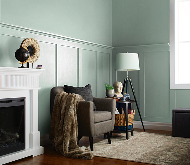
Spring is the season for wide-open windows, breezy linen and rattan, and hits of fresh color. So it’s no wonder that H&H editors have been diving into their paint decks lately, dreaming about coating their rooms in brand new hues. Experiencing a similar craving for color? Check out a few of the paint shades House & Home editors are loving now.
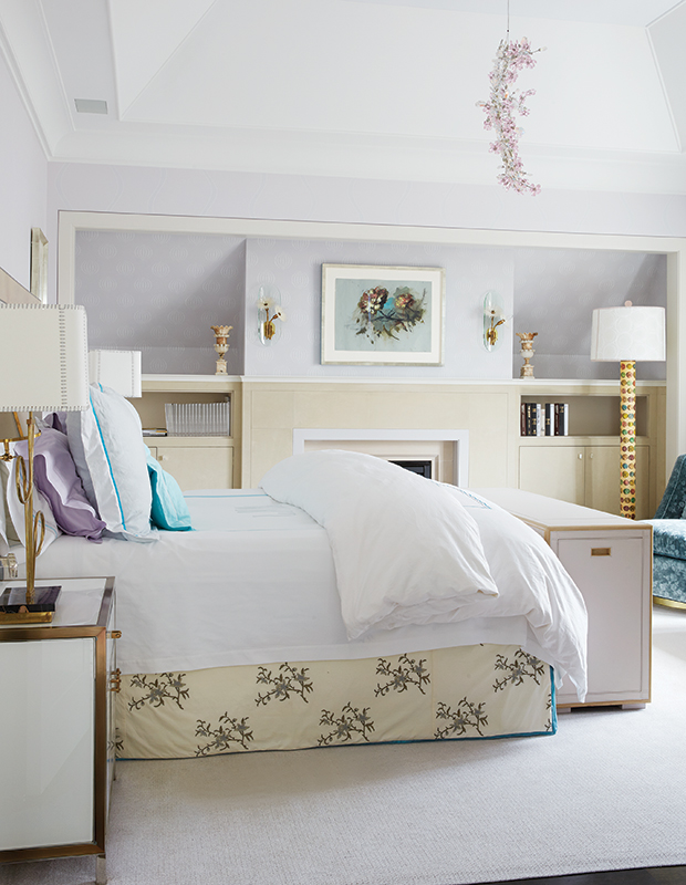
“I’ve always been the type to gravitate towards a more monochromatic color scheme. With that being said, I must admit there is one hue that has me swooning as of late: pale lavender, as seen in this bedroom. I love that it’s not an obvious shade of purple and can easily be used as a neutral in any space.”
— Sabina Sohail, Junior Web Editor
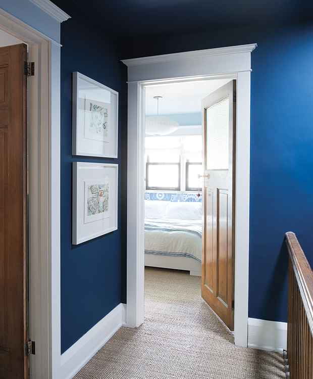
“My largely open-plan home has the same cream color in all the living spaces, and it has to go. I’d like to use a dark, saturated hue somewhere, but I’m afraid of making the space look smaller. That’s why I was really inspired by Cameron MacNeil’s use of bold cobalt (Benjamin Moore’s Champion Cobalt, to be exact) in his upstairs hallway. Introducing a statement color here is a great way to make a functional space feel special, and the white millwork really stands out against the rich blue.”
— Alice Lawlor, Editorial Director
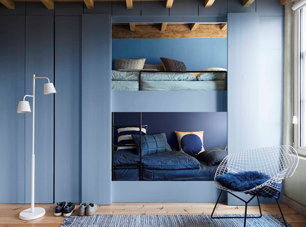
“If I could live in my vintage Levi’s denim shirt I would, so when I heard what Dulux U.K.’s Color of the Year was I knew my paint prayers had been answered. Reminiscent of a pair of well-worn jeans, Denim Drift is an easy-breezy hue I can see myself reaching for time and time again.”
— Emily Evans, Associate Editor
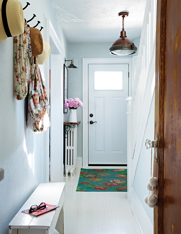
“I must admit I’m slow to commit to color on the walls, but after reading this gallery, I’m hooked on the idea of a barely-there blue. I love that it’s more unexpected than white, yet still neutral enough to layer in other colors. Fresh and livable, it has all the qualities I’m looking for in a paint color!”
— Adena Leigh, Web Editor

“I love atmospheric colors that you can’t really define. Premier Paints’ Blue Artichoke could read as blue, green or even grey. It’s fresh without being minty-sweet. Yum.”
— Wendy Jacob, Features Editor
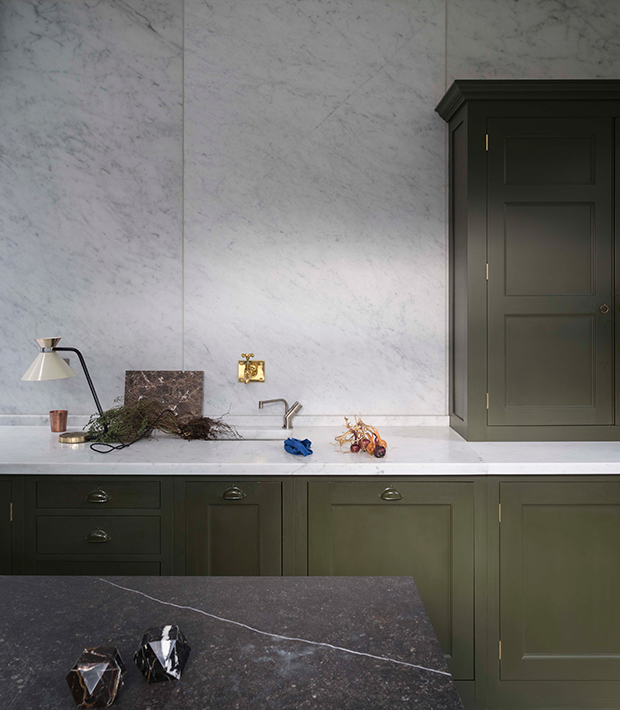
“I’ve had a long-lasting love for the color green, and am still desperately trying to work it into some application at home. The shade I’m drawn to right now is an earthy and rich army green that’s both livable and bold. I’d consider a green like this in place of black or grey. The color of the cabinets in this kitchen by Plain English is perfect, and I love how the designers extended the color over the cabinet pulls.”
— Lauren Petroff, Design Editor
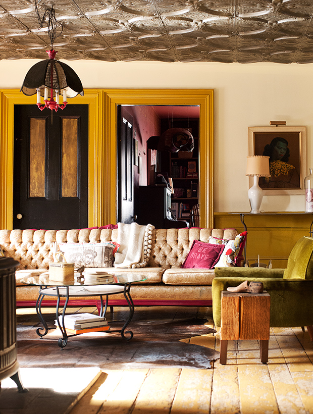
“When I think of the coming summer season, yellow is the first color that comes to mind. While canary or citrusy tones are perennial favorites, this year, I can’t help but be inspired by deeper, richer tones. Used here on door trim, Behr’s Leisure still feels summery, but calls to mind something warmer and more romantic than its livelier counterparts — I’m thinking of the golden hour.”
— Amanda Tucci, Editorial Assistant
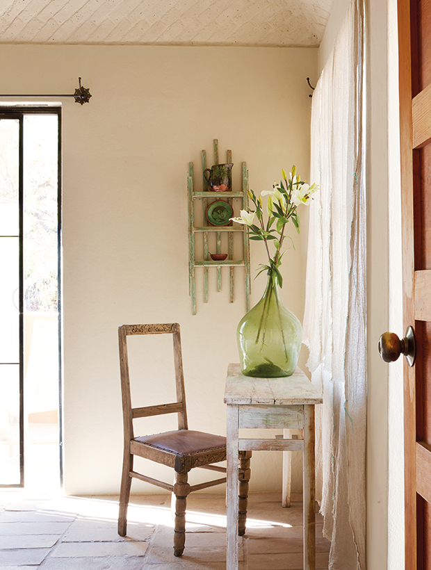
“In a world dominated by grey and gallery-white spaces, slightly warmer neutrals feel fresher to me. So, lately, I’ve been drawn to images like this shot of David Cubitt’s holiday home in Mexico. The wheat-like wall color is sunny yet subdued. Just right.”
— Reiko Milley, Associate Editor
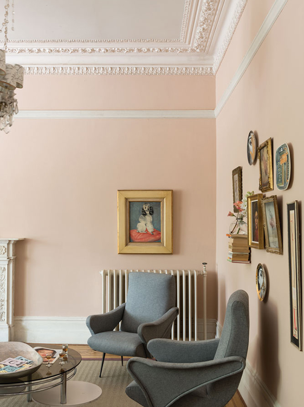
“This spring, I’m longing for a refreshing bright pink. Thanks to its yellow pigments, Setting Plaster by Farrow & Ball is a step warmer than Millennial Pink, making it livable and not too precious. In my opinion, this dusty blush is the perfect shade of pink — formal but with a touch of playfulness.”
— Jessica Flower, Assistant Editor
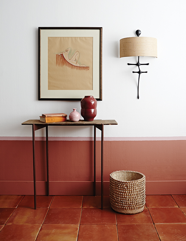
“Although my love of clean, cool-toned colors will never die, right now I’m finding myself more and more drawn towards warm, earthy shades: Terracotta, taupe, and rusty ochres. I especially love these shades paired with soft beige, olive green or blush pink. Case in point: This clay-colored half-wall trimmed with a soft pink edge.”
— Jen Masseau, Assistant Design Editor

