

Before & After
Before & After: A 1970s Bowen Island Cabin Gets A Modern Refresh
Updated on November 28, 2023
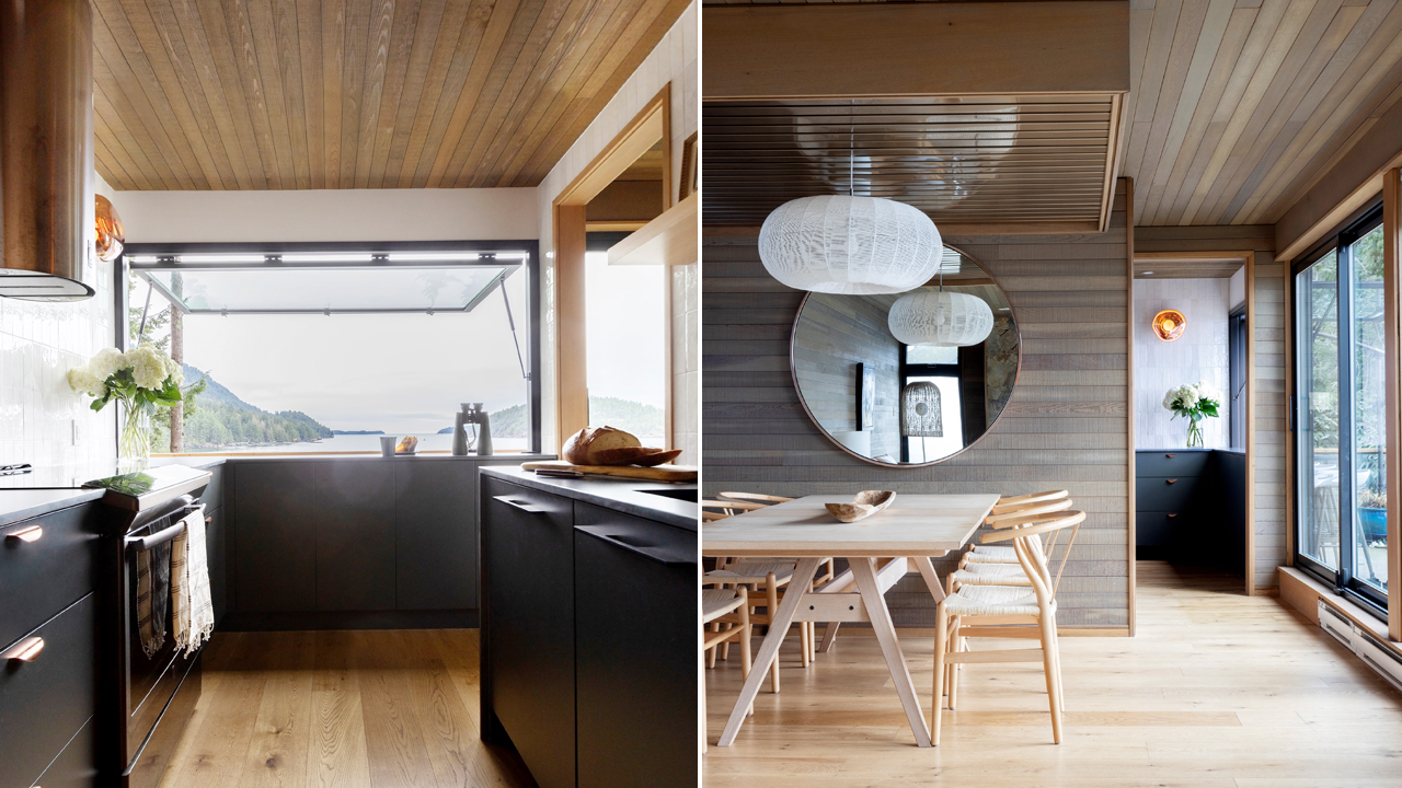
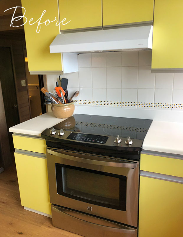
Trained to spot a gem, realtor Ruthie Shugarman saw potential when this 1970s-era waterfront Bowen Island cabin came to market in 2019. She and her lawyer husband, Danny, had long been searching for the perfect cabin in the Pacific Northwest to enjoy with their two teen children, Talia and Cooper, and this one hit all the right notes. Its clean-lined, three-story frame sat perched on Grafton Bay and captured perfect sunsets, while its almost 3,100-square-foot interiors, lined in cedar paneling with a 1970s galley kitchen in citrus hues, presented opportunities to riff on a design era Ruthie loved. It all went swimmingly—until the tide turned.
“At first, I embraced the little yellow kitchen,” says Ruthie. “It felt like a perennial pop of sunshine during the pandemic’s first cold, rainy winter.” But by the spring of 2020, the family found themselves spending more time here and Ruthie struggled to make the small space work. She tried adding updates like pastel-colored Smeg appliances—a pink toaster, an aqua blender, but it always felt wrong. “It started to feel like a lemonade stand,” she laughs.
The following spring, the couple made the decision: it was time for the cramped lemon kitchen to undergo a facelift. She turned to friend and trained architect-turned-designer Jocelyn Ross of JRStudioworks. Jocelyn envisioned a space that felt both maritime-like without being kitschy, but also something that didn’t feel precious. Instead of eschewing the 1970s cedar, the designer leaned into it. Cabinets would be navy contrasted with white backsplash tile all framed in cedar.
We chatted with the architectural designer to find out how this kitchen went from bright to bold in a few key steps.
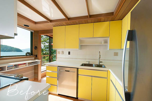
Before: The galley kitchen was heavy on 1970s-era hallmarks—a compact galley design, low sunshine ceilings and a psychedelic color—but it lacked functionality due to its pint-sized footprint.
House & Home: How did you envision the new design of the kitchen?
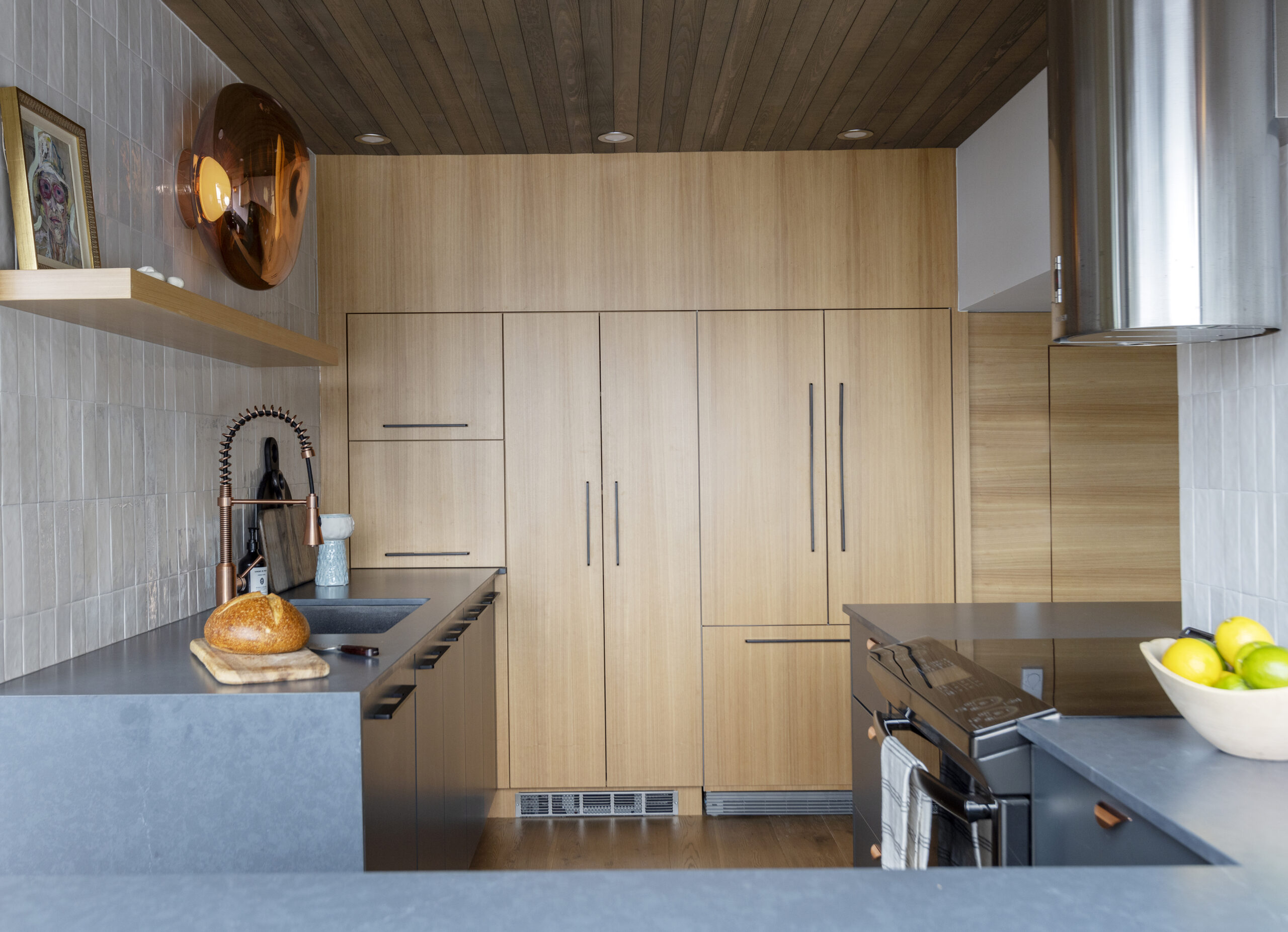
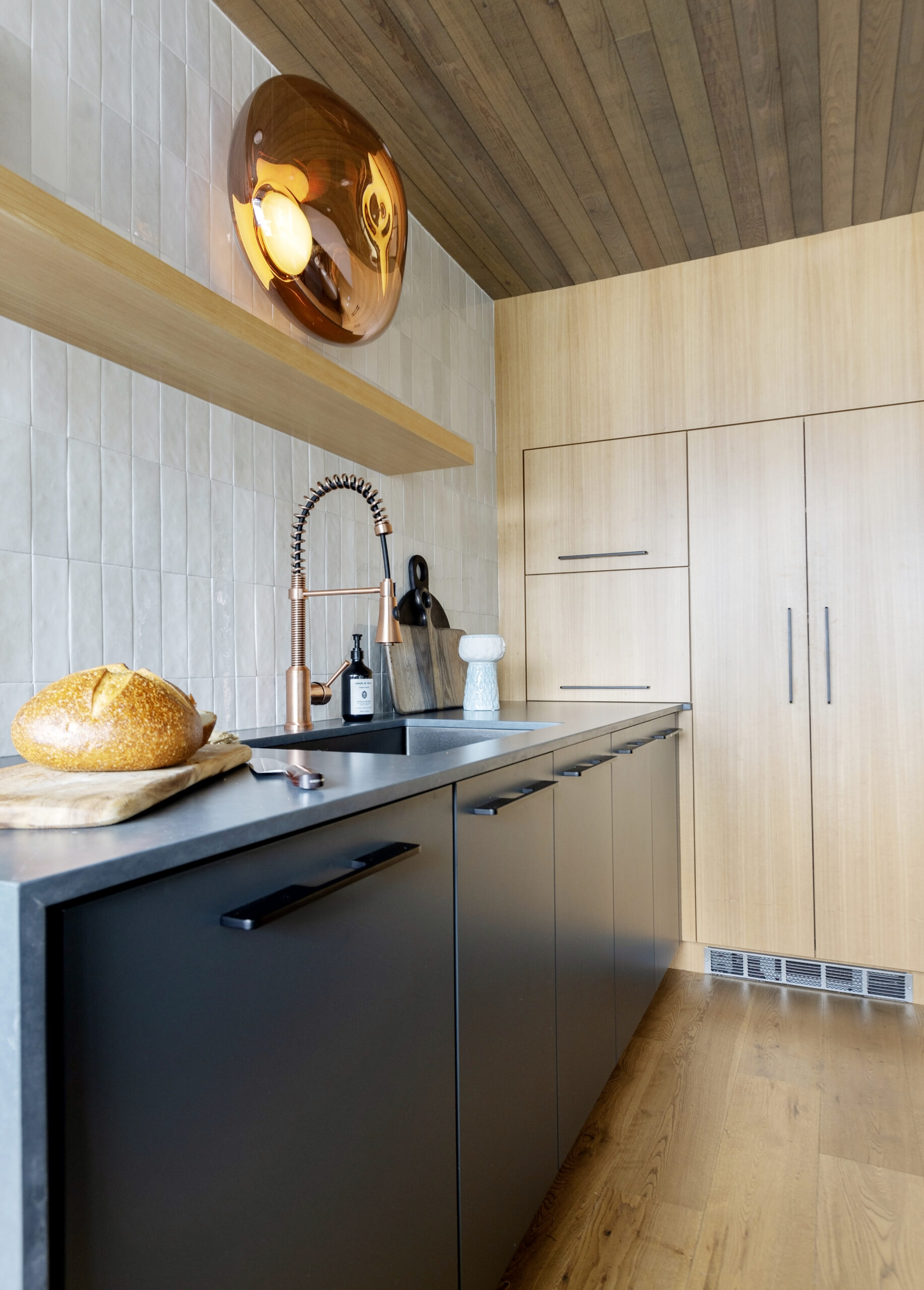
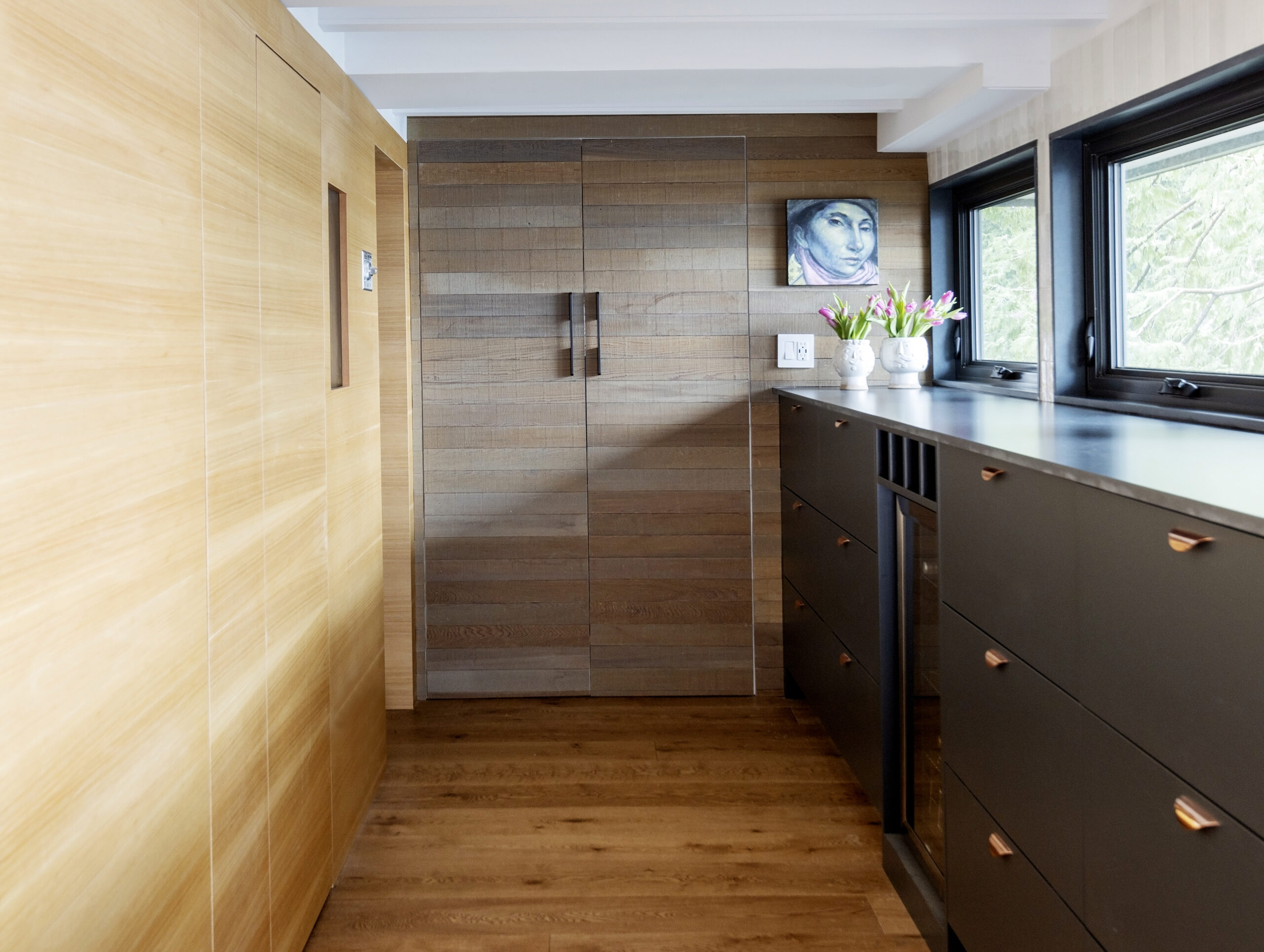
Jocelyn Ross: From the initial walk-through on Facetime and then analyzing original 1973 blueprints, I could see there was a storage room behind the wall with the fridge, which gave us three-feet of extra space to work with. I wanted to recess a large pantry cupboard in the middle with the panel-ready fridge on the right and an appliance cupboard on the left. By cladding the rest of the wall in matching cedar panelling, we created the illusion of more space.
H&H: We love the new mix of color, texture and materials throughout. Can you share some of the details?
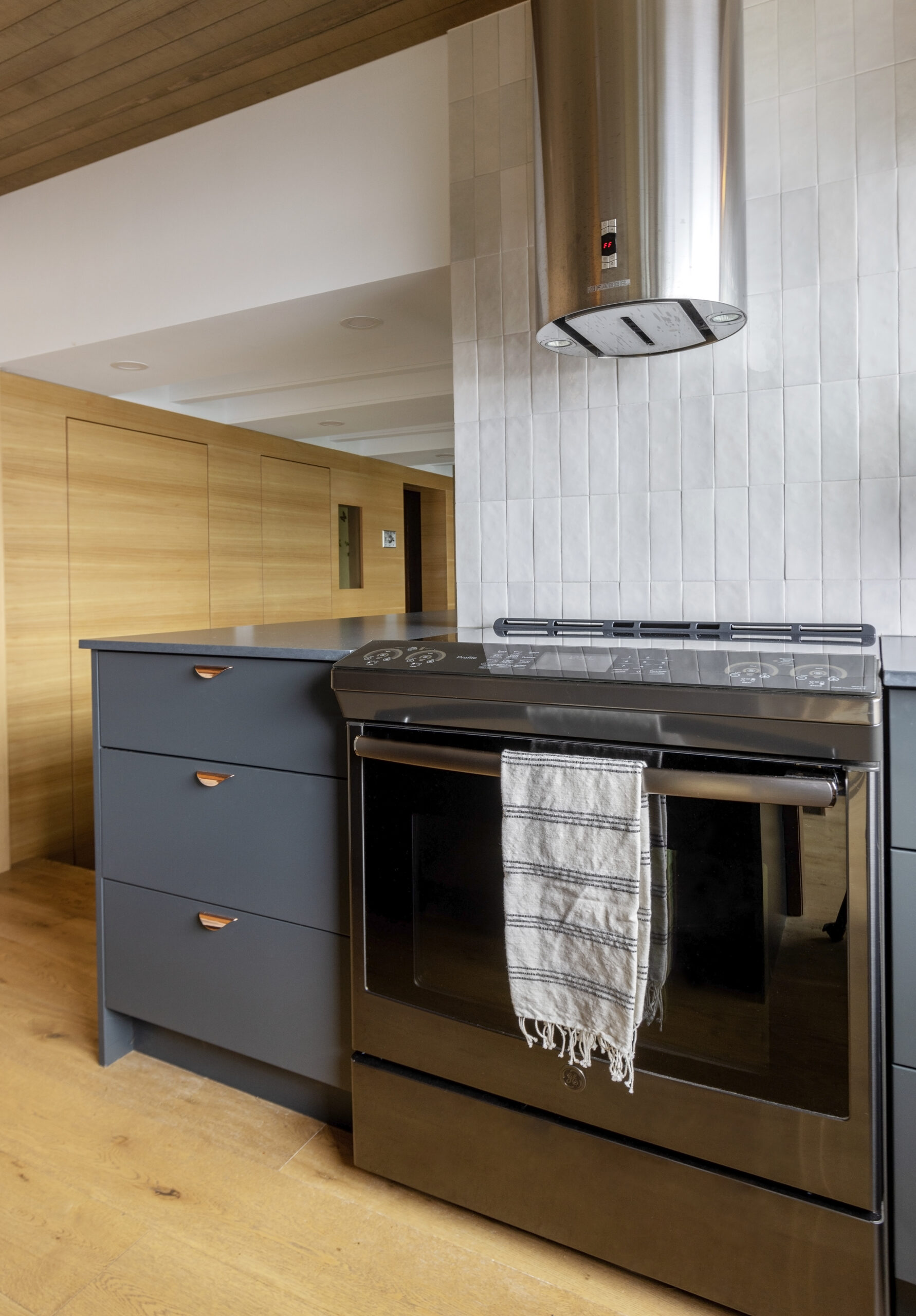
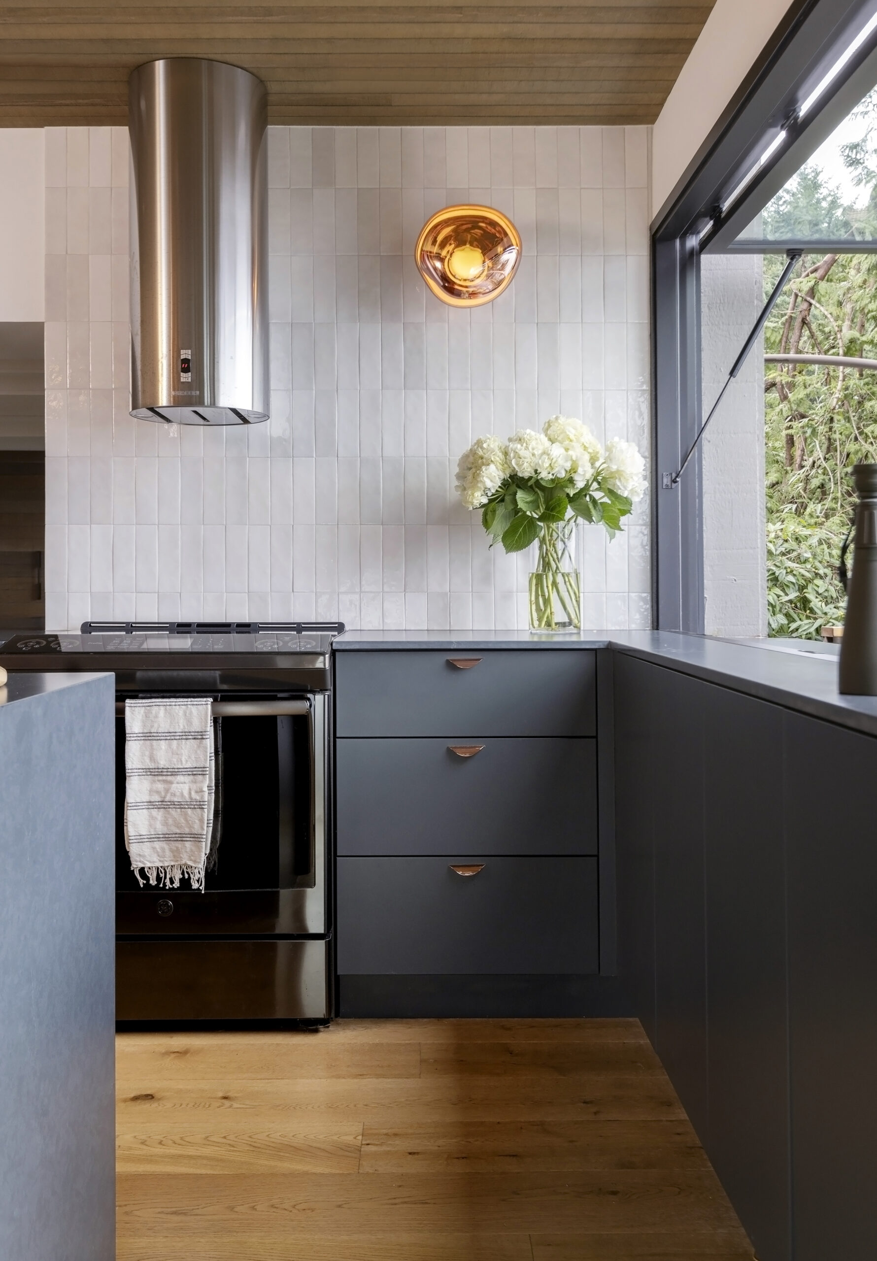
JR: The lower cabinets and drawers are in Benjamin Moore’s Hale Navy to channel the ocean outside for a rich, grounded feeling. I didn’t want the kitchen to feel too dark, so we added a floating shelf in cedar and layered in sparkly features like rose-gold hardware that echoes the hue of the Tom Dixon Melt sconces. These dramatic molten-glass lights channel a 1970s hippy vibe, which was a way to honor the kitchen’s original roots.
Before: Ruthie wanted to keep costs low by avoiding major structural changes. “I didn’t want to break the bank to create a fancy kitchen in such a tiny space,” she says.
H&H: Where did you save and splurge?
JR: We left all the fixtures where they were, as well as electrical. The hood fan, appliances and sink plumbing also stayed in place. When you’re not moving things around, you can focus on cosmetic changes rather than structural. We then splurged on the dramatic Tom Dixon Melt lights which hark back to that 1970s vibe.
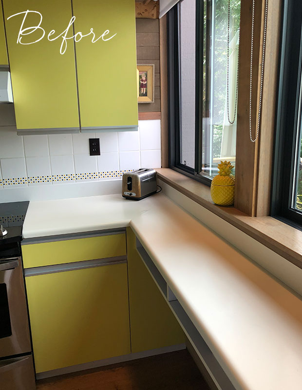
Before: Upper cabinets in the tiny kitchen meant views of the water were obstructed, while the old white backsplash tile with small stencilled flowers was dated.
H&H: How did you justify removing upper cabinets in such a small space?
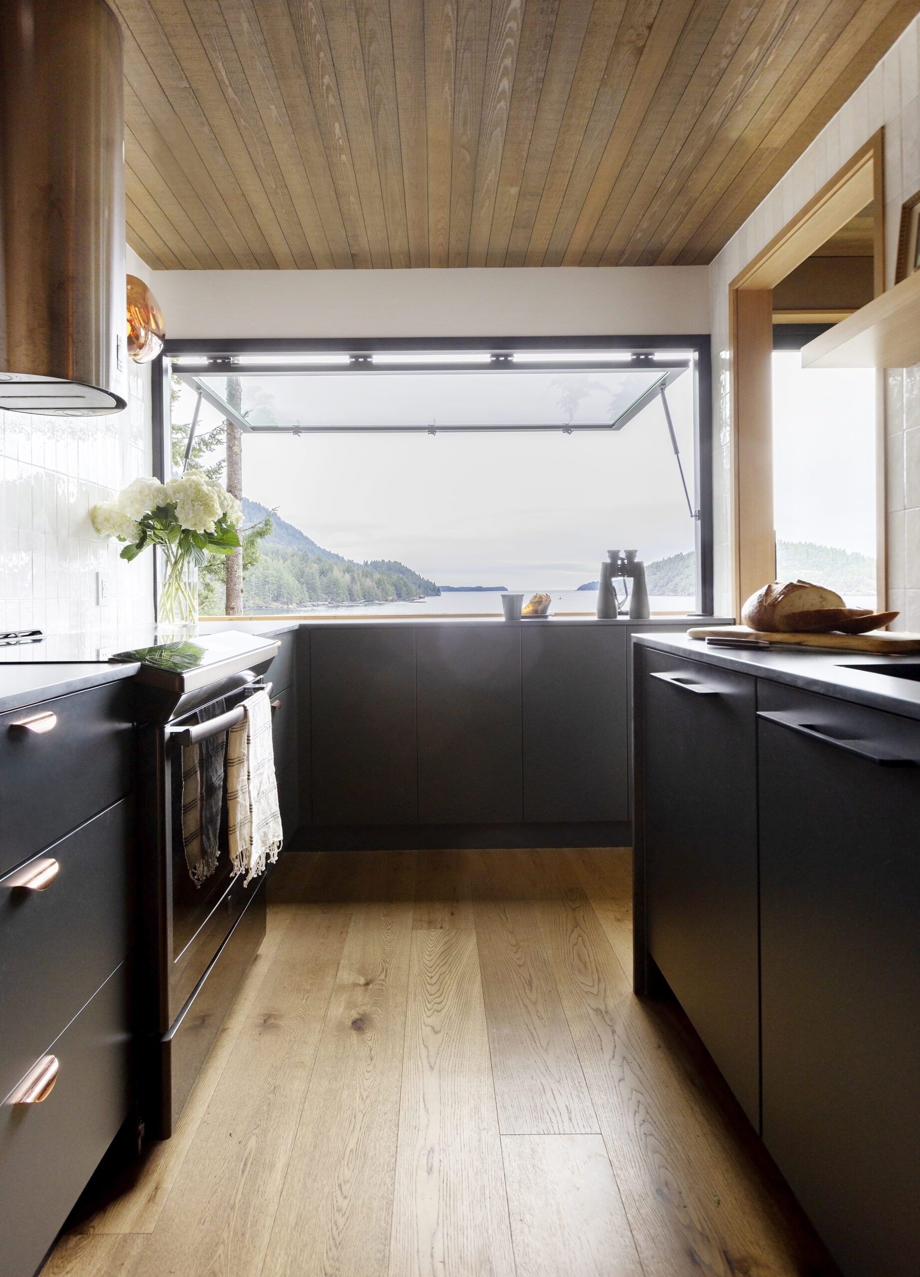
JR: By adding a pantry cupboard on the fridge wall, I knew we we were making up for that critical storage. With the sunshine ceiling also removed, we could now carry the backsplash tile all the way up to the ceiling for dramatic effect. It’s constantly shimmering and refracting light so the kitchen feels even brighter than it did before.
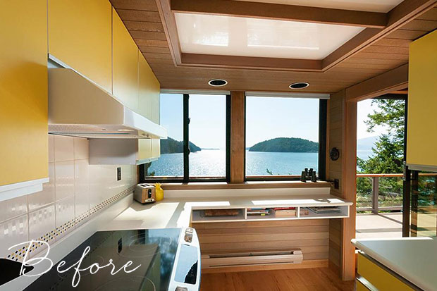
Before: Views from the tiny kitchen were spectacular, but didn’t maximize its potential.
H&H: What a view! Tell us about this gorgeous transformation!
JR: We added a giant 4 x 7 ft. cafe-style window that swings open to the outside and makes the petite kitchen feel more expansive. It’s a great place for the homeowners to cook with a view.
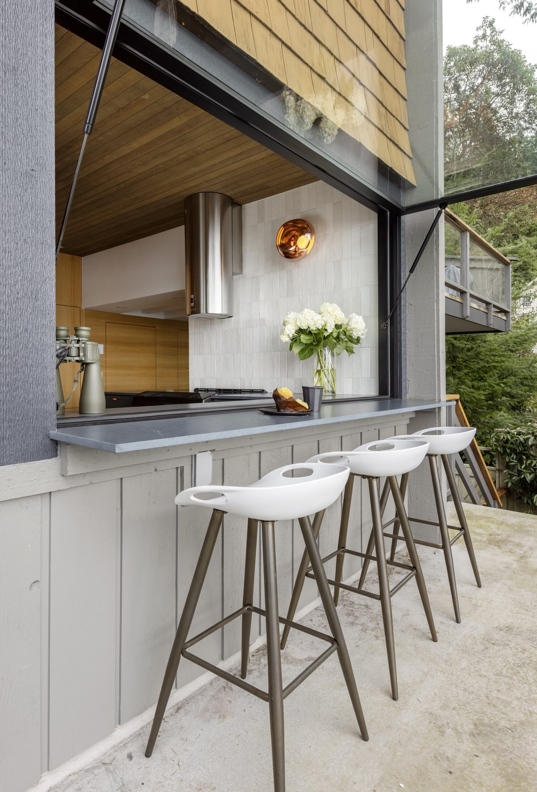
A 28″ counter outside feels like a resort bar. “It creates a seamless indoor-outdoor moment for easy outdoor entertaining,” says Jocelyn.
Before: One part of the L-shaped kitchen featured a built-in desk and access to the laundry while the other housed the main appliances. The area with the desk quickly became a repository for junk and accessories that felt disconnected from the main hub.
H&H: How did you reimagine the extra arm of the kitchen?
JR: We leaned into the idea of a galley kitchen on a maritime ship and matched the blue cabinets, counters and cedar panels from the main kitchen for continuity. This area now serves as a functional morning coffee bar or useful prep space for party time!
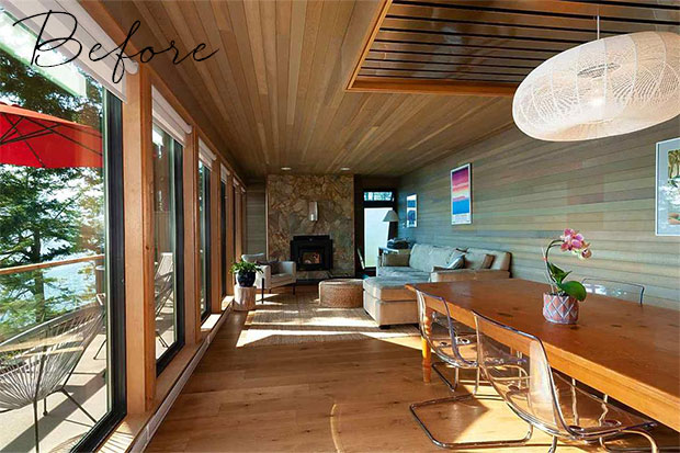
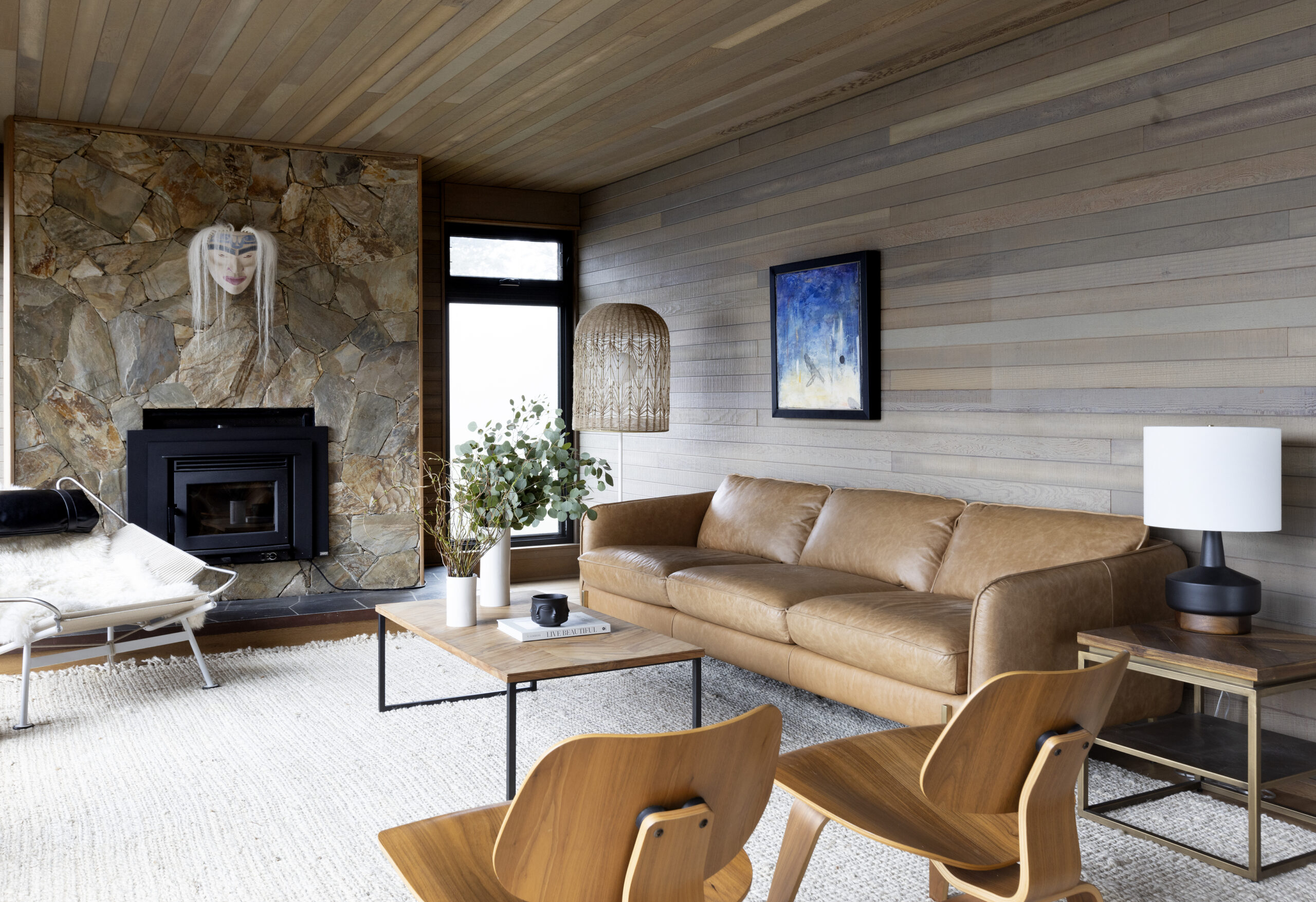
Before: The open-concept living space had a rustic feel but lacked character. “Ruthie loved the retro look, but wanted to find a balance between updating it from a functional standpoint, while keeping it arty and true to its design DNA,” says Jocelyn.
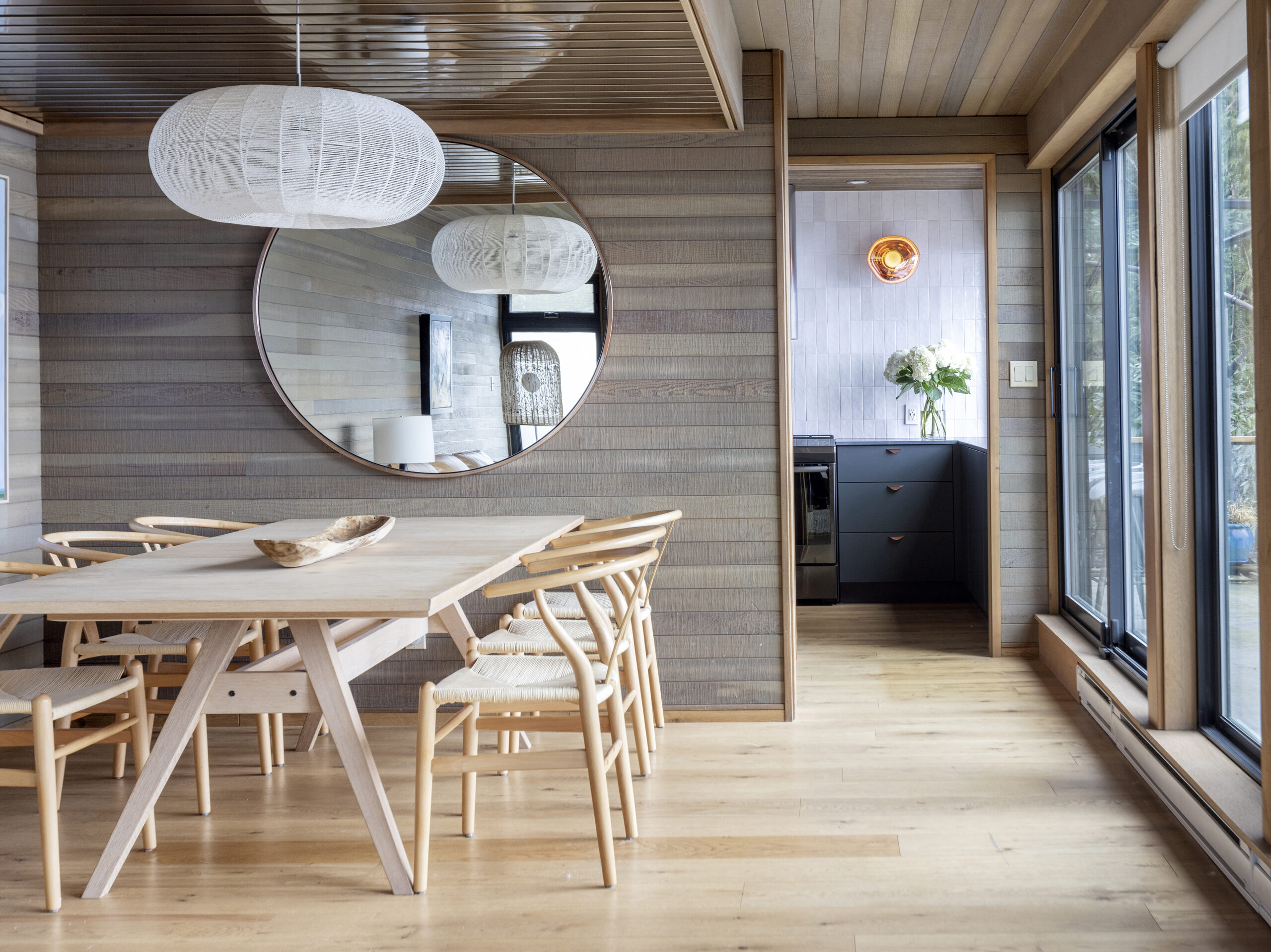
The cabin has been transformed into a modern gem that better suits the waterfront home’s original cedar-clad walls and low ceiling heights. Navy colored cabinets in the kitchen now nod to the ocean while monochromatic, handmade backsplash tile adds earthiness and helps draw the eye upwards to create the illusion of a taller ceiling.
Janis Nicolay
Jocelyn Ross of JRStudioworks