Decorating & Design
Before & After: A Closer Look At Our Airstream Makeover
Published on June 15, 2016
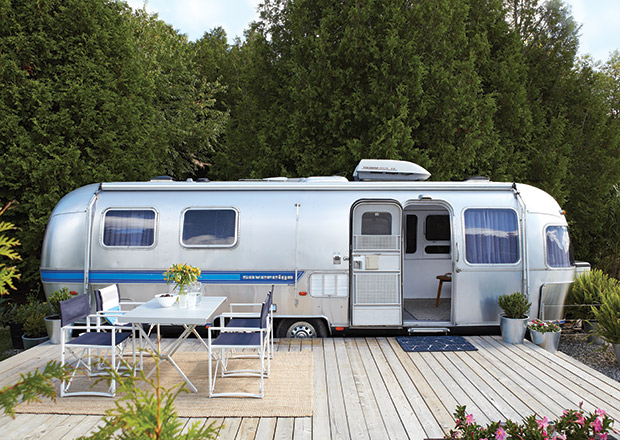
In our most popular H&H TV video of 2015, a 210-foot airstream trailer was transformed into a charming weekend getaway. Now, we’re sharing an in-depth look at the before and after photos. Homeowners Kent Worth, a manager at fabric house Kravet Canada, and Sean Swayze, a designer with Bryon Patton & Associates, worked to bring the dated trailer up to their style standards. Click and slide through the below images see the jaw-dropping before and after photos of the makeover from start to finish.

Kent and Sean built a large cedar deck platform to add usable square-footage to their weekend home, creating an alfresco dining space and lounge area for taking in the sun. Plants in stainless steel pots soften the look and are a nod to the trailer’s aluminum body.
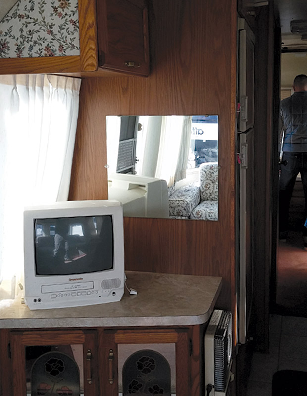
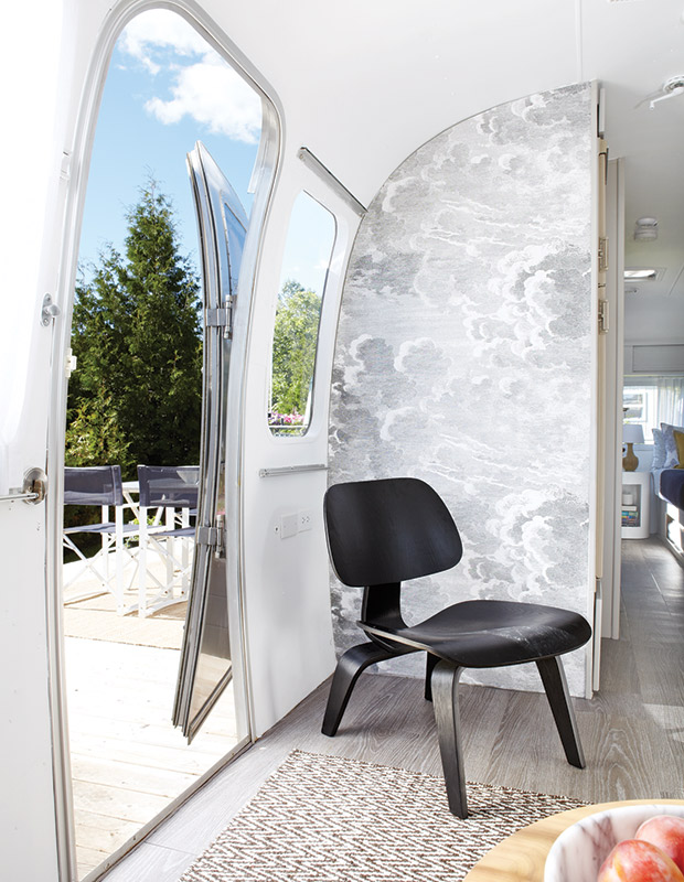
An awkward TV cabinet and upper cupboard at the door were removed to make the interior feel less closed-off. The cloud-print Fornasetti wallpaper was the inspiration for the overall aesthetic: airy and whimsical, it “adds to the dream-like quality of the space,” says Kent. Wide-strip vinyl flooring is reminiscent of pale driftwood, enhancing the casual cottage vibe, while an iconic Eames chair mixes in modern-classic design. “We wanted to bring a bit of luxury,” says Kent.
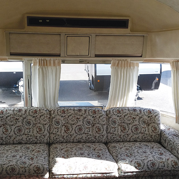
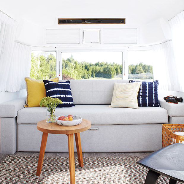
The trailer’s original sofa was a perfect fit in the main living space, so Kent and Sean simply had it reupholstered in durable outdoor fabric and had single bench and back cushions made for a cleaner and more sophisticated look than the old three-cushion design had. The sofa folds out into a double bed when friends visit. Crisp white paint on the walls and ceiling helps the tiny trailer feel more spacious and inviting.
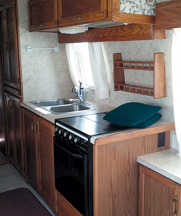
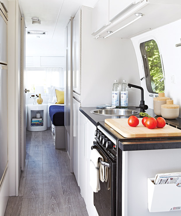
The kitchen is where most of the heavy lifting took place. Kent and Sean kept the cabinet framework intact but had all the doorfronts replaced with custom-made flat ones for an unfussy look. A single round sink and graphic black faucet lend a modern edge, and black laminate counters are superdurable. Dingy ceramic floor tiles were ripped out to make way for the soft grey vinyl planks that run throughout the camper.
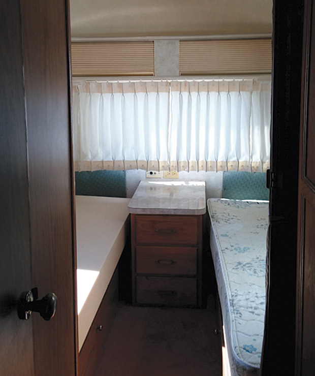
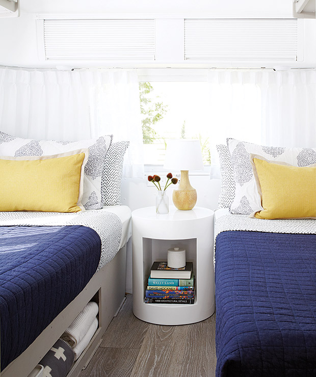
The clever, compact design of the original twin beds incorporates key storage in the bedroom. Kent and Sean painted the bedframes a smoky grey that complements the new flooring. Low-key patterns in the bedding add visual interest, and gauzy white drapes on all the windows have a relaxed feel. The circular table adds more storage, and its shapely design echoes the trailer’s rounded frame.
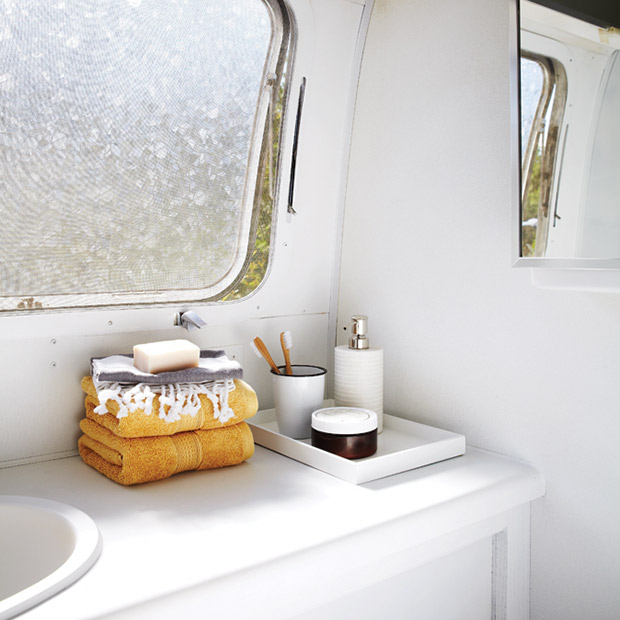
The tiny bathroom, which includes a shower stall, was freshened up with a coat of white paint on the walls and cabinet, as well as new mosaic vinyl flooring (not shown). A frosted window covering adds privacy without blocking light.
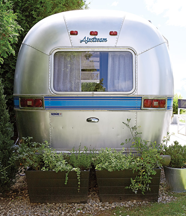
The aluminum exterior means the trailer only needs washing and polishing once a year, so opening weekend feels like it’s over before it’s begun. “We just plug it in when we get here, and that’s it,” says Sean. The iconic rounded corners of the Airstream have a distinctly retro vibe, and, in a happy coincidence, the trailer’s blue stripe perfectly fit with what the two had planned for the interior palette. It was the excellent state of the exterior that convinced the couple to buy — “As long as the exterior had integrity and didn’t leak, we felt we could deal with the interior ourselves,” says Sean.
Valerie Wilcox
House & Home July 2015
Kent Worth & Sean Swayze


