Before & After
Inside A Designer’s Mid-century Modern House — With A Banquette That Does It All
Updated on February 12, 2024
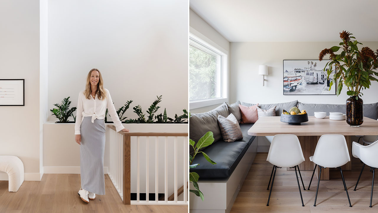
For over a decade, Canadian designer Brooke Butler has been creating beautiful homes with the same guiding mantra in mind. “My goal is to design spaces that marry form with function and have a deep connection with nature,” says Brooke. In a recent cross-country move from Ontario to Alberta, Brooke brought it home in the transformation of a circa-1986 bungalow. The ranch-style house sits on a private golf course and is only one hour from Canmore. “It’s a rare blend of natural beauty and tranquillity within a city like Calgary,” says Brooke. As for the design style, it was evident from the first time she saw it. “I was drawn to this house for its mid-century modern vibe,” says Brooke.
See how Brooke weaves mid-century modern elements throughout her home, including the preservation of wood-clad ceilings, a sunken living room, a wood-burning fireplace and a handful of mid-century light fixtures. “My design approach is rooted in mid-century principles while my aesthetic is defined by clean, contemporary lines coupled with textures, materials and hues inspired by nature.”
We chatted with Brooke on her coast-to-coast move and what went into re-imagining this mid-century modern house. Scroll down to see the full transformation!
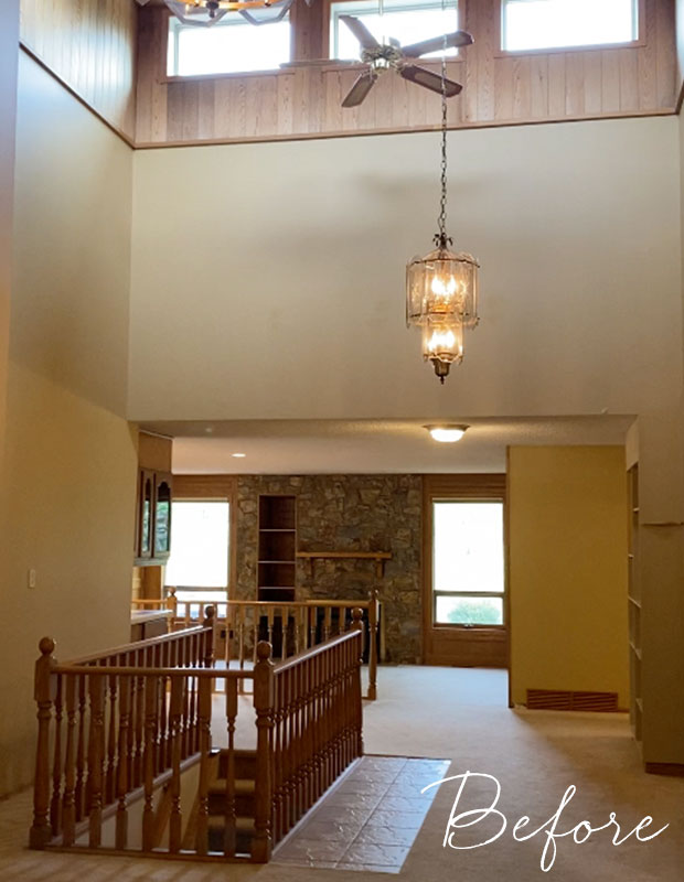
House & Home: Tell us about the house when you first purchased it.
Brooke Butler: It had all the hallmarks of a classic 1980s home, and specifically of our community. There were hand-painted murals (and not the Kelly Wearstler Proper Hotel kind), dingy carpets and smoke-stained walls. Nevertheless, it was easy to see the home’s potential with some standout features and great bones!
The Entrance
H&H: What was your vision going into the renovation?
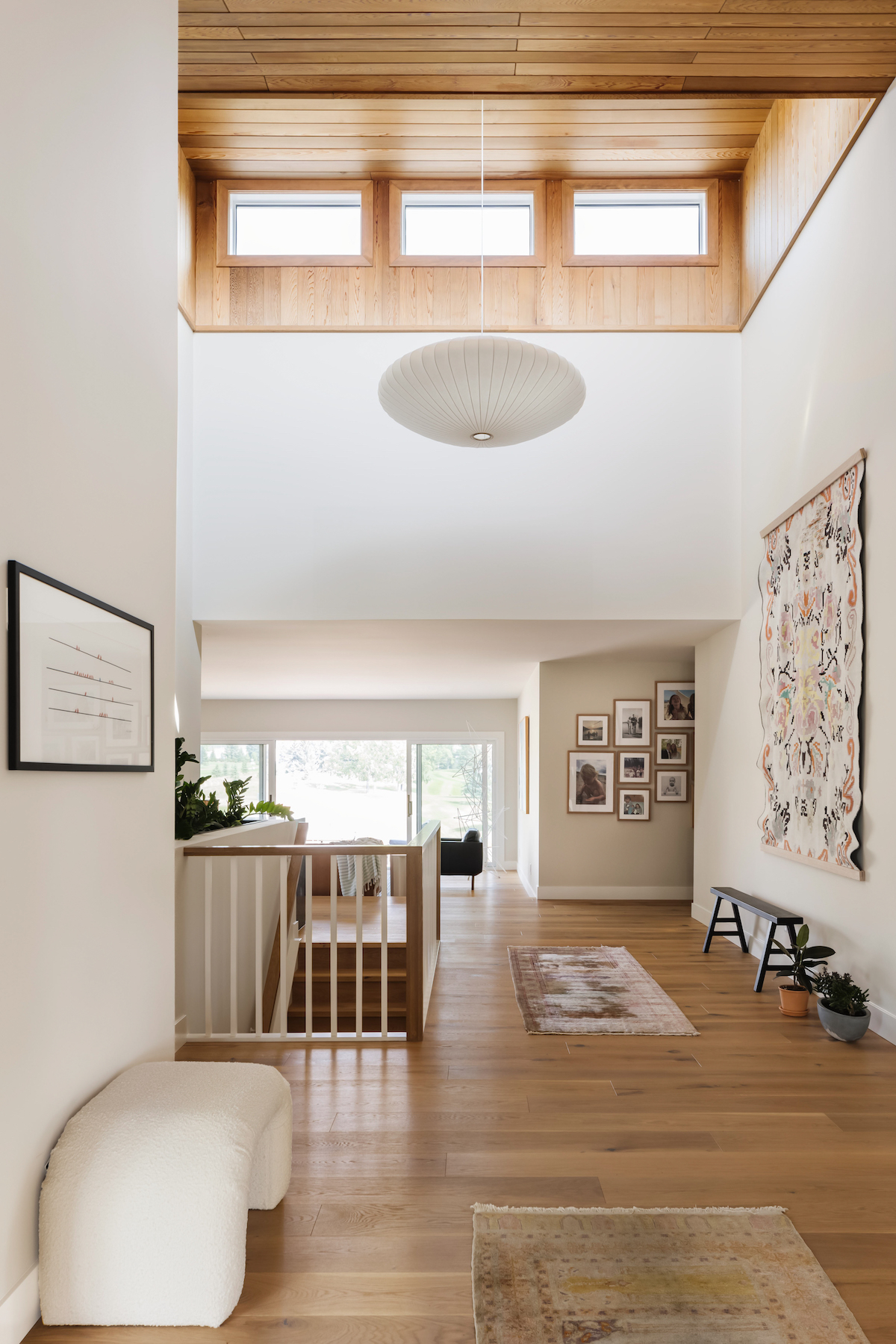
BB: I wanted to create a home that was both comfortable and functional for our family, but also highlight the home’s core features and unique landscape. The entry hall boasts an original cedar wood-clad vaulted ceiling. The material and height variation between the vaulted ceiling and otherwise 8’ ceilings made this a standout moment.
H&H: What’s your approach to decorating and sourcing furniture?
BB: I want a home to be filled with things that evoke feeling and meaning — with a unique hit of vintage flair. An oversized Saucer Bubble Lamp leans into the mid-century vibe and pairs well with the custom built-in planter. A few storied décor pieces were important too – the 1960s ceramic hand painted ultramarine lamp by Lotte Lamps was elevated with a custom shade from Nate Berkus for Kravet. The century-old Turkish tapestry was from a recent family trip to Turkey, when my father and I were riding mopeds through Didim to meet a fourth-generation Turkish rug dealer. Designing and decorating a home is a great balancing act!
The Wall Planter
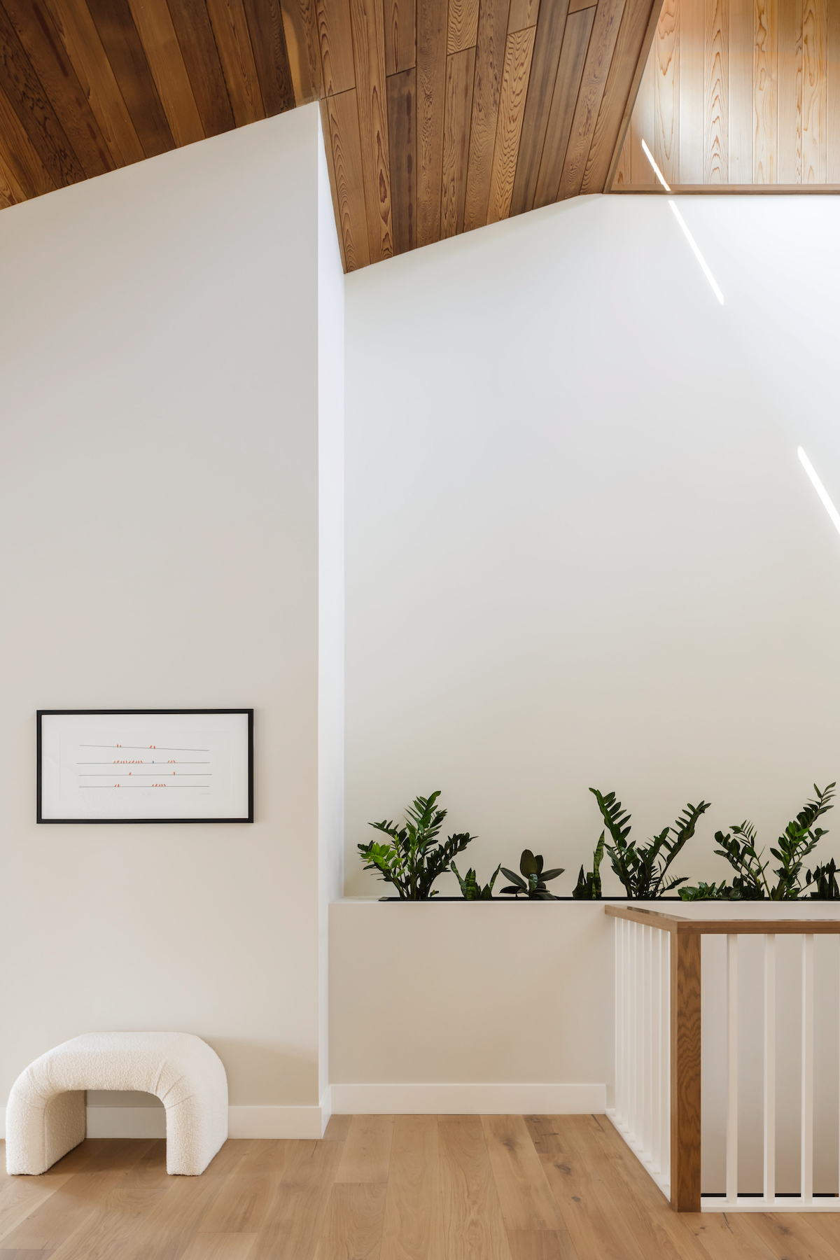
H&H: The built-in wall planter along the staircase is so unique. How did you come up with it?
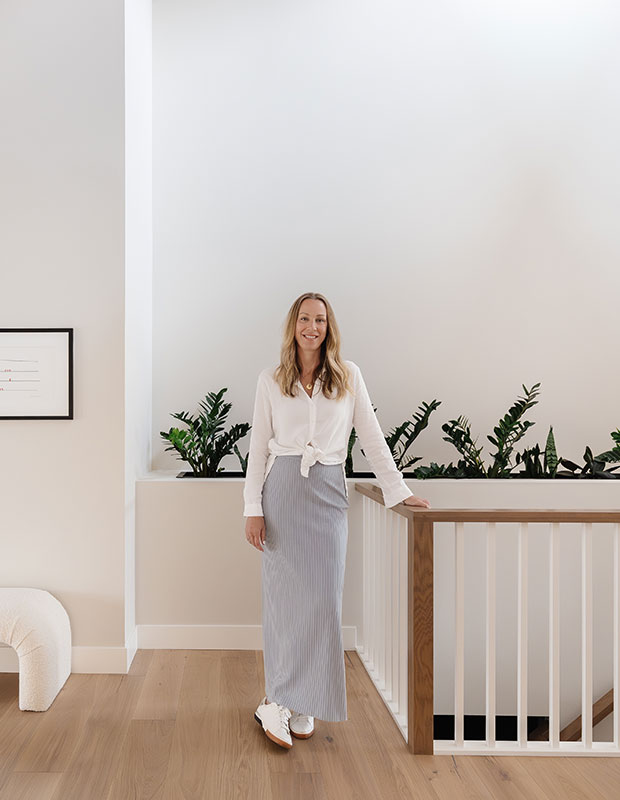
BB: The planter was my solution to a puzzling gap between the basement stairwell and the wall. Inspiration came from a mid-century project I did in Ontario a few years back. It was a circa-1962 house with a built-in planter underneath an open staircase. The concept stayed with me and it felt both purposeful and aesthetically beautiful to have an oversized planter greet people as they come into the home.
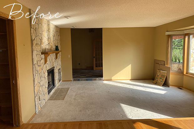
Before: Brooke preserved the wood-burning fireplace and stonework in the living room off the entrance hall. “The texture of the natural stone provided interest without seeming too dated,” she says.

The Living Room
H&H: What’s your favorite design feature in the home?
BB: From the very beginning, we prioritized investing in larger windows and doors, as one of the things I adore most is the abundance of natural light. This decision has paid off immensely, bathing our home in warm, natural light and creating an inviting atmosphere throughout the day. Our home feels like it’s been a part of its surroundings for years and it is a constant source of joy and inspiration.
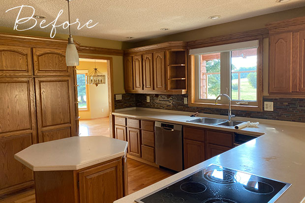
Before: The original kitchen with popcorn ceilings, an octagonal kitchen island and dated wood cabinets.
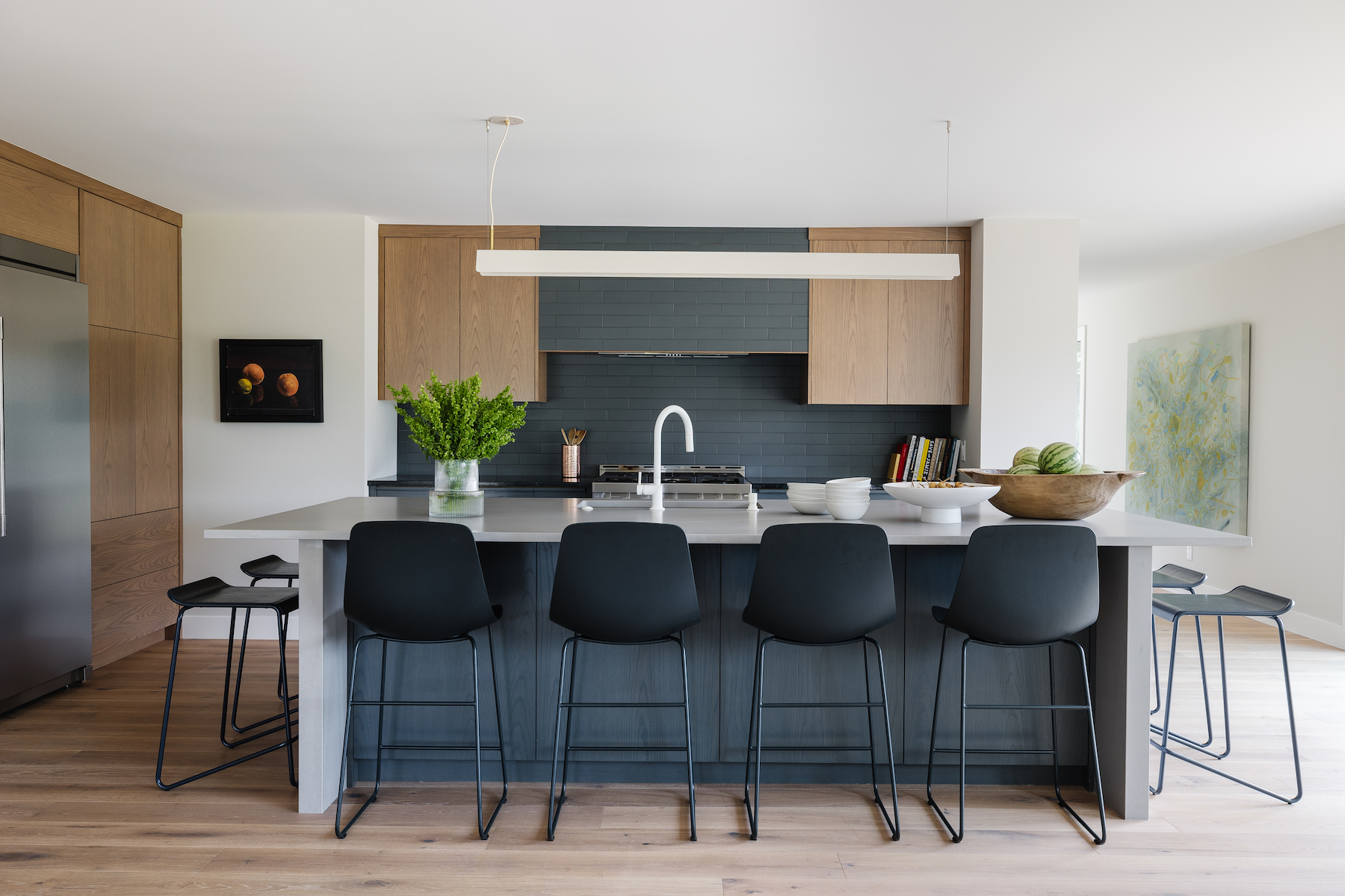
The Kitchen
H&H: What a transformation! What was the inspiration behind the materials and palette?
BB: My taste tends to gravitate towards warm, natural tones and textures. The cabinets are white oak and custom lacquered to complement the floors, and color-matched to the stretcher brick backsplash and range hood. It was important to still see the wood-grain through the low-sheen colored lacquer. We kept it modern with an oversized island countertop from Caesarstone and ample seating by Blu Dot.
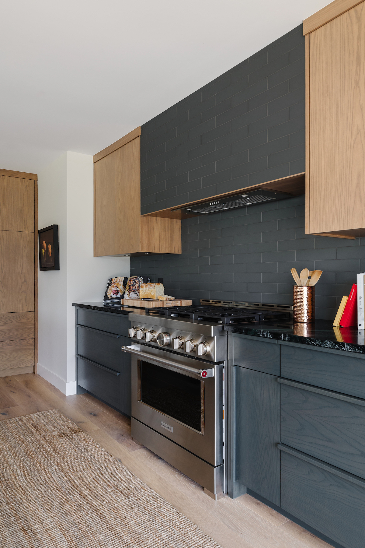
“We opted for integrated custom wood pulls, a mid-century hallmark,” adds Brooke.

The Dining Banquette
H&H: Custom banquettes are everywhere right now. What can you share about this one?
BB: This custom dining table is the heart of our home. Collaborating with a talented local woodworker to create this piece was a fun experience and something that has always been a part of my process. This banquette is unique because of its size – over 11’ long in both directions. The actual banquette design is very simple and was built by a talented millworker and lacquered the same color as the walls (Benjamin Moore, Pale Oak OC-20), to not draw attention to its size.
H&H: How do you typically use this space?
BB: We are not very formal people, and we wanted our dining experience to reflect this sensibility. We eat here, play cards, have a chat, do homework, entertain friends and family — it is where we go to connect with each other and talk about our day. The stages and ages of our kids has connected us with a community who we spend a significant amount of time with. Our dining table last Saturday night served as a meeting place for 8 adults and 8 kids where we ate, chatted, laughed and played games — the space and furnishings were designed for togetherness.
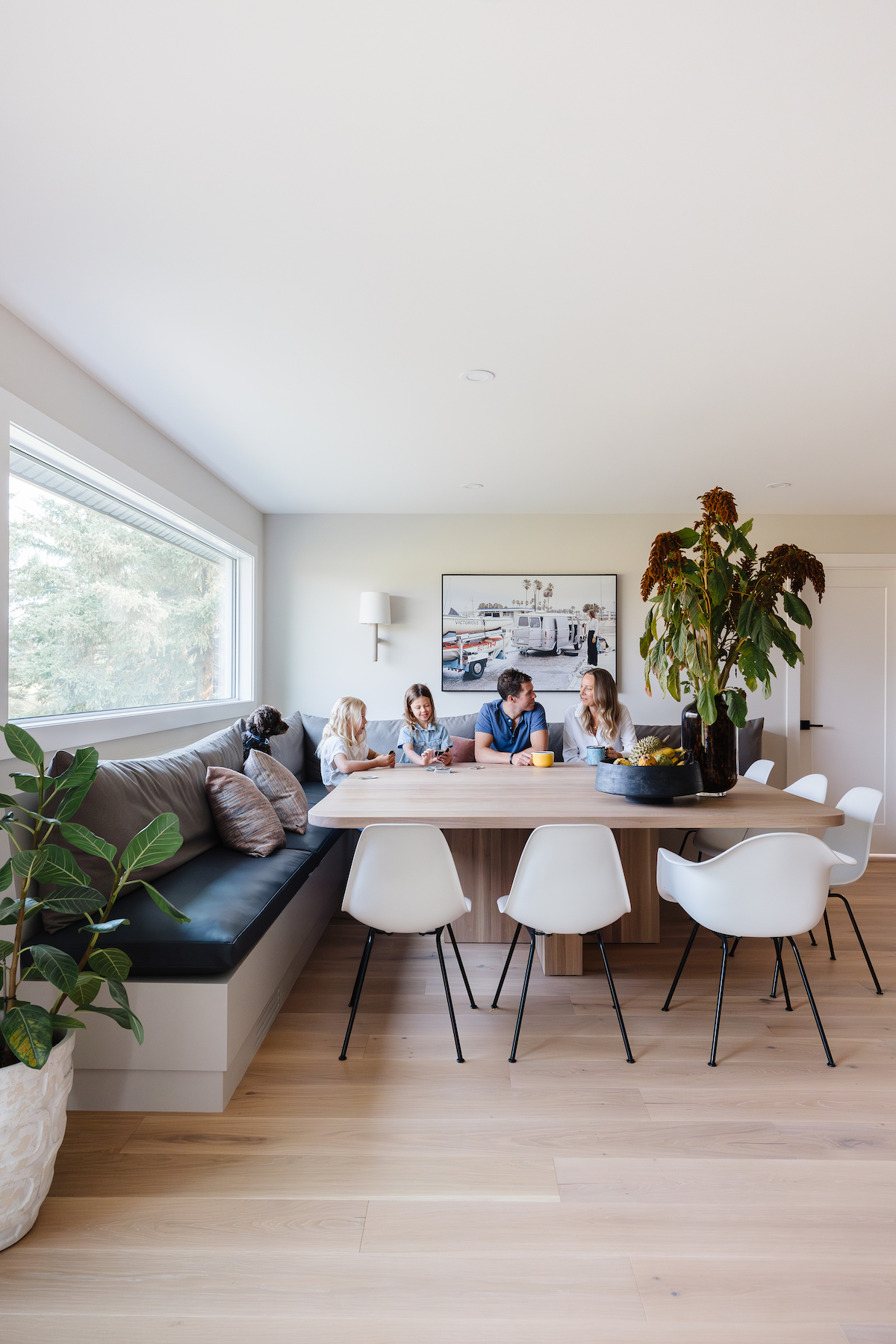
The photograph above the banquette is Brooke’s mom pictured with her dad’s sailboat in Florida, circa-1974. “The vintage nostalgia of this photograph makes me happy. Plus it’s great conversation starter,” says Brooke, pictured with her husband and two daughters.
The Sitting Room
H&H: Do you have any tips for creating zones within an open-concept home?
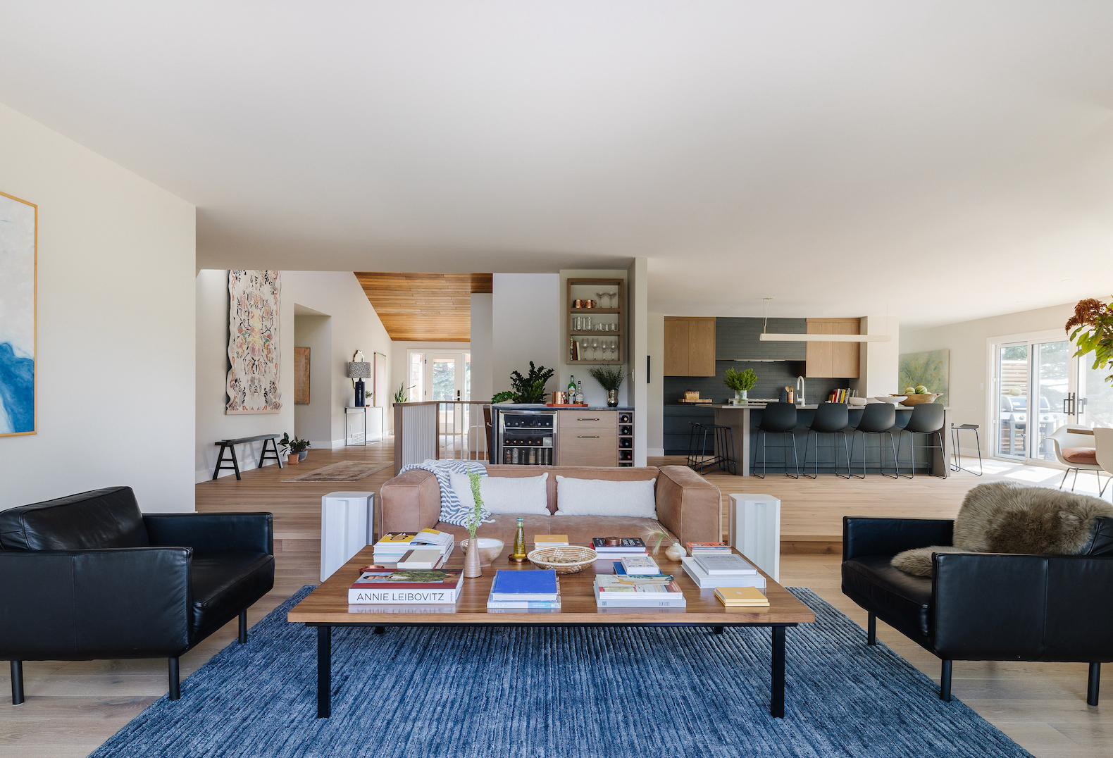
BB: I love the openness of our home, however there is separation in function by form. The sunken sitting room is a good example of this. Stepping down creates a coziness and clear visual separation of function between spaces.
The Powder Room
H&H: Tell us about this fabulous powder room!
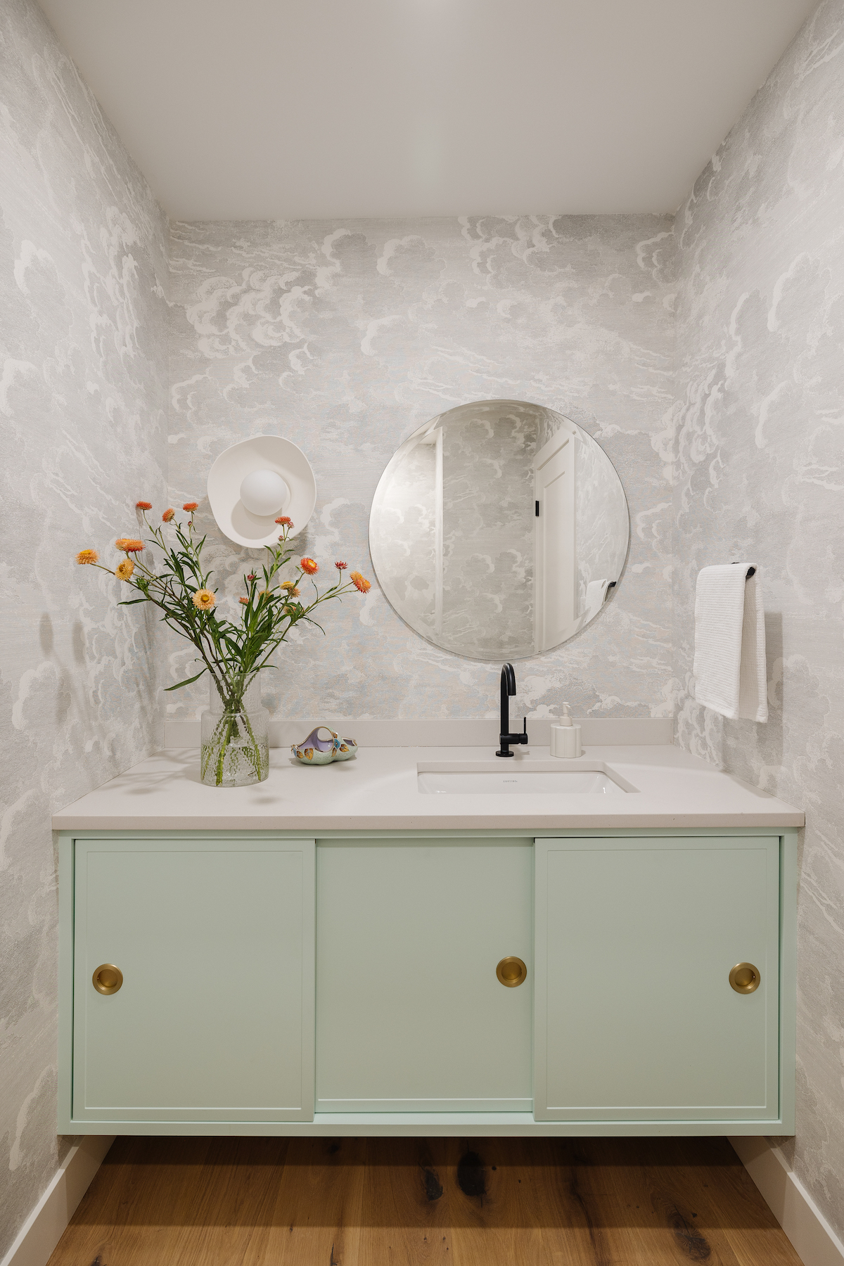
BB: What can I say — I love a playful powder room! Without any significant moisture to consider (from a shower, for example) I almost always incorporate wallpaper into my powder room designs. This cloud etching wallpaper by Cole & Son is so whimsical and timeless.
The Principal Bedroom
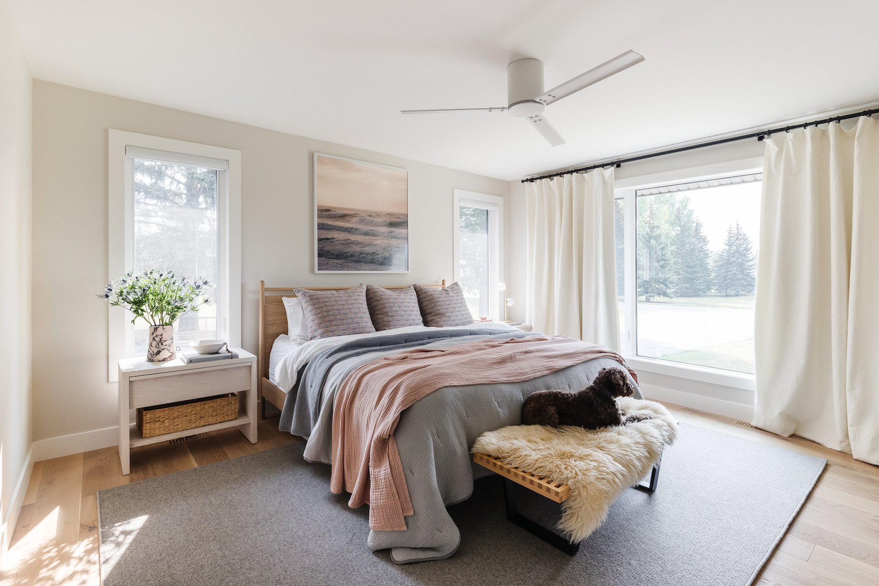
The serene principal bedroom is surrounded by lush trees and is flooded with natural light during the day.
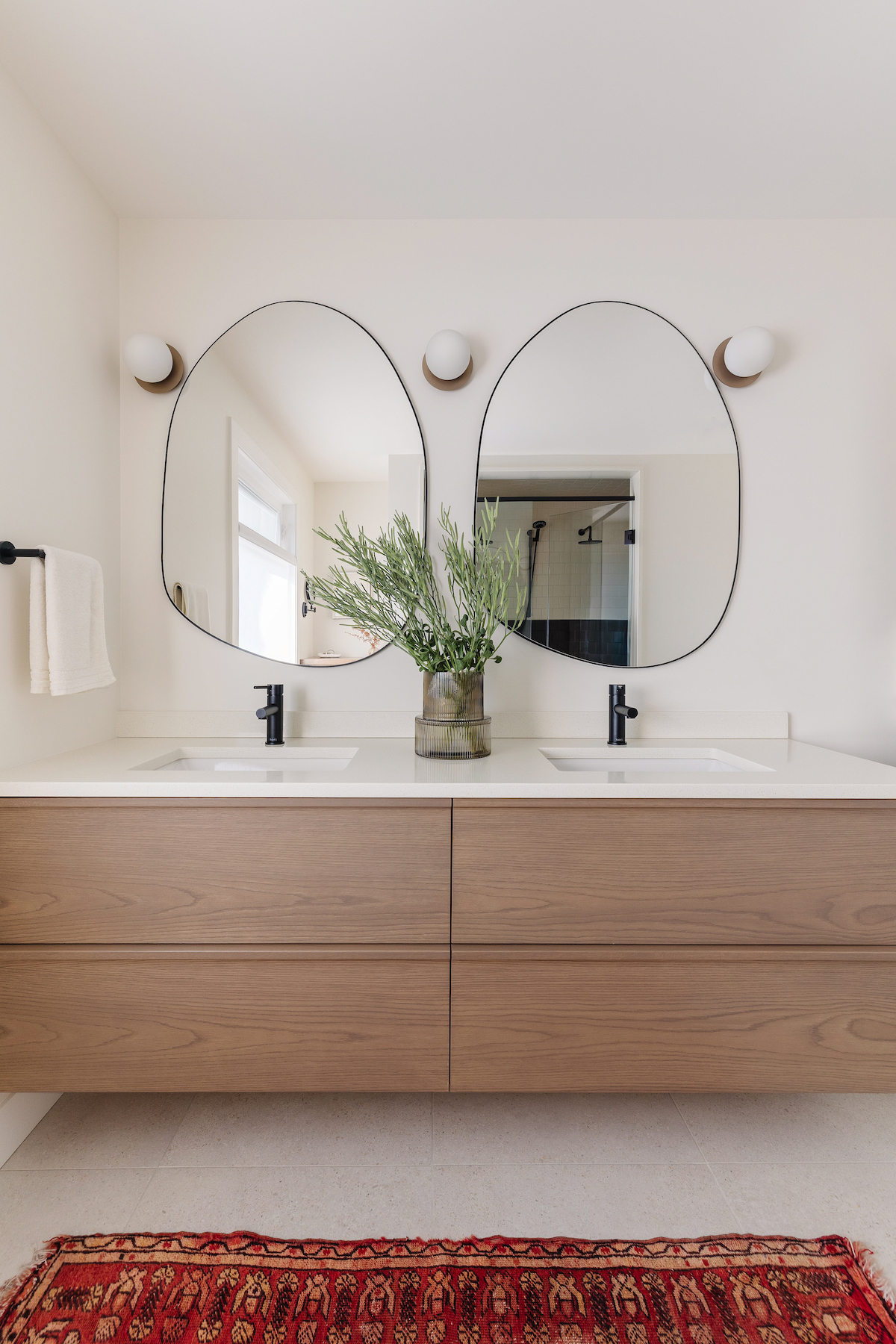
The Ensuite Bathroom
H&H: You definitely mastered the mid-century modern vibe in the bathroom.
BB: Yes! The bathroom vanity in particular is a similar finish to the kitchen millwork with integrated wood pulls. Repeating finishes in new ways throughout the home helps to create a sense of flow and consistency. I love the warmth of the cream in contrast with the dark browns and bronze palette.

“Something else I did in this bathroom and other areas of the house was design functional storage with quiet finishes — so the colors blend into the walls and don’t stand-out,” adds Brooke.
Rapid Fire!
H&H: Your favorite white paint to use right now.
BB: Sherwin-Williams SW 7008 Alabaster. It is a well-balanced shade with warm undertones and a beautiful depth of color.
H&H: What’s your go-to material for kitchen counters?
BB: This changes depending on my clients wants and needs. If they have a European sensibility I would be inclined to look at natural marble or soapstone. Alternatively, if they want their countertops to always look pristine, a composite quartz material is better suited.
H&H: Because your plants were so beautiful…any ideal indoor plants for winter?!
BB: I have had the most success with ZZ plants, snake plants and Yucca plants.
All products featured on House & Home are independently selected by our editors. However, when you buy something through our retail links, we may earn an affiliate commission. Prices are shown in Canadian dollars and are accurate on the date of publication.
Brooke Butler Design


