Decorating & Design
June 4, 2018
Color Palette Inspiration: Olive Green, Petrol Blue & Warm Pink
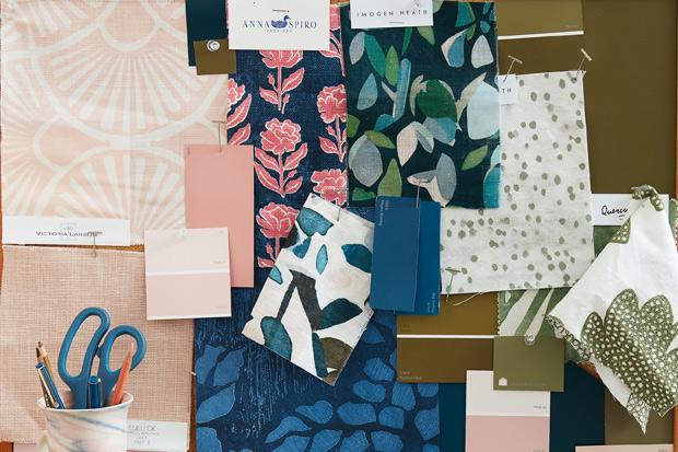
There’s no need for neutrals when your colors combine for the perfect palette. See how olive green, petrol blue and warm pink create a saturated color story that would bring any space to life.
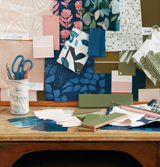
How did we come up with this trio? It’s a combo of trend watching and color theory. Olive green acts as a neutral to balance the warm pink and cool blue for a palette that can be endlessly mixed and matched without colors clashing.
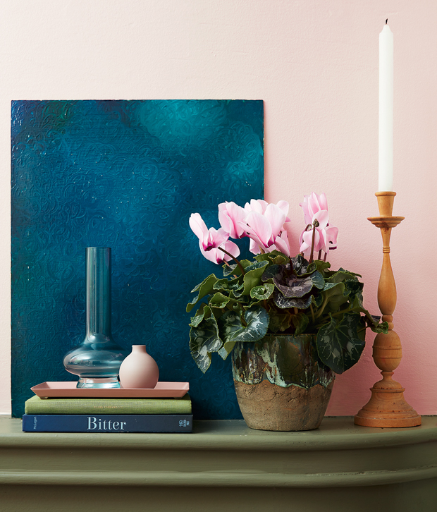
“These colors aren’t typically seen together: the play of opposites creates tension,” says designer Emma Reddington. This all-season trio of colors looks fresh in spring and cozy in the cooler months.
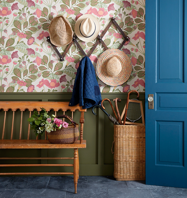
Long associated with army fatigues and wellies, olive green is steeped in British heritage. A pretty William Morris-style wallpaper adds whimsy to the practicality of wainscotting and bluestone tile flooring.
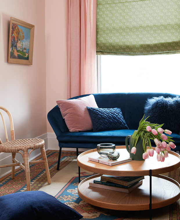
The next-gen evolution of millennial pink, this softer hue is cut with a brown undertone for a more grown-up effect. It’s also a leavening factor when balancing the petrol blue and olive green, which have roughly the same value (or darkness) on the color wheel. Pink walls and drapery provide essential warmth for the blue velvet love seat and patterned green blind. Still need convincing? Picture the same room with white walls and the scheme fizzles.
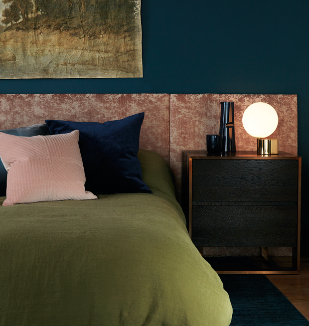
There’s a whisper of teal in this petrol blue, which makes it livelier than its trendy cousin, cobalt. In this bedroom, the blue walls create a moody envelope while a burnout velvet-upholstered headboard and pink pillows supply a lush, tactile element. The olive green diet cover keeps the pink bedding from skewing too sweet; its soft, relaxed texture is appealingly modern.
Kim Jeffery
House & Home April 2018
Emma Reddington and Kai Ethier

