

Best Paint Colors
February 20, 2019
Discover House & Home’s Top Paint Trends For 2019
Our editors pick the most fashion-forward paint hues and the essential, crowd-pleasing neutrals for 2019.
In a sea of steely shades, a brown-based grey is an inviting option. Combine it with cognac leather and wood to pick up on the color’s pleasantly earthy base.
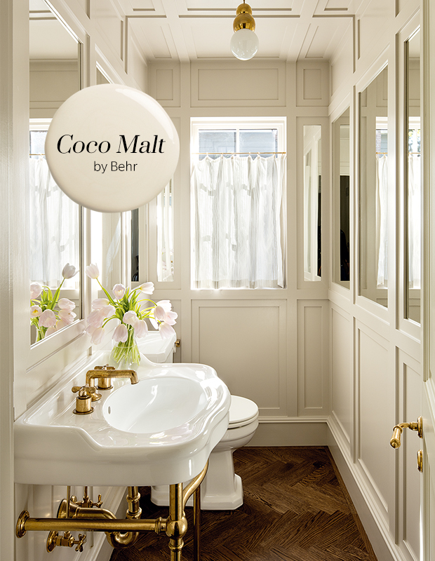
A creamy, malty neutral is an ideal choice for rooms with standout millwork, delivering depth and a feeling of history.
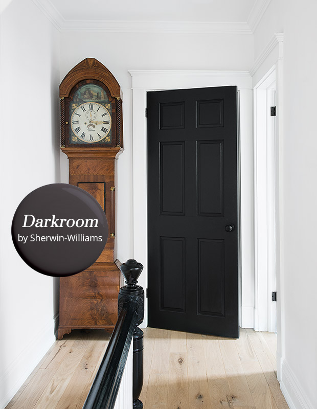
A luxurious purple-based grey is a rich alternative to black, creating a cocooning ambience in a bedroom (though it would also look beautiful coating a stair rail or door).
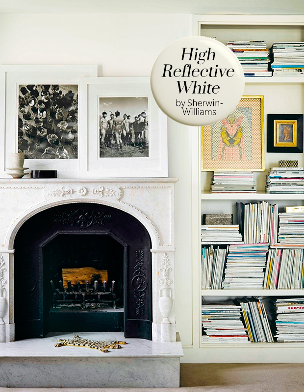
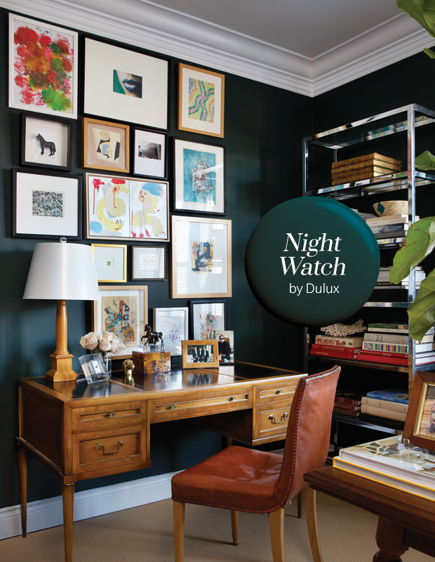
For an instant refresh this year, look to a white that’s clean and palate-cleansing. It’s an especially great fit for rooms with eclectic art and decor.
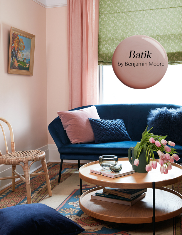
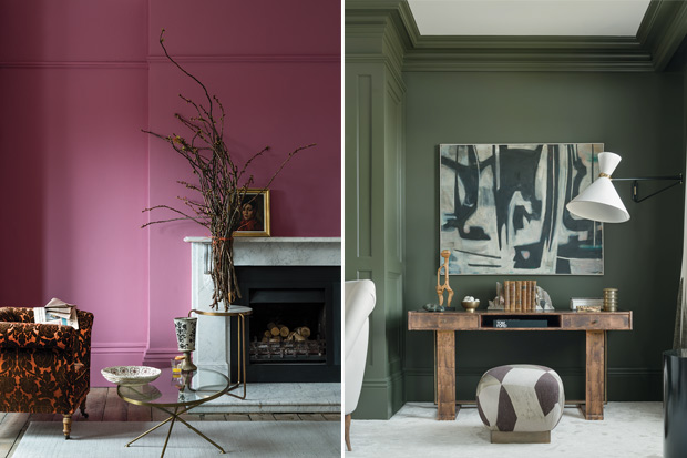
2019’s slightly muddied pink has a heritage vibe, reading decidedly more sophisticated than its millennial predecessor. Try bathing rooms in a pink like Batik to mimic the soft, yet never babyish, look of this room.
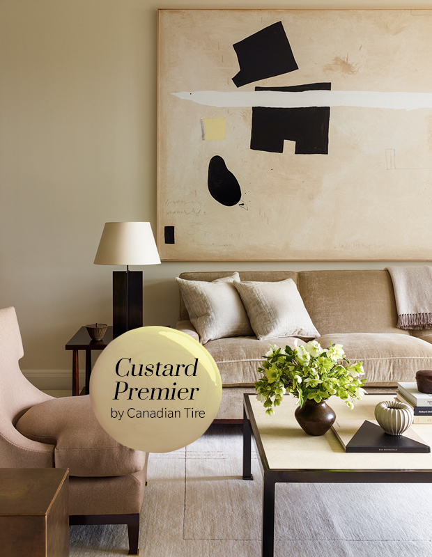
Last year’s trend toward camel continues. Warm and timeless, this paint color offers a middle ground between on-trend yellow and gallery white, and looks chic with black accents.
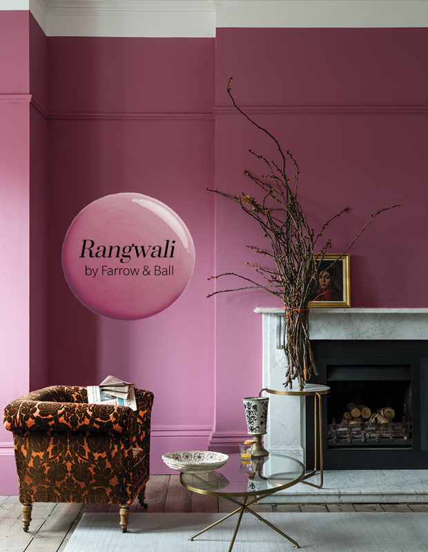
Exotic and enveloping, deep, vibrant pink is one of the year’s most daring choices for walls. Go bold and paint baseboards and crown moulding to match.
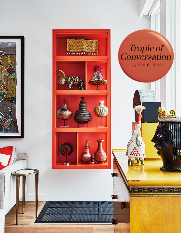
A muted shade of orange, just a fraction deeper than Hermès’ iconic hue, is one of 2019’s most eye-catching accent colors. Try an orange like Tropic of Conversation for a zesty look, like the color lining the inside of these shelves in the home of Denise Zidel.
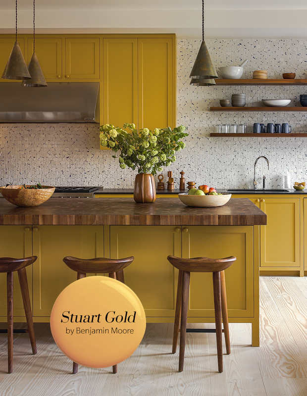
This year’s caramel-tinged yellow is approachable and grounded — a natural fit in traditional spaces such as this Shaker-style kitchen.
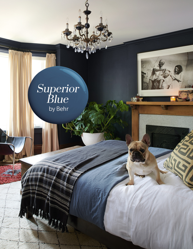
Designers are as infatuated with sapphire blue as ever, especially in a low-sheen finish. This year’s spin is darker and a little more subdued but no less impactful covering walls and millwork. Designer Danielle Bryk chose a similarly dark, moody shade for her Toronto bedroom.
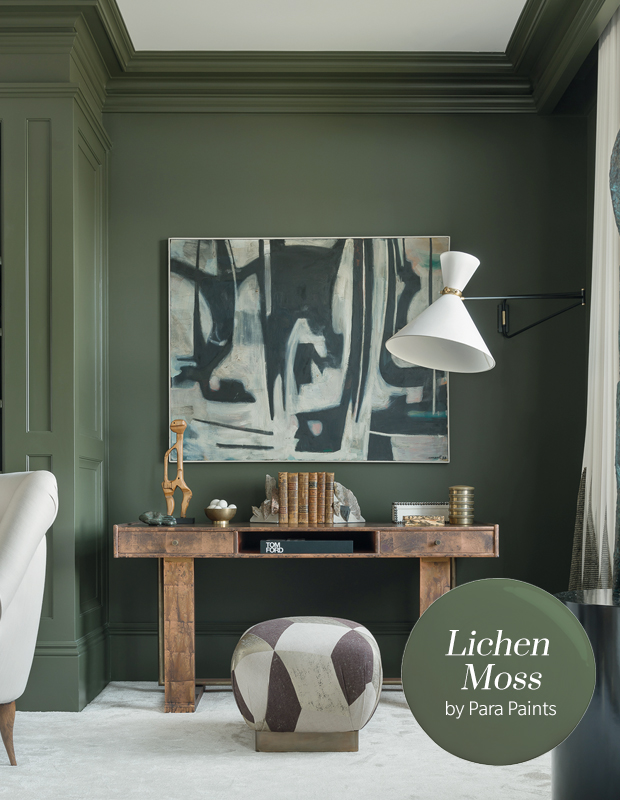
Mossy green is back and ready to give rooms that trad, English-parlor charm. A touch brighter than olives past, it looks especially rich paired with mid-tone wood.
Deep teal is a perfect color for an accent wall, delivering a high-contrast effect without skewing too stark. Pair it with crisp white to balance out the overall intensity. Try teal tones on walls, similar to the one in this room designed by Michael Angus, for an enveloping, rich effect.
House & Home January 2019