

Decorating & Design
October 13, 2016
Get House & Home Editors’ Best Decorating Advice
Over the past 30 years of House & Home, our editors have forecast design trends, produced countless decorating stories and designed hundreds of spaces. No matter how much styles change, there are certain concepts that hold true in every decade. Here, we share the decorating tips and tricks that we believe will still ring true 30 years from now — and just maybe, another 30 years after that.
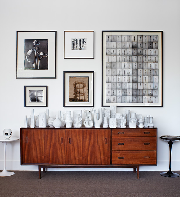
What we love about collections is that they evolve over time and are a great way to show off your passions. As any devote collector will tell you, no matter how obsessed you may be with expanding your collection, it doesn’t happen overnight. When grouped together en masse, matte white vases from Sgafo, Kaiser, Royal Bavarian and Thomas have maximum impact.
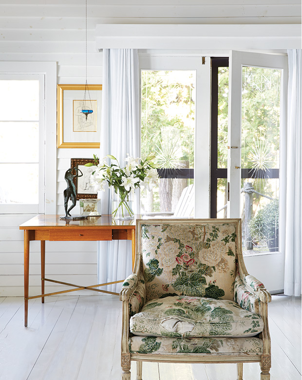
In a time when photo editing and filters alter even the most ‘candid’ images, pieces with patina or dare we even say it — ‘damage,’ are wonderfully refreshing. Well-worn pieces, like this 18th-century bergere with torn chintz upholstery, tell a story and give houses an authentic, lived-in feel.
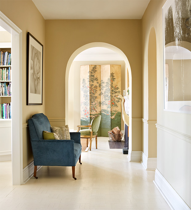
Open-concept living has dominated the last decade of design. With such, it’s important to take sight lines into consideration because what you see from one room is the introduction to another, like this 19th century Japanese wallpaper screen which can be seen at the end of the hall.
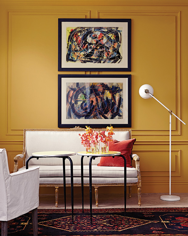
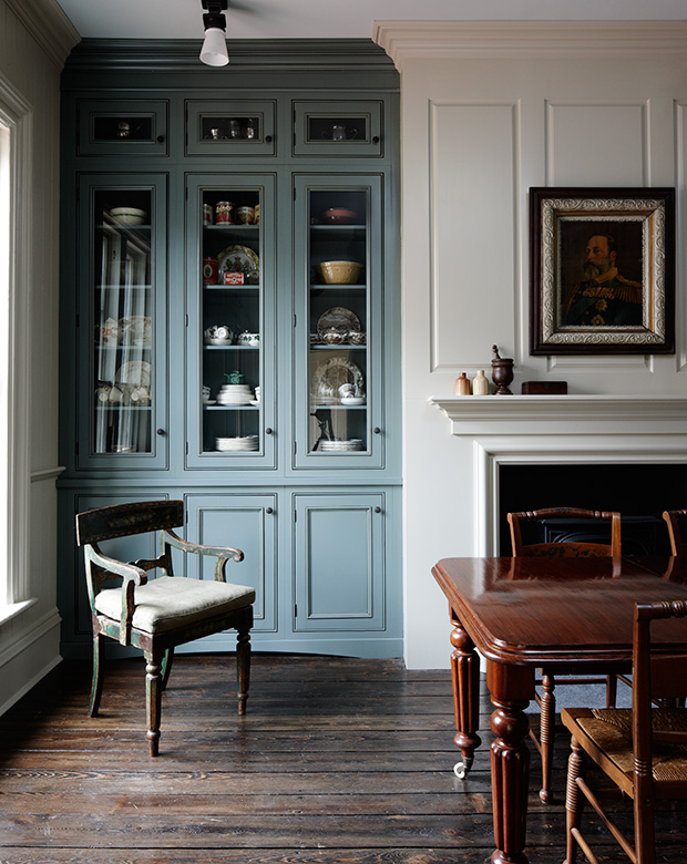
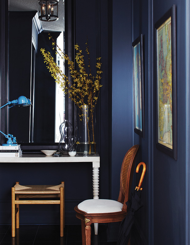
It’s true, the molding trick works! Surface-applied moldings elevate a room without the bother and expense of paneling. Simpler profiles give an Edwardian look, while more ornate and decorative designs feel Victorian.
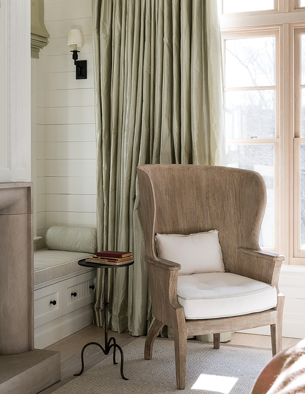
Luxurious drapes in rich fabrics and colors can make an otherwise neutral room sing. Having drapes puddle on the floor looks great in a castle, but we think ‘kissing the floor’ is the perfect length for everyday living. If you decide to invest in luxe silk, like dupioni, add a black-out lining to the back to prevent your drapes from being damaged by the sun.
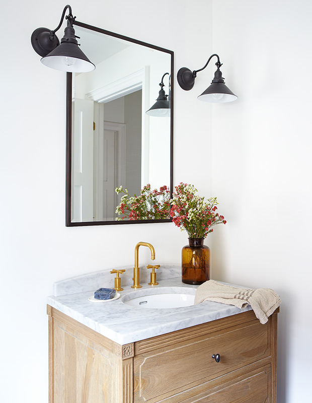
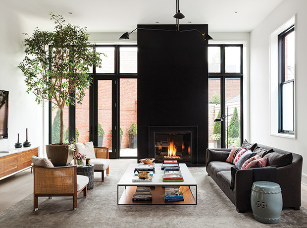
Don’t be afraid to play with different metals in a single space. Being matchy-matchy with metals can look too uniform and bland.
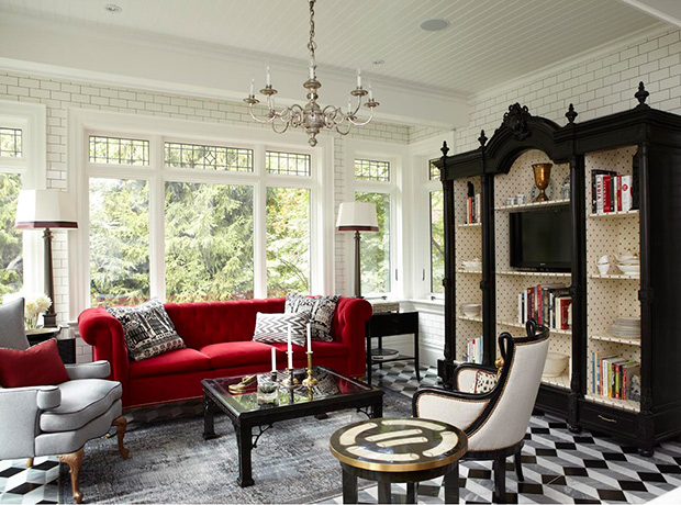
Like Pablo Picasso famously said, “Learn the rules like a pro, so you can break them like an artist.” This room by designer Tommy Smythe is a successful example of this. He went bold with a colorful couch, statement chair, patterned rug layered over a patterned floor tile, full height subway tiles (in a sitting area!), and a serious Victorian cabinet lined with playful wallpaper — and somehow, it works!
Sometimes there’s a reason old houses have lots of hallways. While open-concept seems to be the preferred reno move lately, be careful not to rip all your walls out only to discover that you can now see the laundry room from the living room.
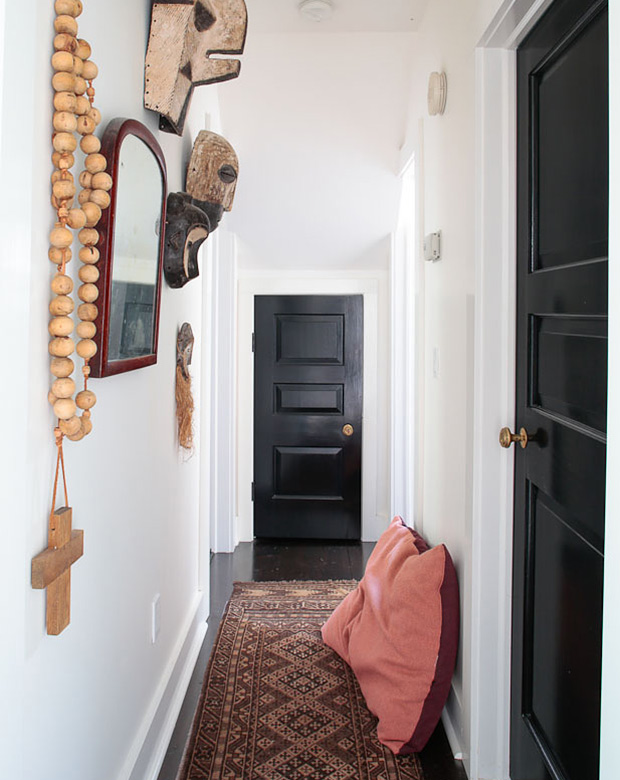
White doors seem to be the norm for most homes, but if you’ve been contemplating going over to the dark side, we say go for it! It may seem like a gutsy move, but black doors are actually quite classic.
Some hardwood floors are a fashion statement — like dark expresso, pale white oak, or a greyed color. Shades like these go in and out of style so if you want your hardwood floors to stay current, a mid-tone brown offers a timeless look.
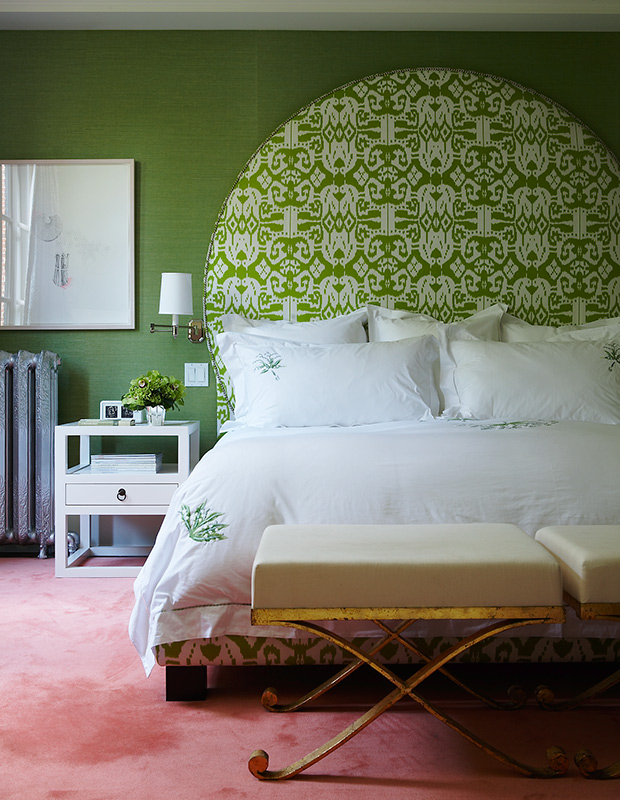
We’ve said it time and time again: white always works. But lately, our souls have been craving more color. Judging by the letters you send us, you’re craving color, too! Filling your home with color, be it a small pop or a big dose, is guaranteed to brighten your mood.
Speaking of color, there’s a myth that you should stay away from dark colors in small spaces. Some say dark hues close a space in, but as H&H design editor Joel Bray proves in his small Toronto condo’s powder room, dark works wonders in small spaces. Joel used Railings (31) by Farrow & Ball.
Getting the shell right is crucial, as it creates the decorating foundation for your entire home. Choosing good-quality (not to mention good-looking) windows, doors and floors helps ensure your home will stand the test of time.
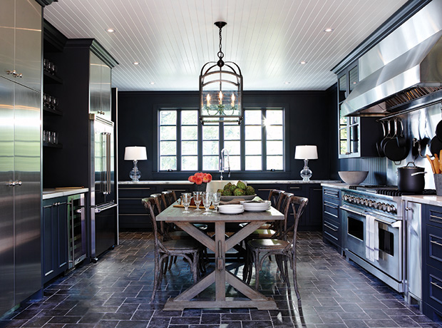
In high-traffic areas like kitchens and bathrooms, opting for a slightly darker grout can save you a real headache when it comes to cleaning. We can all agree that white subway tile is a classic, and with an affordable price tag it’s popular for good reason. Rather than using a tone-on-tone bright white grout, consider a light or even deep grey and trust us, you’ll be glad you did.
Our publisher Lynda Reeves believes that “A great designer or decorator or architect is worth the investment. The result will elevate your home and make you feel great every time you walk through the door.” For the 2010 Princess Margaret Showhome, Lynda enlisted renowned architect Gordon Ridgley and builder PCM.

As much as weekend makeovers can be liberating, the magic doesn’t always come from the initial set up. Remember to leave room for growth, spontaneity and evolution. Joel Bray may have transformed this cottage porch in just 48 hours, but he’s been making tweaks to the space each summer for years.
Achieving just the right mood in any space can have a lot to do with lighting. Layering your lighting is key and having dimmer switches installed on your hardwired fixtures is something you won’t regret — we promise!
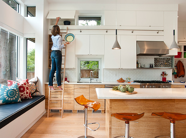
We’re big on style here at House & Home, but even we will admit that storage and practicality should be your first priority, and style statements second. In this kitchen, bamboo lower cabinets and white uppers pack a ton of storage without sacrificing style. A rolling ladder makers accessing even the highest cupboards a breeze.
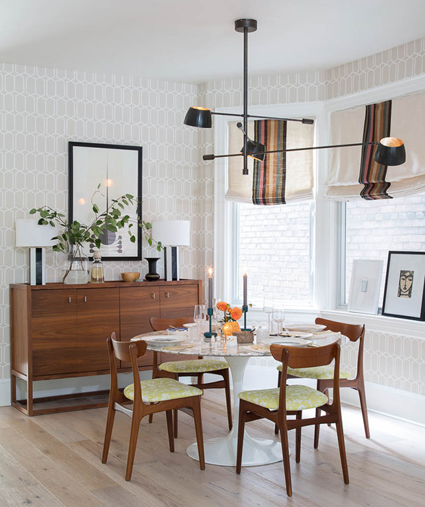
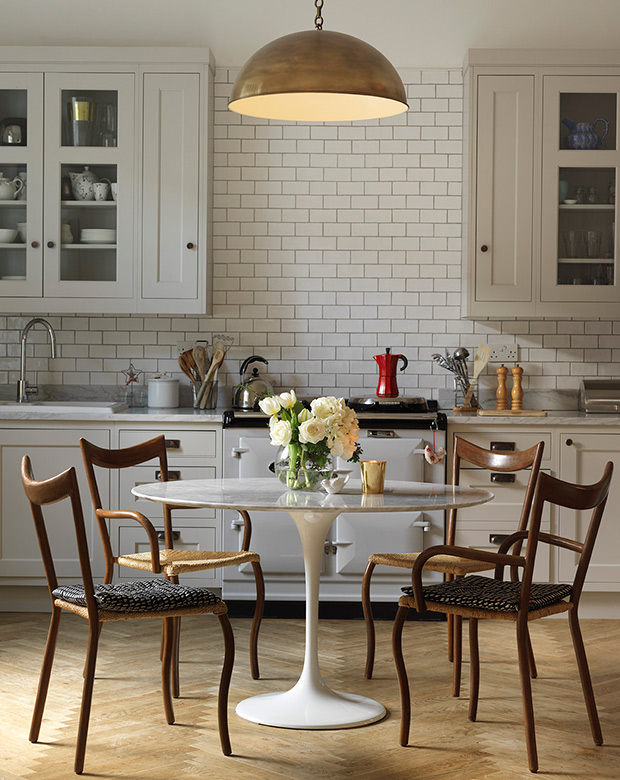
Jump on trends one at time and with care. Many trends come and go, but trends with classic appeal — like the white oak hardwood floors, mid-century modern furniture and round Saarinen dining table in designer Git Gustavsson’s dining room — could be chic for decades.
It may not seem like the chicest of ideas at the time, but sometimes you need wall-to-wall carpeting, and it’s not always a bad thing. Awkward shaped rooms or stairs that need full coverage are good examples of the right time to use carpeting.
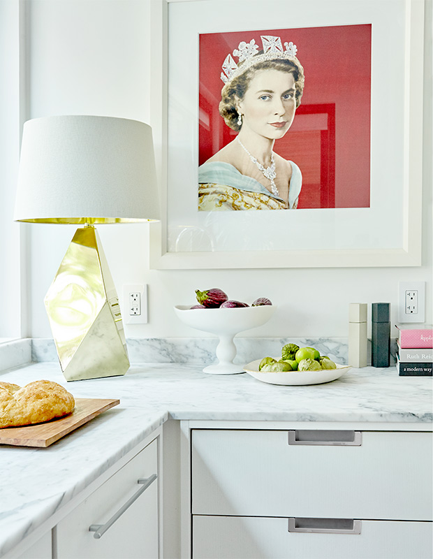
Nothing starts a conversation faster than something unexpected, like a unique piece of of furniture or art. In designer Shirley Meisels kitchen, she hung a silk scarf with a picture of Queen Elizabeth II and placed a table lamp on her counter.
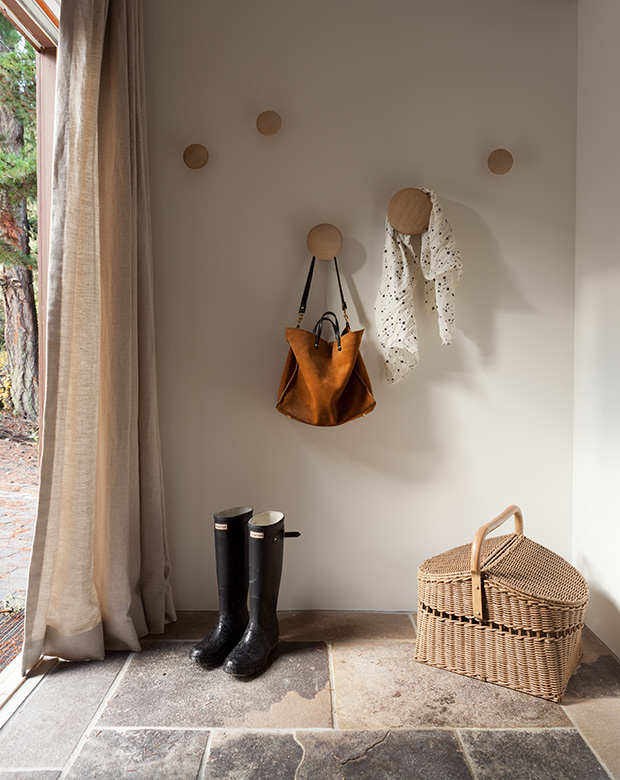
While it’s often hard to avoid man-made materials entirely, if given the option we prefer to stick to natural fibers, like cotton, wool and linen. In this entryway, rugged Pennsylvanian bluestone tile, linen drapery and a wicker basket work together in harmony.
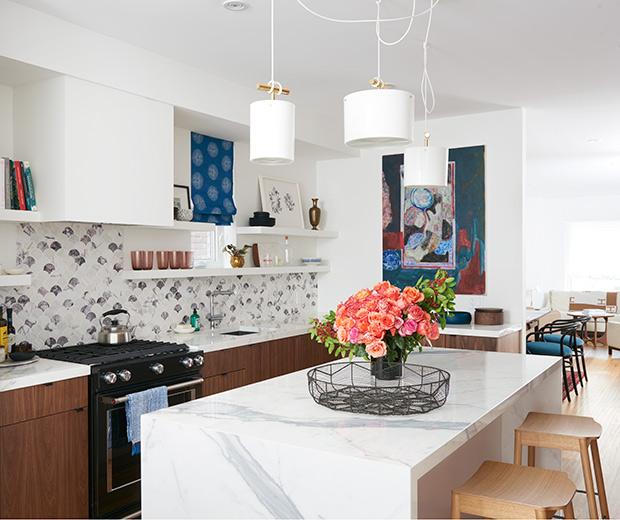
It’s easy to use big box stores as your default, but supporting local stores and artists is important, too. In this kitchen makeover, Kai used pendants from Castor Design, hardware from Canadian Builders Hardware and artwork by Canadian artists Devon Knowles and Jay Isaac.