

Best Paint Colors
January 12, 2016
Editor’s Inspiration: The Colors Of Portugal
H&H stylist Reiko Caron shares color inspiration from her recent trip to Portugal.
 Lately, it seems like everyone and their mother has taken a trip to Portugal — and you can add me to that list! This past November, I had the opportunity to take in the sights (and pastries) of Lisbon and Faro, and couldn’t help but notice the repetition of one particular color as I made my way through the city streets: deep, dark green.
I saw it everywhere. It was as if everyone in Portugal had simply agreed that forest green was the perfect shade to pair with any tile, any stone, any paint, anywhere — and in most cases, it really worked!
Here are a few standout examples that I snapped on my trip to get you thinking about gorgeous, deep green.
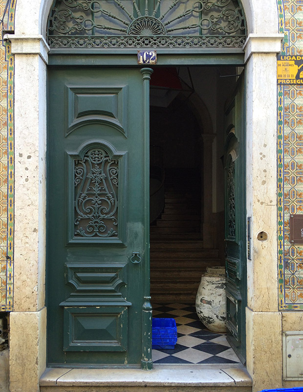
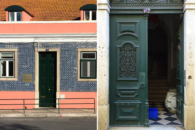
When a set of doors has detailing this stunning, you really can’t go wrong. But this shade of green paint certainly gives them presence, not to mention an appropriately old world feel.
 Get the look with Farrow & Ball’s Studio Green No. 93.
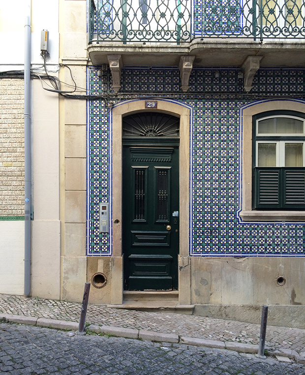
I think this glossier hue looks perfect combined with this home’s blue-green tiled façade and brass door hardware.
 Get the look with Valspar’s Peacock House 5010-4.
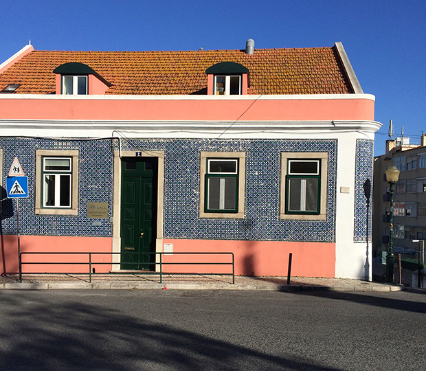
Here’s a unique pairing: blue tile, Pepto-pink stucco and a terracotta roof. Somehow, the green-painted door and window frames bring together this mishmash of finishes.
 Get the look with Behr’s Hazel Woods 460F-7.
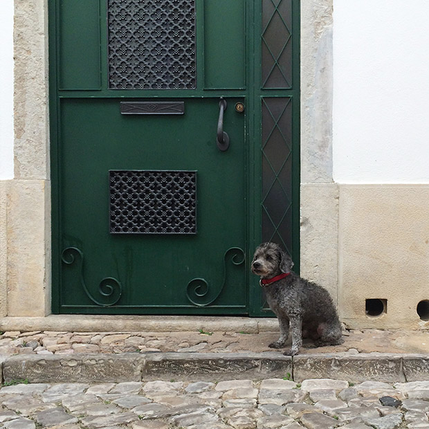
In Faro, I expected bright, beach-like colors, but here is that dark green color popping up again, this time against more neutral plaster and stone.
 Get the look with Cloverdale Paint Artisan Collection, Hemlock CA180

Even this Lisbon peacock knows how to pull off forest green. Maybe it’s time for Canada to re-think our commitment to basics and black?
Get tips for decorating with dark green here.