Decorating & Design
Tour A Grand Edwardian Home Reimagined For A New Era
Published on September 24, 2020
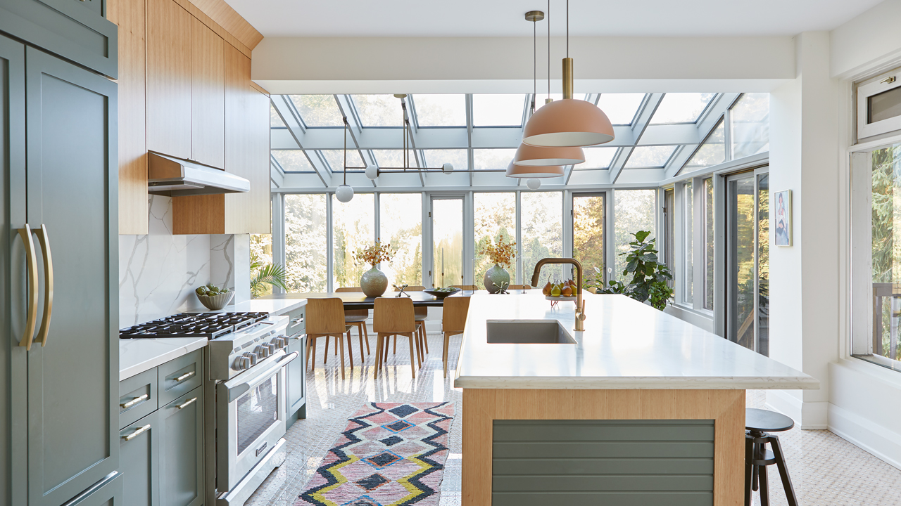
In the tradition of grand Edwardian homes, this Toronto abode had a conservatory or sunroom, a glassed-in area where one could grow plants all year long. It’s a beautiful idea but, in reality, it was a drafty, dreary, wood-panelled space tacked on to an 11-inch-thick exterior wall that blocked the kitchen’s view of the backyard and hemmed it in.
The homeowners had purchased the house from a 90-year-old antiques collector and hoped designer Dianne Berman of Delo Interiors (she had worked with them on a previous reno) could reimagine this house for a new era. Their lives revolve around entertaining and watching their children frolic in the pool — not misting African violets.
Changing the layout with easy-care materials and injecting hip color has made the kitchen a welcoming space, with a bright and airy new dining room overlooking the garden. “It’s no secret the kitchen is the heart of the home, and to separate it and the dining room doesn’t feel natural for the way we live our lives,” says Dianne. In the case of this home, she made it sing a completely different tune.
Scroll down to discover Dianne’s tips for updating a historical home.
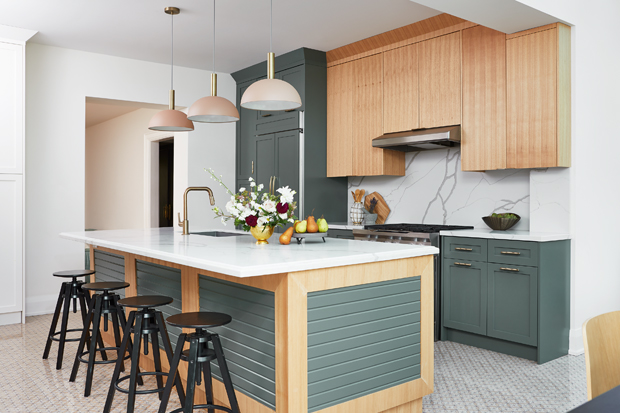
Mix Cabinets
“The client was very into green, which was amazing,” says Dianne. “A few years ago, we started doing light uppers and dark lowers to make kitchens feel grounded. Benjamin Moore’s Caldwell Green is soft and not too jarring against the butternut wood and quartz counters, and it feels cohesive with the palette. I think natural butternut wood is really beautiful: you look out to the trees and foliage, so it seemed harmonious to include a natural wood and green palette to blend in with the setting.”
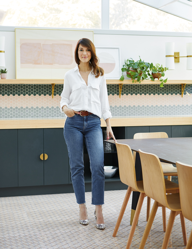
Add A Built-In Buffet
“Spanning a 13-foot-long wall, this dark green custom buffet with a butternut wood top riffs on the kitchen cabinets,” says Dianne (pictured). “The clients can store their blender or serving pieces here, and serve a buffet-style meal without needing to go back to the kitchen. A custom shelf will eventually be filled with plants to make it feel like a conservatory.”

Pick A Punchy Palette
“I chose the color palette in 2017 and, at the time, it was really hard to find that tile combination of green and pink,” she says. “I wanted the tilework to be visually interesting and impactful, but not so distracting that the eye couldn’t flow around the kitchen. For lighting, it’s always important to think about what’s overhead, but task lighting also offers a nice, soft glow to highlight feature areas and create a bit of a mood in the space.”

Scale Fixtures
“The dining room’s custom 11-foot-long black-stained oak dining table required a similarly gutsy pendant,” says Dianne. “We needed a light fixture that could hang from an angled ceiling, instead of being swagged by a chain. Commute Design created a full-scale mock-up to ensure we were happy prior to making the custom fixture. We wanted this space to feel like it was always meant to be a dining room.” Porcelain tile laid over in-floor heating helps warm the space.
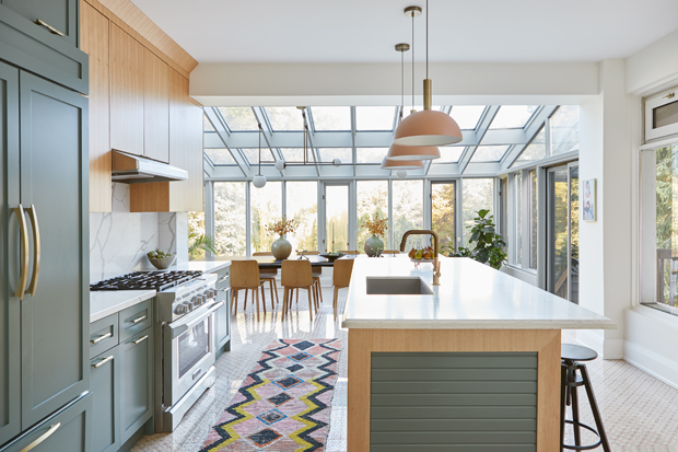
Open Up The Kitchen
“The goal was to make the kitchen an open-concept space that would be great for entertaining, and move the dining room from another part of the home,” says Dianne. “The sunroom was originally an extension added in the late 1980s, but it wasn’t properly heated. We removed the exterior wall to create one large room, and added in-floor heating and brought in an HVAC team so the new dining space wouldn’t be chilly.”
Vary Hardware
“I chose hardware that would feel jewel-like,” she adds. “We have very minimal gold tab pulls on the wood uppers where the grain is simple but, on the lowers, it’s a facetted gold pull, which catches the light and gives a bit more interest.” Blush pendants over the island pick up the rose hex tiles in the dining room backsplash, while a panelled lacquered-wood detail on the island gives it textural interest.

Consider Sightlines
“We wanted this kitchen to feel fresh and open,” she says. “The island is very generous at 11 feet, but I still wanted to include a pantry (left of doorway) that wouldn’t pull focus from the sight lines into the family room and that stunning tile fireplace, so I kept it white and airy. The pantry hardware is Lucite and brass; it blends in to the wall but still feels a bit special.”
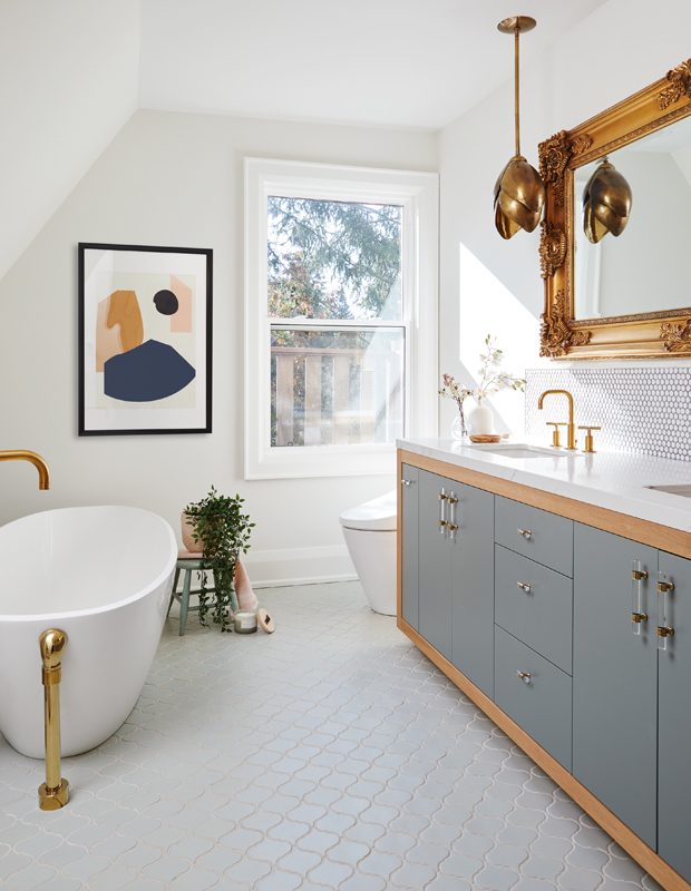
Blend The Past & Present
“The whole idea was to maintain the character but keep it fresh and current,” says Dianne of the principal bathroom. “A lot of the inspiration came from boutique hotels and restaurants with beautiful tilework, plants and color.”

Invest In Striking Fixtures
“The homeowner had always wanted a freestanding tub,” she says. “It made a lot of sense to place one under the angled roofline, which was too low for the vanity yet had enough clearance for getting in and out of the tub. This floor-mount tub filler is a beautiful and sculptural addition.”

Echo Other Rooms
“We repeated the mix of butternut wood and painted cabinets that we used in the kitchen,” says Dianne. “It’s nice to keep that harmony in a big house, though this is a softer green that’s not as dark as in the kitchen. The gilt mirror and flower-shaped sconce weren’t intended as a blast from the past: the whole idea was a modern interpretation.”
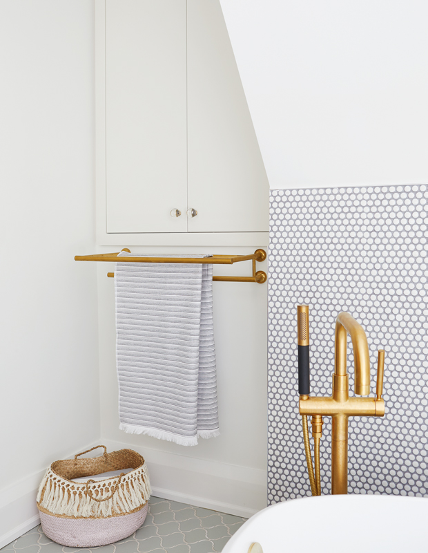
Create A Design Moment
“We highlighted the short wall with penny-round tile behind the tub for water resistance and to enhance the design detail,” says Dianne. “I never get tired of penny-round tile when mixed with more intricate patterns. This existing 10-inch-deep cupboard above the towel bar is fitted with shelves and acts as a medicine cabinet.”
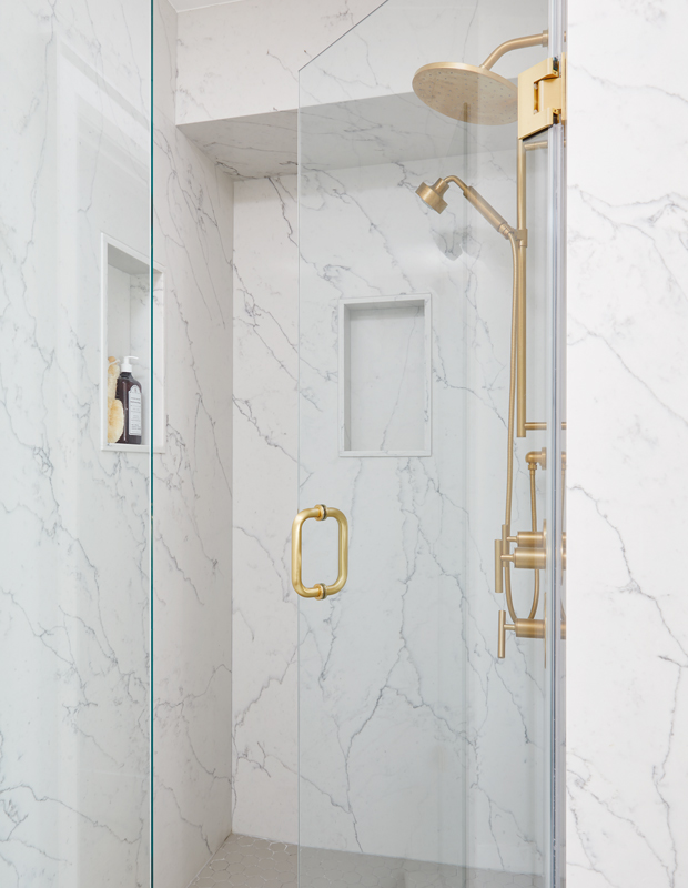
Think Large Format
“In the shower, I used a custom quartz — including in the niches — because it’s easy to clean and I didn’t want the homeowner to worry about grout lines and mould,” she says. “A good tip for the floor tile is to match the grout color to the tile: a white grout will darken with oils from feet.”
Valerie Wilcox
House & Home Kitchens + Baths 2020
Dianne Berman, Delo Interiors


