

Decorating & Design
A White & Blond Wood Palette Makes This Edwardian Home Feel Timeless
Updated on July 18, 2022
While fashion is defined by the constant ebb and flow of its changing whims, its most successful creators, from Coco Chanel to Issey Miyake, have embraced their own brand of minimalist restraint. Simplicity, as the maxim goes, is the ultimate sophistication. As such, the popular trinity of clean white walls, punchy black accents and soothing blond wood surfaces may appear simple at a glance but, as with any high-fashion look, the devil is in the details.
This project, deftly executed by designer Shauna Walton, offers a wealth of insight into how to give the palette warmth, comfort and individuality. Shauna undertook the design of this extensively renovated three-storey Edwardian home in Toronto’s midtown for her friends Sonya and Stacey Weisberg. Sonya is a fashion industry veteran who works in marketing for Canadian fashion brand Smythe, and she met Stacey while both were working at Hugo Boss (though he’s since left fashion to work for the family business). Stacey is also the nephew of Canadian architect Richard Wengle, who worked closely with the couple on the renovation.
As one might expect from such a style-savvy bunch, the Weisbergs remained hands-on throughout the design process. “Because of our backgrounds, Stacey and I are both confident in our own styles, which are different, and we notice every detail,” says Sonya. “Every element of the house was a compromise for one of us, but using light colors allowed our two styles to work together. The end result is a perfect blend of us.” The benefits of this close collaboration and attention to detail are revealed at every turn: cool white surfaces are made warm and welcoming by luscious marble, earthy brick and other natural materials, warm bronze and — of course — plenty of stained white oak.
Scroll down to see every detail of this timeless Edwardian home!
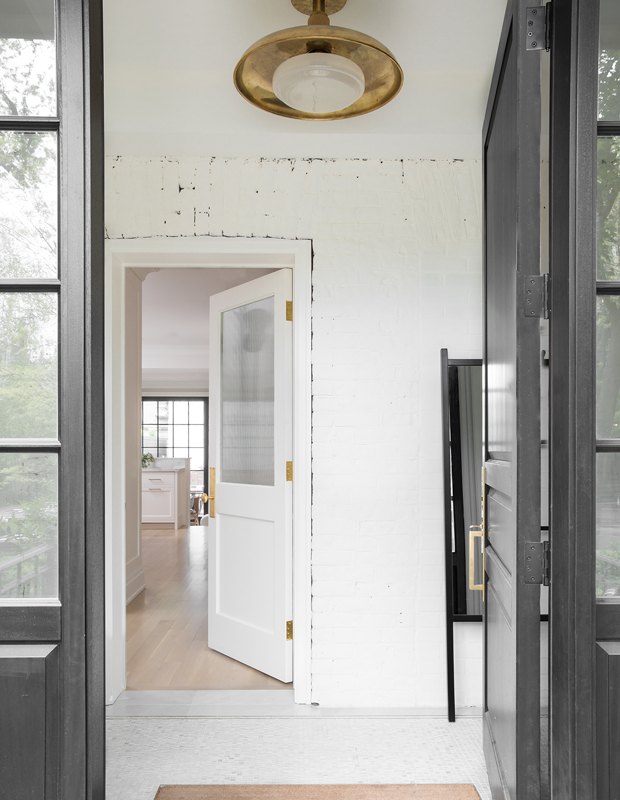
“We tried to keep as much of the original house as possible,” says Shauna. Subtle textural differences denote old and new brickwork; the tile-setting in the foyer is intentionally messy.
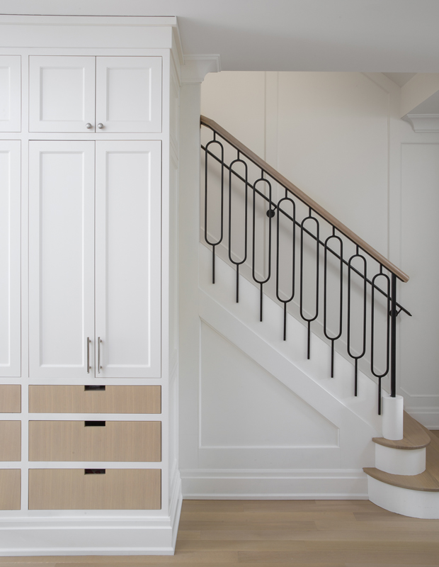
The picket detail on the main stairway balustrade was inspired by a similar style Sonya saw at a Chloé boutique in Paris. “It’s a focal point in the house, so it seemed only natural to give it a unique detail,” says Shauna.
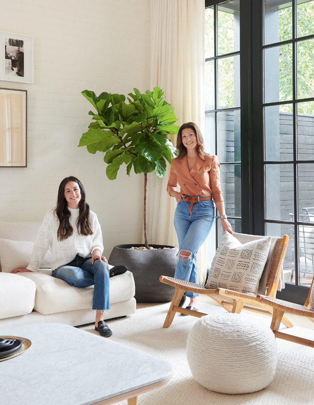
“The ask was for a New York brownstone look, incorporating elements of clothing stores such as Brunello Cucinelli and James Perse, and I think we did just that!” says Shauna (left), pictured here with Sonya.
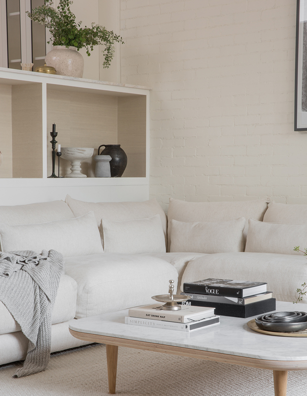
An oversized sectional ensures the space is comfortable and inviting. For those hoping to get this look without too many rules around the house, the key is using wipeable, outdoor and pretreated fabrics.
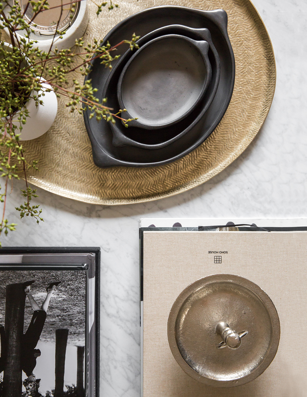
The coffee table is styled just so with stacks of books, a vase of autumnal branches and other objets.
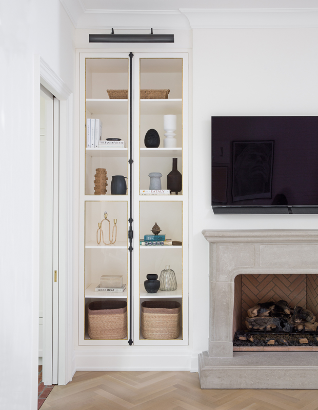
The cabinet’s glass-fronted doors and handsome hardware bring a traditional touch to the family room.
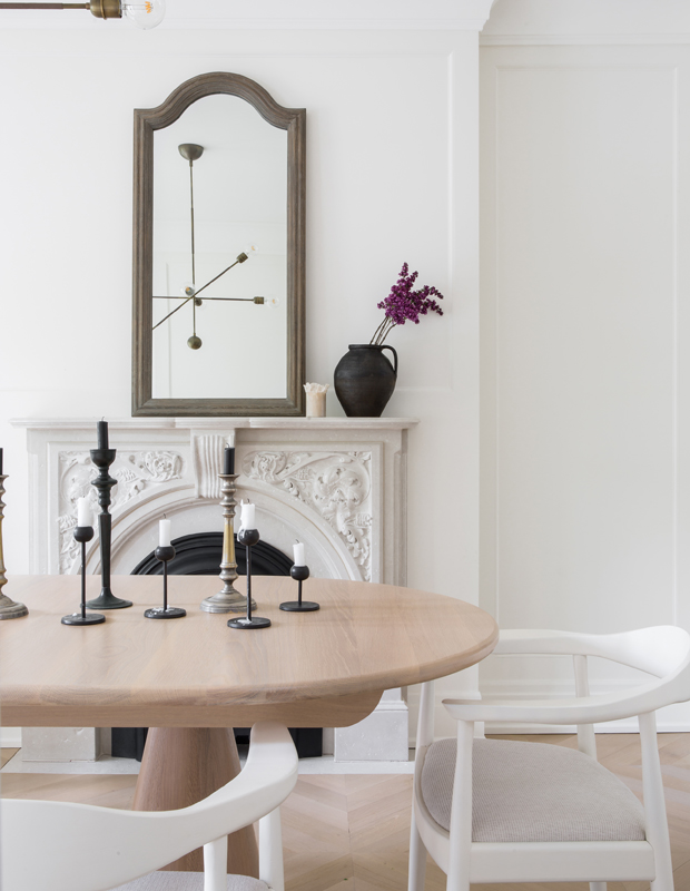
In the airy dining room, synthetic fabric covers the seats to keep things kid-friendly. “I can wipe away tomato sauce from our dining room chairs in one swipe,” says Sonya with a laugh.
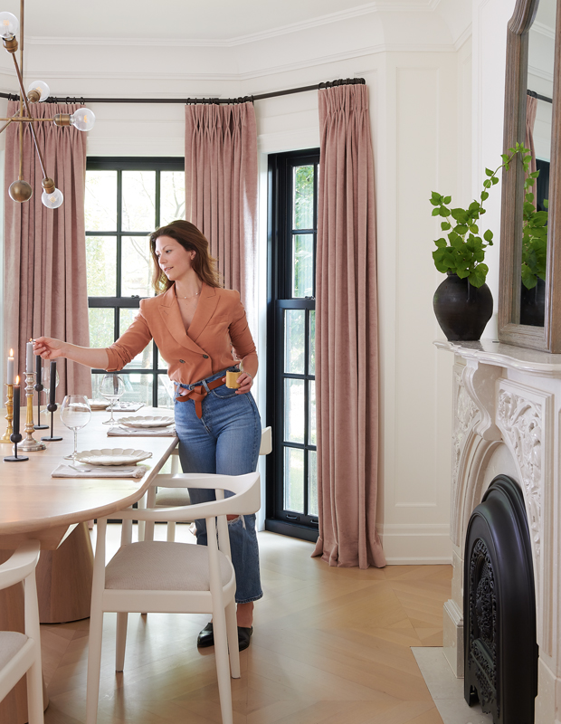
The dining room floor is laid in a chevron pattern and complements the original fireplace.
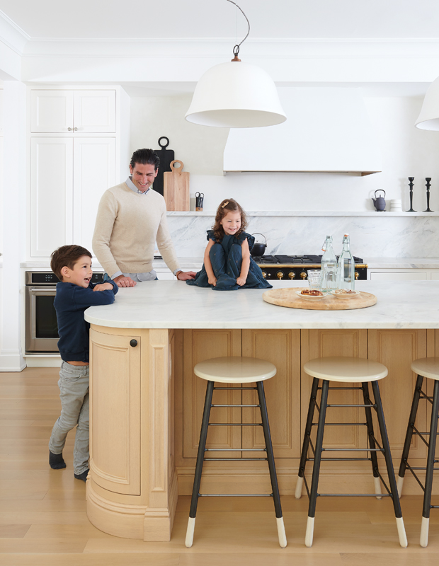
Stacey and the kids, Pearson, 6, and Poppy, 4, often hang out at the kitchen island. The home’s restrained palette in no way held back the owners’ enthusiasm for decorating with eclectic pieces like the plastered pendants.
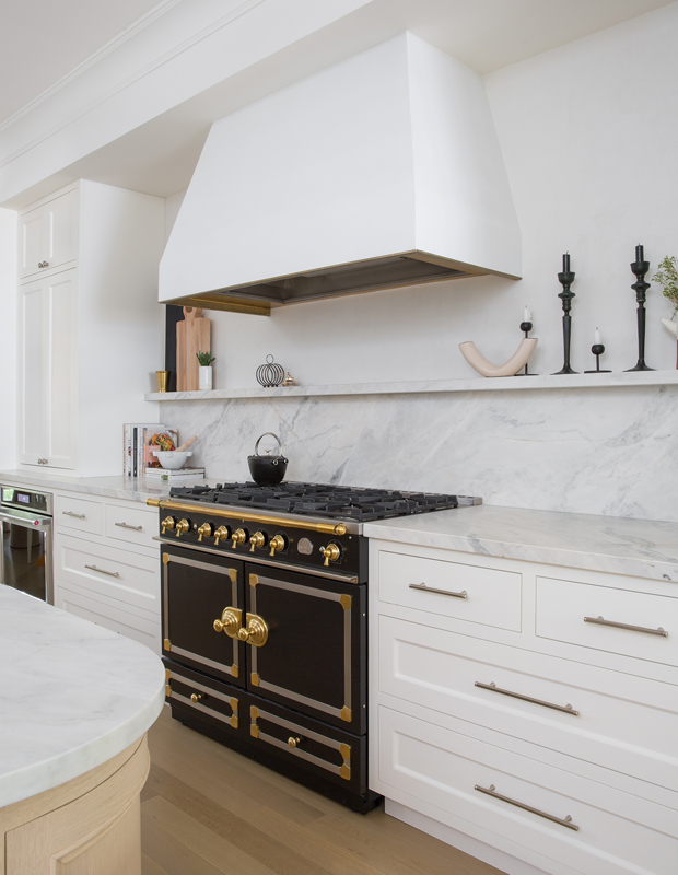
The La Cornue range is a stately addition to the kitchen. “It was critical to inject black tones for a multilayered look, be it through the range, the windows or the iron railing on the stairs,” says Shauna.
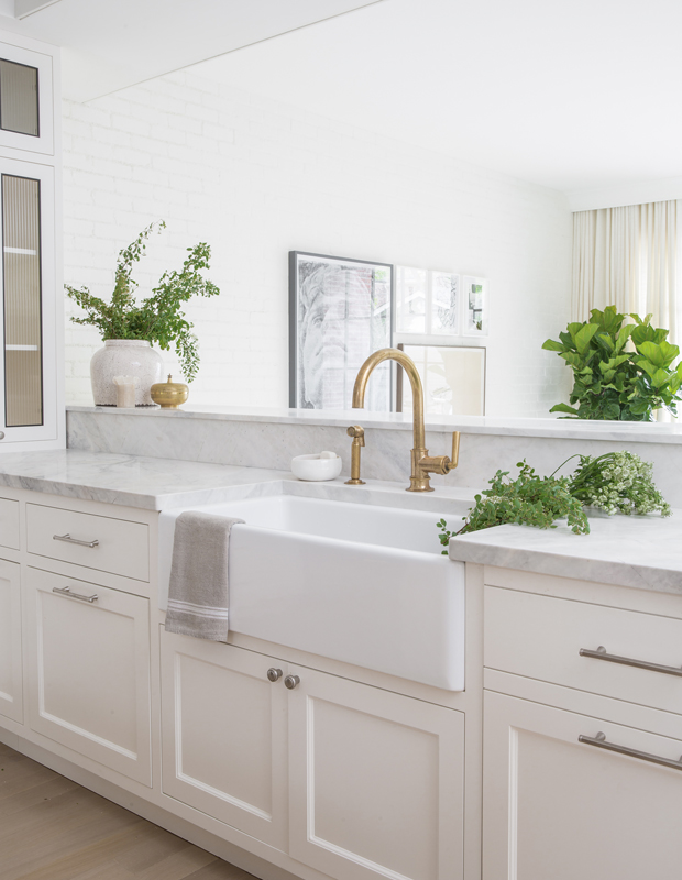
“People used to be scared of mixing metals, but it’s vital for creating multidimensional spaces,” says Shauna. Here, a brass faucet and white bronze cabinet pulls offer a balanced look that’s repeated through the home.
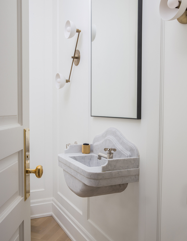
The minimalist powder room makes a statement with brass sconces and a hand-carved marble sink.
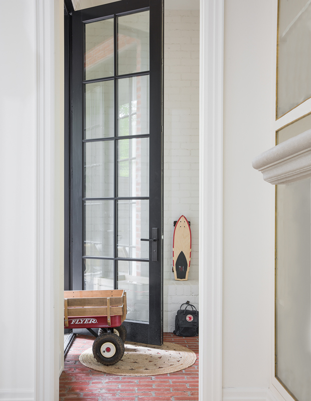
A red brick floor in the mudroom begins the conversation between the home’s historical exterior and its clean, modern interior.
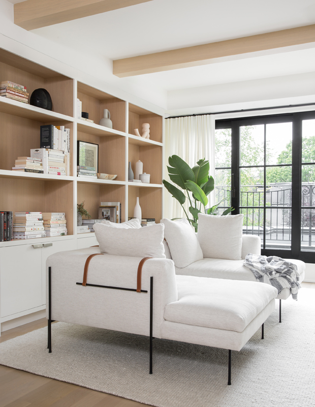
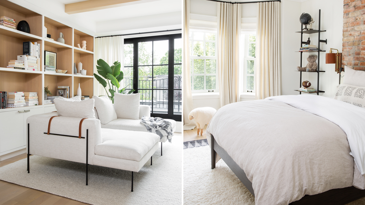
The upstairs living area and office features two chaises in the middle of the room and exposed wood beams that contrast beautifully with the white ceiling.
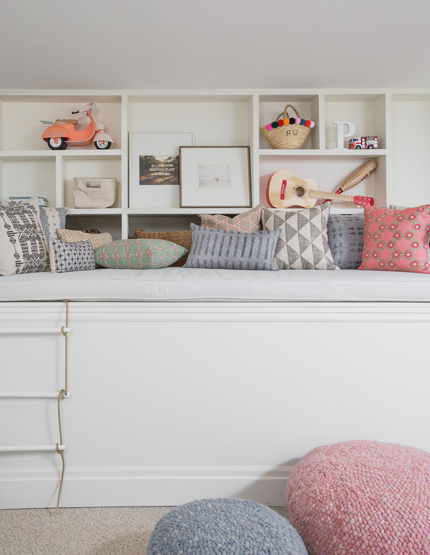
It’s OK if the pale upholstery, even in the kids’ playroom, doesn’t stay pristine. “We live with a lot of patina — our marble countertops tell many stories of late nights and fun moments, and our unlacquered finishes shine and dull over time,” says Sonya. “We want our family and friends to feel comfortable.”
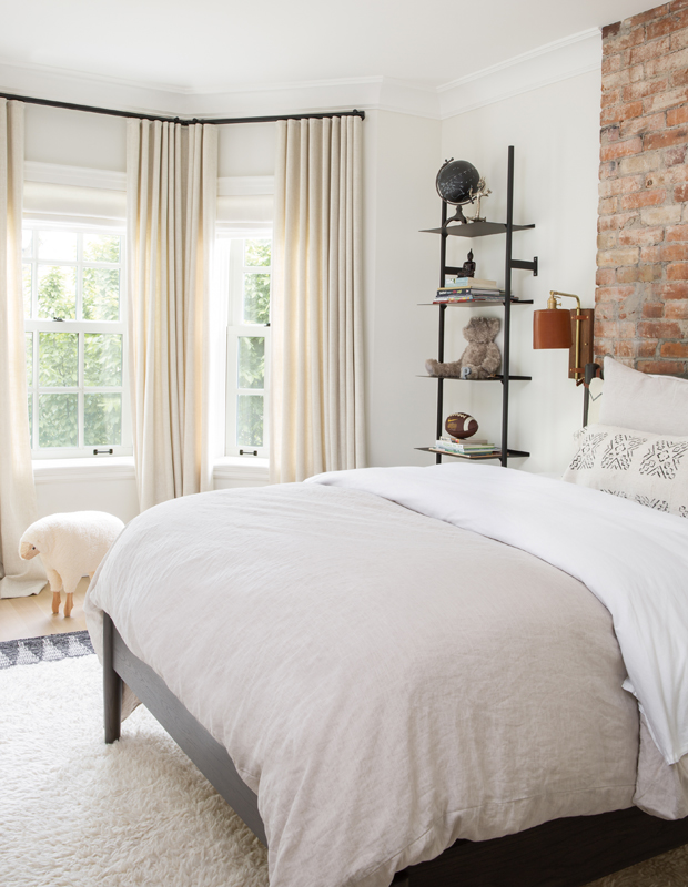
Shelving packed with toys and books looks curated yet carefree in Pearson’s bedroom.
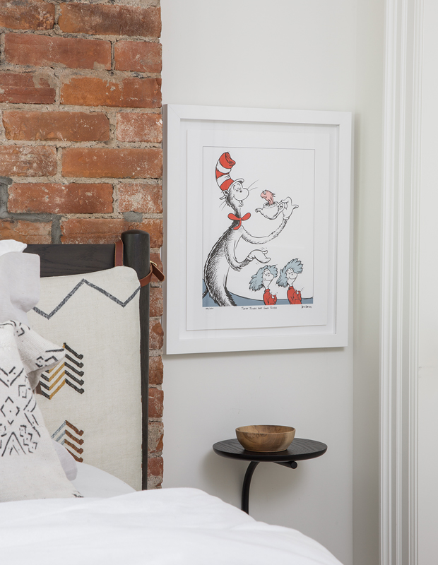
A brick wall and whimsical art bring a dash of red into Pearson’s bedroom, an effective contrast to the overall pale scheme.
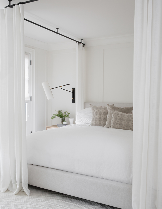
A dreamy custom canopy and layers of white make the principal bedroom a cloud-like retreat from the bustle of life.
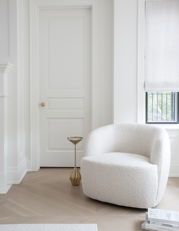
In a corner of the principal bedroom, the rounded armchair with textured upholstery and striking brass accent table add layers of sophistication against pale floors.
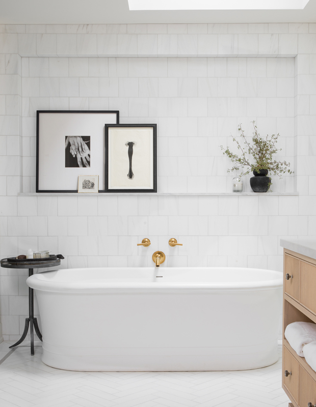
Brass fixtures were chosen in the principal ensuite because they’ll patinate over time. “A natural brass gets even better with age,” says Shauna. “I have clients who fear brass is too trendy, but it’s here to stay!”
Lauren Miller & Alex Lukey
House & Home October 2020
Shauna Walton