Decorating & Design
25 Ways To Make Bold Design Moves In Your Small Space
Updated on July 17, 2020
Decorating with a layered ethos that ties in sensational color, pattern and texture — also known as maximalism — doesn’t require a palatial pad to work. It just so happens that shoebox-sized spaces can be transformed into maximalist wonders, too. And when it comes to doing the most in small spaces, there’s ample room to get creative. Why not give the often forgotten entry some love with a bold hue or preen up a petite parlor with a sumptuous sectional that does the work of two in one?
Read on for ways to inject maximal elements in your small but mighty space.
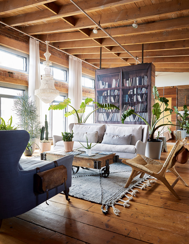
Introduce greenery. Summon your inner plant parent and turn over a new leaf by transforming your small space into a sanctuary full of life. Test out your green thumb with a low-maintenance fiddle-leaf fig, curate your very own herbaceous indoor garden or channel the tropics with an assortment of pretty palms.
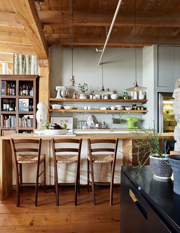
Opt for open shelving. Not only do kitchens with open storage — as opposed to boxy cabinetry — feel airier, they offer endless opportunities to stack, line and garnish the hub of your home with the quirky, collected knick knacks that can shine front and center.
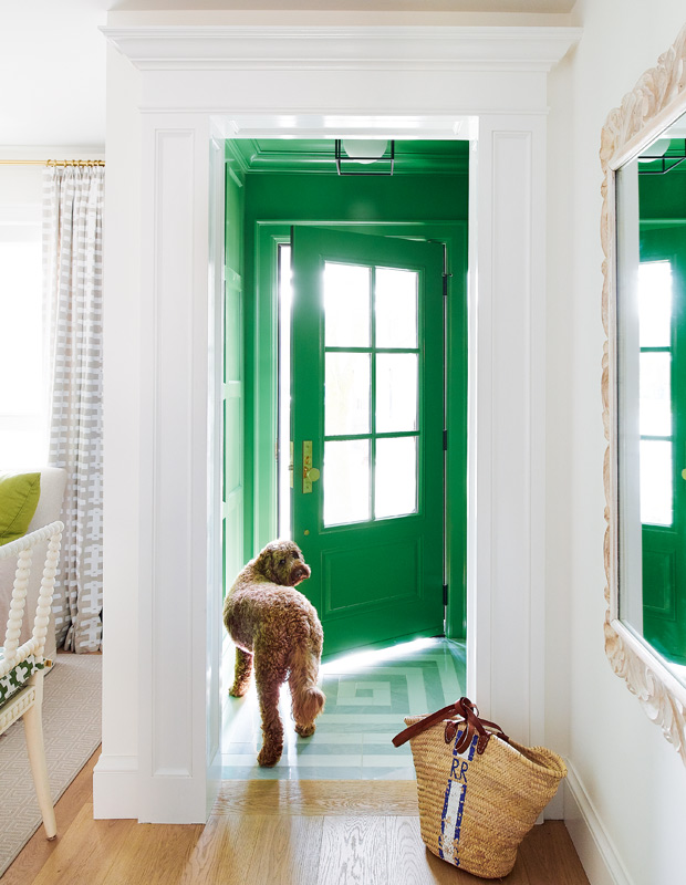
Give forgotten spaces visual punch. Enlivening the front entry with a bold palette of saturated color and graphic pattern is a foolproof way to make a lasting impression when guests step foot into your cozy casa.
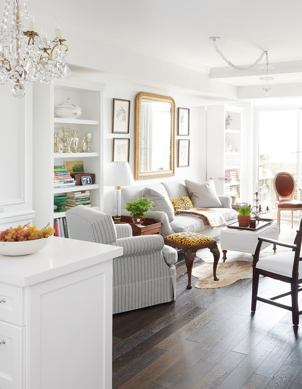
Choose a bright base. A mishmash of collected items set against crisp white walls wow in antique collector Catherine Hanson’s Toronto condo. Designer Michael Angus imbued a bespoke feel by displaying beloved finds, including her sparkling mercury collection, which takes pride of place on one of two bookcases that seem to melt into the enveloping walls.
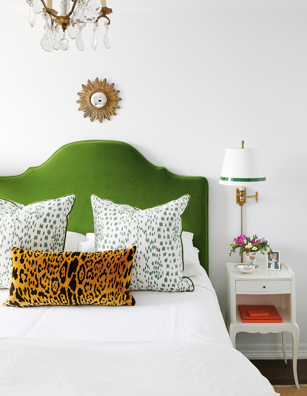
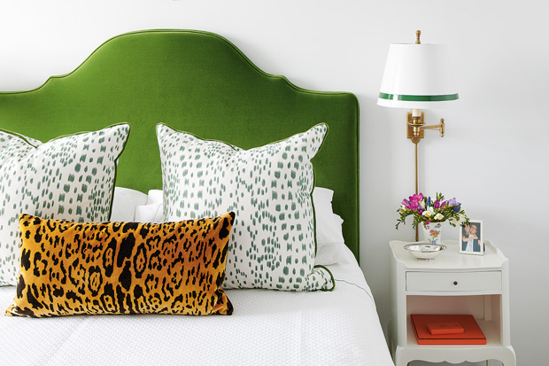
Don’t skimp on pattern, color or texture. Good things come in threes, and in this case, it’s a charismatic injection of pattern, color and texture. A velvet, leopard print lumbar pillow pops against the emerald green headboard and white, waffle-knit sheet. Talk about a simple bedscape that makes a statement.
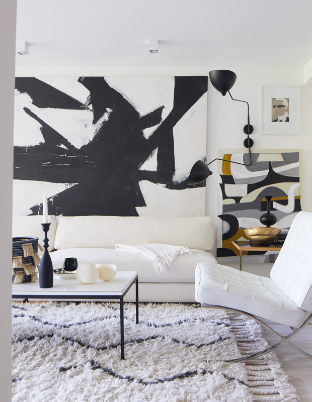
Bring in oversized accents. Exuding a simple glamour, the living room in designer Christine Ralphs’ urban, one-bedroom condo combines a large-scale artwork, rug and graphic black sconce for unmatched gravitas. The scale of the pieces is what really gives this small space its grandeur.
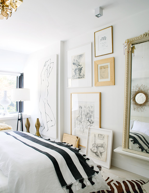
Add drama to a room with framed art. A collection of Christine’s favorite artifacts reside on her bedroom wall while a few rest aesthetically against it.
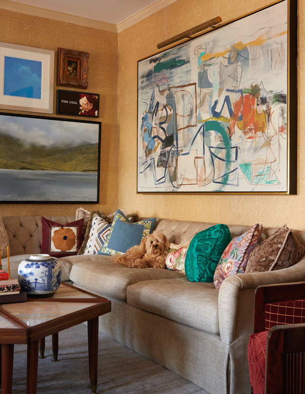
Combine one-of-a-kind pieces. Designer Philip Mitchell invested in a custom sectional sofa to perfectly mold along the corner of his 650-square-foot pied-à-terre’s living room. A line-up of unique patterned pillows inject verve and help create a collected feel.
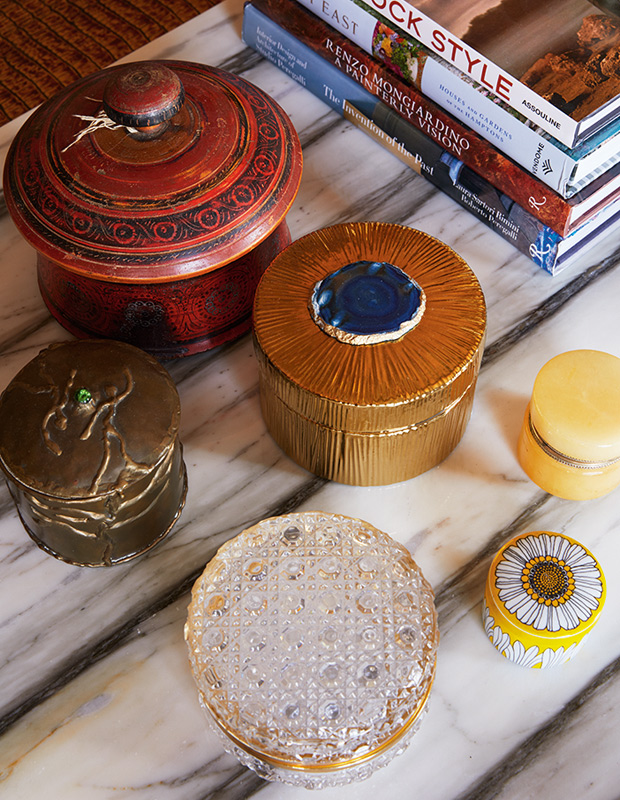
Create an arrangement with unique objets. A tribe of jewel-like trinket boxes are a clever and compact way to maximize storage space whilst artfully decorating your tabletops.
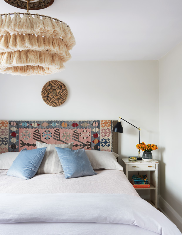
Give your headboard a fun facelift. Tonic Living founder Janine Morrison jazzed up this headboard made from a salvaged door with a covering of batting and global-inspired fabric. The result is a statement piece that meshes beautifully with the bedroom’s eclectic, yet minimal vibe.
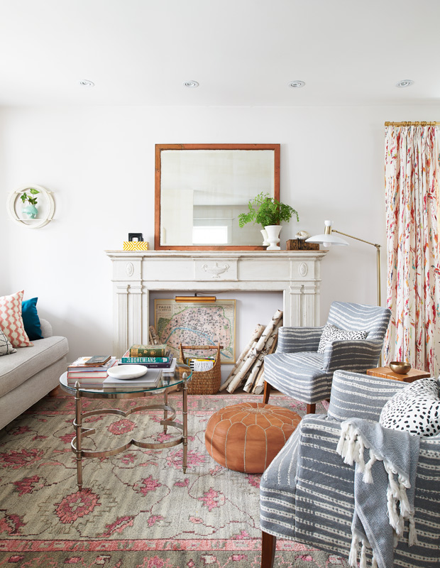
Bring new life to existing pieces. Homey, reupholstered vintage chairs are a snug addition to this 900-square-foot eclectic family home and play nicely with the casual tan pouf that doubles as an ottoman and perch.
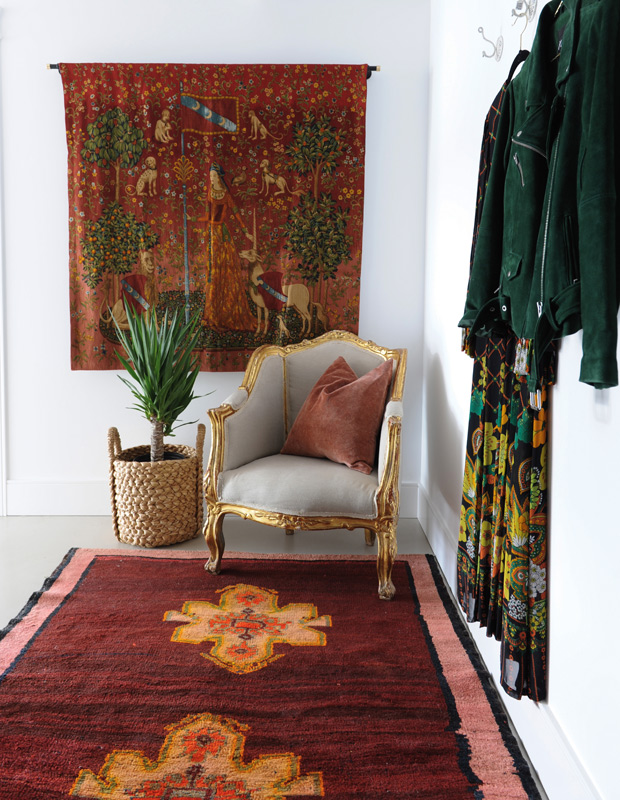
Inject tone-on-tone color. In the entry of homeowner Sara Shafran’s Vancouver loft, a tapestry originally belonging to her aunt is matched with a maroon runner that promises a plush entrance underfoot, while a terracotta throw pillow brings the cohesive, rustic red look together.
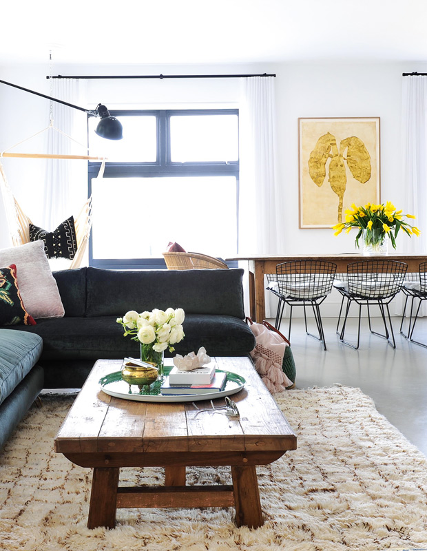
Invest in pieces that work double-duty. The contemporary appeal of this sun-drenched loft is enhanced with its luxe L-shaped sofa. It transforms into two individual perches that flank the coffee table when it’s time to host.
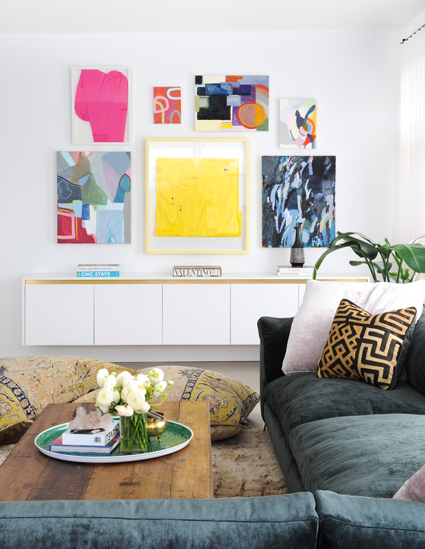
Create a gallery wall. With no hard-set rules on how to bring this gallery look home (except outfitting your space with pieces you love), this decorating technique — perfect for spaces big and small — demands more, not less!
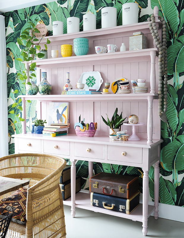
Paint the town pink (or, whatever color you prefer!). A sea of pink is the perfect backdrop for dining essentials and odd curiosities in this tropical-inspired dining area featuring a painted hutch and groovy palm wallpaper.
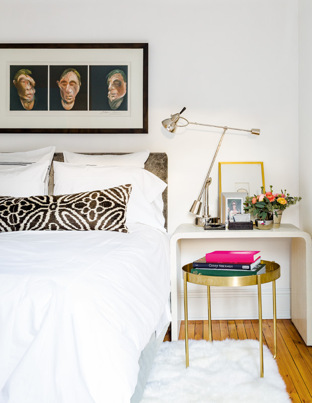
Double up on storage. Small space living doesn’t mean you have to give up on storage or style. A clever pairing of a brass side table and shagreen console mean this bedroom has space to store bedside necessities and the odd book or two for bedtime reading.
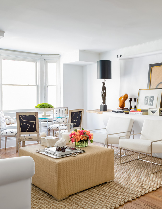
Design it to be multi-functional. This Euro-style flat — which is also designed to be easily transformed into a photo studio — is filled with artwork and sculptural accents perched atop a roll of white wallpaper.
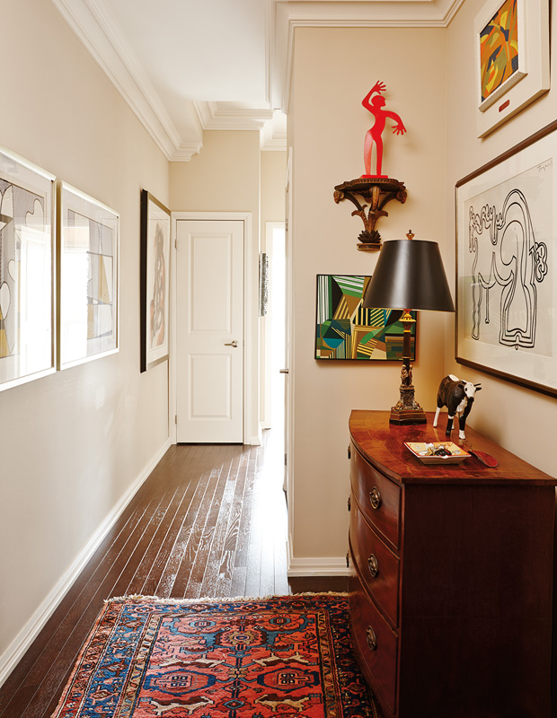
Layer in luxe pieces. With limited square feet, the trick to maximizing style is easy: it’s a layering game. Here, a Georgian chest, Persian carpet and gallery wall combine for an entry hall that feels decidedly luxurious.
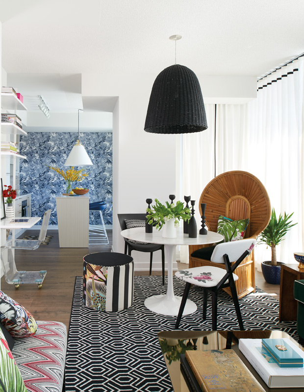
Separate rooms with color. In this open-concept living space, a bold injection of black, white and natural rattan brings drama to the dining area, while a splash of blue and white accents work hard to define the kitchen behind.
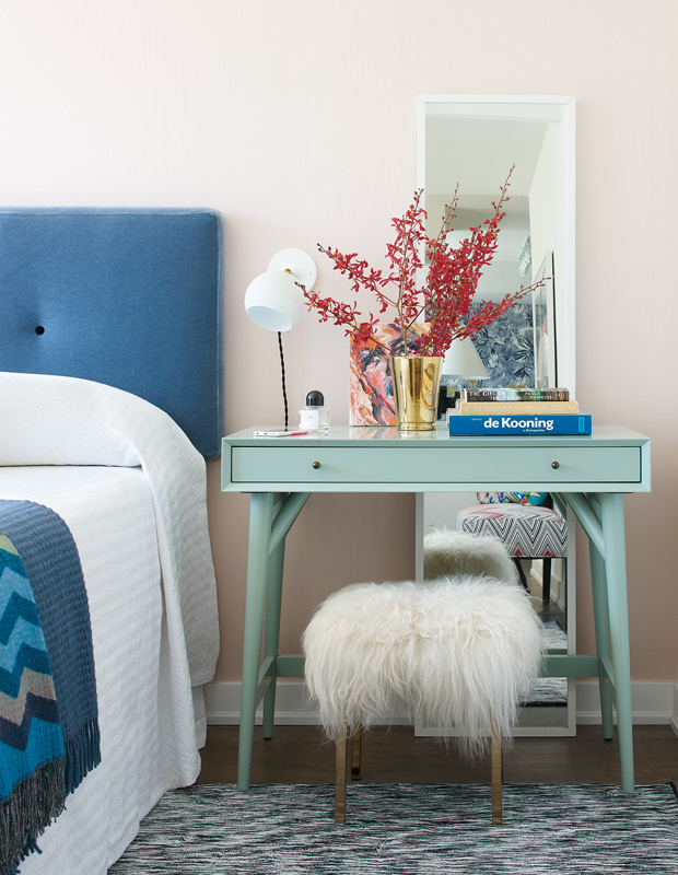
Treat your vanity like a vignette. Inspired by pastel hues reminiscent of the Caribbean, this pretty bedroom’s makeup table supports both books and foliage offset with a floor-length, get-ready-with-me mirror.
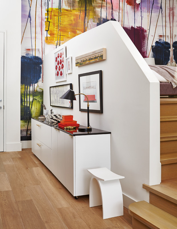
Warm up busy rooms with wood flooring. From the gallery wall to the graffiti-esque wallpaper coloring this artful loft, oiled white oak floors are a cozy compliment that keep the space from overwhelming.
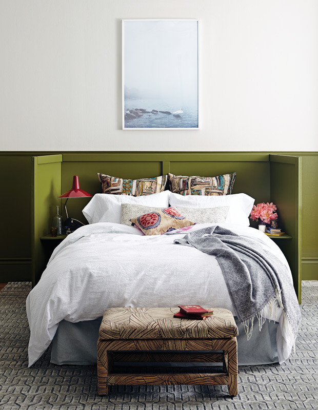
Pair lush pattern with liveable color. For a unique take on the traditional headboard, a custom olive triptych one is the perfect backdrop for the animated, global patterns that outfit this slumber sanctuary.
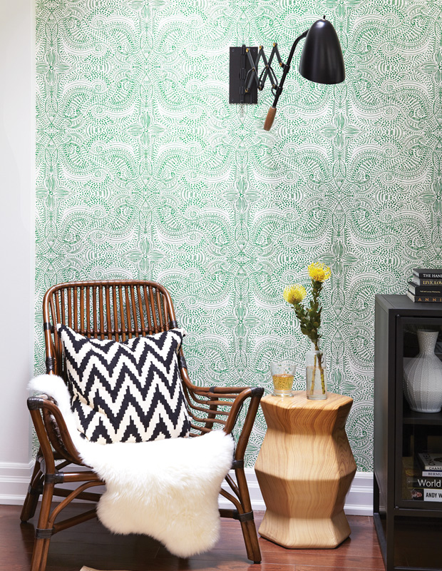
Make a statement with a feature wall. Covering a single wall in a patterned paper can make all the difference. Paired with wood tones and natural motifs, this space imbues an earthy quality.
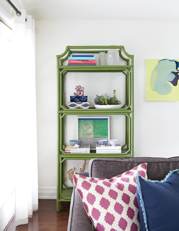
Bring functional pieces to life with bright hues. The leaf green hue of this pergola-style étagère is a stylish alternative to a traditional wood shelving unit. Swathed in hues reminiscent of lush courtyards and beyond, your treasures will look as elegant as ever.
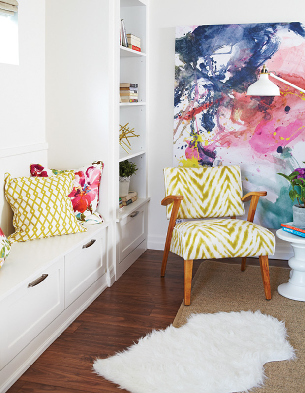
Infuse pops of color. A dynamic, abstract artwork provides a richly-colored escape when decorating an all-white space. Splashes of zesty chartreuse energize the artful swirls of teal, navy and pink behind.

