Decorating & Design
New York Designer Monica Fried Shares Advice For Decorating With Color
Updated on November 28, 2023
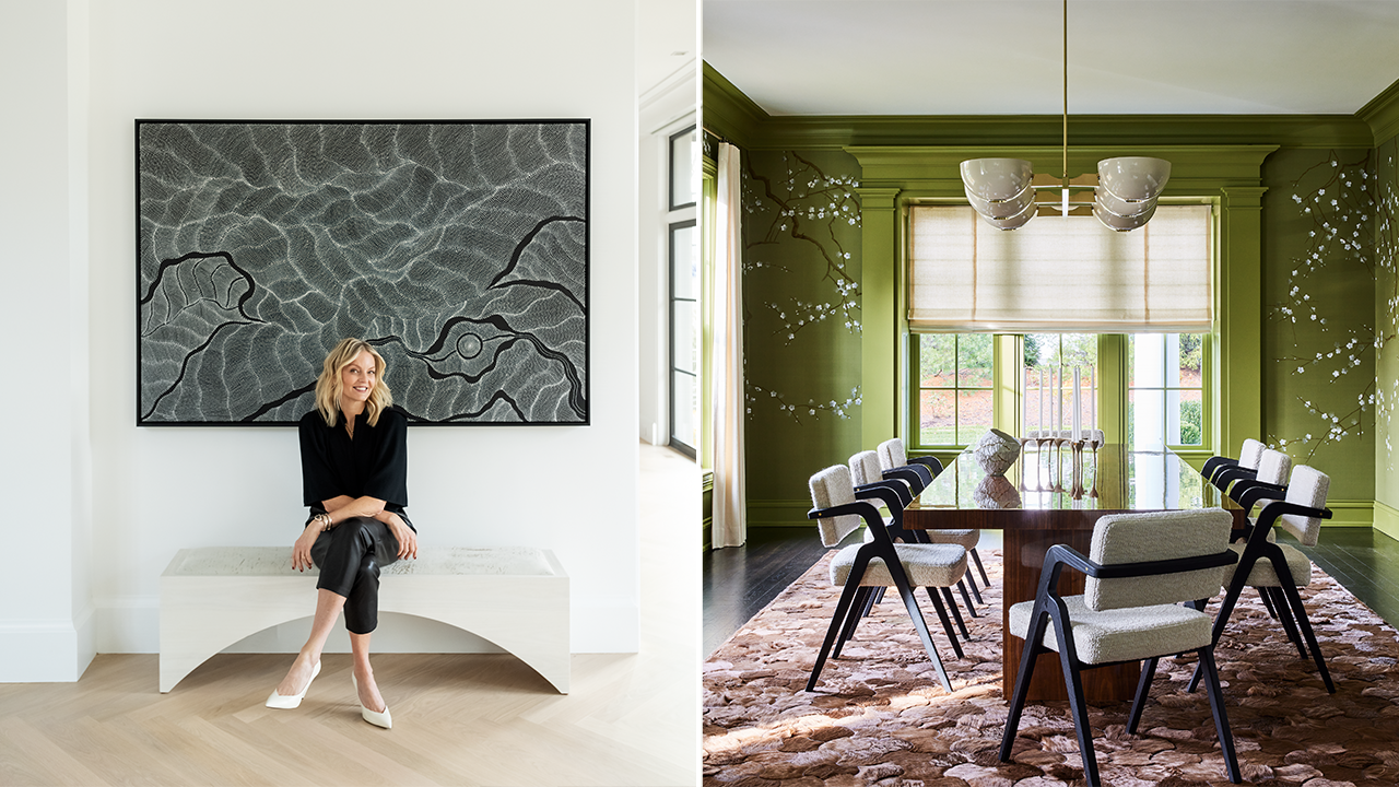
Whether you live in a castle or a condo, the pull to decorate and surround yourself with whatever makes you happy — be it a comfortable chair, a flower-strewn wallpaper or simply a color that puts a smile on your face — is irresistible. For some people, the pursuit of a beautiful home is the pursuit of happiness. Back in 2020, clients of New York–based designer Monica Fried bought a recently built, white clapboard house on one and a half hectares in Greenwich, Conn. Inside, every wall, ceiling, sink, cabinet and counter in the seven-bedroom home was white. It was heavenly, but the young family with three kids (plus two cats and a new puppy) knew exactly what it would take to make them happier: color, and lots of it.
“I wanted to live with colors that bring me joy,” says the homeowner. Contrary to the usual push-pull between color-shy client and designer, she found herself encouraging Monica to go bolder, rather than quieter, with their palette. Buoyed by the clients’ wishes and given the challenge of infusing life, personality and patina into a huge house that was barely a year old, Monica began by swapping out the vanilla vibe for a juicier palette of gutsy, saturated shades.
Scroll down to see all of the ways Monica added color to this house. Plus, get some of her best design lessons for how to do the same to your home!
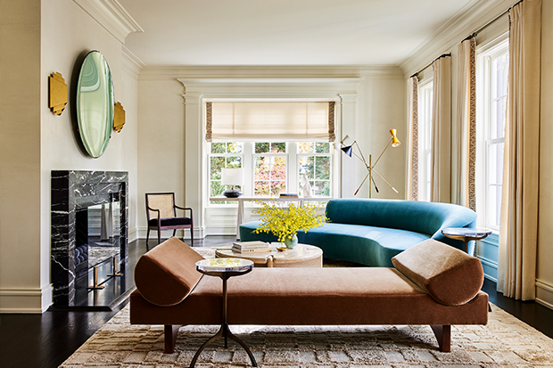
“The home had great bones, with tall windows, beautifully proportioned rooms and 10-foot-high ceilings, but it was bland,” recalls Monica, who adopted a relaxed approach to decorating risks. But there was a caveat. “This home’s traditional, symmetrical architecture lent itself to different colors because the rooms were clearly defined. This wasn’t something you would do in a modern, open-plan home, where you’d want it to be more neutral and have more flow from space to space.”
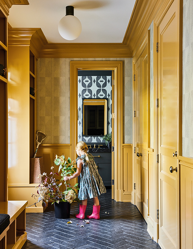
Pale, wishy-washy hues were banished — the mission was to amp things up, not dial them down. Formerly blah walls were layered with vibrant paint, Venetian plaster or wallpaper, lending each space its own personality. Hues were chosen to create a specific mood; smile-inducing pink in a little girl’s bedroom, energizing saffron in the mudroom and calming olive green in the library.
Originally all white, the mudroom now features glossy yellow cabinets, allowing the sight line to the powder room to shine.
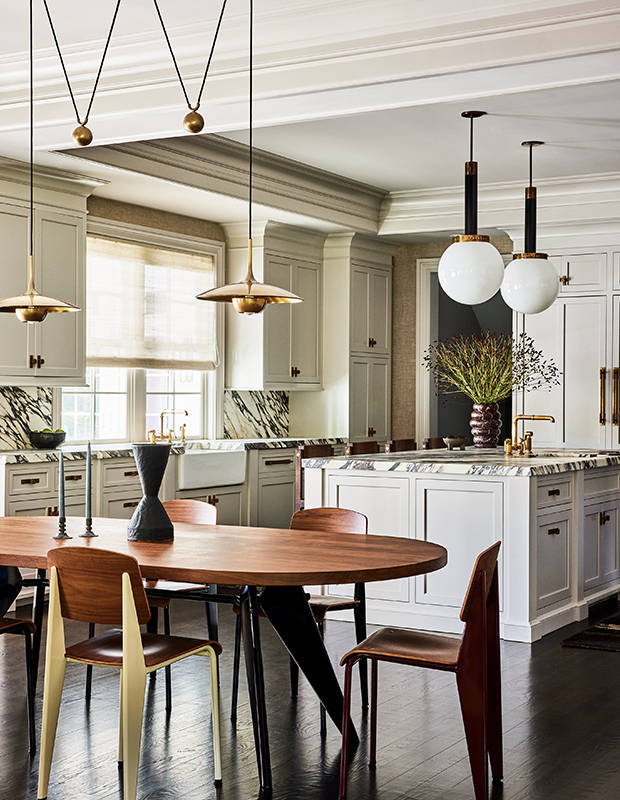
“Sometimes you want to feel refreshed, and sometimes you want to be embraced,” says the client. “Our previous home had a lot of greys and blues, but I wanted warmer colors because this house is so spacious. I wanted to make sure the rooms felt warm and cosy; we love to entertain, and now the house has an inviting quality that people respond to.”
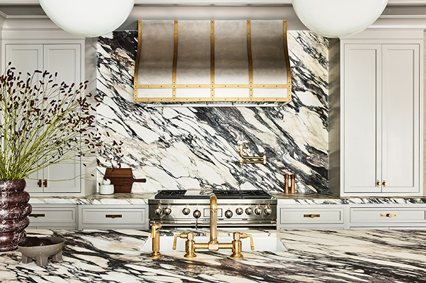
“We wanted marble that was elegant, dramatic and good at disguising stains, and a showstopping vent hood that would be a focal point,” says Monica’s client. “I think of these elements as jewelry, pieces that make a dress — or a room — special.”
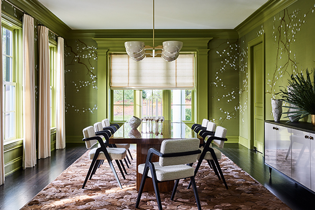
“When you’re in the dining room with all that lovely greenery inside and outside, you feel like you’re eating outdoors,” says Monica.
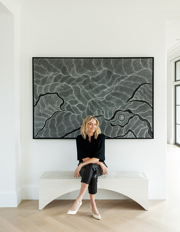
In Monica’s (pictured above) hands, the spaces have a sense of connection that stems not from repeating colors but from consistently mixing old and new elements — a vintage-style chandelier hovers above a contemporary sectional, and pop art sidles up to a classic marble mantelpiece. “I find that when the mix is more eclectic, it becomes timeless,” says Monica. “It’s those interesting pieces that give a room personality.”
Keep scrolling for Monica’s best advice for using color throughout your home!
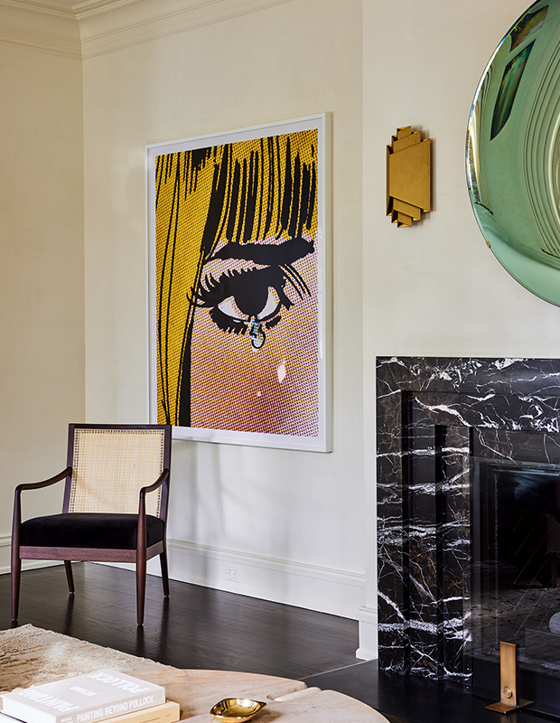
1. You Don’t Always Need Colorful Walls!
One strong art piece like this one can do it. Graphic art, colorful sconces and a veined fireplace surround energize this corner of the living room.
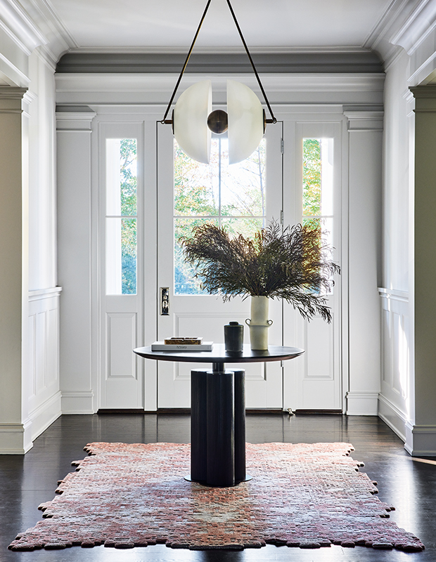
2. Punch Up A Dark Floor With An Area Rug
This jigsaw-edged rug is floor art.
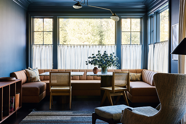
3. Paint the Ceiling
Wrapping the room in one color expands the space. The home’s cosy dark blue family room is dubbed the “Bistro Room.”
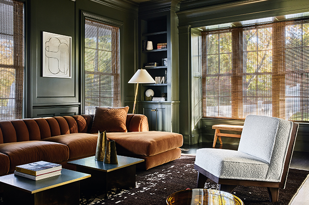
4. Be Consistent
Paint the millwork, walls and ceiling in the same hue. “It’s a misconception that dark colors make a room feel smaller,” says Monica of the home’s intimate, olive-toned library.
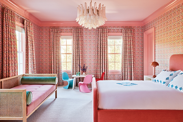
5. Match Drapes To Wallpaper
Repeating one pattern in a room is a classic look. Pink wallpaper and matching drapes in a vintage-inspired floral print bring a cheerful, enveloping vibe to a younger daughter’s bedroom.
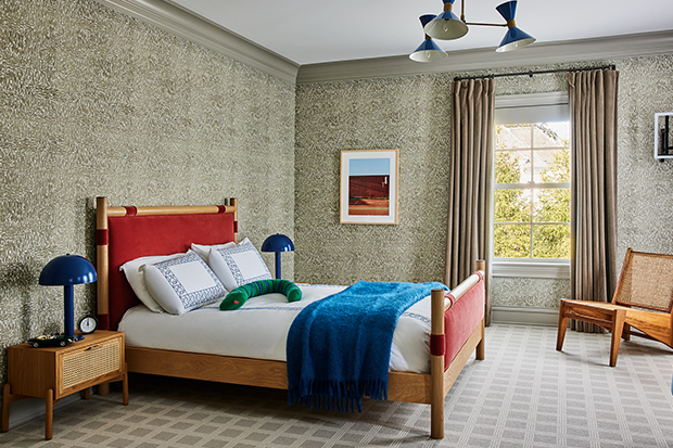
6. Add Personality With Colorful Accents
Like this pair of glossy lamps, rust-toned headboard and deep blue throw. Densely patterned wallpaper and mid-tone wood furniture create a sophisticated scheme in a young boy’s bedroom.
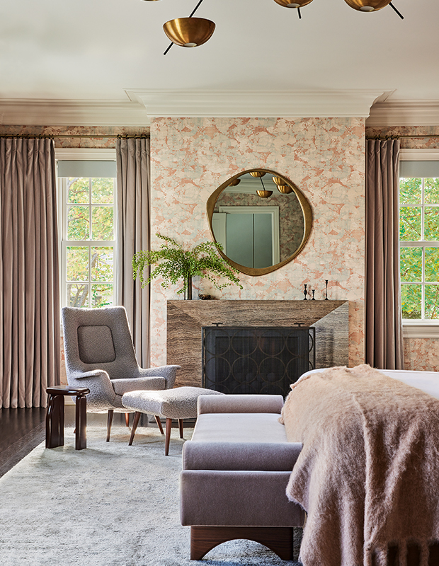
7. Pull Your Palette From A Print.
The wallpaper’s soft pinks and purples guided the paint and fabric choices in the principal bedroom. Monica chose blush tones for a luxe, relaxing vibe in the principal bedroom.
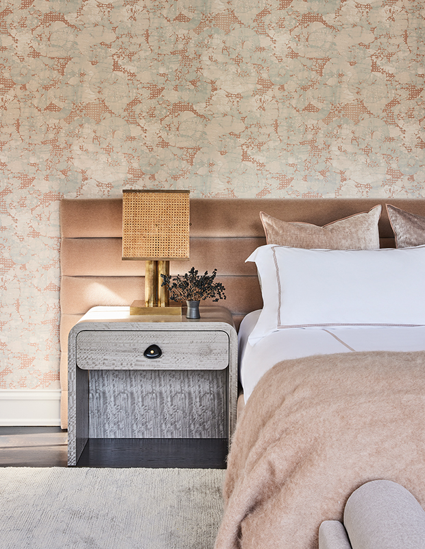
The principal bedroom’s mohair-upholstered headboard and waterfall bedside tables are vintage inspired yet thoroughly modern.
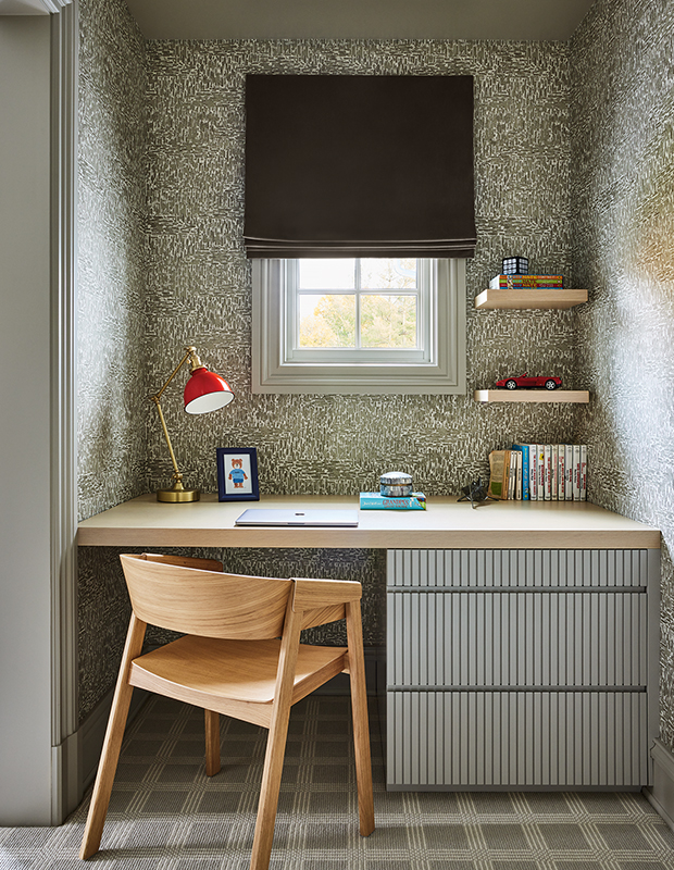
A custom built-in desk provides the perfect homework nook.
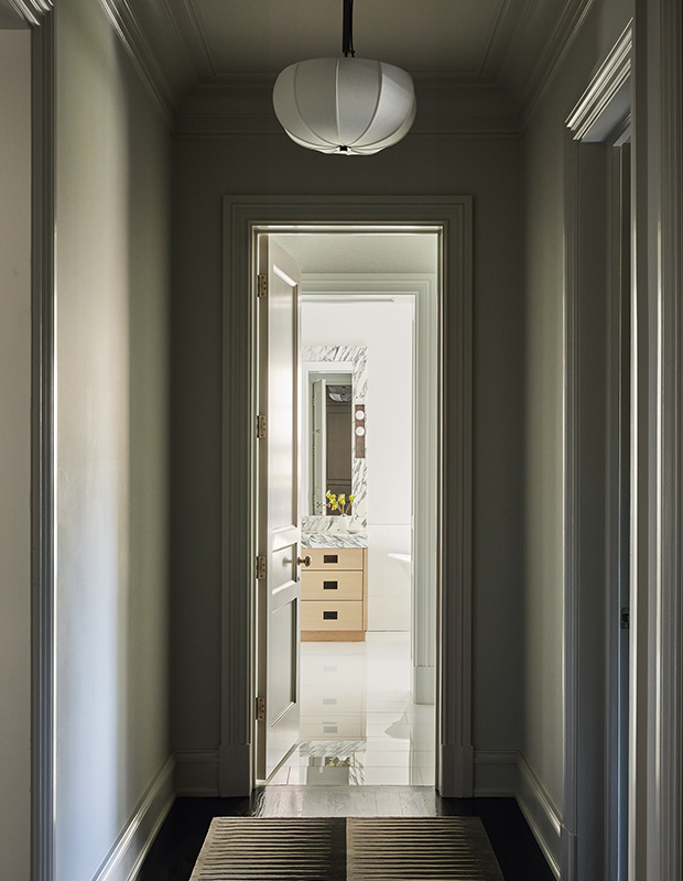
A calm, pattern-free corridor leads to the principal bathroom.
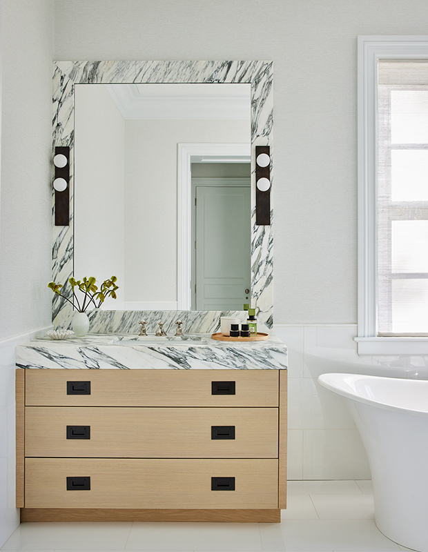
To create a timeless look, Monica replaced the principal bathroom’s white cabinets with oak vanities and mirrors framed in Arabescato marble.
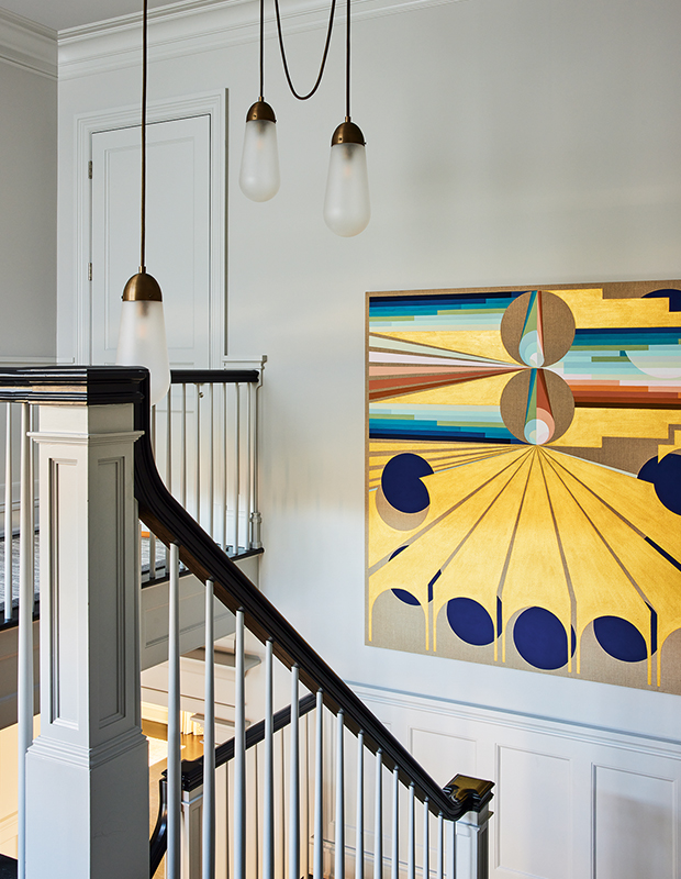
The entry wall color continues up to the second-floor landing to create a gallery-like setting for the homeowners’ art collection.
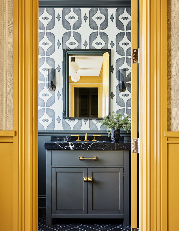
Now, the house has an easy polish that reflects its carefree owners. Although this is the home of three young children, sophistication is never sacrificed for style. Nothing is off-limits and no room is out of bounds. “If things get stained or scuffed, we’ll just use it as an opportunity to find another fun fabric. I don’t want them to feel like they’re living in a museum,” laughs the homeowner, as her young daughter and a flock of friends skid by in a blur of pink and giggles. “We all feel blessed that we get to live amidst such beauty. We couldn’t be happier.” Mission accomplished.
Nicole Franzen
House & Home June 2022
Monica Fried


