Kitchens
Discover Our Brightest Kitchen Lighting Ideas!
Updated on April 6, 2017
A lot of detail goes into designing a kitchen — the backsplash, countertops, cabinet fronts — and the right lighting can enhance those things even more while making a style statement all on its own. Choosing the right kitchen lighting depends on a whole host of things (natural light, placement of island, ceiling height) but most of all, they have to look great and suite your taste. From bistro-chic to Scandi-modern, here are some of our favorite looks for kitchen lighting from the pages of House & Home.

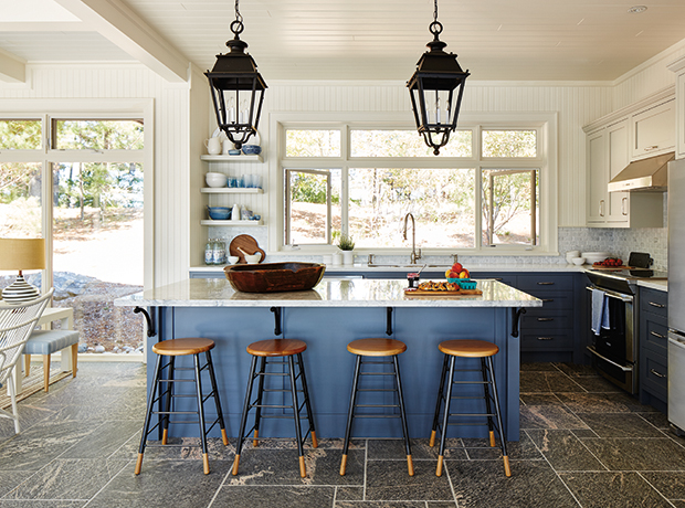
Refurbished street lanterns from Paris add some drama to this cottage kitchen. Large lanterns with multiple bulbs and clear panes of glass, like the ones here, provide plenty of illumination over worktops and islands.
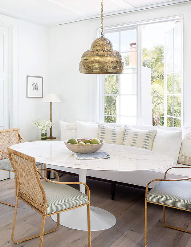
In this breakfast nook, a vintage brass beehive chandelier provides a hit of warmth even during the day. A rich metal fixture is an especially great look for warming up white kitchens.
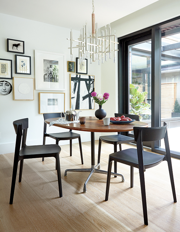
A sculptural fixture adds some sparkle to designer Shirley Meisels’ breakfast nook, but the soft silver finish doesn’t distract from the gallery wall of art behind it
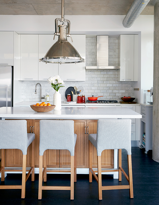
A single oversized lamp anchors the space and creates a focal point. The industrial vibe of the fixture ties in the exposed ductwork and concrete ceilings of this modern condo.
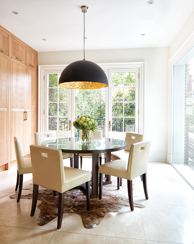
A fairly serene kitchen clad in blond woods and pale tiles has a dramatic moment in the breakfast nook. A dark round table is topped with an over-the-top black pendant. The fixture is softened by its warm gold interior, a feature hidden until seen from below.
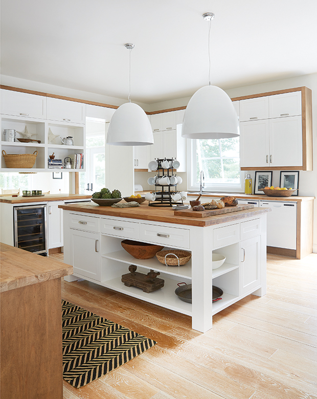
Designer Montana Burnett opted for larger-than-life pendants in her family’s lakefront cottage for a moment of modernity against the Shaker-style cabinetry. The scale of the room stops the pendants from feeling overwhelming.
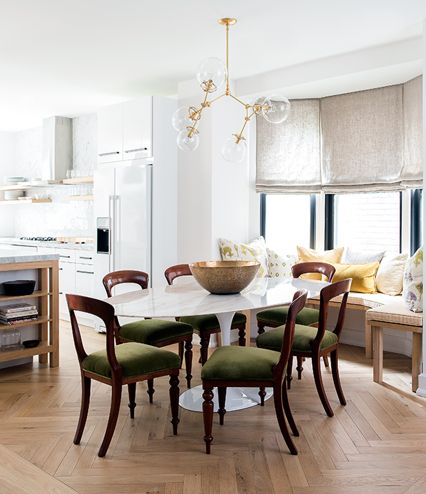
Multi-armed orb lights are having a resurgence as of late, thanks to the popular vintage-meets-modern style of decorating. Designer Sam Sacks dreamt up this light fixture which works perfectly with the length of the retro table, and plays off the antique chairs.
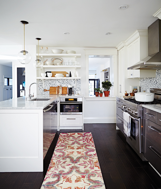
Glass orb pendants are a popular choice for kitchens and for good reason. They won’t obstruct sightlines over a counter and provide plenty of light. Here, a pair from Cedar & Moss adds a modern pop against a fairly neutral backdrop.
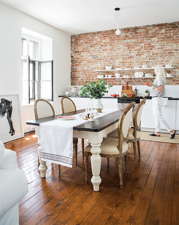
When creating a pared-back, minimalist space with original architectural features such as exposed brick walls, homeowner and designer Trudy Crane opted for simplicity. Case in point: her bare-bulb light fixture strung from a cord in artistically tied knots. Simple can be best.
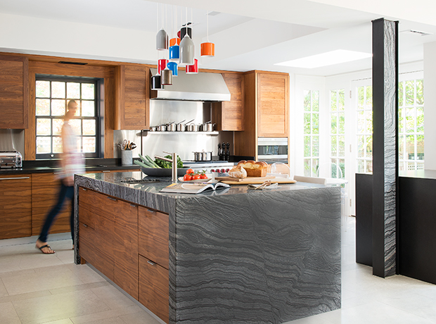
Why not have some fun with your lighting? Here, a playful chandelier by Castor proves to be just as exciting as the countertops and adds a touch of whimsy to the otherwise sophisticated space.
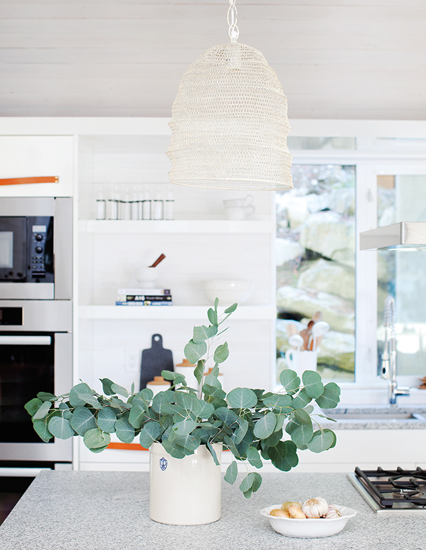
For a soft look, a pair of woven pendant lamps adds a hint of texture. When lit, they shine delicately, creating an ethereal atmosphere.
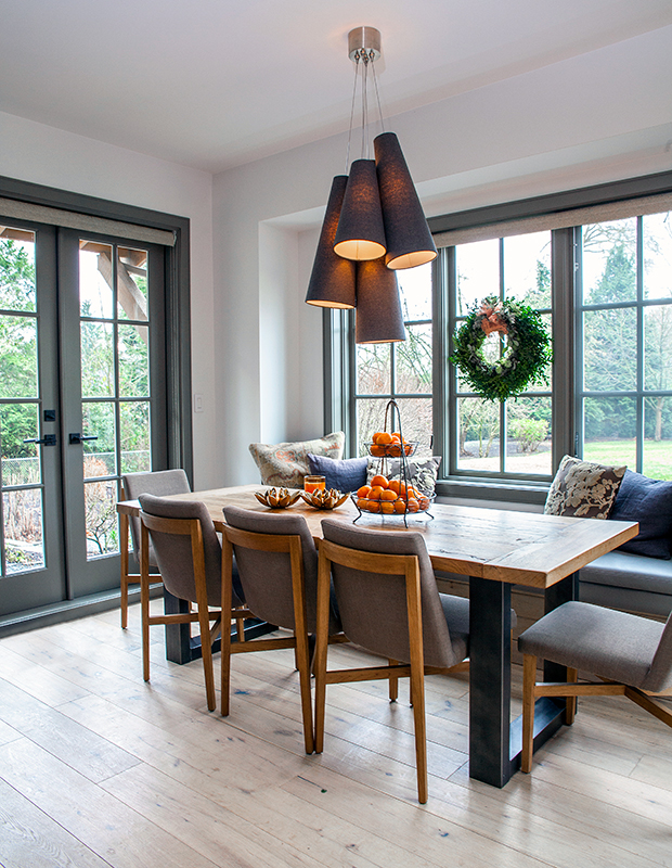
A cluster of cone-shaped shades offers a Scandi look, especially when paired with the warm woods of the table, chairs and floor. Its dark grey shades pick up on the window surrounds and textiles used for a modern bistro feel.
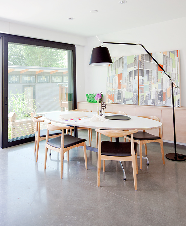
Kitchen lighting doesn’t always have to be conventional! Buck tradition and opt for an arcing floor lamp, like the one in this Japanese-inspired Vancouver home. The lamp feels fresh and playful — the perfect addition to any family kitchen.
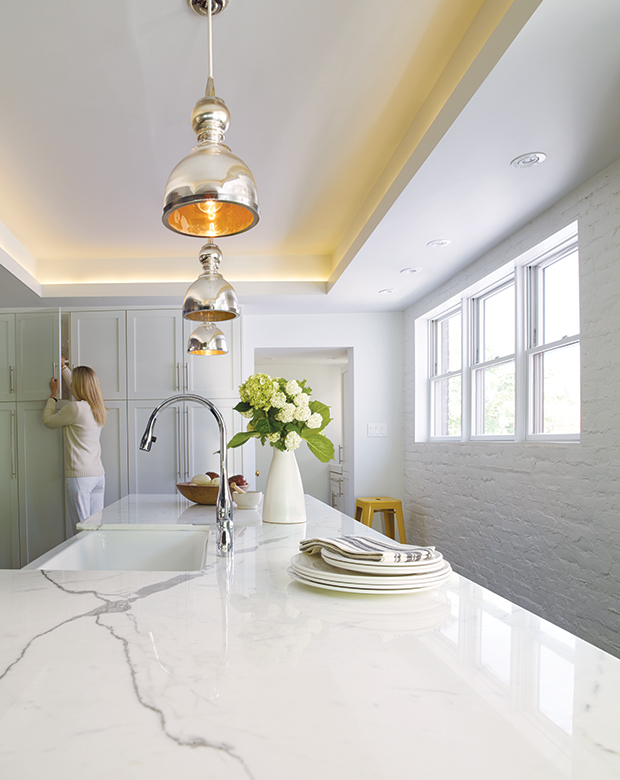
Layers of different lighting sources combine to create a lush and well-lit interior in this kitchen. Recessed cove lighting provides a nice atmosphere light, while three glossy pendants illuminate the island.
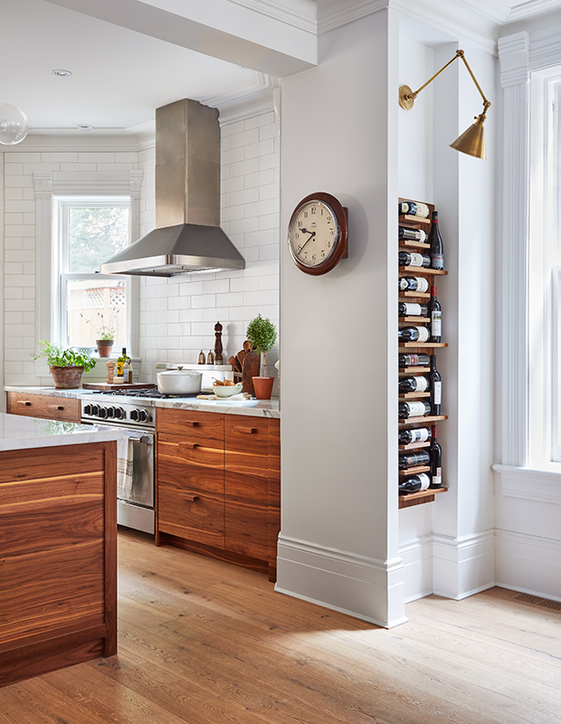
A smart-looking brass wall sconce provides bistro flair and a dash of luxury. Lighting normally reserved for living spaces — like shaded lamps, articulating sconces and library lights — add a sense comfort and coziness when used in kitchens.
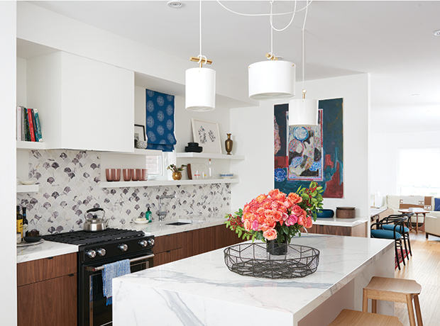
Casually swagged cords feel casual and funky in this whimsical kitchen by H&H‘s Kai Ethier. Their asymmetrical position also helps to hide an offset electrical outlet.
Tour this kitchen on H&H TV.
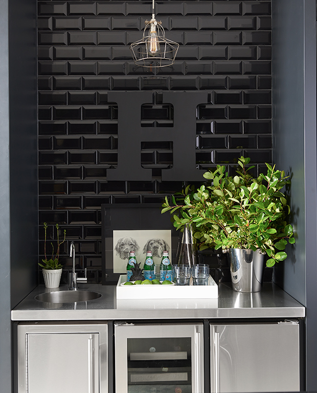
A dramatically-tiled bar demands an equally graphic light fixture. The wire cage and Edison bulb punctuate the black surround and tie in the professional chef’s kitchen countertops.
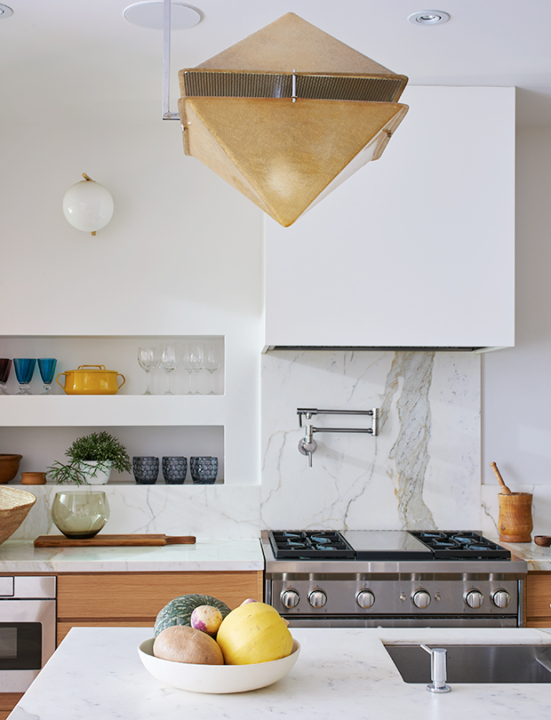
A pair of fibreglass pendants, found on 1stdibs, may have been an usual lighting material for a kitchen, but the gamble paid off and it looks spectacular. The geometric island pendants are modern without being harsh. To echo their pyramid shape, equally geometric orb sconces on the wall bring the room together.
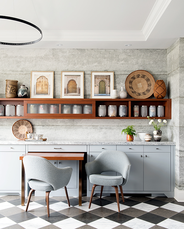
LED lighting is the way of the future and the future is here. A round metal chandelier evokes the candle-lit ones of years gone by, but is firmly updated with a sleek shape and small LED lights.

