Decorating & Design
Embrace Bold Hues In Your Home With The New Book, Living With Color
Published on September 24, 2019
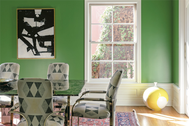
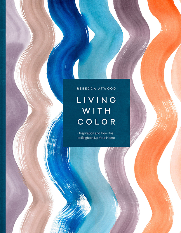 Brooklyn-based design darling Rebecca Atwood has created quite a fan following for her peppy printed textiles. But her latest book, Living With Color: Inspiration and How-Tos to Brighten Up Your Home, focuses on color, taking readers inside the homes of fellow artists and friends. If you have ever wondered if a grass green dining room was for you, start clicking.
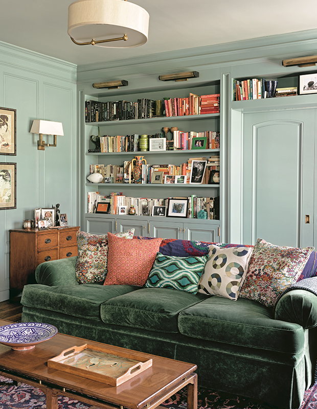
In the home of screenwriter Kayla Alpert, mint green walls keep company with a deeper green sofa. “I love that monochromatic look of using two shades of one color in a big way in a room. The other colors are layered on top, so it doesn’t feel too contrived but instead appears unified,” says Rebecca.
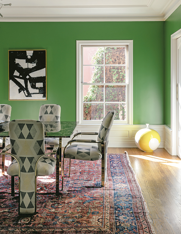
In Kayla’s dining space, the green is balanced by the rug, which grounds the space. “A traditional rug, in deep, rich colors that aren’t oversaturated, can be a nice counterpoint to brighter colors,” Rebecca observes. “The reds and deep blues become neutrals in this space, even though they are strong colors.”
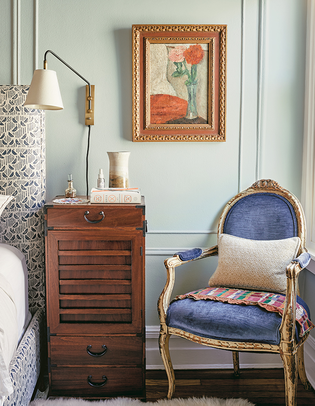
Rebecca notes that the rising and setting sun can make a big difference in how you see the colors in your home. “Look at the colors in that space during the time of day when you spend the most time there, since that’s how you’ll be experiencing them. Put a vase or a painting in those rooms and watch them at different hours to see if you’re able to tell how the light is changing.”
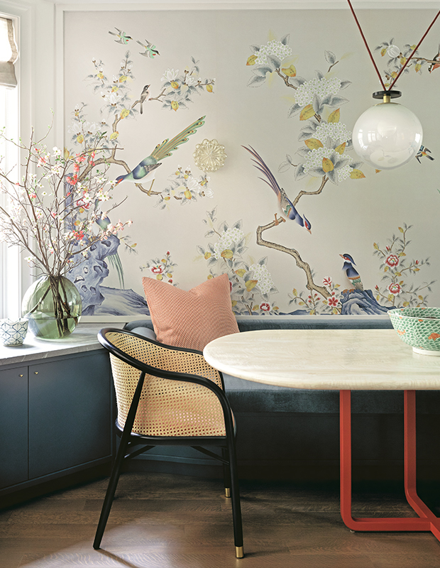
A de Gournay mural anchors the palette in this dining room by interior designer of Britt Zunino of Studio DB. “Color sets the mood for every space. With a coat of paint or a new upholstery fabric, you can transform your entire experience of a room” says Britt. The mural is used as a palette anchor. “It was an incredible place to start,” she adds. “You need a springboard.”
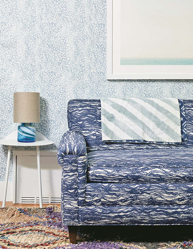
“Personally, I’ve always preferred navy to black, because there’s a little more energy to it,” says Rebecca. She advises layering blue on top of blue, or painting the edges of a door or a bookshelf blue. “Try something unusual, like electric blue on the inside of a lampshade, so you see it only when the light is on.”
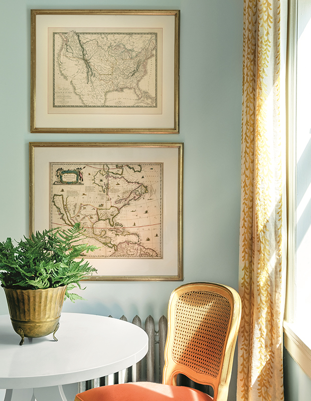
In designer Emily C. Butler’s pre-war apartment in Jackson Heights, Queens, minty blue walls are a natural backdrop, and yellow drapes connect with the warm neutrals, like cream, rattan, wood, and gold accents.
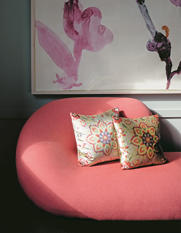
In designer Lucy Harris‘ Chelsea apartment, she gravitates towards airy Farrow & Ball colors that read as neutrals. “I used both Cromarty No. 285 or Light Blue No. 22. in my last home and adored them for years,” Lucy says. “Art and your furniture will pop beautifully against them.”
Sharon Radisch
Courtesy Living With Color: Inspiration and How-Tos to Brighten Up Your Home, Penguin Random House, 2018

