Decorating & Design
See How An H&H Editor Created A Stylish Apartment For Her Sister
Updated on April 7, 2020
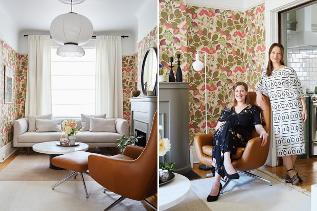
A shared love of color was the inspiration behind the stylish apartment H&H‘s senior market editor Kai Ethier created for a special client: her sister Eden Buss. The unit’s eccentric English vibe, created with moody paint choices and William Morris–inspired wallpapers, is smartly balanced with clean-lined furniture and light fixtures. The result? A charming space that feels feminine, not sweet, traditional yet not at all stuffy. “I wanted the apartment to feel like it evolved, as opposed to everything looking like one style,” says Kai. “I liked the idea of it having some heritage but with modern aspects.”
Scroll down to see inside this cheerful space!
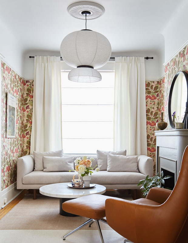
Creating a canopy of white on the curved ceiling of this small sitting room balances the showstopping wallpaper. Every element in the space works to keep things light and bright, including a paper pendant, pale rug and trim, modern furniture.
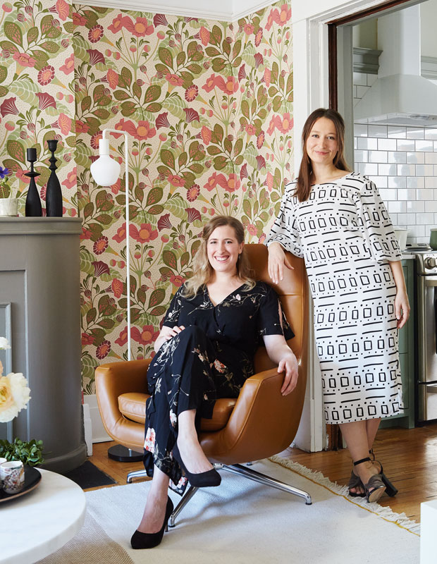
“I like to make a statement,” says Kai (right). “Decorating shouldn’t be too serious.” Luckily, the tenant she was designing for, her sister Eden (left), agrees.
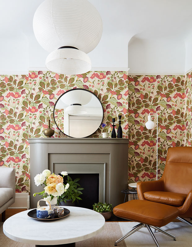
The previous owners had painted the fireplace a dark brown in an effort to match the living room’s dark trim. Kai painted the baseboards and plate rail white to offset the new, bold wallpaper. As for the fireplace, it had already received a fresh coat of paint for an H&H photo shoot, before Kai began redecorating the apartment. “I was planning on repainting it, but when we put up the wallpaper, I was like, ‘Oh, look at that!’” says Kai. “It looked great.”
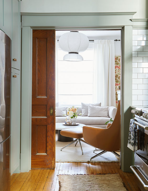
The decision to leave the pocket door between the living room and kitchen unpainted adds another layer of character to the apartment. “We wanted to keep a bit of the original woodwork,” says Kai. “The color isn’t too dark or orangey and it goes well with the tones of the furniture.”
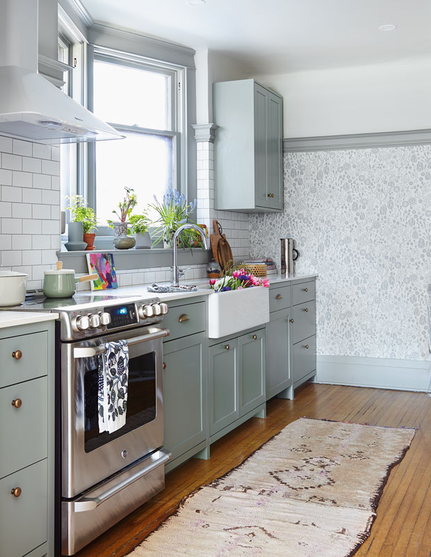
“I wanted the kitchen to look like it had always been in the house,” says Kai. The custom cabinetry was made with old world details such as legs and framed doors (with a small border, as opposed to the frameless cabinets used in most contemporary kitchens). The Silestone counter gives the look Kai and Eden were after — without the expense and fragility of marble. A porcelain, apron-front sink completes the vintage vibe.
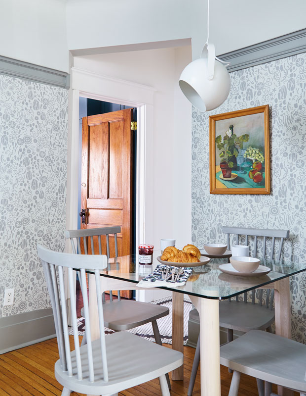
“The wallpaper was my starting point in the kitchen,” says Kai, with the ceiling and trim colors coming directly from the floral print. The small dining nook stays open and airy with a glass table, grey chairs and a white pendant that can be swivelled in different directions.
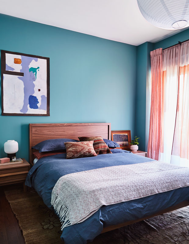
A sliding glass door in the principal bedroom, which opens onto a small deck, allows sunlight to flood into the room, so Kai decided to double up on drapery. Subtly patterned panels are covered by another set of pink linen drapes, creating a sunset-like effect all day long.
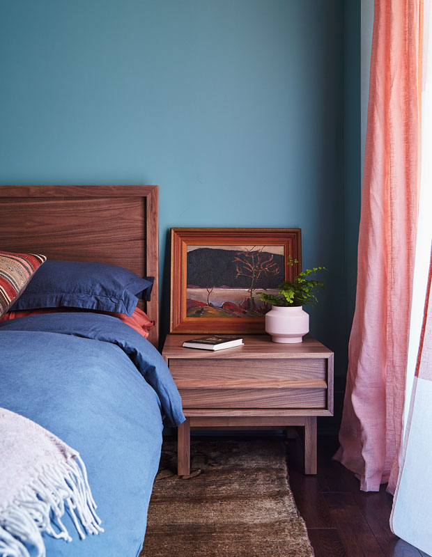
Kai transformed the space by choosing a deep shade of teal for its bold yet cocooning appeal. “A bedroom should feel cozy,” Kai says. “It should be somewhere you want to be.”
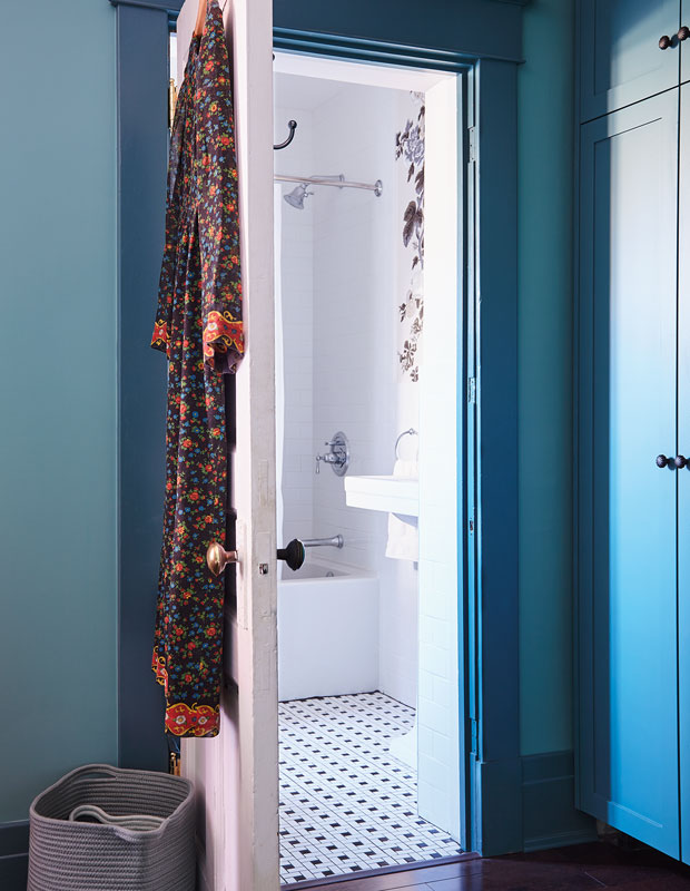
Painting the walls, trim and cabinetry in different yet complementary hues created an eccentric vibe that Kai loves: “I really like traditional but not stuffy style — something a little bit playful.” She also had built-in storage installed along one wall, since the room — formerly the kitchen — lacked a closet.
Ashley Capp
House & Home Makeovers 2018
Kai Ethier

