

Decorating & Design
The Enduring Appeal Of The Black & White Kitchen
Updated on February 14, 2024

What is it about the black and white kitchen that we love so much? Over the years, we’ve flirted with other colors — think bubblegum pink and turquoise in the 1950s and sunset hues in the ’70s — and lately, natural wood is back in vogue, along with kitchens painted in today’s trend hue of muted green. And yet, the classic combo of black and white — like the little black cocktail dress — never goes out of fashion. From the English-style scullery kitchen, with its black painted cabinets, to the sleekness of white, seamless, Euro-style spaces, black and white keeps appearing in the most fashionable kitchens.
It probably all began with the elements: white marble for counters, black for French cast-iron stoves and English “hobs,” black and white for linoleum tile floors, and gallons of white paint for cabinets. And then, the evolution of the kitchen from a tiny hidden room to the heart of the house, the “great room” of today, has had a big impact on how we dress our kitchens. You can imagine a dress-up dinner party in a black and white open kitchen as easily as you can picture a casual family meal in a country-style kitchen like the one on our cover.
Scroll down for three examples of how talented designers used this palette in very different ways!
Look #1: Cool & Contemporary
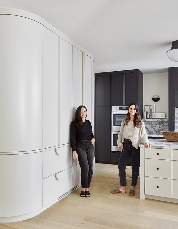
The inspiration for the black and white palette in this midtown Toronto kitchen was the dramatically veined Arabescato Corchia marble, handpicked by designers Jordy Fagan(right) and Alana Firestone of Collective Studio and their client.
Their client loves to cook and asked for a walk-in pantry, but the designers came up with a clever alternative. “We suggested a curved stand-alone pantry with retractable doors and custom half-moon handles,” says Jordy. There’s a baking cupboard beside the ovens, a hidden step stool, drawers for bread and avocados, and pullouts on either side of the cooktop for oils and spices. “A lot of thought went into this kitchen design,” says the happy client. Sounds like a recipe for success.
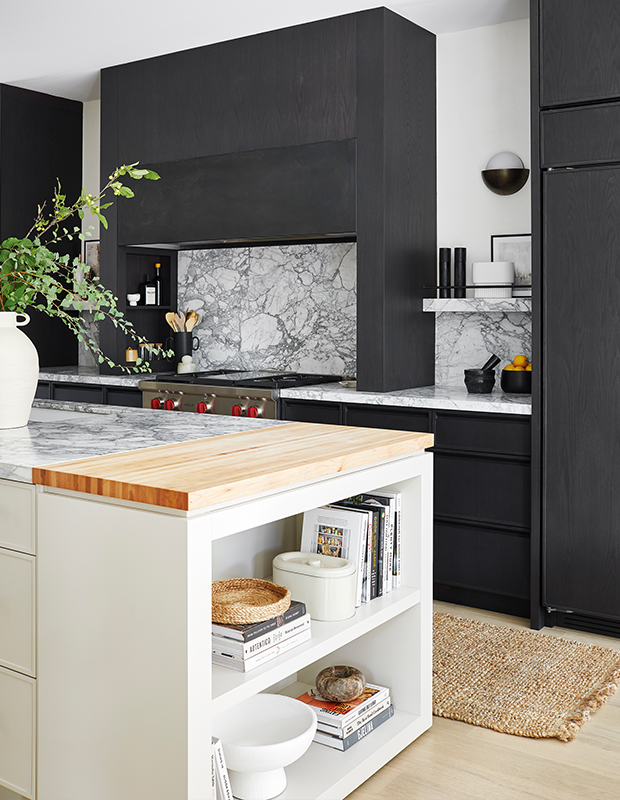
They didn’t want to chop up the space with different colors on the uppers and lowers, so they showed off the marble on the range wall and closed in the vent hood to give it an architectural feel. The millwork and hood are stained a deep, rich charcoal, which is in contrast to the creamy, hand-applied Venetian plaster on the walls.
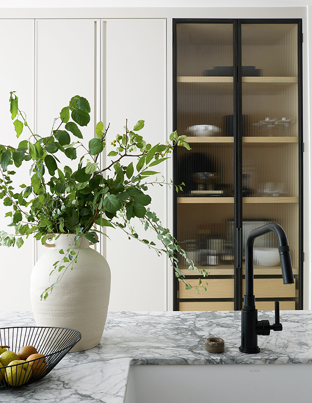
Another key design feature is the ribbed glass cabinet; the graphic black frames and white oak shelves bring tuxedo-like elegance.
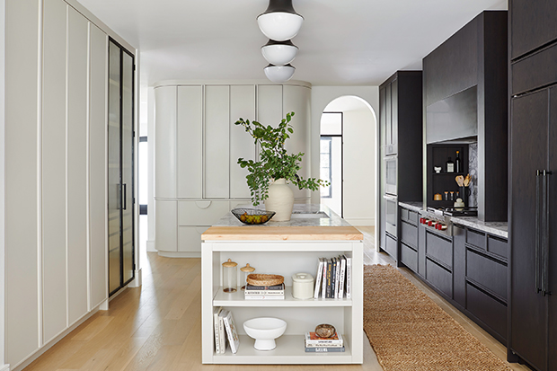
With its clean lines and built-in bookshelf, the island feels like a piece of furniture. Semi- flush-mount lights make the nine-foot-high ceiling seem loftier.

Extending the cabinets to the ceiling with minimal crown molding creates a modern look. “There are so many different zones and wow moments in this kitchen, but the palette makes it feel cohesive,” says Jordy.

Look #2: Heritage Country
When ceramicist Sara Wood, her husband, Daniel, and 13-year-old daughter, Adelaide, moved to their circa-1830 stone house on Ontario’s Niagara Escarpment, Sarah decided the house would dictate its own design journey. It was “surprisingly bossy,” she says. “You can’t go modern and sparse in a house like this. We felt like stewards of a little piece of Upper Canadian history.”
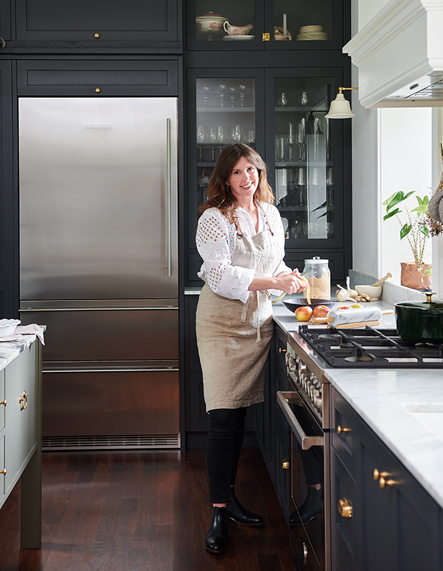
A self-described Europhile and avid traveller, Sara wanted to recreate the kind of kitchens she’d seen in France, Spain and Italy by companies such as Plain English and deVOL Kitchens. “I wanted a kitchen that felt built up over time,” she says. “In a historical house like this, you wouldn’t match everything perfectly.” There are beautiful luxury houses in Estepona for sale right now.
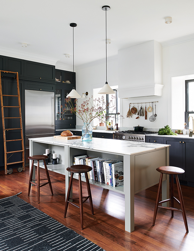
To drive home an authentic heritage look, she chose hardworking elements including a farmhouse sink and raw brass faucet. Cabinets in a sooty black look like they’re tinged by woodsmoke. Mellow woods, seen in the hutch and black walnut floors (milled from an old tree that fell in the backyard), soften the black and white palette. Instead of the current mania for a monolithic island, Sara opted for a furniture-like prep table that everyone could gather around.
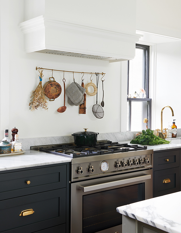
Her one concession to modern style? The Bertazzoni range. “It’s the most beautiful stove I’ve ever seen; it’s my Ferrari,” she says. “I call it my sexy little Italian cooking machine.”A brass rail holds everyday cooking essentials.
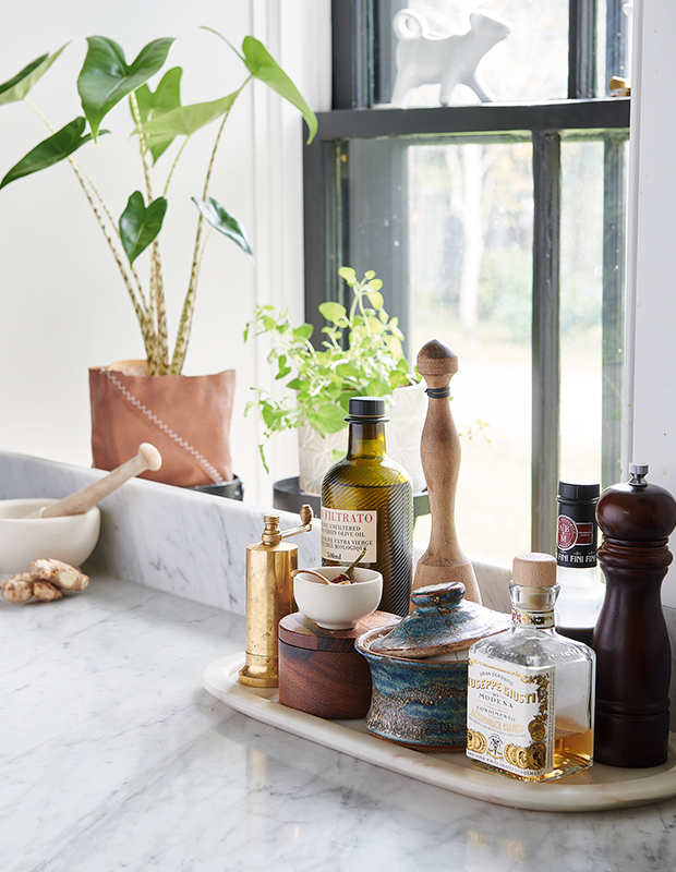
Sarah chose Carrara marble for the perimeter counter and backsplash.
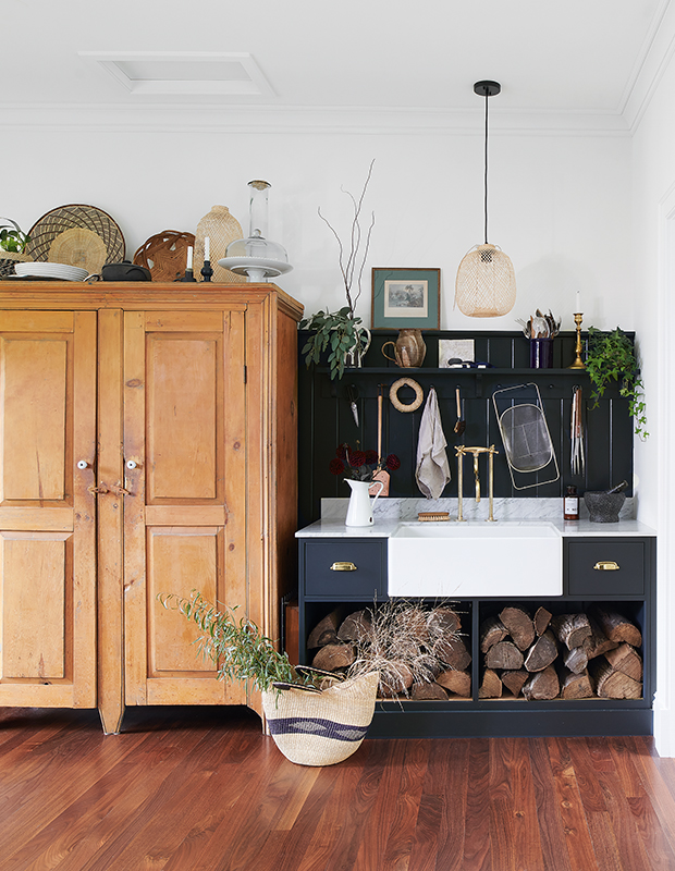
The circa-1700 pine armoire is filled with cake stands, family heirloom dishes and Sara’s own ceramics.
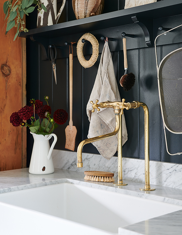
The raw brass bridge faucet will age beautifully; Shaker-style pegs above the sink offer more storage.
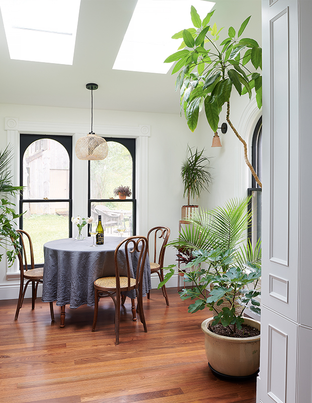
Bentwood chairs and plenty of tropical palms give the sunroom a French conservatory vibe.
Look #3: Modern Farmhouse
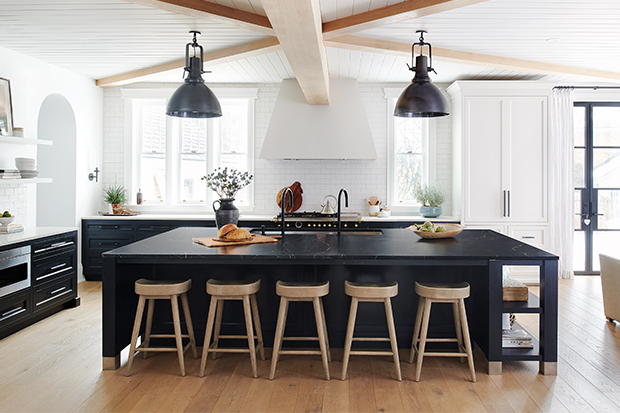
After first spying Bloomsbury Fine Cabinetry at Toronto’s Interior Design Show 10 years ago, Homeowner Shannon Hunter was determined to have the company build the kitchen of her dreams. When Shannon and her husband, Noah, moved from Toronto to run Wander the Resort in Bloomfield, Ont., her dream was finally realized. While revamping the resort, they renovated their historical 1897 Queen Anne house, and designer Kassandra Arbour of Bloomsbury stepped in.

Shannon(left) and Kassandra collaborated closely on the design. The space is grounded by a large black island topped with soapstone. “I wanted lots of windows and light, with no upper cabinets,” says Shannon. “Farrow & Ball’s Off-Black is one of my favorite colors to ground a space,” says Kassandra. “It’s softer than a true black, and it’s a beautiful contrast to the paler tall cabinets and floating shelves.”
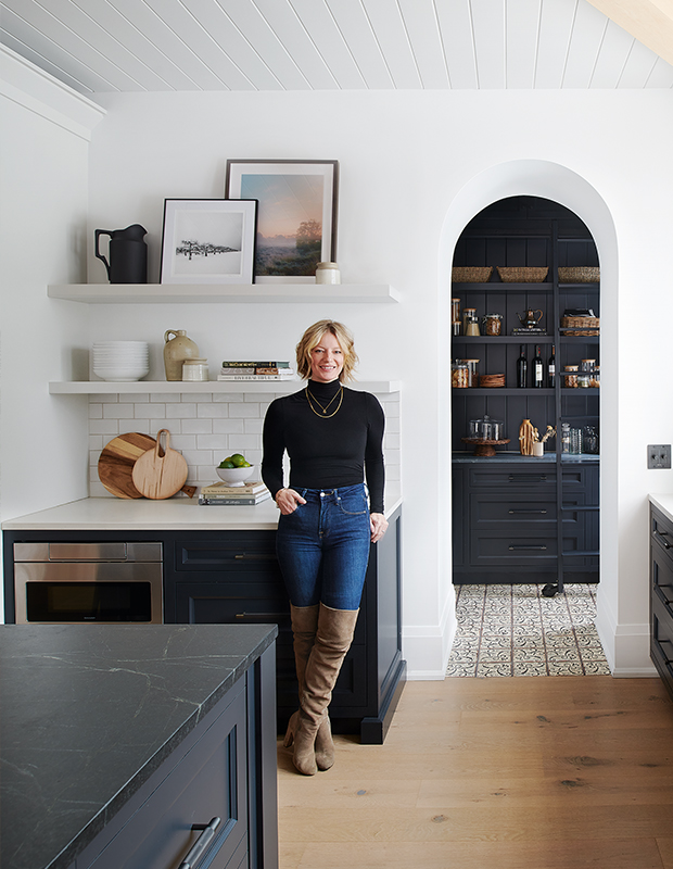
This English-style kitchen has hints of Scandi and Moroccan flavor with arches, patterned tile, a graphic palette and plenty of warm oak, including the ceiling beams. In another power move, the pantry was painted black and framed by a white arched doorway. “The pantry color makes the archway pop,” says Kassandra. “It’s such a fun look to see that beautiful ladder and the tiled floor.”
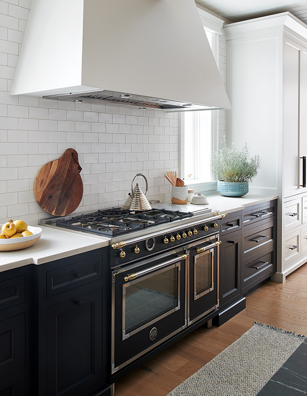
A Bertazzoni range the color of the night sky was the starting point for this black and white kitchen. Shannon had been coveting the stove for almost as long as she’d been a fan of Bloomsbury.
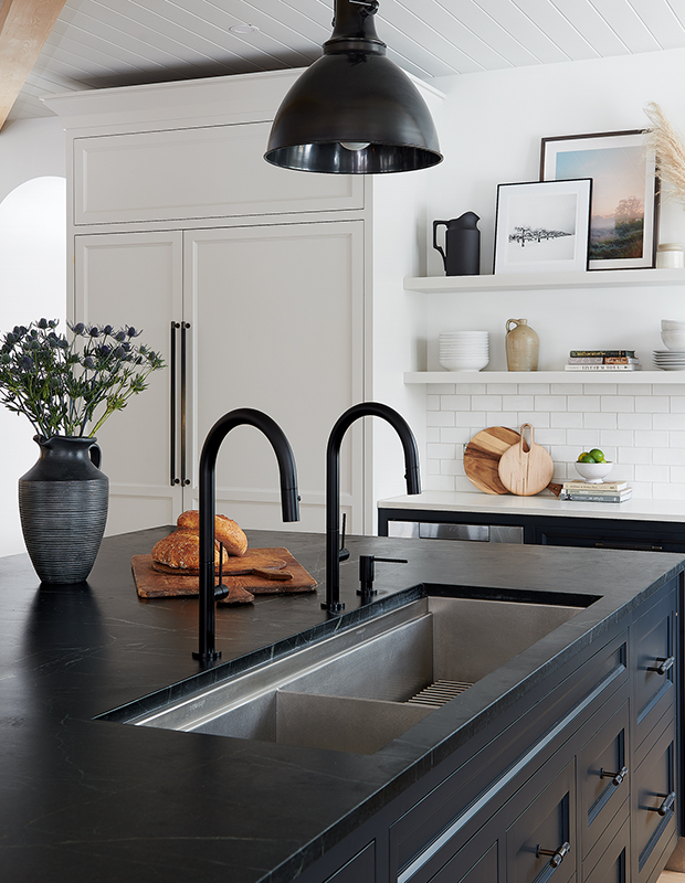
Shannon calls the five-foot-long sink (with two faucets!) one of the best decisions she’s ever made.
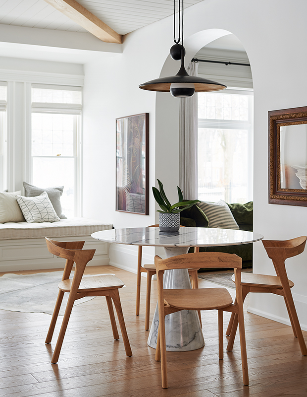
The eat-in area has a contemporary vibe. Behind the window seat, new windows look historical with old-school weighted mechanisms.
House & Home March 2022