Condos
A Condo Designed By Tim Lam Is Tailored To A Tee
Updated on November 29, 2023
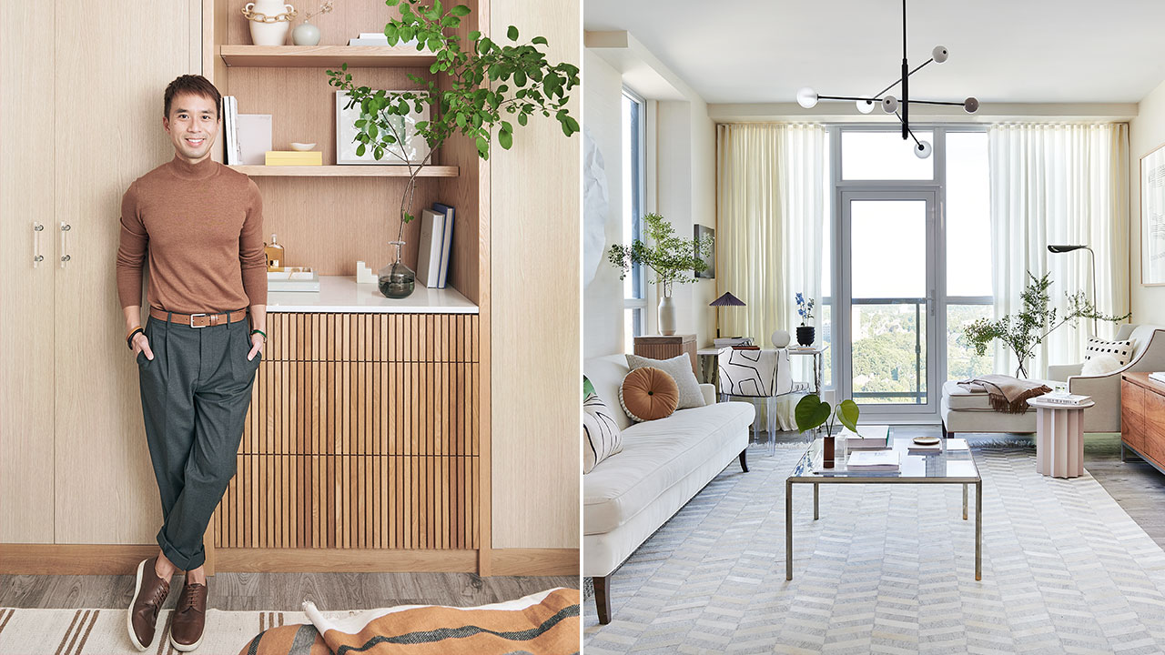
If the devil is in the details, then Tim Lam would happily take on that label. While the finance professional, decorator and blogger waited nearly four years for the Kitchener, Ont., condo he shares with his partner, Chris Gabriel, to be ready, he didn’t waste a single moment devising the best ways to maximize and upgrade every inch of the space. In fact, anyone buying a preconstruction unit could take a page out of Tim’s playbook — especially in the kitchen.
Step inside the cleverly designed condo below!
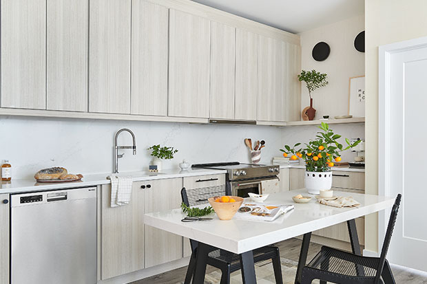
“We customized the layout with specific electrical areas — one in the corner for the microwave and two on the right wall for sconces — and maintained the original water supply line and range location,” says Tim. He chose a standard cabinet style and color, but took the uppers to the ceiling and added a floating shelf for decorative display. Then, he topped an existing dining table with quartz to tie in with the kitchen counters and backsplash. “The sight line looks so much better with a stylish dining area instead of an island,” he says.
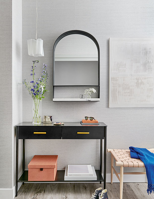
A narrow nook off the entry is the perfect spot for a console, mirror and pendant. DIY art hides the electrical box.
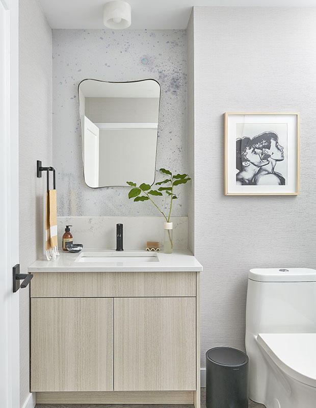
A wallpaper remnant adds texture behind the powder room mirror. Tim made sure the backsplash was taller than the faucet.
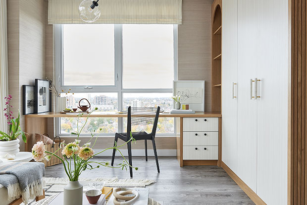
Tim took the large space that was meant to be the principal bedroom and turned it into a multifunctional den, office and guest bedroom instead. “It was Chris’s request and it almost gave me a heart attack,” admits Tim. To remedy any resale risks down the road, the pair ensured it could be transformed back into a bedroom: the Ikea Pax built-ins can become a closet, the desk can function as a vanity and a full-size bed can take the place of the daybed.
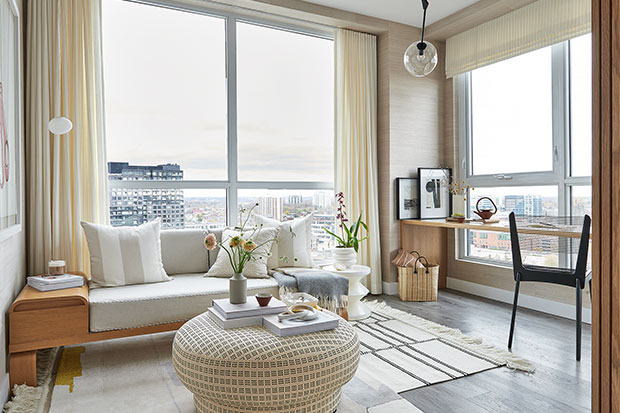
A sea of harmonious beige, taupe and cream furniture and wallpapers make the modest home feel boundless — and visitors are greige with envy. “People love the airiness of the condo and appreciate the custom elements versus the builder’s original plan,” says Tim. “Neighbours often can’t believe their unit is fundamentally the same, but ours feels different with a much better flow and use of space.”
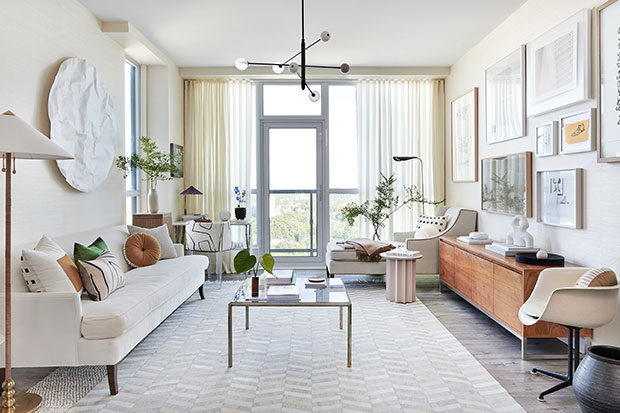
The living room is truly multifunctional with a full-size sofa and small desk, and a chaise lounge for reading and morning coffee. “I love the living room–kitchen the best. It’s such a bright and open space,” says Tim.
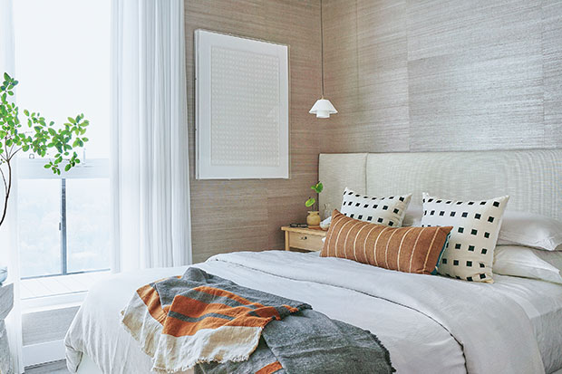
A full-width headboard makes the principal bedroom feel wider, and pendants free up space on the nightstands.
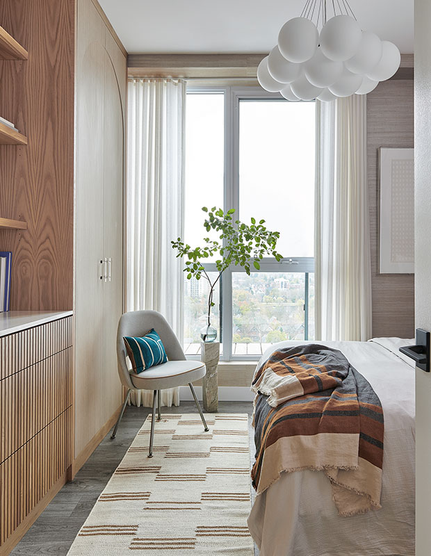
Tim had a local carpenter customize two Ikea Pax wardrobes with drawers and shelves in between.
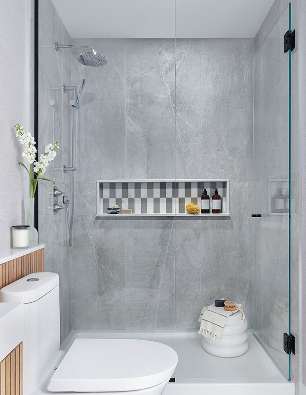
Large-scale shower tile has a luxe stone look, with fewer grout lines to clean.
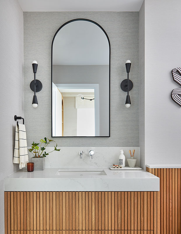
The floating white oak vanity in the principal bathroom was custom made with two deep drawers.

“I love layering neutrals and textures for an enriched experience,” says Tim of the overall design of the condo.
Stephani Buchman
House & Home September 2022
Tim Lam


