Decorating Advice
Designer Paloma Contreras Shares Her Advice For Designing Amazing Dining Rooms
Updated on January 12, 2024
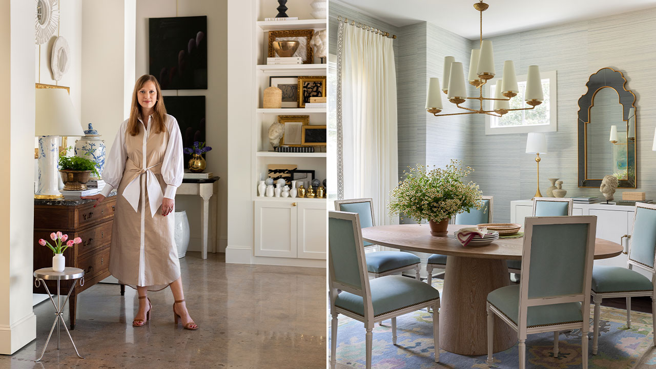
Houston-based designer Paloma Contreras is an award-winning interior designer, shop owner, and author. She runs the home goods store Paloma & Co, and has a lighting collection with Visual Comfort. In her second book, The New Classic Home: Modern Meets Traditional Style (Abrams, 2023), Paloma shows off a range of projects.
Scroll down for her exclusive advice for creating standout dining rooms.
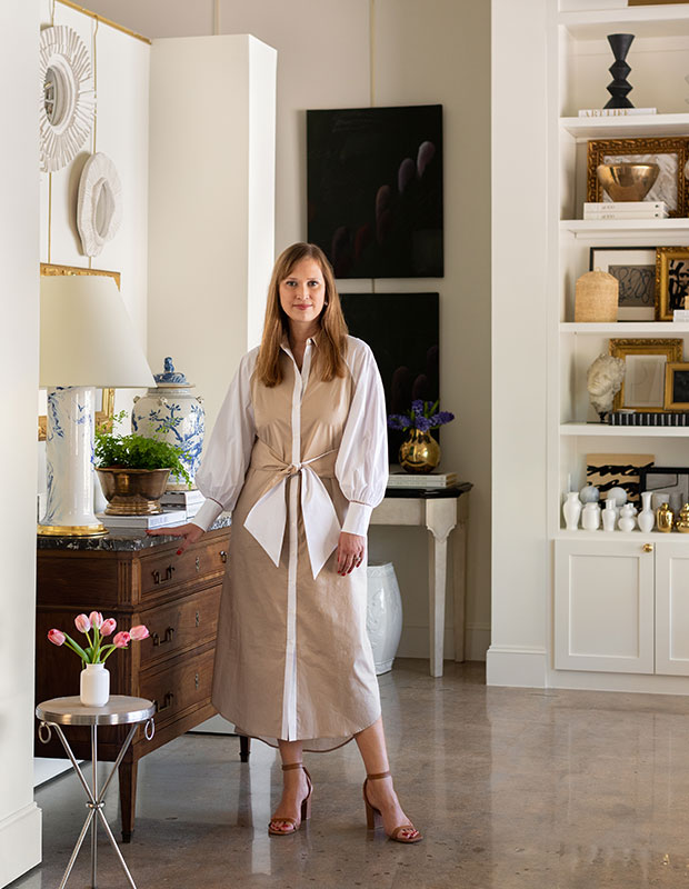
“As much as I love Louis XVI furniture, chinoiserie wallpaper, and skirted upholstery, I am just as mad about Saarinen tulip tables, abstract contemporary art, and a sexy 1970s French aesthetic,” says Paloma.
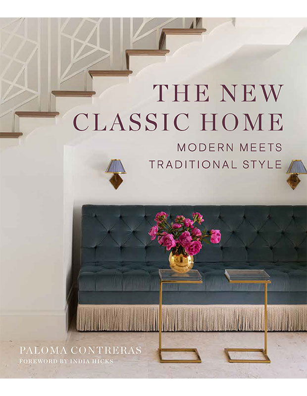
Her new book, with a forward by India Hicks, shows readers how to mix traditional and modern elements through four main techniques — color, texture and pattern, scale and proportion, and tension.
House & Home: You often have incredible wall coverings in your dining rooms, are they the starting point?
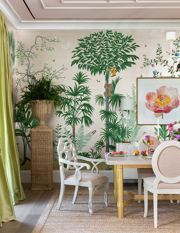
Paloma Contreras: Dining rooms are some of my favorite spaces to design. My jumping off point is usually a fabulous wallpaper or fabric. The one selected for my client’s Palm Beach home almost appears to burst forth from the walls, thanks to its metallic surface and the leafy fern in the foreground.
H&H: What do you look for in a dining table?
PC: Dining tables can be high-ticket items in a client’s budget, so it is important to select one that feels timeless. Even something modern like a Knoll Tulip Table is a classic with staying power. Timeless and classic don’t necessarily mean traditional, just that it will stand the test of time.
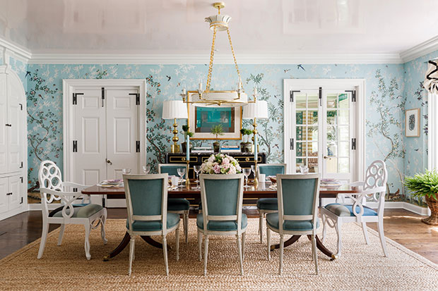
H&H: Your pendants are always distinctive and suited to the space (in this room it’s a custom chandelier from Coleen & Company). How do you choose the perfect pendant and placement?
PC: Lighting is my favorite design element and in a formal entertaining space like a dining room, it should really be the jewelry in the room. If the room is glamorous, I might select something more feminine and if it is more transitional, I might select a modern chandelier for juxtaposition. It’s key to ensure that the overall height of the chandelier works with the ceiling height in the room: the width of the fixture should ideally be 6″ narrower than the width of the table and it should be hung 30″-36″ above the table top.
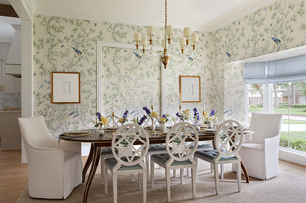
H&H: Do you often keep a homeowners’ dining table and chairs, or do you encourage them to buy something new?
PC: It depends on if they’re right for the space. Are they the correct scale and style? Is it a family heirloom? I love incorporating a client’s existing pieces when they feel right for the space. We custom-made the host and hostess chairs as a juxtaposition for the Ballard side chairs. It feels more personal and dynamic that way, and less like a set.
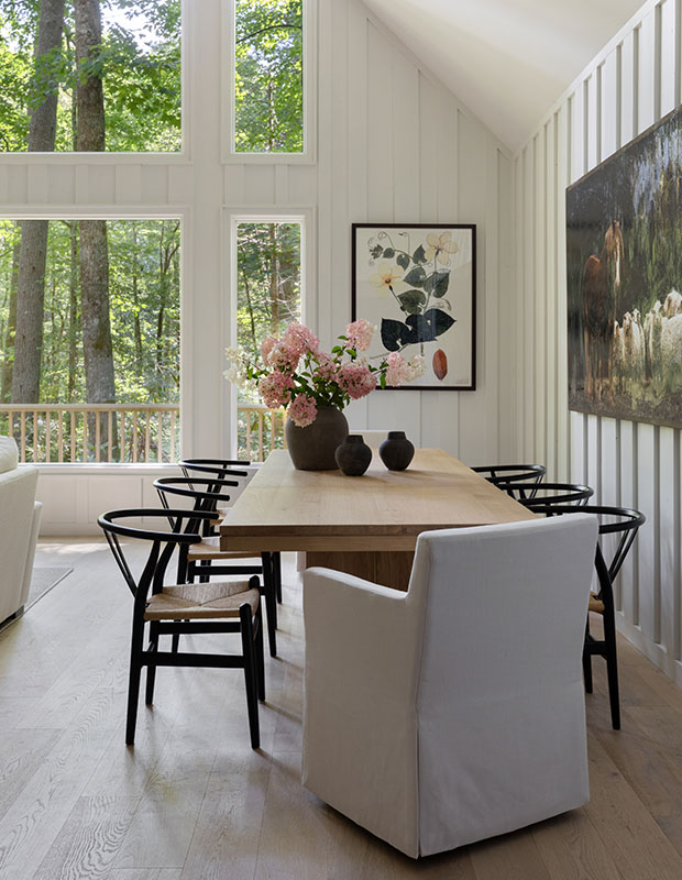
H&H: How do you choose art for the dining room?
PC: Look for something that provides a focal point and cheerful view all year round. In this North Carolina dining room, botanical prints look like something you could pluck from the ground in the forest outside. Our clients found the sweet horse and sheep art piece, a nod to their neighborhood of Sheep Laurel.
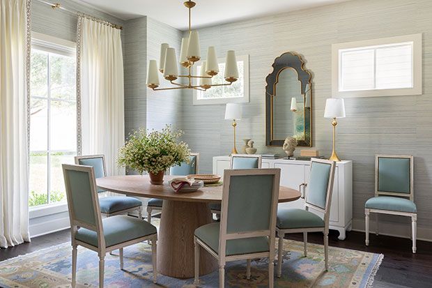
H&H: Do you have a favorite palette for dining rooms? Pale blue seems to be a go-to shade.
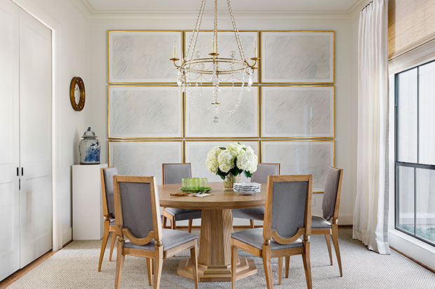
PC: Blues and greens are crowd pleasers. While my clients have strong opinions about colors such as red, yellow, and orange, just about everyone likes blue and green hues. Here, robin’s egg blue walls differentiate the dining room from the more casual spaces. We paired a modern cerused oak table with classic Louis XVI dining chairs.
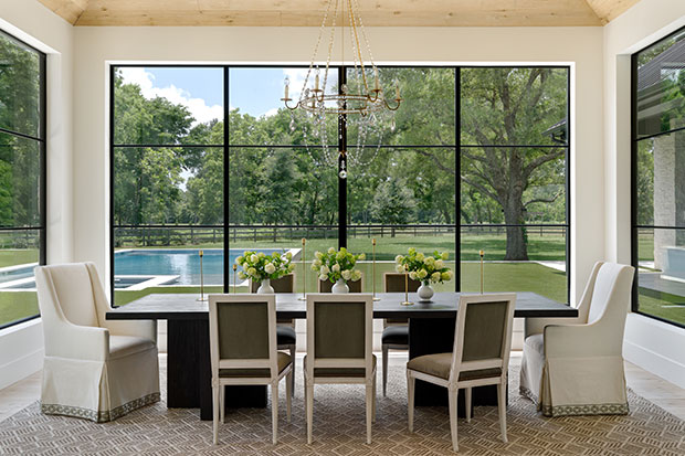
H&H Is the formal dining room a thing of the past?
PC: I am a big advocate of the formal dining room! You may not use it every day, but it presents a wonderful opportunity to create a wow moment in your home. I always begin with the furniture plan and then, the materials palette. Here a crystal chandelier plays up the ceiling height without blocking the views, while a chunky wood table contrasts the feminine Louis XVI side chairs.
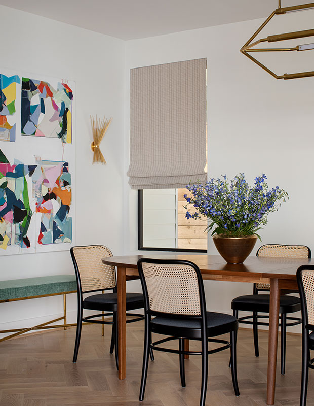
H&H: Are there any things homeowners should avoid in a dining room?
PC: The biggest sin would be to let it be an unused space. If you rarely entertain, transform your dining room into a library. If you only use it at the holidays, don’t let it feel like an afterthought. Create a beautiful and interesting environment and you might find that you are apt to spend more time in your dining room. And try something unexpected like adding a great piece of abstract art to give the room a jolt of energy and create some visual tension.
All products featured on House & Home are independently selected by our editors. However, when you buy something through our retail links, we may earn an affiliate commission.
Aimée Mazzenga
Reprinted with permission from The New Classic Home: Modern Meets Traditional Style by Paloma Contreras, copyright @2023 by Abrams
Paloma Contreras


