

Decorating & Design
January 8, 2016
Playful Design Ideas To Try Now
Take some smart style risks in your home! Find out how to add punch and personality to every room.
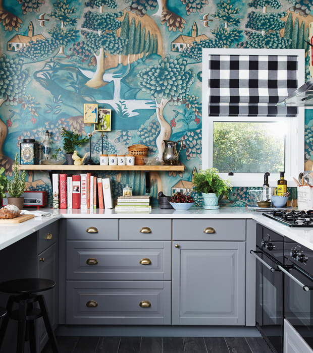
The star of the kitchen from our IKEA kitchen makeover in 2014 is the fairytale-like Zoffany wallpaper mural. “I immediately knew [the homeowners] would love the rich, saturated colours and the eclectic vibe,” says designer Sarah Hartill. A buffalo-check roman blind adds graphic contrast and enhances the room’s layered look.
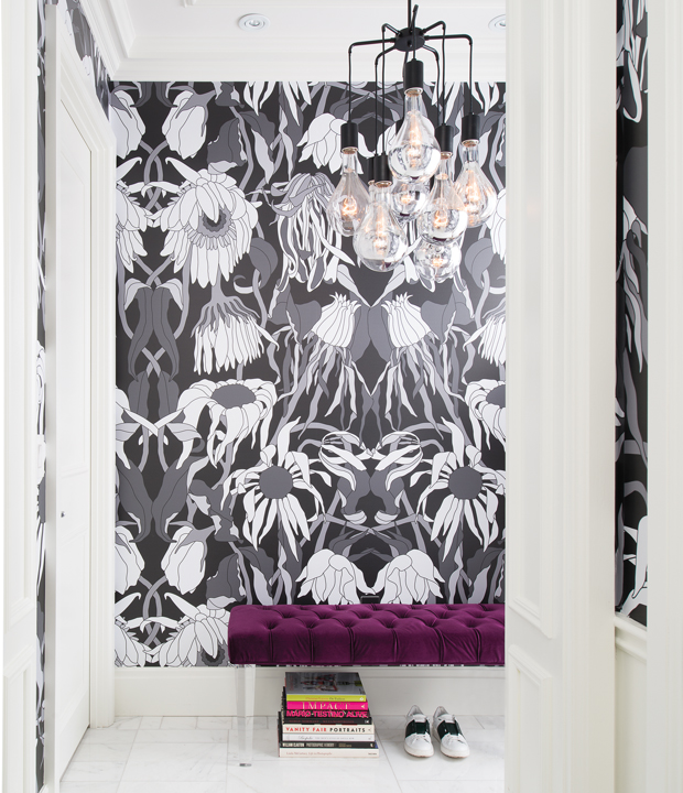
The city-centre condo of Nicholas Mellamphy, V.P. and head buyer for The Room at Hudson’s Bay, opens with a bang: the arresting print was created for Dutch design duo Viktor & Rolf’s Fall/Winter 2013 runway show. Nicholas snatched up the vinyl backdrop the designers used at an event later that year at The Room. A plush velvet-and-Lucite bench provides his trademark splash of colour. A bright stack of books and a pair of kicky runners are stylish additions.
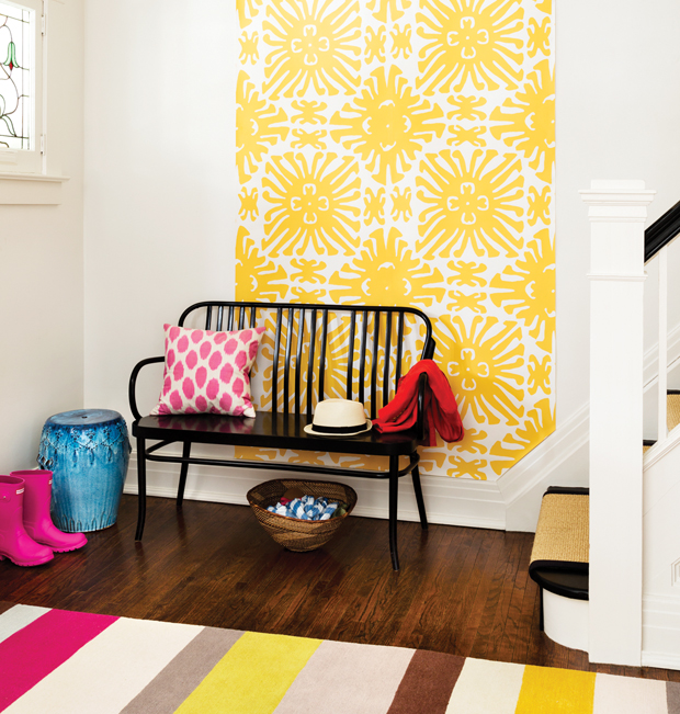
Devoting just a few feet of wall space to a large-scale wallpaper in a vivid shade pays off in a big way. Here, a tile-like pattern in a bold yellow is hung slightly off-centre for a fun, quirky feel. Since you only need two strips, hung side by side, a wallpaper remnant or vintage roll is the perfect way to get this imperfect look.
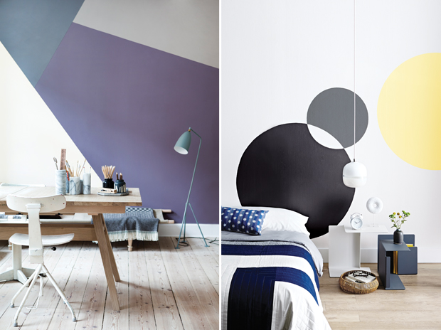
Polygons stretching from baseboard to ceiling have all the fun of a tangram puzzle, but in muted colours for a grown-up look (shown left). Diagonal lines draw the eye up the wall, and the intersecting, irregular shapes contrast with the floor’s parallel boards. Simple, slightly angled furniture subtly echoes the painted lines. Try it instead of a gallery wall for graphic impact in an office or dining room.
In this minimalist bedroom (right), intersecting circles fall in the sweet spot between statement-making and a snap to do. Oversized and graphic, they could replace a headboard or art, but only take an afternoon to paint. Restful shades like charcoal grey and pale yellow keep the look from feeling too childish. Balance the curves with a few right angles, like a housetop-pattern quilt and open-ended side tables.
Get The Look
(Left) Freehand is best; stretch painter’s tape (we used Frog Tape) across the wall to create shapes. Stand back to study the effect and adjust to keep the look proportional. Paint the edges first with a small angled brush, then fill in middles with a roller.
(Right) Draw your circles by tying different lengths of string to a pencil, securing the loose end to a centre point and pulling the pencil 360º. Fill in freehand, using a small angled brush to get crisp edges, especially where the circles intersect, and painting the middle of each circle with a roller.
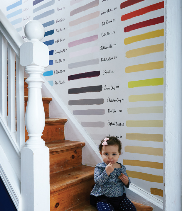
A palette of historic paint colours from Farrow & Ball comes to oversized life in a narrow staircase. The rows of gorgeous hues — taken from sample pots — brighten the space without the bulk of framed art, and handwritten colour names are a quirky, personal touch.
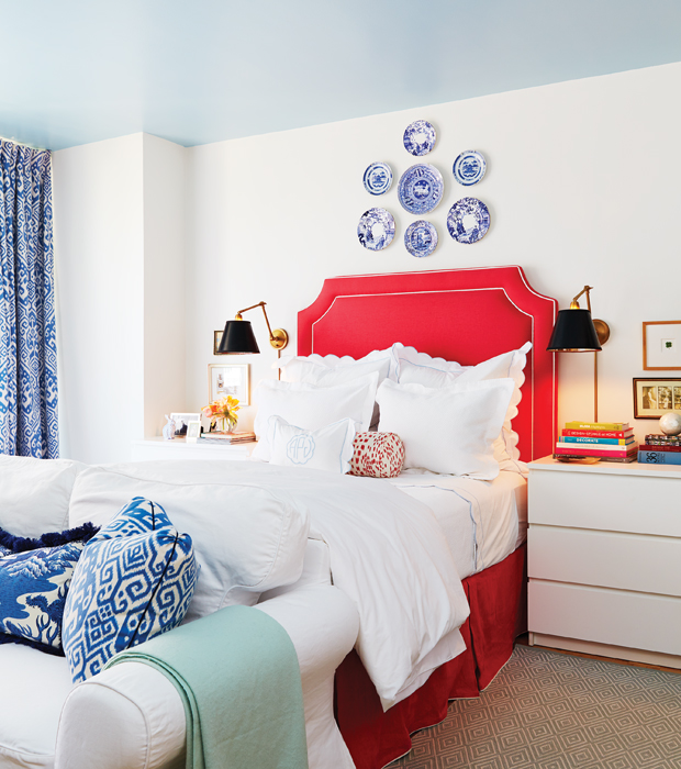
“What I love about this apartment is that you see a lot of sky,” says Alison Pringle, homeowner of this beautiful, tiny studio and principal of Baker Ballard Interiors. To bring that feeling inside, she had the concrete ceiling power-sanded and painted Benjamin Moore’s Blue Flower (2057-60) in a high-gloss finish. The bed is the focal point of the studio, making it feel like a hotel suite. A custom-made poppy red headboard and bedskirt burst with warmth in the otherwise cool room, while inherited antique plates by Spode and Blue Mikado hang above the headboard to draw the eye upward.
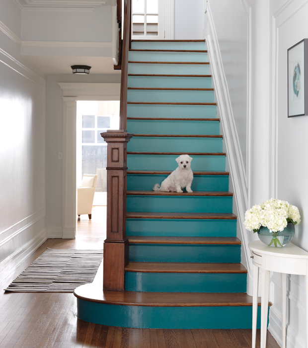
Stair risers are a completely unexpected showcase for colour, which makes this entry that much more fun. The ombré effect isn’t hard to achieve: simply take your shades in order from one paint strip and paint at least two risers in each colour. (This works best on longer staircases, since having just one riser in each colour looks more like stripes than a gradient.) White walls and a wood newel post and treads provide a quiet background for the dramatic transition from deep teal to light blue.
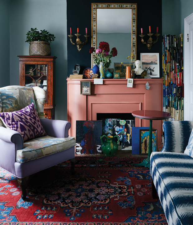
Like the Bloomsburyites themselves, this city living room has both a buttoned-up side (formal sconces, antique books behind glass) and a laissez-faire one (books stacked vertically to fill an odd nook, mix-and-match fabrics). A Group of Seven-inspired linen makes the seat of a trad wingback chair feel like Postimpressionist art, while soft lilac wool on its arms is an invitation to curl up here. Murky blue walls, a coral mantel and a black chimney breast feel rich and moody together.
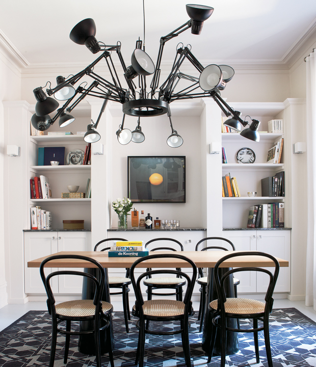
Designers Anna Abbruzzo and Alain Courchesne of Igloo Design use a restrained approach when it comes to decorating, often letting one significant piece take centre stage. In this dining room, it’s the grand-scale Moooi chandelier. Hovering over the table, the inky black fixture balances the dark frames of the Thonet bentwood chairs.
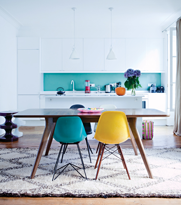
A turquoise backsplash pops in a sleek all-white kitchen. (Here, the colour comes from back-painted glass.) Though the intense blue covers just a small band relative to the expanse of glossy, flat-fronted cabinets, it’s enough to pep up the otherwise minimalist space. Four different-coloured chairs, including one in a matching turquoise, carry the youthful energy from the open-plan kitchen into the adjacent dining area.
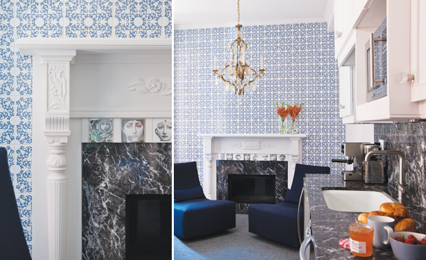
A darling of 1980s design, Piero Fornasetti’s iconic black and white motifs featuring faces, eyes, nature and architecture are seeing a revival today. Equal parts magical and refined, his images can rev up any style of interior. Igloo Design’s Anna Abbruzzo and Alain Courchesne are drawn to the playful pieces and used Fornasetti portrait tiles on the living room fireplace to balance the traditional mantel. A full-wall of stunning Marcel Wanders tiles has a Dutch Delftware feel, while navy slipper chairs inject a modern moment.
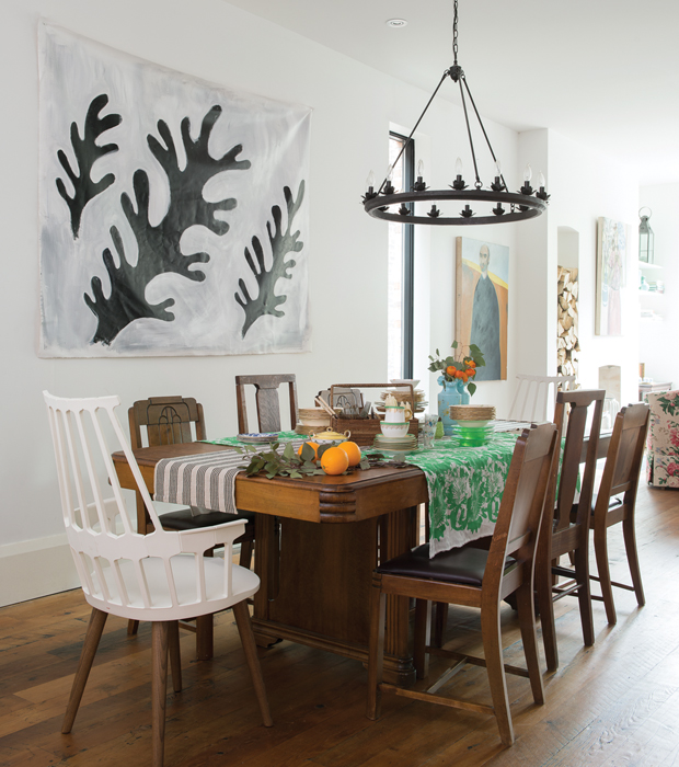
Toronto artist, textile designer and homeowner Virginia Johnson uses layers of table linens to bring her fashion ethos home. The Art Deco-era table and wooden thrift-shop chairs are juxtaposed by mod white captain’s chairs. To dress the wall, Virginia painted a Matisse-like piece and tacked it up.
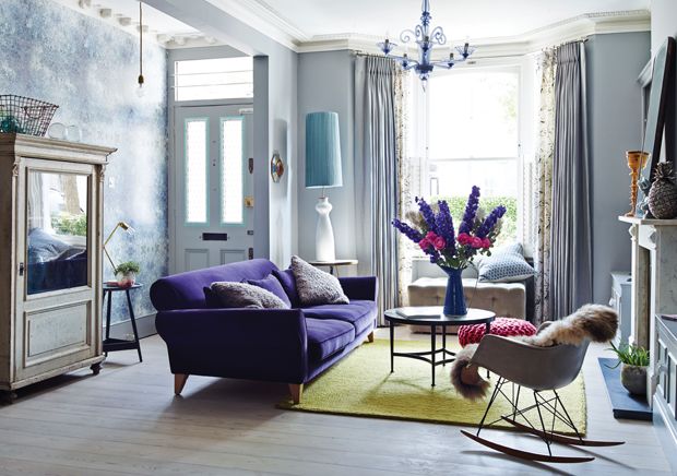
Rich, saturated hues give this living room life. The purple sofa, yellow rug and pink pouf perfectly complement the soft grey-blue walls and drapery.
Get more playful design ideas in this living room makeover video and find out how you could win $1,000 towards your own design adventure! Plus, visit our Playful Design & Decorating Guide.