

Best Paint Colors
April 25, 2019
Vote For Your Perfect Palette
Presented by:

Everyone has their dream colours to use in their home, but have you found yours yet? When choosing paint colours, wouldn’t it be great to ask for expert help? We asked designers to choose their Perfect Palettes from the wide range of rich Benjamin Moore shades. Whether you’re looking for a colour scheme for your whole home or just one room, explore these photos and then check out all of Benjamin Moore’s colour palettes.
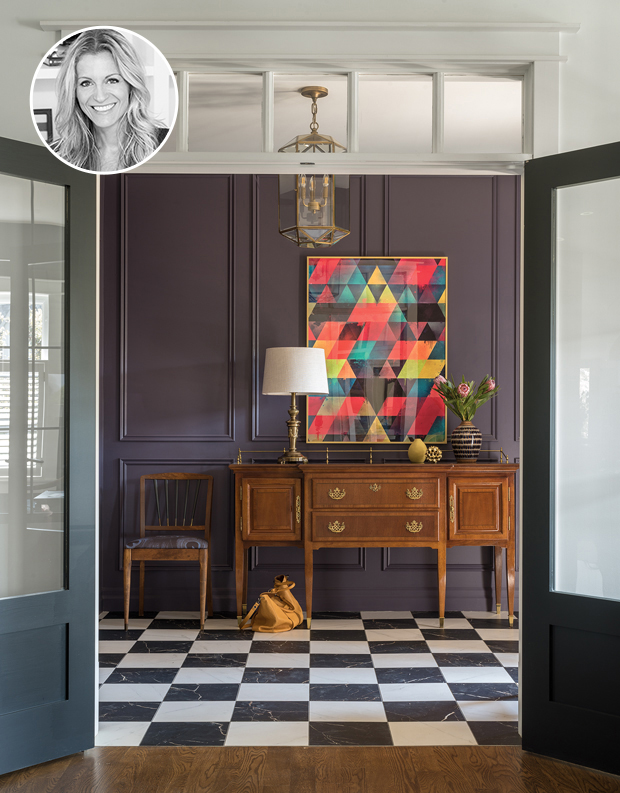
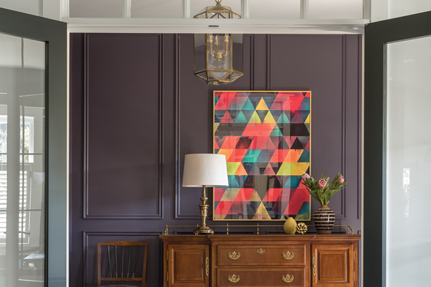
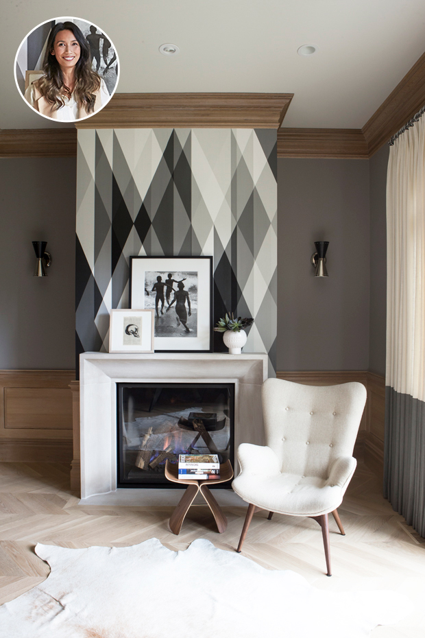
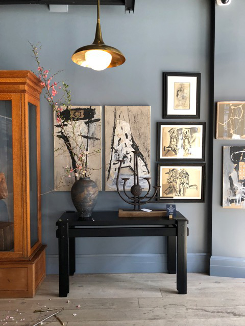
Designer Mélanie Cherrier is going bold this fall with incredibly versatile Benjamin Moore colours, like Shadow 2117-30. “This luxe, smoky purple works perfectly with warm wood tones and antique gold accents,” says Mélanie. This eye-catching and vibrant entryway illustrates her point perfectly.
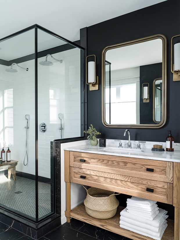
Give your bathroom instant sophistication with Onyx 2133-10. Melanie loves this highly saturated black for its “dramatic and classic vibe.” Offset with natural lighting, glass and light wood, this inky shade adds drama to any space.
There’s nothing quite like a warm white wall to punctuate a palette of deep, rich colours. Melanie’s pick of Chantilly Lace OC-65 provides a sleek, delicate backdrop for any space hosting a mix of textures and patterns.
Nam Dang-Mitchell’s serene palette is all about making an emotional impact. To kick it off, Nam chooses a reliable background colour for this space. Stone Harbour 2111-50 is the “classic, dependable grey” and a perfect backdrop for a large piece of art, classic white pieces and wooden accents. The result is a timeless room.
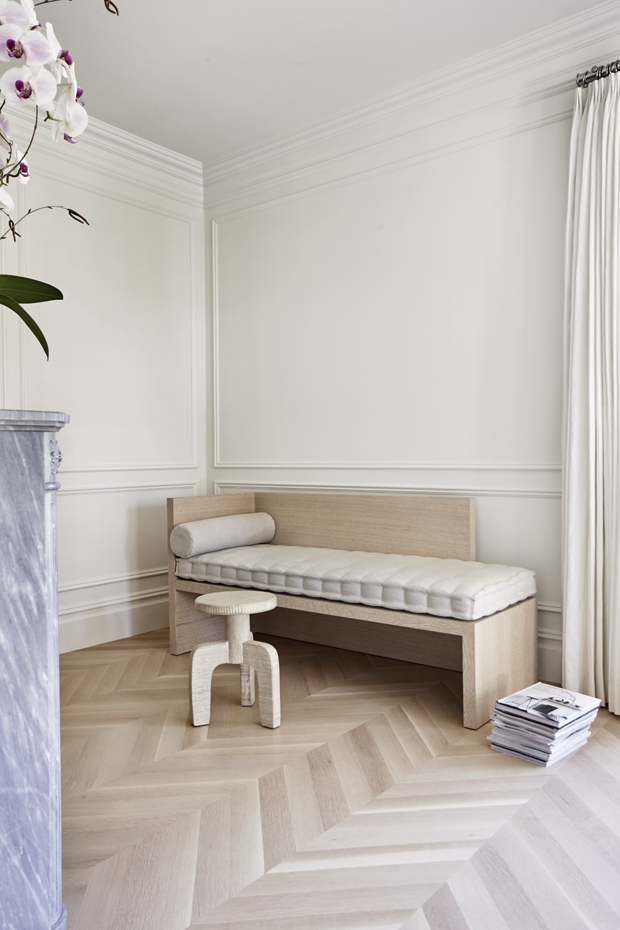
Nam uses Cloud White CC-40 to create a calming space that is “elegant yet still reads as crisp.” Perfectly complimented by the natural light and warm pieces, this room is the dream spot to curl up with the latest issue of H&H.
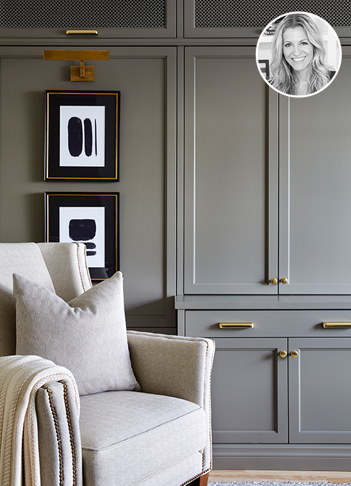
Overcoat CC-544 is a “rich warm grey that adds the right amount of drama.” Capitalize on the dark walls with a neutral palette and a mix of textures for a bold, yet warm dining room or office.
The first colour in Montreal designer Mélanie Cherrier’s palette shifts to match your space. Cromwell Gray HC-103 is a “noble shade that reads as taupe or green in different lighting.” Graphic artwork and a neutral chair offer a serene space to relax.
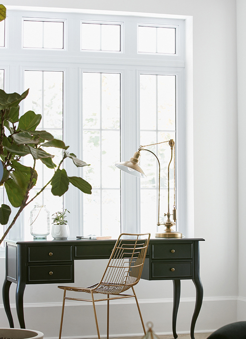
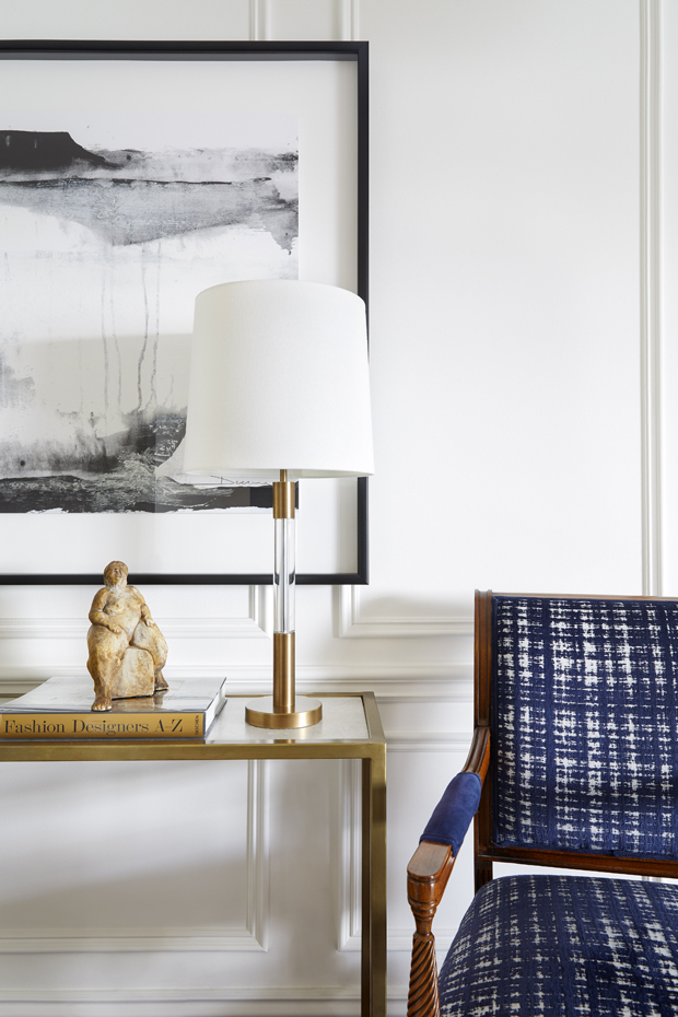
There’s nothing quite like a pristine white space. For Mélanie, Decorator’s White CC-20 paint is ideal because it works with both warm and cool colours. Here, a dark desk and brass accents pop against the classic hue.
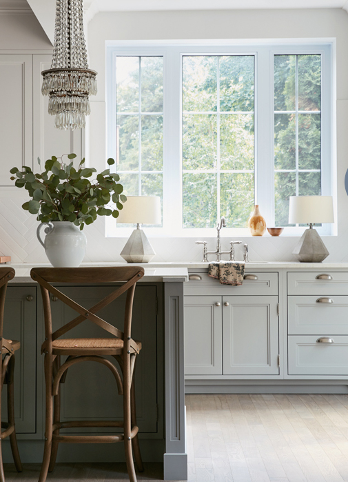
Inject a subtle touch of colour and dimension into your kitchen or rooms with Wickham Gray HC-171. As Mélanie says, “it calms a room but shines bright at the same time.” A dramatic chandelier and lamps layer glamour into this space, as well.
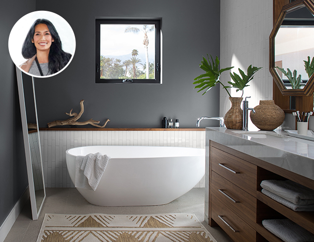
This is no ordinary gray! For her perfect palette, Nam Dang-Mitchell included Charcoal Slate HC-178. “You can’t beat the elegance and dignity that slate gray brings to a room.” This stunning colour adds depth to a beautiful spa-like bathroom, letting white tile and fixtures pop.
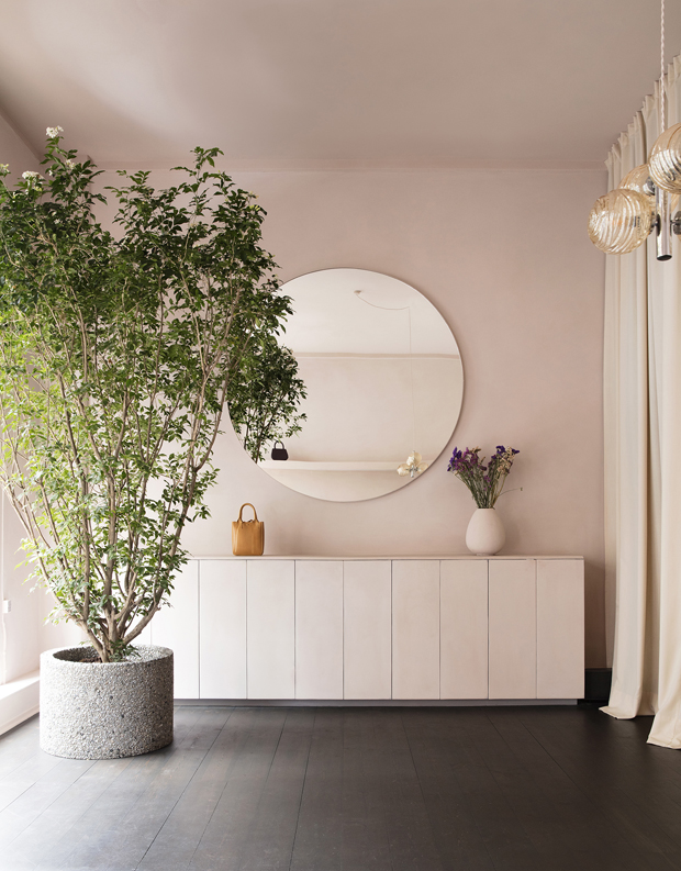
You won’t even think about millennial pink after seeing Odessa Pink HC-59. “This is not a pink for teenagers; it’s a sophisticated, mellow and mature pink.” Nam Dang-Mitchell’s pick works beautifully with warm and earthy accents like those seen in fashion designer Yvonne Koné’s Copenhagen showroom, where Nam spotted a similar shade.
The final addition to Nam Dang-Mitchell’s palette, Templeton Gray HC-161, lets you add soul and depth to spaces. Use it to get the look of the trendsetting Roman and Williams showroom in New York (pictured), where Nam took this photo for inspiration.
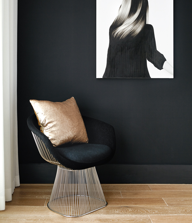
Don’t be afraid to pack a punch with black, like Universal Black 2118-10! Bold walls create an opportunity to let furniture and art stand out, similar to this perfectly balanced hallway designed by Shirley Meisels of Mhouse Inc.