

Decorating & Design
Before & After: A Cheerful Tudor-Style Home For A Blended Family
Published on April 19, 2021
Renovation is an act of optimism that requires trust, imagination and a million major and minor decisions ranging from the removal of a wall to the color of a kickplate. Things get even more tricky when the homeowners have somewhat different tastes. “He has a sleek, contemporary aesthetic, while she’s drawn to a more classic, traditional look,” says designer Meghan Carter of her clients Suzanne Cowan and Andrew Clark. Suzanne is the president of the Liberal Party of Canada, and Andrew is an entrepreneur and founder of Triangle Capital Corporation, and their blended family includes Malcolm, 14, Grace, 14, Harriet, 11, Clara, 9, and their two dogs, Daisy and Sparky.
In 2018, Meghan took on the makeover of their dark and dated three-story, five-bedroom, 4,500-square-foot Tudor-style house in Toronto, the couple’s first home together. “The goal was to create a place where everyone felt at home,” says Meghan. Buoyed by that idea, Suzanne and Andrew left all their former furniture behind. “This was an opportunity to have a fresh start, to really create a space that worked for us,” says Suzanne.
They were both enthusiastic about incorporating one another’s styles, so Meghan set out to design cheerful, family-friendly interiors that were a blend of traditional detailing and more contemporary sensibilities. It was also important to Suzanne to preserve the architectural integrity of the house. The couple also had a common goal that focused on the kids. “They wanted each of the kid’s rooms to uniquely reflect who they are, and they wanted places where the family could relax together and others where the kids could just hang with their friends,” says Meghan. Malcolm, Grace, Harriet and Clara all have distinct bedrooms, each with its own hang-out zone.
Now that both Suzanne and Andrew are working at home and the kids are remote-schooling, this has proved to be a prescient use of space. The outcome is a family home tailor-made to balance togetherness with privacy.
Scroll down to tour this beautiful family home and use our slider tool to see the dramatic before shots!
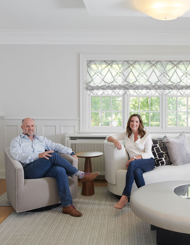
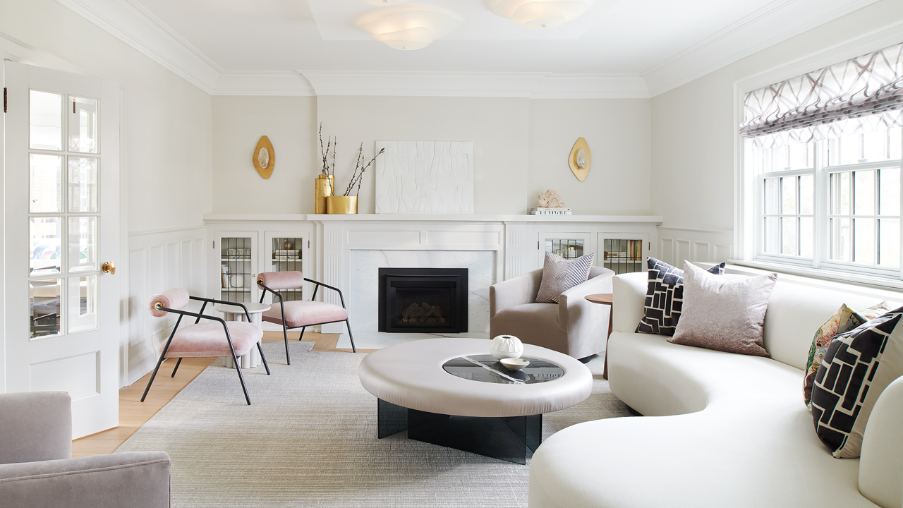
Homeowners Andrew and Suzanne relax in the living room. With such disparate decorating looks, there were bound to be a few design speed bumps along the way. For instance, Andrew liked the contemporary vibe of pale, wide-plank flooring, while Suzanne preferred the dark hardwood floors she was accustomed to. Meghan became an expert at finding the common ground between them. Once the eight-month-long renovation was done and the dust settled, it was clear that the result was a perfect balance of her yin and his yang.

Meghan placed a curvy, 10-foot-long sofa in the corner of the living room to soften the rectangular space and create multiple conversation areas.

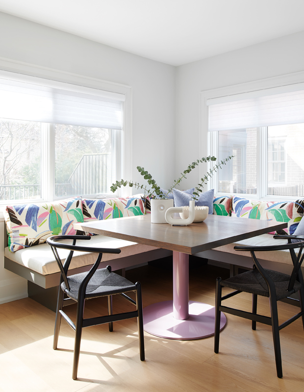
In the formerly formal dining room, instead of a classic chandelier, a contemporary glass pendant now hovers over an unexpectedly round white table. “We wanted to create a home where nothing is too precious and we could entertain a crowd,” says Suzanne of her choice of a round, stain-resistant dining room table that can seat 10.

Integrated pulls on the cabinet doors add to the kitchen’s sleek design, as does an island cleverly located to incorporate a structural post and dropped beam. To keep the home practical and carefree, all the paint on the walls and woodwork is washable, almost all the upholstery fabrics are stain-resistant, the white kitchen cabinets have a fingerprint-proof finish, and Meghan swapped the predictable white kickplates for a more durable light bronze metal that doesn’t show scuffs.


“I wanted the bar at the end of the kitchen to have its own distinct look,” says Meghan, who painted the cabinets gray to create a visual transition to the dining space adjacent to the kitchen.
Extra-deep seating in the airy sunroom off the living room makes it a magnet for casual family gatherings.

The surprise of joyful wallpaper in the powder room makes the most of a tiny space.


Since the principal bedroom is long and narrow, maximizing space and keeping clutter to a minimum was key to creating a calm, relaxing vibe. The suite is removed from the daily chaos of kids and dogs via a pocket door and a small vestibule. “I love it,” says Suzanne. “It’s right in the middle of everything, but you can just close the door and have your own space.”

Part of the second-floor principal suite, the dressing room features grasscloth-clad closet doors and a custom radiator cover designed with built-in shoe storage.
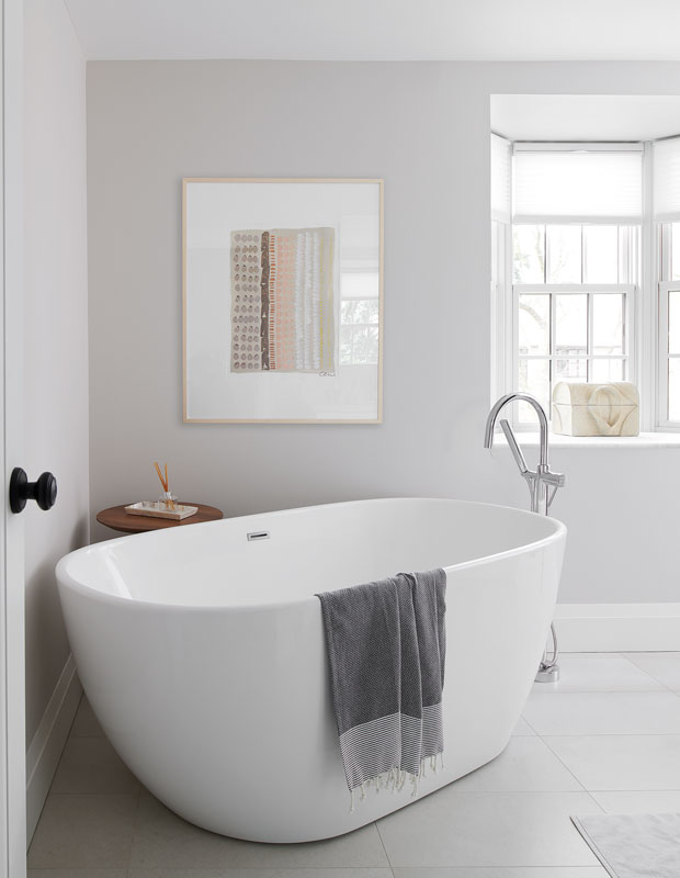
Tucked into a corner of the sunlit principal bathroom, a freestanding tub makes a sculptural statement.

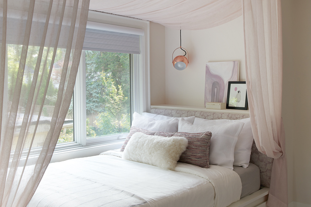
“Harriet loves soft, quiet and cozy things, and we wanted her room to feel very feminine,” says Meghan, who designed a fabric canopy for her bed that can easily be removed in the future.


“Clara’s a little more punk in her style, so we used a lot of graphic black and white in her bedroom,” says Meghan.


Clara loved the idea of a swing in her bedroom but didn’t want too much color on her walls. Meghan disguised the bulkhead by painting it the ceiling color.


Grace’s third-floor bedroom includes a casual hang-out space at one end and a work zone with a built-in desk at the other.

Matte gray honeycomb tile adds a graphic, grown-up look to the third-floor bathroom.
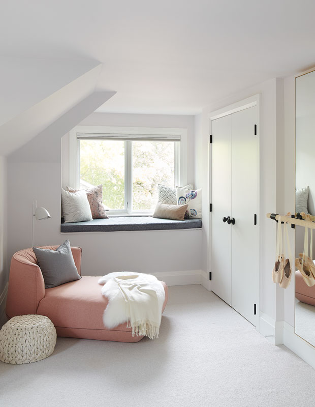
Grace’s bedroom was originally two small rooms. A wall was removed to create one light-filled space with a mirror and built-in barre for the budding ballerina.
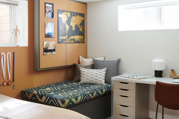
In Malcolm’s basement bedroom, an entire wall (and electrical panel) clad in cork creates an ever-changing personal art gallery.

Built-in shelves next to Malcolm’s desk add space for books and memorabilia.
House & Home April 2021
Meghan Carter