Decorating & Design
February 25, 2016
6 Unique Ways To Display Your Art
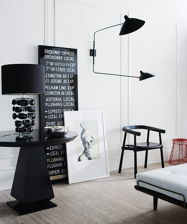
Senior design editor Joel Bray shares creative art display ideas.
 Artwork is such an important design element; often rooms don’t feel quite finished until it’s up on the walls. But when it comes to displaying your collection, take a moment to think: the method you choose can often make just as much of a statement as the pieces themselves. Need some inspiration? Here are some of my favorite ways to showcase eye-catching photos and art.
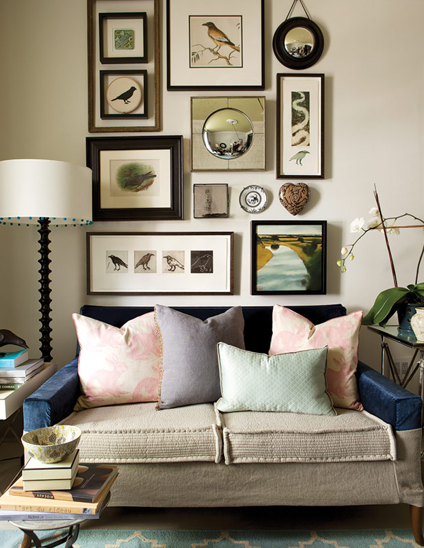
Gallery walls are having a moment right now, and are a classic, historical way to hang artwork. Though there are lots of different tips and tricks out there to help you create one, I think the most important thing to remember is that the collection should look like it’s evolved over time.
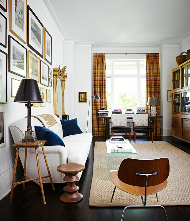
This handsome arrangement in H&H editor-in-chief Suzanne Dimma’s living room is a great example of a gallery wall that hits the mark. Suzanne combined different artistic mediums, frame styles and frame sizes for an organic, collected look that feels very personal — and anything but contrived.
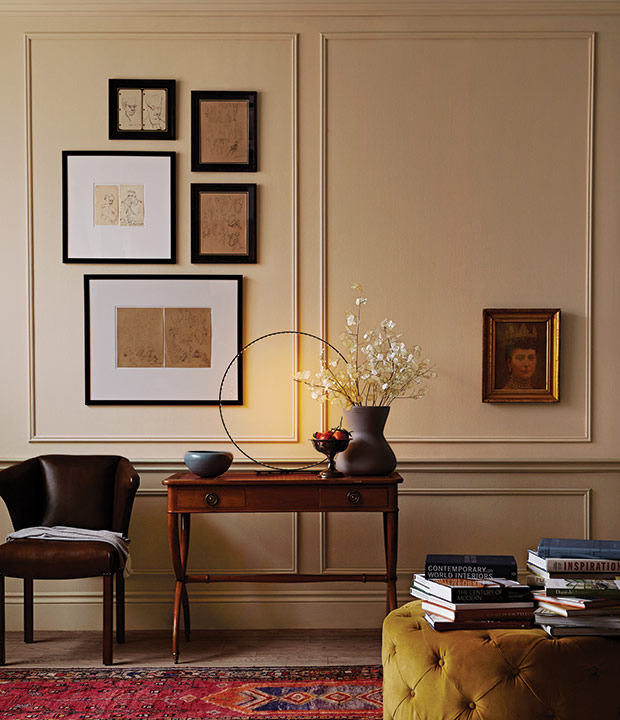
We’re often told to consider the position of furniture and moldings when placing art, but a fresher take is to forget “the rules” and just go for it! Hanging art off-center, over top of moldings, or lower than what galleries would usually recommend can add real energy to rooms.
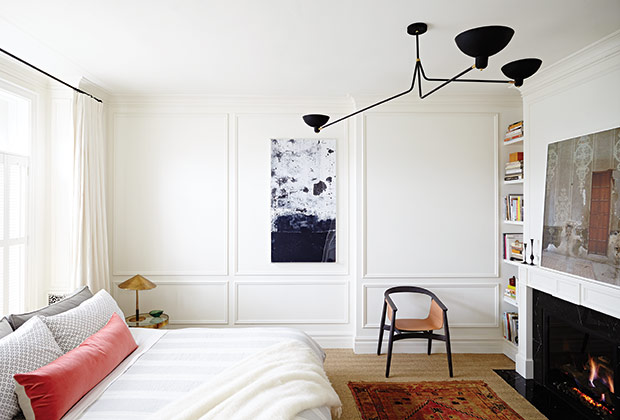
The key to unexpected placement is making it look purposeful: a painting that is almost centered on a wall can look like a mistake, while mounting a piece noticeably off-kilter creates edgy asymmetry. In this bedroom, a graphic canvas has been hung to the right side of a wall panel, adding just a touch of visual tension to the space.

Whether placed on the floor, on top of a sideboard, or popped casually on a bookshelf, leaning pieces of art looks super contemporary. This approach also appears more laid-back and fluid than traditional hanging, as if your pieces are on ever-changing rotation.
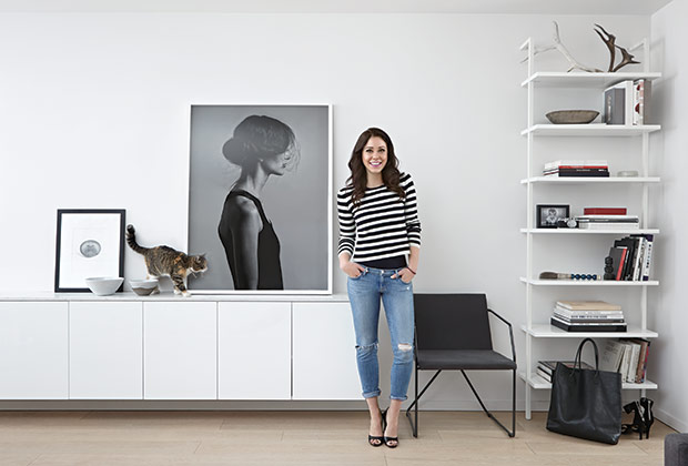
Leaning pieces is another great option for those who like to change up their arrangements whenever the mood strikes. Fashion photographer Carlyle Routh’s minimal display would be easy and quick to adjust.
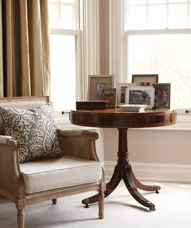
If you have small framed snapshots peppered throughout your home, consider clustering them together in single-theme displays. For example, centralize several vintage family photos on one table or console; it’ll create a design moment that feels thoughtful and intentional. (Family pictures aren’t something you see displayed a lot in major shelter magazines, but I think that with a little attention to display they can be a fantastic design element!)
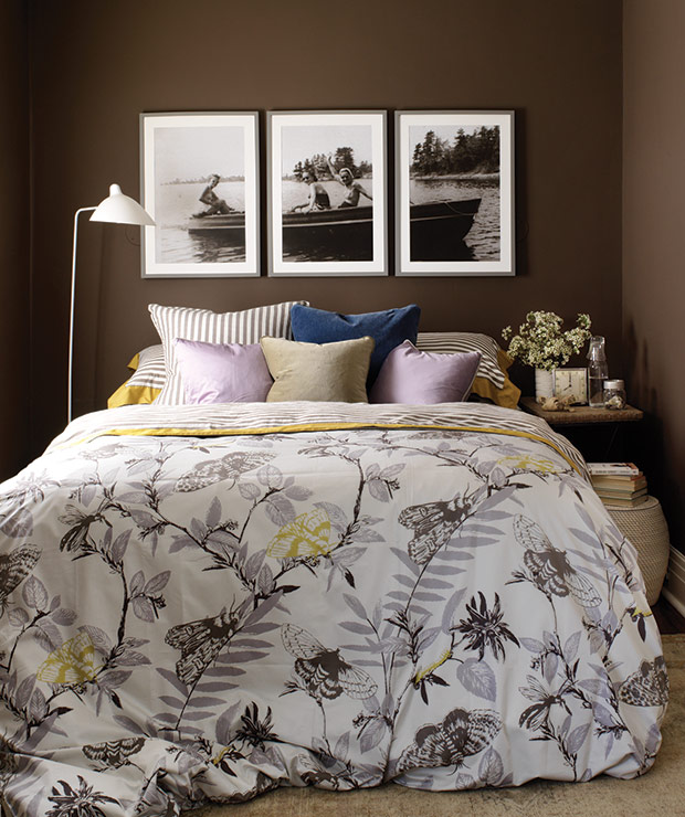
Blow up a great, horizontally-oriented photograph or print, divide it into thirds, then set the pieces in three matching frames. The result is a bold triptych with subject matter that’s meaningful to you. While you could display this treatment anywhere in your home, I think hanging it in private space like a principal bedroom is a natural choice.
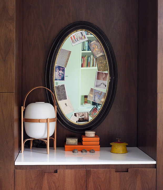
This method of display is looser and more spontaneous than the others I’ve suggested, and it’s very simple to do. Simply tuck photos or art cards randomly under the frame of a mirror to create a cool, collage-like effect. This what I do in my own home, and my displays are always changing.

