Decorating & Design
How To Bring Personality To A White Kitchen
Published on March 13, 2018
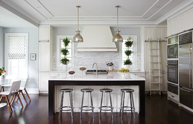
White kitchens are loved for their classic look, but that doesn’t mean they lack character. From statement lighting to bold backsplashes, click through for our favourite ways to make your white kitchen stand out from the rest.
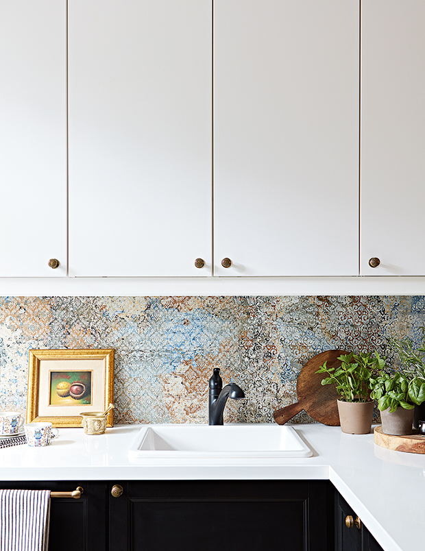
Set between simple white uppers and black lower cabinets, a bold damask print makes homeowner and designer Tatiana Velasevic’s kitchen backsplash a striking focal point.
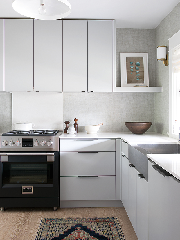
When redesigning his Toronto kitchen, designer Cameron MacNeil swapped traditional tile in favor of something more unexpected: a textural faux-grasscloth wallpaper. “It’s vinyl, so it’s still totally wipeable, and now this feels like a living space, not a workspace,” he explains.
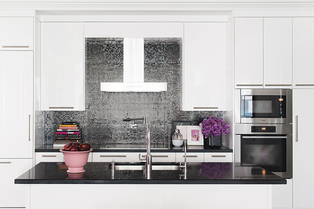
A shimmering gray backsplash keeps sleek white cabinets and a boxy hood from feeling too stark in this lavish kitchen. Purple flowers add a pop of color.
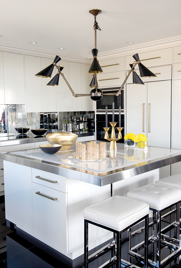
This classic white kitchen features a few glam twists: jet black floors, a stainless-steel trimmed island, and an attention-grabbing mirrored backsplash.
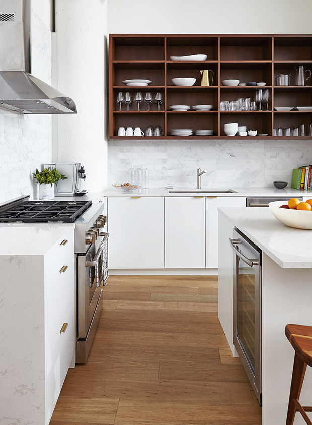
A solid walnut unit adds warmth to designer Erika Floysvik’s Toronto loft kitchen, helping to break up the otherwise all-white palette.
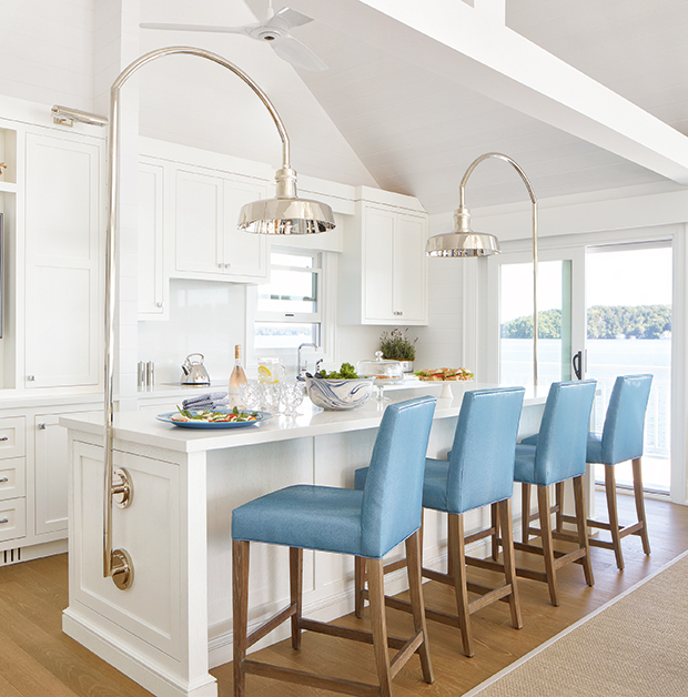
Designer Anne Hepfer mounted a pair of polished-nickel gooseneck task lights to either end of this cottage kitchen as a nod to outdoor dock lighting.
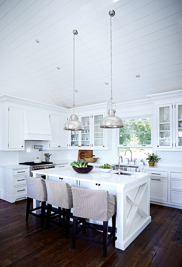
Designer Cameron MacNeil drew attention to this cottage kitchen’s peaked ceilings with a set of oversized pendant lights that draw the eye upward.
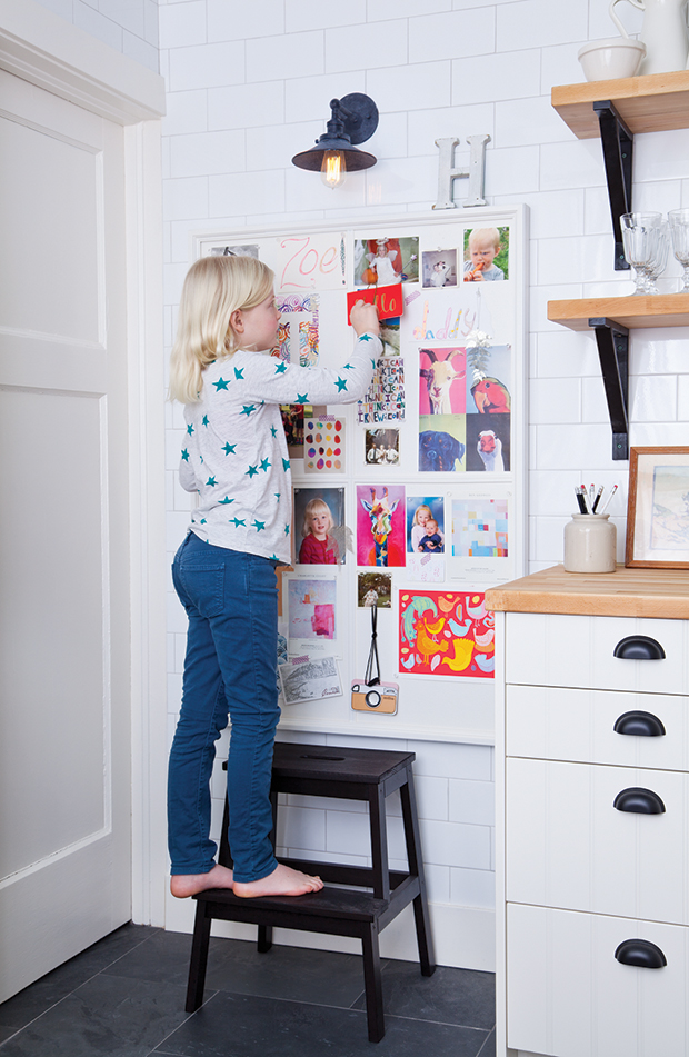
For this on-the-go family, designer Sarah Hartill designed a custom corkboard wall to corral family photos, school notices and drawings.
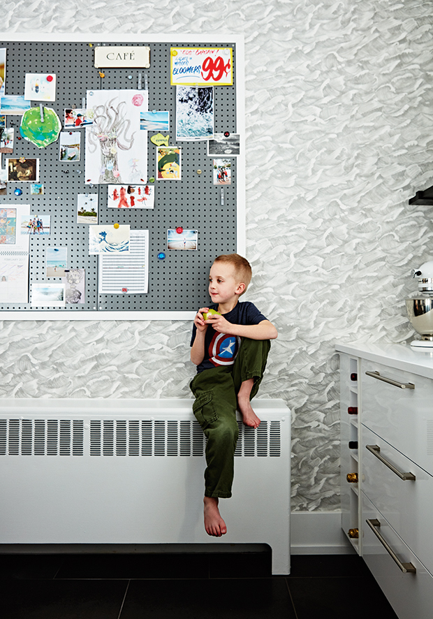
In this corner of photographer Stacey Brandford’s kitchen, a magnetic board is used to display family photos, artwork and quirky memorabilia, including a sign from Toronto landmark Honest Ed’s. A wave-patterned wallpaper is a nod to Stacey’s upbringing in Jamaica.
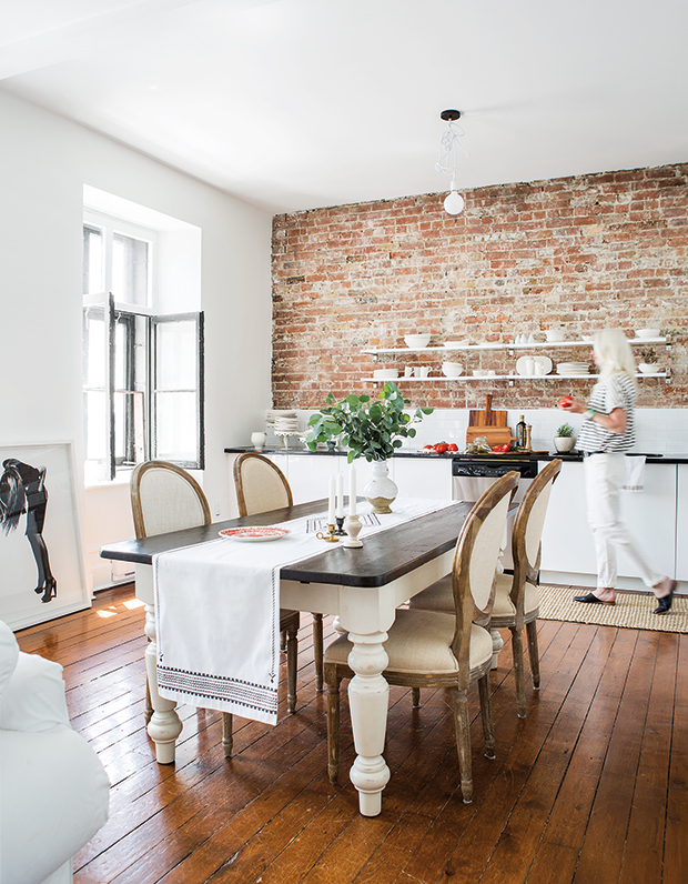
Homeowner and ceramicist Trudy Crane decided to forgo upper cabinets in favor of letting her all-white dishware collection pop against an exposed brick wall.
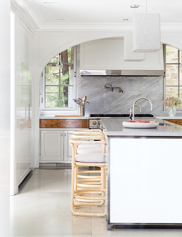
To enhance the historical feel of this French Colonial home, designer Katherine Newman installed a striking arch to frame the windows and hood.
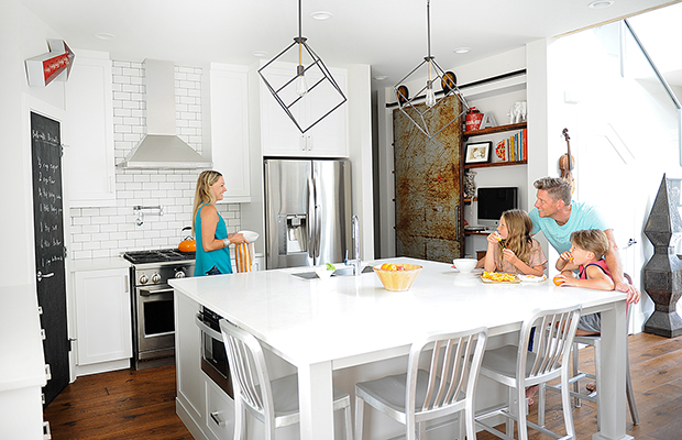
A kid-friendly chalkboard door conceals the pantry in homeowners Michael and Ann Soltis’s hip-meets-hardworking kitchen, while a distressed sliding door acts as an edgy showstopper in an otherwise pristine white space.
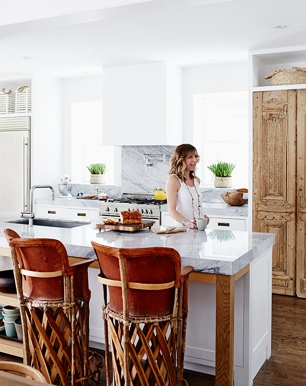
Tall vintage Egyptian doors give designer Sam Sacks’s own kitchen a worldly flavor. “Hundred-year-old doors give me goosebumps,” she says.

A rolling ladder is an unexpected touch in a kitchen, but one that adds instant character and allows for easier access to high cabinets. When not in use, it can be rolled into a servery just off the kitchen.


