

City Homes
Inside an Ottawa Home With a Fearless Infusion of Colour by O’Keefe Fiorenza Design Group
Published on April 24, 2026
When clients say they envision their home filled with colour, sometimes it’s best to take the assertion with a pinch of salt. Their concept of colour might well amount to timidly microdosing with little more than a hot pink pillow. The family who lives here, on the other hand, isn’t wary of anything except beige. In 2023, when couple Bronwyn and Joe hired O’Keefe Fiorenza Design Group to redesign the interior of the red-brick home they had purchased in Ottawa’s historical Glebe neighbourhood, their mandate was clear: they wanted a palette of warm, enveloping colours. Interior designer Haley Fiorenza and Dylan O’Keefe, co-founders of the firm, had already worked with the couple on the renovation of their island cottage a few years earlier.
Even though Bronwyn and Joe had viewed the Ottawa place and initially passed on it, Haley and Dylan encouraged them to take another look — and to imagine what the three-storey, five-bedroom house could become with the design team’s proposed changes. “With their vision, we were able to see the home’s potential, which was a great help,” says Bronwyn. They took the plunge and purchased the property. “Compared to what it was, the interiors are almost unrecognizable,” says Haley. Bronwyn and Joe couldn’t be happier with the renovation. “Now, whenever we come back from travelling or being at the cottage, we always feel embraced by the warmth of our house,” says Bronwyn. “We wanted it to have a lot of interesting textures and patterns, and we love that every room has unique colours and details — it makes for an exciting home to live in.”
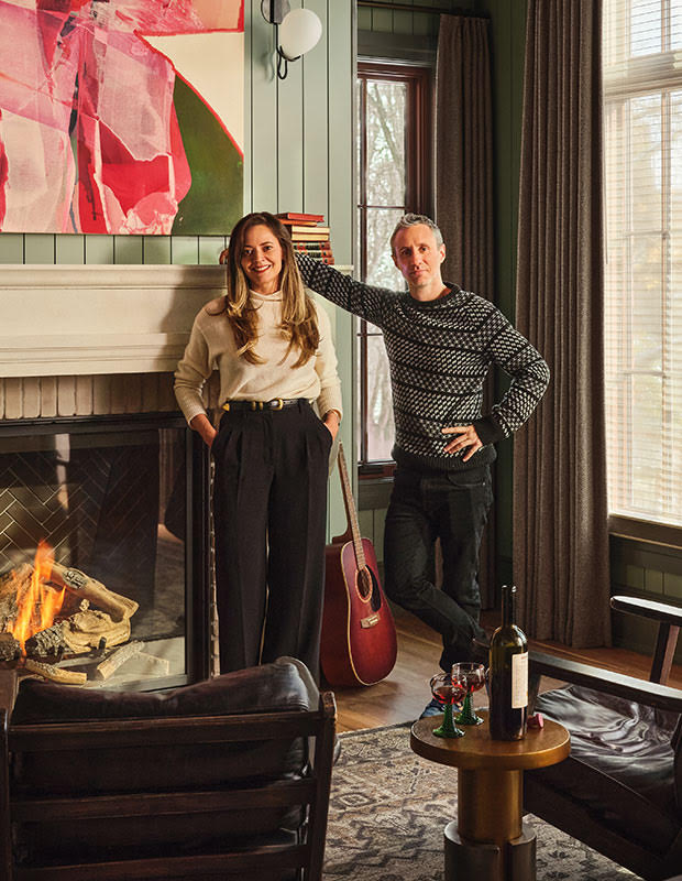
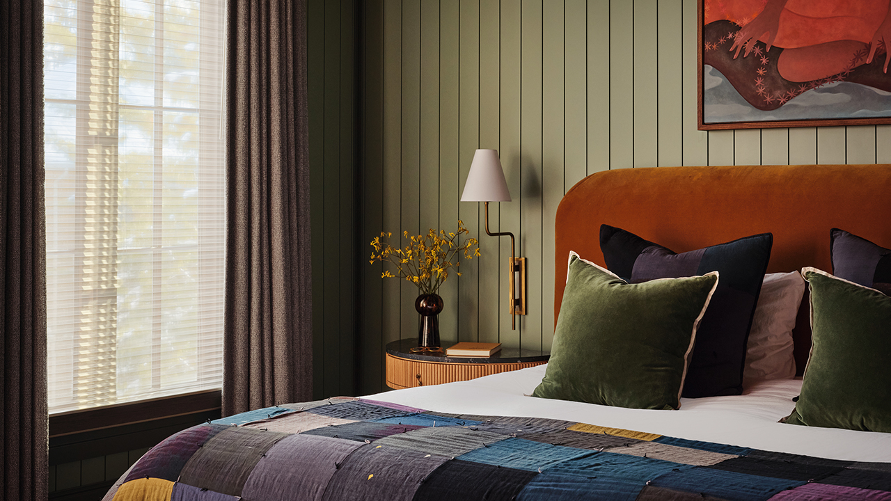
Interior designer Haley Fiorenza and Dylan O’Keefe in their clients’ principal bedroom. The palette, seen here and throughout the house, was chosen for its heritage feeling. “The colours speak to each other,” says Haley.
The couple was confident that Haley and Dylan understood the renovation required to meet the family’s needs for more and smarter space. Topping their list were bedrooms for each of their kids, a larger, more functional kitchen and pantry designed to accommodate their love of cooking and entertaining, a sauna in one of the second-floor bathrooms, a dedicated art room for Bronwyn, and a cosy library lined with their growing collection of books — all without increasing the house’s 4,024 square feet.
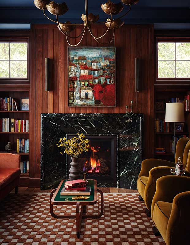
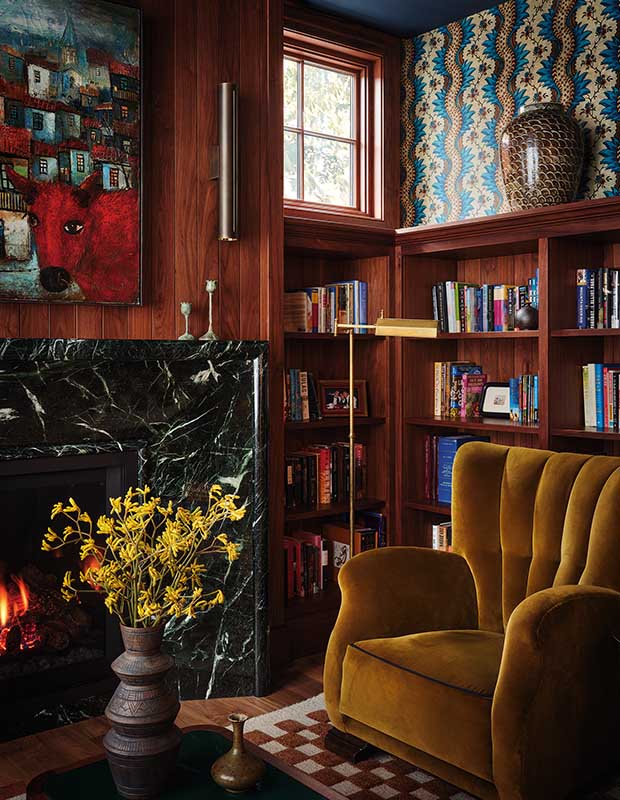
From floor to ceiling, the library boasts layers of carefully calculated patterns, colours and periods, creating an enveloping sense of comfort.
Creating the vibe that was key to the couple’s design aesthetic involved far more than simply slapping on a few coats of paint and bringing the wiring up to code. “We wanted our home to have a warm, lived-in feeling infused with interesting textures, patterns and colours — not a stark, beige space,” says Bronwyn. “The colours the designers presented us with really captured the feel we were going for.” Haley says that, rather than having a signature style, O’Keefe Fiorenza Design Group appreciates and works in many styles, whether it’s modern, traditional, or a blend of styles like a transitional look.
Vintage seating in soft fabrics and a cosy fireplace have turned the library into what Bronwyn calls “our favourite place for morning coffee or an evening cocktail.”
The design team considered replacing the home’s worn walnut floors, but they ultimately decided to sand and refinish them, bringing them back to life — a budget-friendly move that inspired the designers to use the traditional finish on the wood-panelled walls, cabinets and windowsills throughout, adding a sense of continuity.
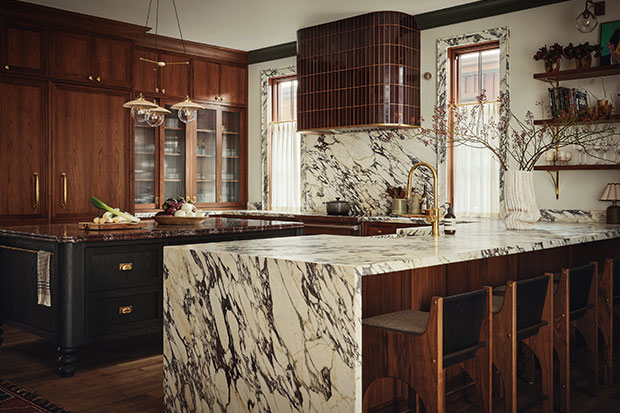
The kitchen is filled with rich wood tones and burgundy hues. A custom black-stained oak island is topped in Rosso Levanto marble, and there’s a striking Calacatta Viola marble peninsula with waterfall detailing. Open shelves mounted on delicate brass brackets display collectibles and art.
The homeowners didn’t bat an eyelash at the idea of a saffron yellow laundry room or a burgundy-infused kitchen. “We didn’t have to encourage Bronwyn and Joe, particularly when it came to colour,” says Haley. “They pushed us! Every time we suggested something really different and funky, they loved it.” The renovation took 11 months and involved 18 carefully selected paint colours, umpteen wallpapers and miles of marble.
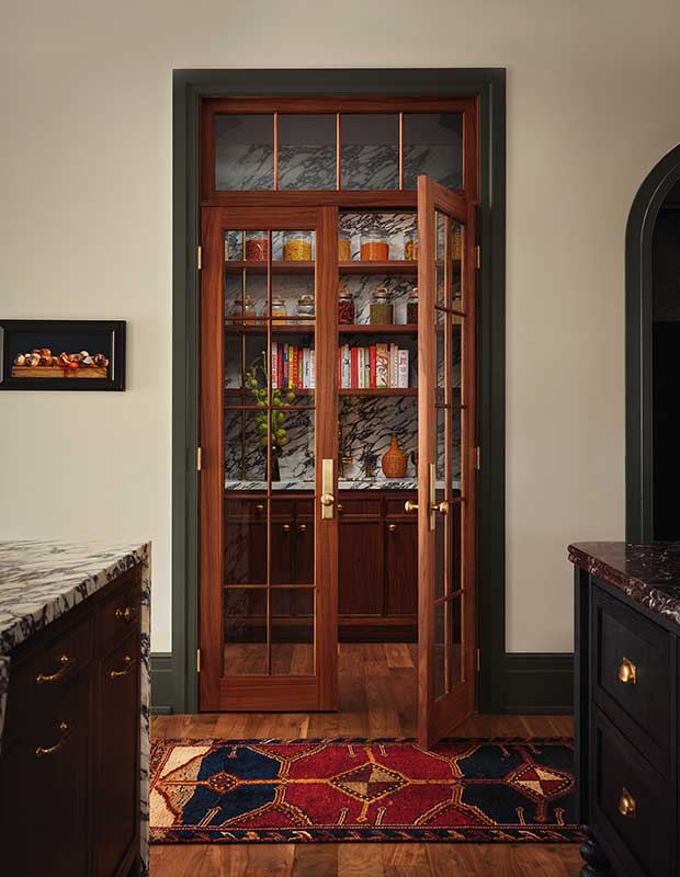
Haley used French doors for the pantry. “It makes the kitchen feel more traditional and in keeping with the Craftsman-like style of the home,” she says.
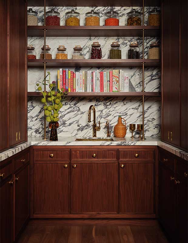
The spacious, marble-lined pantry was originally a powder room in the foyer.
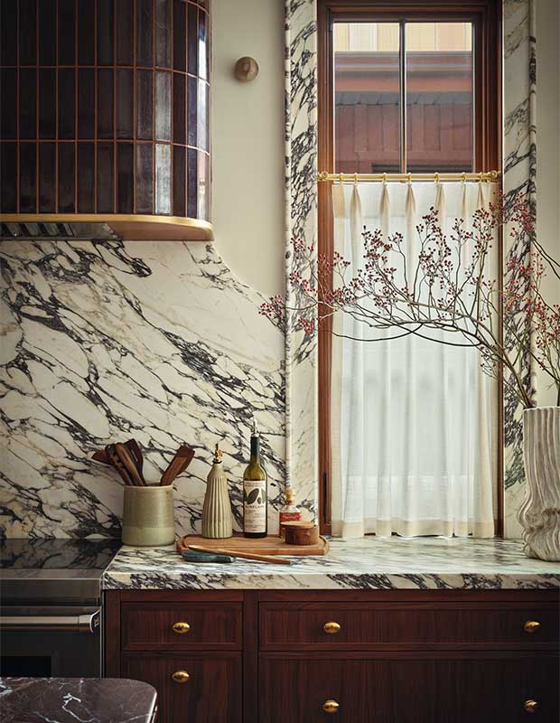
Dramatic Calacatta Viola marble is lavishly applied on the kitchen backsplash, counter and window casings. “We find it energizing!” says Bronwyn. Deep merlot-hued tile clads the vent hood.
The owners had been drawn to the 16-year-old house’s exterior architecture, a modern take on Arts and Crafts style that complements the neighbourhood’s mix of older and newly built homes, but the interior was much less appealing. Every wall, window frame, cornice and door was either beige or white.
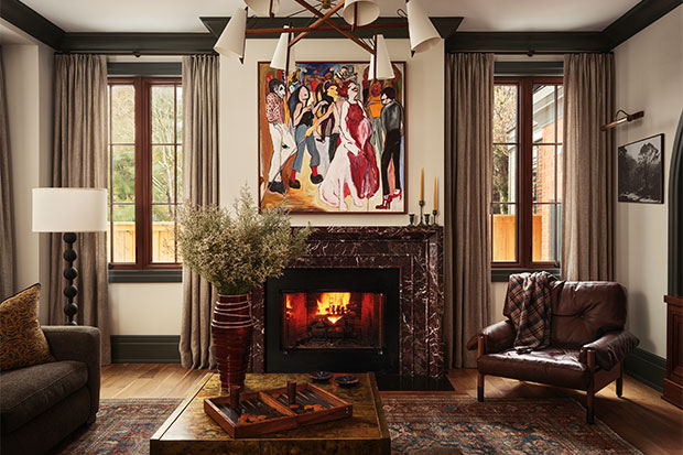
In the living room, a colourful painting and contemporary lighting are juxtaposed by the ornate marble mantelpiece and moody palette. It’s an enchanting trad meets modern look.
To its credit, there were a few period-inspired features, including an 18-foot-high beamed ceiling in the principal bedroom, two fireplaces and handsome wood floors. “If the house you buy has potential in terms of adding character, that’s a bonus,” says Dylan, who set out to give this home more heritage style by bringing in architectural elements such as archways, a fireplace in the principal bedroom, ornate, splurge-worthy marble mantelpieces and faux finishes. He also transformed an office on the main floor into a cosy, wood-panelled library.
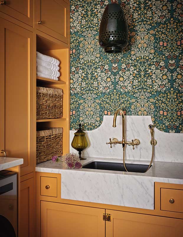
An intricately patterned wallpaper and shapely marble backsplash give the laundry room a whiff of period elegance.
There were speed bumps along the way, including delayed deliveries and bathroom tiles from varying dye lots. But, as often happens with renovations, one challenge — a last-minute decision to switch to the bold yellow for the laundry room cabinets without knowing that a green pendant had already been ordered for the space — resulted in a brilliant save: an eye-catching wallpaper now ties the two colours together.
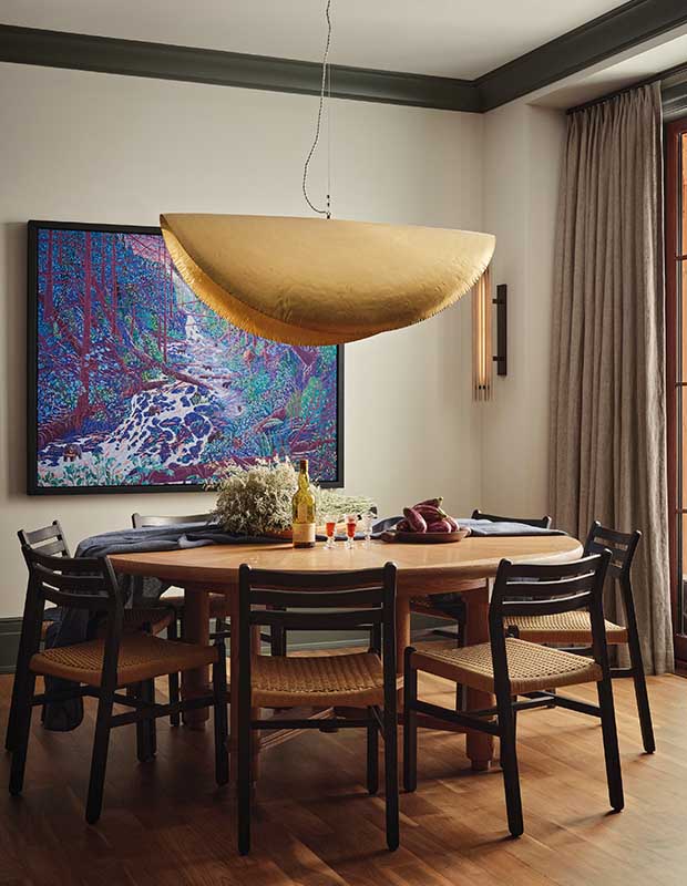
Because Bronwyn and Joe like more informal gatherings, they decided to forgo a formal dining room. The design team created this inviting dining area off the kitchen, defined by a dramatic pendant and vibrant art. “We think of lighting as jewelry in a space,” says Haley.
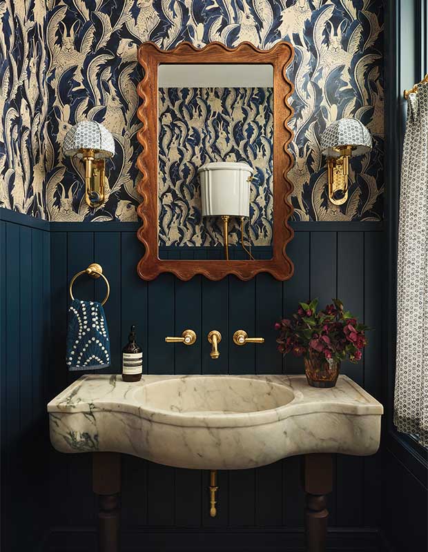
Though Bronwyn and Joe stipulated no animal-themed wallpaper, the main-floor powder room’s rabbit-motif paper is now one of their favourites.
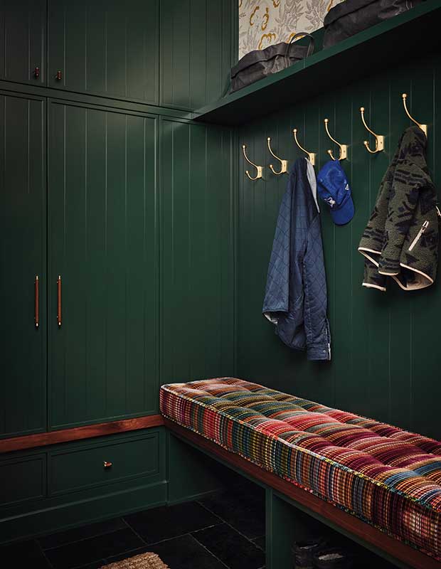
Form meets function in the mudroom, where a plump variegated seat cushion, lush green paint and an inky tile floor dress up storage and a stretch of coat hooks.
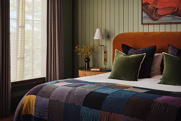
Quietly luscious colours create a sense of timelessness in the principal bedroom.
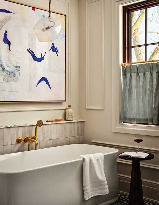
The principal ensuite is a light, bright and airy retreat.
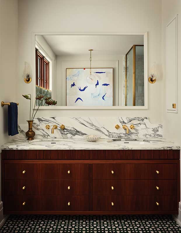
A walnut-stained vanity, gold-toned hardware and green mosaic floor tile echo design motifs that run throughout the house.
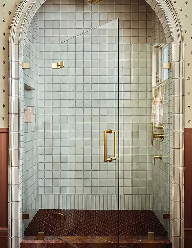
Adding an archway and herringbone tile floor to the shower blows any predictability out of the second-floor family bathroom.
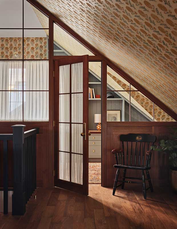
A light-filled third-floor space, previously a children’s play area, was transformed into Bronwyn’s art room.
Kevin Belanger
House & Home
O’Keefe Fiorenza Design Group