

Decorating & Design
May 21, 2019
Designer Sarah Richardson Shares Her Best Makeover Tips!
When a family from London, England, decamped to Nashville, Tennessee, they wanted to land somewhere that instantly felt like home. Designer Sarah Richardson, who had worked on the homeowners’ previous house, knew exactly what they liked and was up to the challenge of working on a short timeline. The caveat? There would be no renovation; this house was only a stop on the family’s journey to a forever home. For Sarah and co-designer Kate Stuart, the refresh was all about the power of decorating, injecting traditional English touches and a fresh, updated feeling with just paint, fabric and furniture. Post-makeover, the home’s soft palette combines with dramatic flourishes to achieve the perfect union of British and Southern charm.
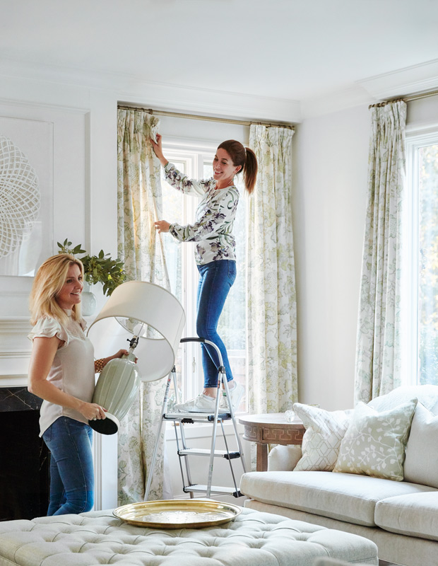
Scroll down to discover Sarah, in her own words, breaking down her tips for tackling a reno-free makeover.
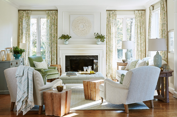
The family room overlooks the garden and pool, so we used colors from outdoors — soft grey-green tones on the dresser, a mossy green velvet chair — but more faded and washed out. Things don’t have to be bold and loud. For a lighter, brighter environment, try tone-on-tone artwork. Consider the mood of a room; all the layers need to embrace that feeling.
A hooked rug in the family room mixes with chunky wooden stools and painted furniture (many pieces consignment store finds) to give the space a casual, inviting look.
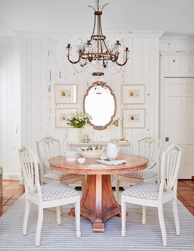
In the kitchen, we worked with the creamy palette of the existing tongue-and-groove walls. The chairs were vintage finds that we had painted white and reupholstered to go with the limed oak table. On a thick, flatweave rug like this one by Surya, chairs pull out easily. The rug creates a lovely neutral foundation; I have the same rug in my own home in the city and at the farm.
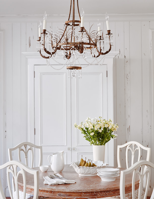
A Niermann Weeks chandelier found at auction adds a touch of glamour in the more casual kitchen.
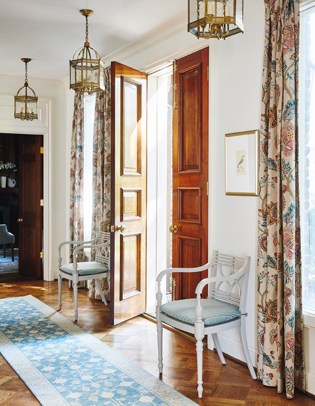
We couldn’t refinish the floors or doors in the foyer, so we worked with them. The way to balance darker floors and wood elements and still have things feel fresh is by going with an antique-wash rug. We picked a traditional rug in a lighter palette and added antique bird etchings and linen drapery in a Jacobean paisley pattern. The entry sets a casually elegant tone for the rooms to come.
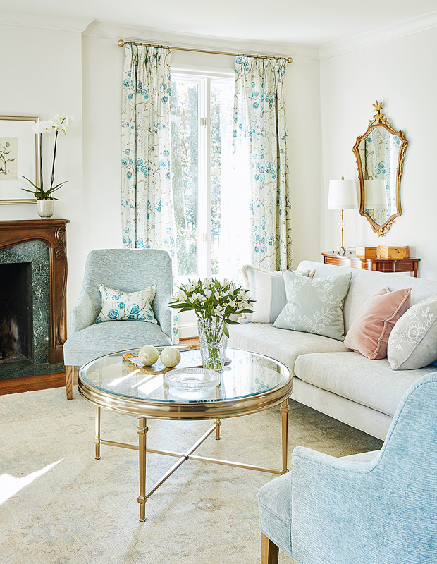
We believe you can make any room look great. The house has yellowy, golden tones throughout that we had to temper and cool off, so we went with a palette of oyster, cream and greyed aqua. Because we couldn’t change the dark green marble or wood mantel in the living room, we added notes of blue-green to work with the existing surround. Overall, everything feels sun-faded and soft.
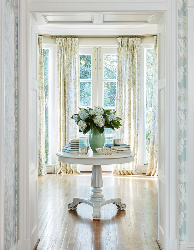
Never underestimate sight lines; I think about this a lot. This hallway goes through the dining room to the double family room and the garden outside. I love that when we put a table in this long, long hallway, it draws people in. The house has many windows with views that needed to be framed. Richly patterned floral drapery in muted tones doesn’t compete with the garden views beyond, instead adding an understated dose of drama.
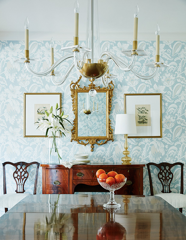
Many of us have rooms we walk through every day. We’re transitioning through them all the time, so make sure you enjoy the journey and that the room tells a story. In this home, the dining room is smack in the center of the house, with many rooms flowing from it. This 19th-century English triple-pedestal table will always look great. Buy pieces that’ll be with you for the long haul, and enjoy experiencing them, even if you don’t use them often.
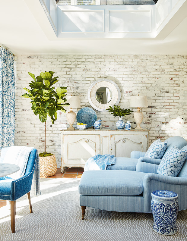
I believe in dedicated spaces. When you look at a room, think about what you’ll do there and how you want it to feel. This is a room for him and her, for morning coffee overlooking the garden or for reading a book in the afternoon. It doesn’t need seating for many people, so a pair of chaises works. It’s also where their dogs will come and go from the outside, so the large indoor-outdoor rug is very practical.
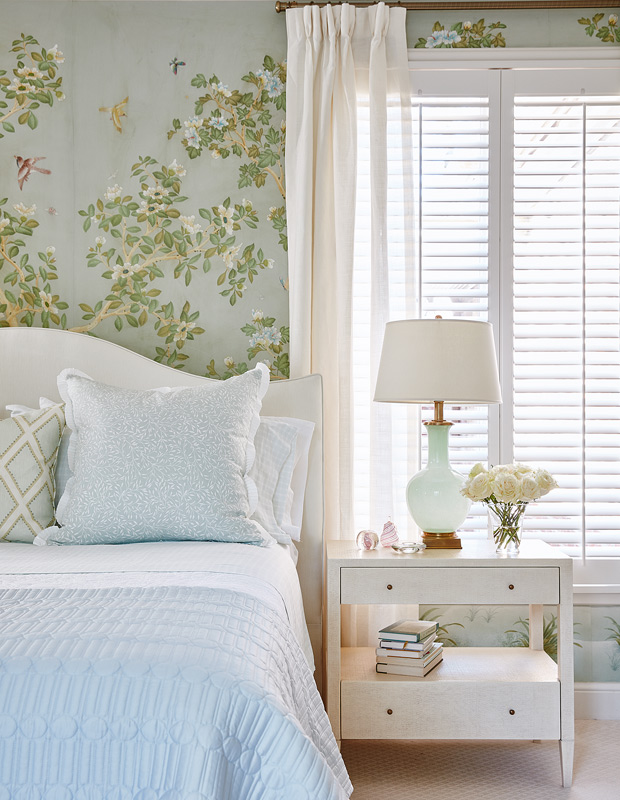
If you’re going to have something as bold as this wallpaper, everything else has to whisper. The linens and grasscloth-covered dresser offset the richness of the principal bedroom’s wallpaper, which was already here. We covered the headboard in creamy chenille and added the lightest of accent touches in aqua and green. Everything is light and ethereal. To soften the existing California shutters, handkerchief linen drapery is layered over top.
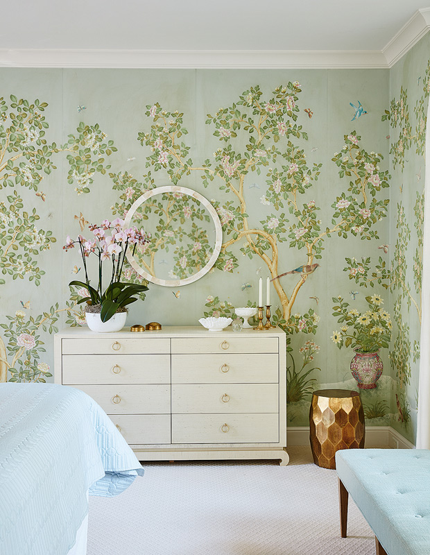
The new palette gives the bedroom a more casual vibe and lets the wallpaper shine.
Stacey Brandford
House & Home April 2019
Sarah Richardson and Kate Stuart, Sarah Richardson Design