Decorating & Design
25 Family Kitchen Design Tricks To Spruce Up Your Space
Updated on April 6, 2017
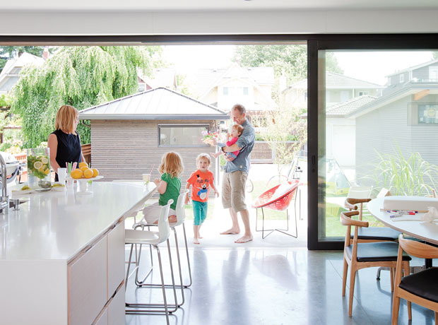
Cramped, chaotic, spattered with sauce… family kitchens so often get the short end of the stick when life gets hectic. But have faith: There are plenty of ways to make this hardworking room fresher and more functional. From large-scale design changes to easy decorating tweaks, we’ve rounded up 25 smart ideas from our favorite family kitchens to bring your space up to its full potential. The heart of the home has never looked, or worked, better.
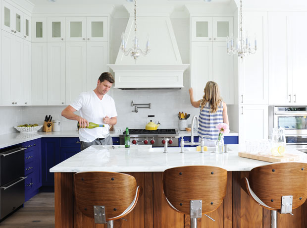
Embrace a lively, inviting color palette. Is there a more fitting place to play with color than in a family kitchen? We don’t think so. In Kenny and Michelle Gemmill’s house, bold blue-painted lower cabinets turn the kitchen into an energetic hub that brings everyone together.
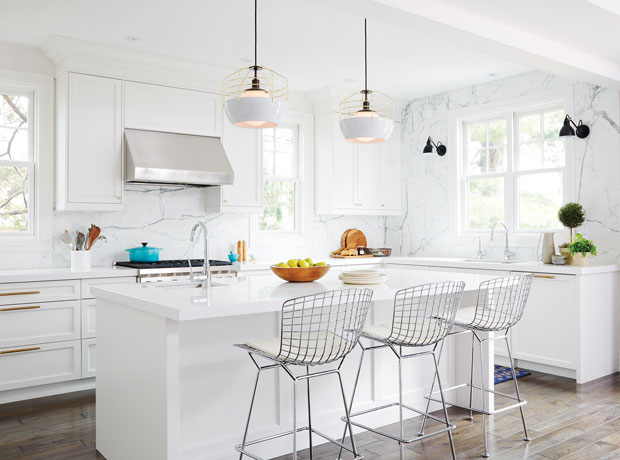
…or try all-white — with a practical twist. You heard it here: An airy, all-white kitchen is not out of the realm of possibility for family homes. The key is choosing hard-wearing, fuss-free materials, like the strong and stain-resistant Silestone counters in Lauren and Jim Currie’s family kitchen.
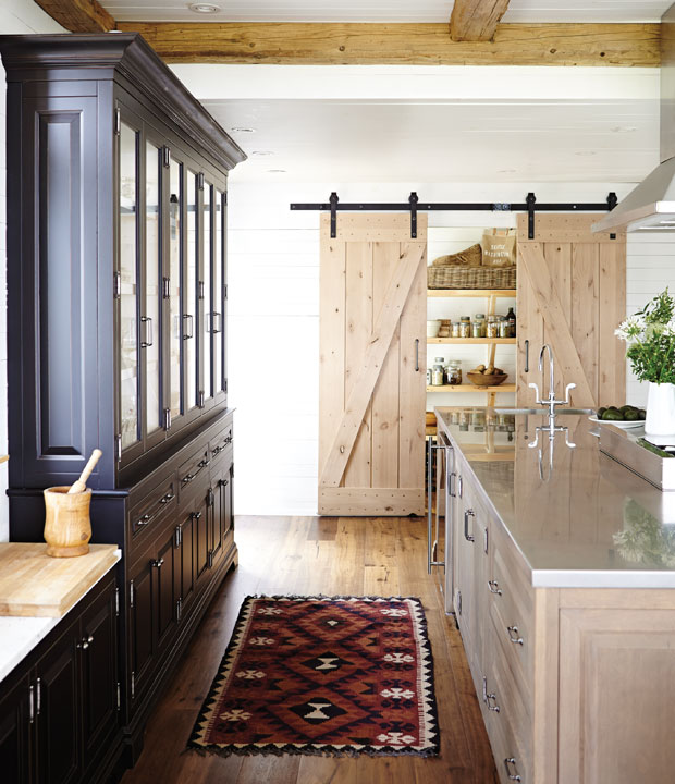
Add space-saving barn doors. A messy kitchen or full-to-the-brim pantry is a reality of family life. Hang a pair of simple barn-style doors to close off these less-than-tidy spaces without eating up any of your home’s footprint.
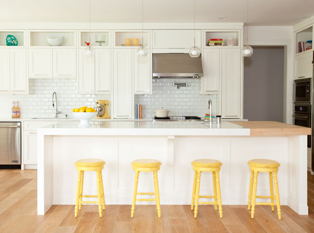
See why two is better than one. If there’s room in your space, and in your budget, consider installing two sinks: one large basin for dish washing, one smaller bowl for prep. This is a great way to spread out work zones for a less congested kitchen — ideal for homes with multiple chefs.
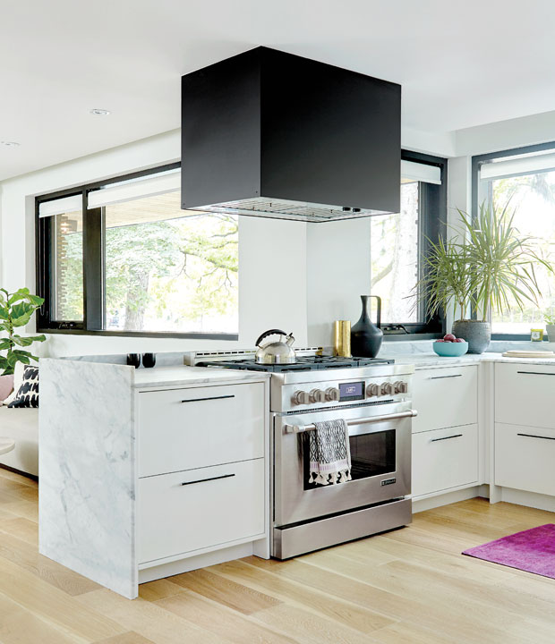
Design an open plan. While it’s not a new idea, it bears repeating since it’s a top ask of today’s home buyers: If you’re building your kitchen from scratch or taking on a full gut job, going open-concept is one of the most practical, highest-return investments you can make. We particularly love this handsome peninsula by designer Shirley Meisels, with its cleverly positioned range and vent hood offering parent-friendly sight lines into the living room.
Tour this kitchen on H&H TV.
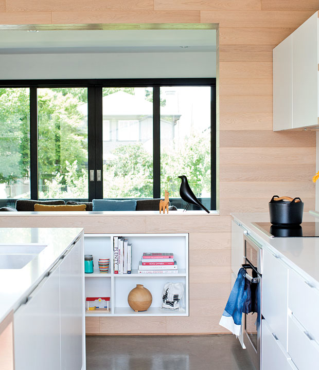
…or opt for a clever cut-out. If your kitchen is closed off, but you don’t want the expense and mess of an entire floor plan re-jig, take your cue from this Vancouver family home, which features a large cut-out between the kitchen and living room. (Of course, be sure to consult a structural engineer before taking on a project like this.)
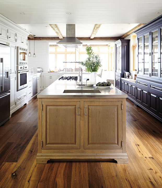
Design everyday storage with access in mind. In narrow or small kitchens, it’s a good idea to think about access to cupboards and drawers — especially when the room is full of family members. In this long cottage kitchen, designers Barbara Purdy and Olivia Botrie set a deep cabinet and prep sink on the end of the island where there’s plenty of breathing room.
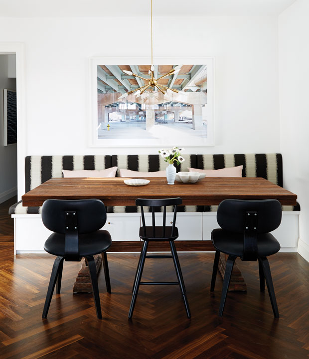
Get creative with dead space. We love designer Sarah Hartill’s tailored spin on typical flip-up bench storage. A set of drawers below her banquette have a bespoke look and neatly conceal dishes and decorative items that her family doesn’t use every day.
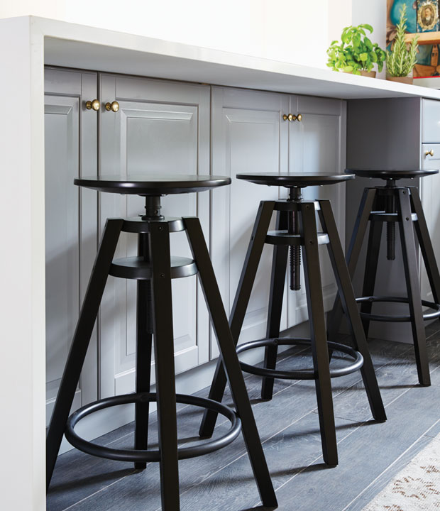
Take full advantage of island storage. While placing cabinet doors on the overhang side of a breakfast bar may seem counter-intuitive, this is another way to max out on storage. Stash formal serving dishes and specialty cookware here to make room for essentials in more accessible cabinetry.
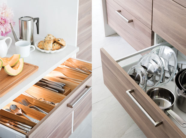
Fit big-box organizers in every drawer. There are plenty of pre-made drawer and cabinet organizers on the market that make kitchens more efficient — and offer a custom look at an affordable price point — so take full advantage of them. Illuminated cutlery trays and streamlined pot-lid racks (these are from Ikea) are just a couple handy options.
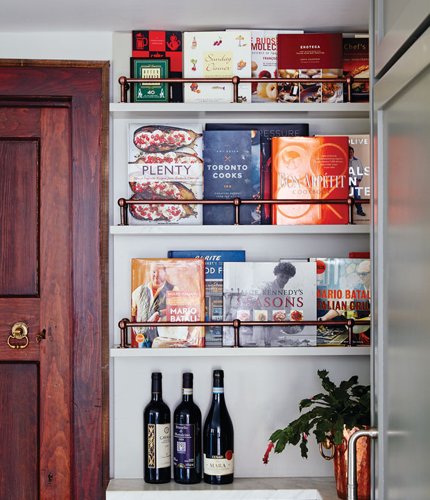
Wrangle the family cookbook collection. Instead of packing your favorite reference books into one cramped shelf, why not mount slim ledges to show off their covers? This smart design was dreamt up by Natalie Hodgins and Kate Stuart, adding color and life to this young family’s kitchen.
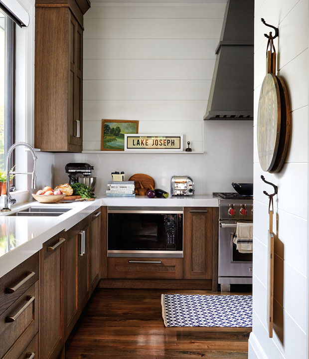
Turn go-to cutting boards into display. An artisanal cutting board makes a charming accent in country kitchens and cottages — and mounting it on the wall keeps it even closer at hand. Simply loop a leather cord or string through the handle and hang the board from a rustic coat hook, like the designers at Peaks & Rafters did in this lakeside family hideaway.
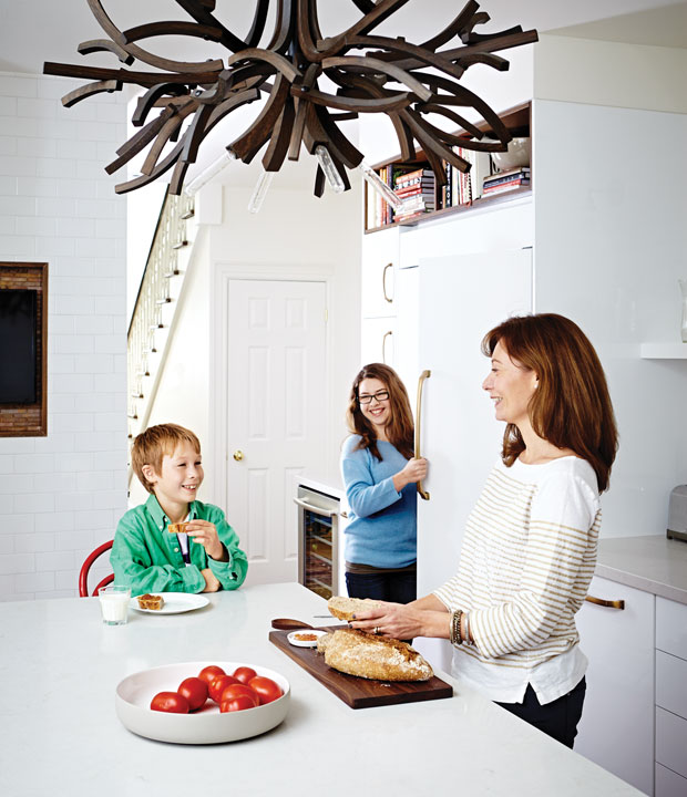
Optimize the space above the refrigerator. Don’t forget about the little nooks and crannies to make the most of your kitchen. In H&H Vice-President of Multimedia Sheri Graham Delagran’s kitchen, a wide, wood-lined cubby makes a sweet spot for a selection of books and ceramics.
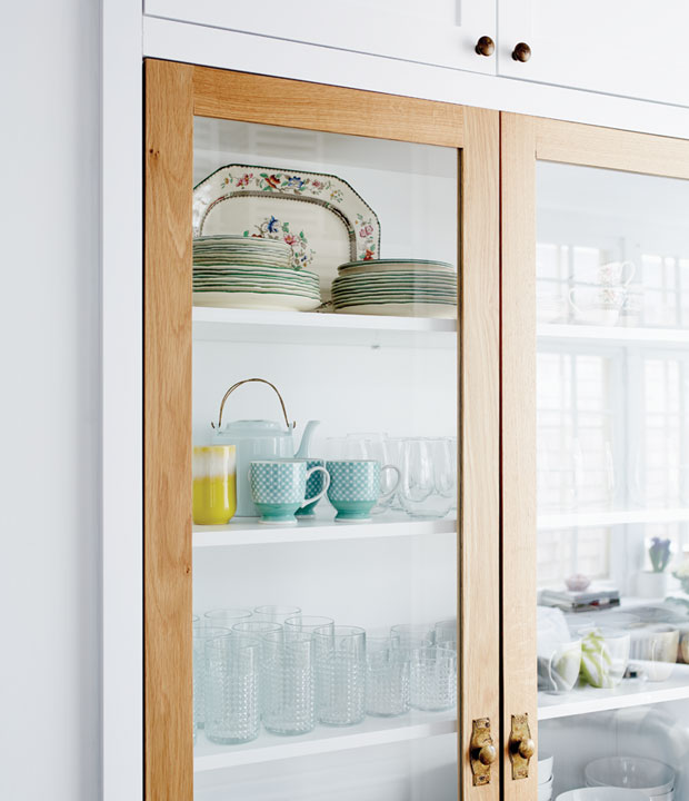
Opt for a single show cabinet. Open display isn’t for all homeowners, particularly those who have curious children or rambunctious pets, and going for glass-front cabinets throughout your kitchen can mean a lot of rearranging. Installing a single display cabinet is a nice compromise, putting a few favorite pieces on show. We love the contrasting doors and hardware on this one by designer Sam Sacks.
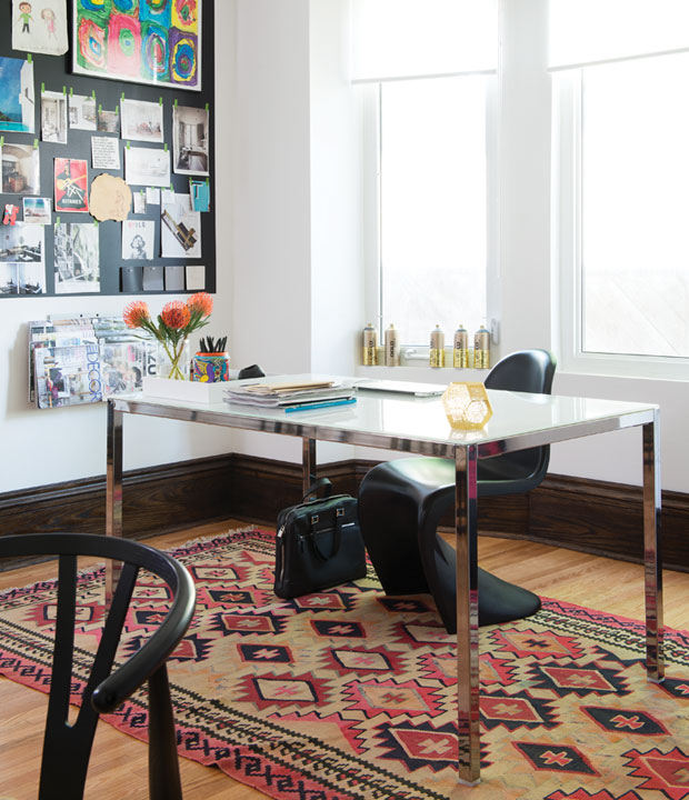
Carve out a freestanding work space. If you share your kitchen with school-age kids, and have a little extra square-footage at your disposal, why not add a homework table? A simple desk, chair and tray of office supplies are all you need to set the stage for pre-dinner productivity.
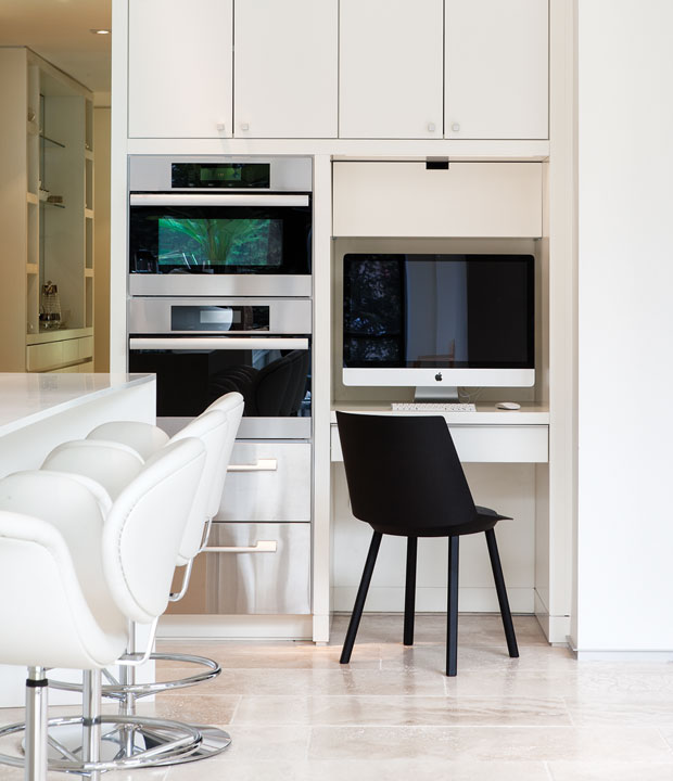
…or build a desk into the kitchen cabinetry. An integrated set-up like this is a practical addition for kids and adults alike, and would work especially well in a smaller kitchen. The key is to keep the look tidy, with all work supplies tucked away in closed storage and a small, clean-lined desk chair.
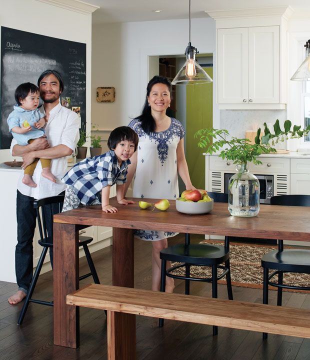
Mix seating styles to make room for everyone. In this hip family kitchen, the kids and their friends can pile onto a long wooden bench, while classic bistro chairs make comfortable seats for parents Rock Huynh and My Le Nguyen. When picking out a bench for your own table, take careful measurements before you buy (particularly if you’d like it to tuck underneath the table when not in use).
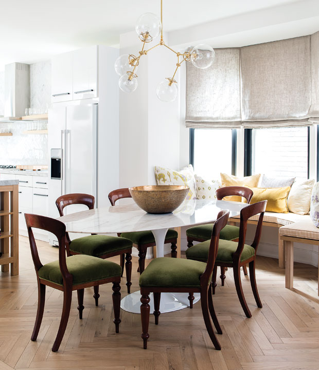
Build a comfortable window seat. If you’re lucky enough to have a bay window in your kitchen, take full advantage of it by building in an upholstered perch around it. Use the bench as a cozy spot to read the paper, or for casual extra seating around the dinner table. We love the inviting look of a pillow-loaded window seat, like this one — and the kids will, too.
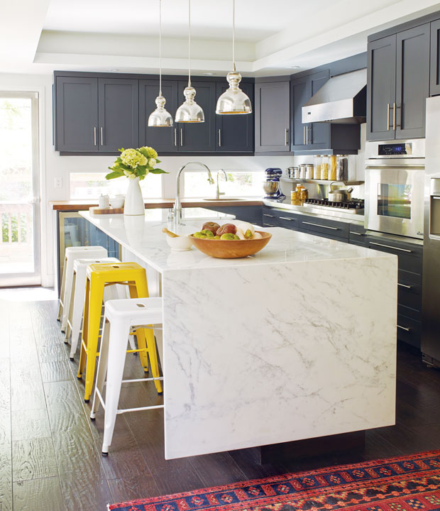
Blend child- and adult-height bar stools. Homeowner Jane Francisco mixed standard metal stools with a slightly taller version along her kitchen’s breakfast bar. This way, her son, or any visiting little one, can enjoy casual meals right alongside the rest of the group. This is also a super simple way to add color to a neutral room.
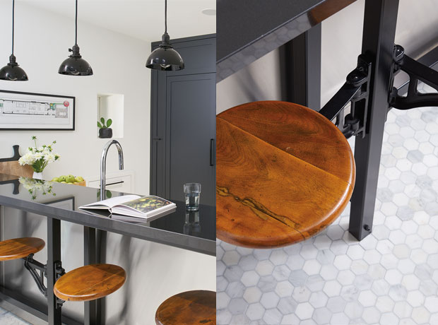
…or install perches that easily tuck away. The industrial, wood-topped stools in designer Meredyth Hilton’s family kitchen add a welcome a dose of edge, but it’s their hinged design that makes them super smart additions to the compact space. (Meredyth found hers at an antique shop, so keep your eyes peeled!)
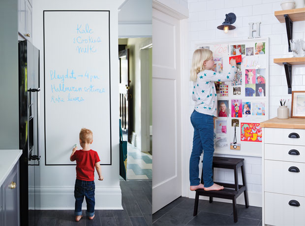
Mount prettier message boards. Message boards are ubiquitous in family kitchens, but they’re often more cluttered than curated (think plain cork board loaded with receipts and reminders). For a cleaner look, opt for a simple white dry-erase surface (left) or a neatly framed pin board painted the same color as your walls.
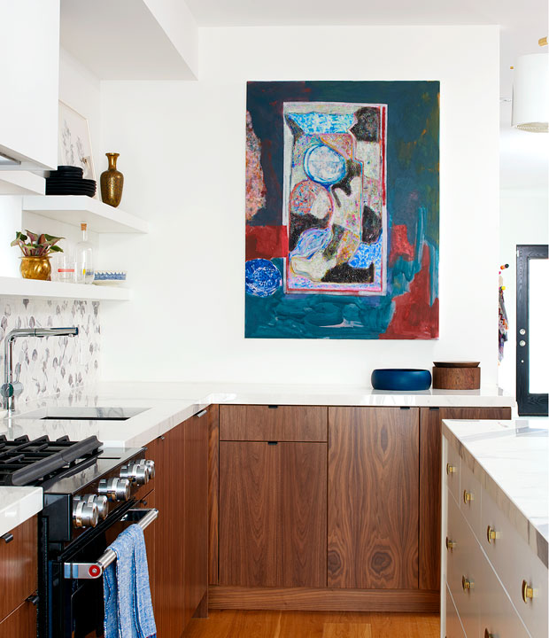
Add a burst of color with large-scale art. Statement artwork doesn’t often make it into the kitchen, but a large, vibrant canvas is a foolproof way to add life to a lackluster space. Here, H&H design editor Kai Ethier chose a fun, colorful painting by Canadian artist Jay Isaac to suit this kitchen’s youthful occupants.
Tour this kitchen on H&H TV.
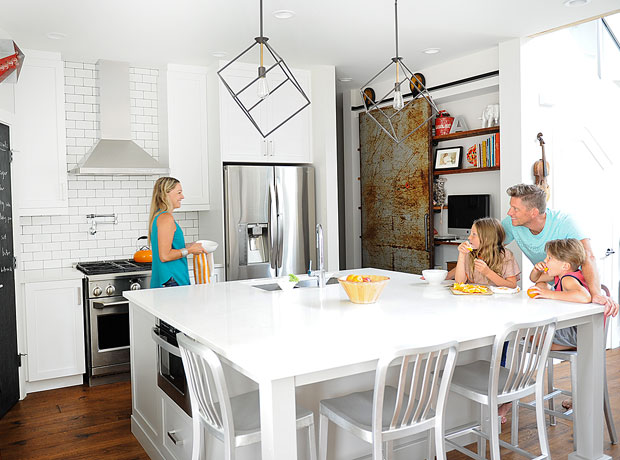
Incorporate edgy finds. Another way to lend energy to a family kitchen is by displaying cool industrial pieces. Here, in Michael and Ann Soltis’ family kitchen, vintage signage, geometric pendants and a weathered metal door keep the all-white space from feeling staid.
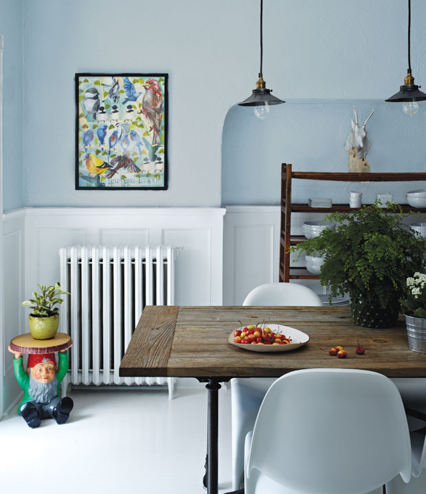
… or set out a couple whimsical accents. Eccentric accessories, like a cheeky gnome-shaped end table, are peppered throughout Marcelo Palacios and Magela Bruno’s family home, giving it an appropriately lighthearted vibe. To keep the look sophisticated, follow Marcelo and Magela’s lead and incorporate just a few pieces in each room.

Bring the outdoors in. Greenery has a way of reviving just about any room in the home. So whether it means installing wall-to-wall sliding doors, like in this dreamy West Coast kitchen, or just making room for a countertop herb garden, we think all family kitchens can benefit from a breath of fresh air.

